


本文仅做分析。项目作者见 github
GitHub 源地址: Before After
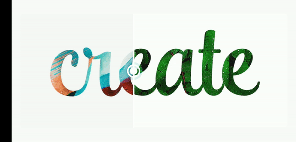
先上预览图:
原理分析图:
源码共两个文件:rect_clipper.dart
custom_widget.dart
custom_widget.dart 是控件的主要实现。
rect_clipper.dart 是对不同方向 (裁剪)的实现。继承于 CustomClipper
rect_clipper.dart:SizedImage
/// 使用 [SizedBox] 来限制图像大小
class SizedImage extends StatelessWidget {
/// 传入的 WIDGET
final Widget _image;
/// 用作 [SizedBox] 的宽高,以限制 [_image] 的大小
final double _height, _width, _imageCornerRadius;
const SizedImage(
this._image, this._height, this._width, this._imageCornerRadius,
{Key key})
: super(key: key);
@override
Widget build(BuildContext context) {
// 裁剪
return ClipRRect(
borderRadius: BorderRadius.circular(_imageCornerRadius),
// 固定宽高
child: SizedBox(
height: _height,
width: _width,
child: _image,
),
);
}
}复制代码
这里使用 SizedBox 来限制传入的 widget 宽高。
rect_clipper.dart: CustomThumbShape
class CustomThumbShape extends SliderComponentShape {
/// 滑块半径
final double _thumbRadius;
/// 滑块颜色
final Color _thumbColor;
CustomThumbShape(this._thumbRadius, this._thumbColor);
@override
Size getPreferredSize(bool isEnabled, bool isDiscrete) {
return Size.fromRadius(_thumbRadius);
}
@override
void paint(PaintingContext context, Offset center,
{Animation activationAnimation,
Animation enableAnimation,
bool isDiscrete,
TextPainter labelPainter,
RenderBox parentBox,
SliderThemeData sliderTheme,
TextDirection textDirection,
double value}) {
final Canvas canvas = context.canvas;
// 内圈
final Paint paint = Paint()
// 抗锯齿
..isAntiAlias = true
// 描边宽度
..strokeWidth = 4.0
..color = _thumbColor
..style = PaintingStyle.fill;
// 外圈
final Paint paintStroke = Paint()
..isAntiAlias = true
..strokeWidth = 4.0
..color = _thumbColor
..style = PaintingStyle.stroke;
canvas.drawCircle(
center,
_thumbRadius,
paintStroke,
);
canvas.drawCircle(
center,
_thumbRadius - 6,
paint,
);
// 画出一条"直线"
canvas.drawRect(
Rect.fromCenter(
center: center, width: 4.0, height: parentBox.size.height),
paint);
}
}
复制代码
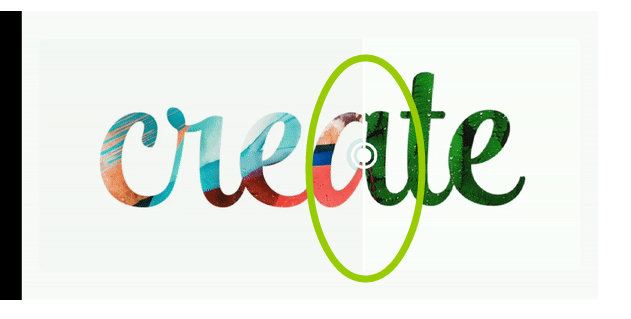
CustomThumbShape 就是这个(绿圈内):
至于 CustomThumbShape 用在何处下面解释。
rect_clipper.dart:BeforeAfter,_BeforeAfter
class BeforeAfter extends StatefulWidget {
/// image1
final Widget beforeImage;
// image2
final Widget afterImage;
/// 图像宽高
final double imageHeight;
final double imageWidth;
/// 图像四角裁剪半径
final double imageCornerRadius;
/// 拖动指示器颜色
final Color thumbColor;
/// 指示器半径
final double thumbRadius;
/// 点击指示器的背景颜色
final Color overlayColor;
/// 拖动方向
final bool isVertical;
const BeforeAfter({
Key key,
@required this.beforeImage,
@required this.afterImage,
this.imageHeight,
this.imageWidth,
this.imageCornerRadius = 8.0,
this.thumbColor = Colors.white,
this.thumbRadius = 16.0,
this.overlayColor,
this.isVertical = false,
}) : assert(beforeImage != null),
assert(afterImage != null),
super(key: key);
@override
_BeforeAfterState createState() => _BeforeAfterState();
}
class _BeforeAfterState extends State {
/// 裁剪程度
double _clipFactor = 0.5;
@override
Widget build(BuildContext context) {
return Stack(
alignment: Alignment.center,
children: [
// AFTER
Padding(
padding: widget.isVertical
? const EdgeInsets.symmetric(vertical: 24.0)
: const EdgeInsets.symmetric(horizontal: 24.0),
child: SizedImage(
widget.afterImage,
widget.imageHeight,
widget.imageWidth,
widget.imageCornerRadius,
),
),
/// BEFORE
Padding(
padding: widget.isVertical
? const EdgeInsets.symmetric(vertical: 24.0)
: const EdgeInsets.symmetric(horizontal: 24.0),
child: ClipPath(
clipper: widget.isVertical
? RectClipperVertical(_clipFactor)
: RectClipper(_clipFactor),
child: SizedImage(
widget.beforeImage,
widget.imageHeight,
widget.imageWidth,
widget.imageCornerRadius,
),
),
),
Positioned.fill(
child: SliderTheme(
data: SliderThemeData(
// slider 宽度调整为 0
trackHeight: 0,
overlayColor: widget.overlayColor,
thumbShape:
CustomThumbShape(widget.thumbRadius, widget.thumbColor),
),
child: widget.isVertical
? RotatedBox(
quarterTurns: 1,
child: Slider(
value: _clipFactor,
onChanged: (double factor) =>
setState(() => this._clipFactor = factor),
),
)
: Slider(
value: _clipFactor,
onChanged: (double factor) =>
setState(() => this._clipFactor = factor),
),
),
),
],
);
}
}复制代码
从中我们可以看出两张图片置于 Stack中,底部图片用 SizedImage进行限制大小,顶部图片通用限制大小后被 ClipPath包裹,ClipPath顾名思义,用于裁剪 widget
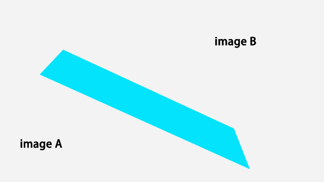
我们根据是否垂直来使用不同的 clipper。什么是垂直,见下图:
我们可以看到 RectClipper传入了一个值,_clipFactor,此值用于控制裁剪的程度(裁剪的百分比),后面又具体解释。
custom_widget.dart:RectClipper
class RectClipper extends CustomClipper {
final double clipFactor;
RectClipper(this.clipFactor);
@override
Path getClip(Size size) {
Path path = Path();
path.lineTo(size.width * clipFactor, 0.0);
path.lineTo(size.width * clipFactor, size.height);
path.lineTo(0.0, size.height);
path.close();
return path;
}
@override
bool shouldReclip(CustomClipper oldClipper) => true;
}
复制代码
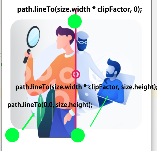
这里代码用一张图解释:
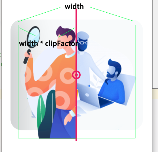
clipFactor取值 0 ~ 1 。
至于这三行代码,我们继续用图表示:
path.lineTo(size.width * clipFactor, 0);
path.lineTo(size.width * clipFactor, size.height);
path.lineTo(0.0, size.height);复制代码
下面具体说一下 CustomThumbShape
Positioned.fill(
child: SliderTheme(
data: SliderThemeData(
// slider 宽度调整为 0
trackHeight: 0,
overlayColor: widget.overlayColor,
thumbShape:
CustomThumbShape(widget.thumbRadius, widget.thumbColor),
),
child: widget.isVertical
? RotatedBox(
quarterTurns: 1,
child: Slider(
value: _clipFactor,
onChanged: (double factor) =>
setState(() => this._clipFactor = factor),
),
)
: Slider(
value: _clipFactor,
onChanged: (double factor) =>
setState(() => this._clipFactor = factor),
),
),
),复制代码
使用 SliderTheme 加上 SliderThemeData创造一个自定义 slider, trackHeight: 0, 把 slider 进度条调整为 0 。
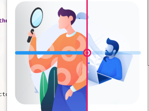
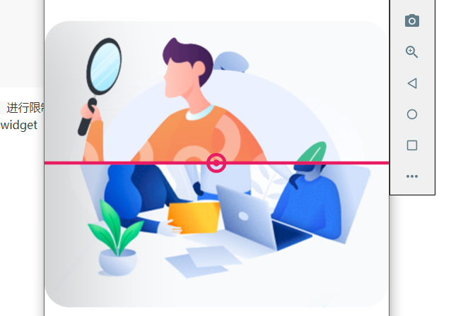
上图是不调整 trackHeight的效果。
然后通过判断是否为垂直,来决定是否使用 RotatedBox旋转 Slider。
以上就是 Before After 的分析笔记。

关于找一找教程网
本站文章仅代表作者观点,不代表本站立场,所有文章非营利性免费分享。
本站提供了软件编程、网站开发技术、服务器运维、人工智能等等IT技术文章,希望广大程序员努力学习,让我们用科技改变世界。
[【分析】Flutter 滑动对比图]http://www.zyiz.net/tech/detail-134790.html


 2215
2215


 被折叠的 条评论
为什么被折叠?
被折叠的 条评论
为什么被折叠?
 到【灌水乐园】发言


