css鼠标拖拉卡顿_CSS3之3D魔方酷炫效果:鼠标随意拖拽

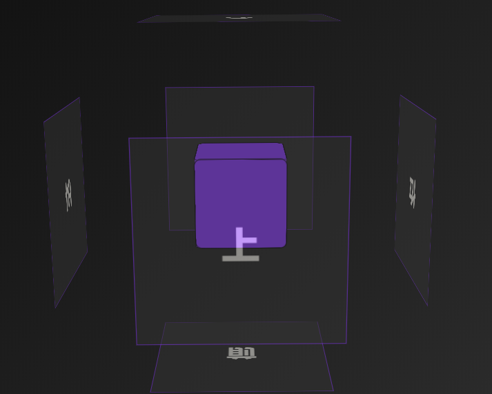
CSS3之3D魔方酷炫效果,鼠标随意拖拽,也可以点击。主要用的CSS3特效和JS来处理,废话不多说,先看下效果图:

89597984d757c54aa84d5137dcf1e178.png

直接上DEMO代码:html>

CSS3之3D魔方酷炫效果 - Web前端之家

* {

margin: 0 auto;

padding: 0;

}

html {

background: linear-gradient(135deg, #000 0%, #333 80%);

/*渐变色*/

cursor: pointer;

height: 100%;

}

.content {

margin-top: 200px;

perspective: 1000px; /* 视距 */

}

.box {

width: 200px;

height: 200px;

position: relative;

color: #fffdf5;

font-size: 36px;

font-weight: bold;

text-align: center;

line-height: 200px;

transform-style: preserve-3d; /* 默认 2D */

transition: transform 1s; /*transform动画效果*/

/*不让鼠标选中文字*/

-webkit-user-select: none;

-moz-user-select: none;

-ms-user-select: none;

user-select: none;

}

.box > div {

width: 200px;

height: 200px;

border: 1px solid #8d28ff;

position: absolute;

background-color: #333;

opacity: 0.5;

transition: transform 0.4s; /*transform动画效果*/

}

.box .out-front {

transform: translateZ(100px);

}

.box .out-back {

transform: translateZ(-100px) rotateY(180deg);

}

.box .out-left {

transform: translateX(-100px) rotateY(-90deg);

}

.box .out-right {

transform: translateX(100px) rotateY(90deg);

}

.box .out-top {

transform: translateY(-100px) rotateX(90deg);

}

.box .out-bottom {

transform: translateY(100px) rotateX(-90deg);

}

.box > span {

display: block;

width: 100px;

height: 100px;

border: 1px solid black;

background-color: #8d28ff;

position: absolute;

top: 50px;

left: 50px;

border-radius: 8px;

}

.box .in-front {

transform: translateZ(50px);

}

.box .in-back {

transform: translateZ(-50px) rotateY(180deg);

}

.box .in-left {

transform: translateX(-50px) rotateY(-90deg);

}

.box .in-right {

transform: translateX(50px) rotateY(90deg);

}

.box .in-top {

transform: translateY(-50px) rotateX(90deg);

}

.box .in-bottom {

transform: translateY(50px) rotateX(-90deg);

}

$(function () {

var clickNum = 1;    //点击次数

$('.box').children().click(function () {

if (clickNum % 2 == 0) {

console.log(clickNum);

//闭合

$('.out-front').css({transform: 'translateZ(100px)'});

$('.out-back').css({transform: 'translateZ(-100px) rotateY(180deg)'});

$('.out-left').css({transform: 'translateX(-100px) rotateY(-90deg)'});

$('.out-right').css({transform: 'translateX(100px) rotateY(90deg)'});

$('.out-top').css({transform: 'translateY(-100px) rotateX(90deg)'});

$('.out-bottom').css({transform: 'translateY(100px) rotateX(-90deg)'});

} else {

console.log(clickNum);

//展开

$('.out-front').css({transform: 'translateZ(200px)'});

$('.out-back').css({transform: 'translateZ(-200px) rotateY(180deg)'});

$('.out-left').css({transform: 'translateX(-200px) rotateY(-90deg)'});

$('.out-right').css({transform: 'translateX(200px) rotateY(90deg)'});

$('.out-top').css({transform: 'translateY(-200px) rotateX(90deg)'});

$('.out-bottom').css({transform: 'translateY(200px) rotateX(-90deg)'});

}

clickNum++;

});

//角度初始化

var RotateY = 0;

var RotateX = 0;

$('.box').children().mouseenter(function () {   //box 的所有子元素

$(this).css({cursor: 'pointer'});

});

var flag = false;

var old_x = 0;

var old_y = 0;

document.onmousedown = function (e) {

flag = true;

old_x = e.pageX;

old_y = e.pageY;

//console.log(old_x, old_y);

/*原本所处的位置*/

}

document.onmouseup = function () {

flag = false;

//鼠标抬起时结束

};

document.onmousemove = function (e) {

if (flag) {

var _x = e.pageX - old_x;

var _y = e.pageY - old_y;

/*新位置减去老位置*/

console.log(_x, _y);

RotateY += _x / 70;

RotateX += -(_y / 70);

$('.box').css({

transition: 'linear',

transform: 'rotateX(' + RotateX + 'deg) rotateY(' + RotateY + 'deg)'

});

}

};

})

可以在console.log下面看到我们记录的坐标,大家可以去看下。

  • 0
    点赞
  • 0
    收藏
    觉得还不错? 一键收藏
  • 0
    评论

“相关推荐”对你有帮助么?

  • 非常没帮助
  • 没帮助
  • 一般
  • 有帮助
  • 非常有帮助
提交
评论
添加红包

请填写红包祝福语或标题

红包个数最小为10个

红包金额最低5元

当前余额3.43前往充值 >
需支付:10.00
成就一亿技术人!
领取后你会自动成为博主和红包主的粉丝 规则
hope_wisdom
发出的红包
实付
使用余额支付
点击重新获取
扫码支付
钱包余额 0

抵扣说明:

1.余额是钱包充值的虚拟货币,按照1:1的比例进行支付金额的抵扣。
2.余额无法直接购买下载,可以购买VIP、付费专栏及课程。

余额充值