css3动画animation
<!DOCTYPE html>
<html>
	<head>
		<meta charset="utf-8">
		<title>动画</title>
		<style type="text/css">
			#donghua {
				width: 200px;
				height: 200px;
				background-color: #14569B;
				animation-name: donghua1;
				animation-duration: 2s;
				animation-timing-function: ease-in;
				animation-iteration-count: infinite;
				animation-direction: alternate;
				animation-delay: 3s;
                /* animation: donghua1 3s;综合性动画设置 */
				/* animation-name: 动画名称; */
				/* animation-duration: 2s; 动画周期时间*/
				/* animation-timing-function: 动画的变化速度; 默认ease, linear, ease-in,ease-out*/
				/* animation-iteration-count: 动画循环次数; infinite无限循环*/
				/* animation-direction: 运动方向 默认normal; alternate次数奇数正常,偶数反方向 ,reverse反方向*/
				/* animation-delay: 延迟时间; 只是第一次动画有效*/
				}
				@keyframes donghua1{
					/* from同等于0 */
					0{transform: translate(0,0);}
					25%{transform: translate(500px,0);}
					50%{transform: translate(500px,500px);}
					75%{transform: translate(0,500px);}
					/* to同等于1 */
					1{transform: translate(0,0);}
				}
		</style>
	</head>
	<body>
		<div id="donghua">
			动画1
		</div>
	</body>
</html>
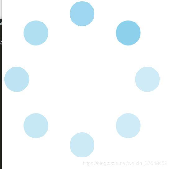
loading动画
<!DOCTYPE html>
<html>
	<head>
		<meta charset="utf-8">
		<title>loading</title>
		<style type="text/css">
			.loading {
				width: 500px;
				height: 500px;
				margin: 0 auto;
				position: relative;
			}
			.circle {
				width: 500px;
				height: 500px;
				position: absolute;
				top: 0;
				left: 0;
			}
			.small {
				width: 80px;
				height: 80px;
				background-color: skyblue;
				border-radius: 40px;
				margin: 0 auto;
			}
			.circle:nth-child(1) {
				transform: rotate(45deg);
				animation: loading 2s infinite;
			}
			.circle:nth-child(2) {
				transform: rotate(90deg);
				animation: loading 2s infinite;
				animation-delay: 0.15s;
			}
			.circle:nth-child(3) {
				transform: rotate(135deg);
				animation: loading 2s infinite;
				animation-delay: 0.5s;
			}
			.circle:nth-child(4) {
				transform: rotate(180deg);
				animation: loading 2s infinite;
				animation-delay: 0.75s;
			}
			.circle:nth-child(5) {
				transform: rotate(225deg);
				animation: loading 2s infinite;
				animation-delay: 1s;
			}
			.circle:nth-child(6) {
				transform: rotate(270deg);
				animation: loading 2s infinite;
				animation-delay: 1.25s;
			}
			.circle:nth-child(7) {
				transform: rotate(315deg);
				animation: loading 2s infinite;
				animation-delay: 1.5s;
			}
			.circle:nth-child(8) {
				transform: rotate(360deg);
				animation: loading 2s infinite;
				animation-delay: 1.75s;
			}

			@keyframes loading{
				from{opacity: 1;}
				to{opacity: 0.4;}
			}

		</style>
	</head>
	<body>
		<div class="loading">
			<div class="circle"><div class="small"></div></div>
			<div class="circle"><div class="small"></div></div>
			<div class="circle"><div class="small"></div></div>
			<div class="circle"><div class="small"></div></div>
			<div class="circle"><div class="small"></div></div>
			<div class="circle"><div class="small"></div></div>
			<div class="circle"><div class="small"></div></div>
			<div class="circle"><div class="small"></div></div>
		</div>
	</body>
</html>


 409
409


 被折叠的 条评论
为什么被折叠?
被折叠的 条评论
为什么被折叠?
 到【灌水乐园】发言


