


1、flexible.js适配
flexible的实质
flexible实际上就是能过JS来动态改写meta标签,代码类似这样:
(function(win, lib) {
    var doc = win.document;
    var docEl = doc.documentElement;
    var metaEl = doc.querySelector('meta[name="viewport"]');
    var flexibleEl = doc.querySelector('meta[name="flexible"]');
    var dpr = 0;
    var scale = 0;
    var tid;
    var flexible = lib.flexible || (lib.flexible = {});

    if (metaEl) {
      console.warn("将根据已有的meta标签来设置缩放比例");
      var match = metaEl
        .getAttribute("content")
        // eslint-disable-next-line no-useless-escape
        .match(/initial\-scale=([\d\.]+)/);
      if (match) {
        scale = parseFloat(match[1]);
        dpr = parseInt(1 / scale);
      }
    } else if (flexibleEl) {
      var content = flexibleEl.getAttribute("content");
      if (content) {
        // eslint-disable-next-line no-useless-escape
        var initialDpr = content.match(/initial\-dpr=([\d\.]+)/);
        // eslint-disable-next-line no-useless-escape
        var maximumDpr = content.match(/maximum\-dpr=([\d\.]+)/);
        if (initialDpr) {
          dpr = parseFloat(initialDpr[1]);
          scale = parseFloat((1 / dpr).toFixed(2));
        }
        if (maximumDpr) {
          dpr = parseFloat(maximumDpr[1]);
          scale = parseFloat((1 / dpr).toFixed(2));
        }
      }
    }

    if (!dpr && !scale) {
      // eslint-disable-next-line no-unused-vars
      var isAndroid = win.navigator.appVersion.match(/android/gi);
      var isIPhone = win.navigator.appVersion.match(/iphone/gi);
      var devicePixelRatio = win.devicePixelRatio;
      if (isIPhone) {
        // iOS下,对于2和3的屏,用2倍的方案,其余的用1倍方案
        if (devicePixelRatio >= 3 && (!dpr || dpr >= 3)) {
          dpr = 3;
        } else if (devicePixelRatio >= 2 && (!dpr || dpr >= 2)) {
          dpr = 2;
        } else {
          dpr = 1;
        }
      } else {
        // 其他设备下,仍旧使用1倍的方案
        dpr = 1;
      }
      scale = 1 / dpr;
    }

    docEl.setAttribute("data-dpr", dpr);
    if (!metaEl) {
      metaEl = doc.createElement("meta");
      metaEl.setAttribute("name", "viewport");
      metaEl.setAttribute(
        "content",
        "initial-scale=" +
          scale +
          ", maximum-scale=" +
          scale +
          ", minimum-scale=" +
          scale +
          ", user-scalable=no"
      );
      if (docEl.firstElementChild) {
        docEl.firstElementChild.appendChild(metaEl);
      } else {
        var wrap = doc.createElement("div");
        wrap.appendChild(metaEl);
        doc.write(wrap.innerHTML);
      }
    }

    function refreshRem() {
      var width = docEl.getBoundingClientRect().width;
      // 最小1366px,最大适配2560px
      if (width / dpr < 1366) {
        width = 1366 * dpr;
      } else if(width / dpr > 2560){
        if (width / dpr === 3840){
          width = 3840 * dpr;
        }else{
          width = 2560 * dpr
        }
      }
      console.log(`${width}----${dpr}`)
      // 设置成24等份,设计稿时1920px的,这样1rem就是80px
      var rem = width / 24;
      docEl.style.fontSize = rem + "px";
      flexible.rem = win.rem = rem;
    }

    win.addEventListener(
      "resize",
      function() {
        clearTimeout(tid);
        tid = setTimeout(refreshRem, 300);
      },
      false
    );
    win.addEventListener(
      "pageshow",
      function(e) {
        if (e.persisted) {
          clearTimeout(tid);
          tid = setTimeout(refreshRem, 300);
        }
      },
      false
    );

    if (doc.readyState === "complete") {
      doc.body.style.fontSize = 12 * dpr + "px";
    } else {
      doc.addEventListener(
        "DOMContentLoaded",
        // eslint-disable-next-line no-unused-vars
        function(e) {
          doc.body.style.fontSize = 12 * dpr + "px";
        },
        false
      );
    }

    refreshRem();

    flexible.dpr = win.dpr = dpr;
    flexible.refreshRem = refreshRem;
    flexible.rem2px = function(d) {
      var val = parseFloat(d) * this.rem;
      if (typeof d === "string" && d.match(/rem$/)) {
        val += "px";
      }
      return val;
    };
    flexible.px2rem = function(d) {
      var val = parseFloat(d) / this.rem;
      if (typeof d === "string" && d.match(/px$/)) {
        val += "rem";
      }
      return val;
    };
  })(window, window["lib"] || (window["lib"] = {}));
事实上他做了这几样事情:
动态改写标签
给元素添加data-dpr属性,并且动态改写data-dpr的值
给元素添加font-size属性,并且动态改写font-size的值
自己粗浅地理解:
该flexible.js的应用场景:用来在缩放屏幕大小得过程中能够自动地调整字体的大小
flexible.js会设置html的remUnit的大小(即html标签下的font-size),默认为屏幕大小的1/20,(也就是说屏幕大小改变,则html也会font-size也会变)
其他元素的宽高也可以写成以rem为单位,从而随着屏幕大小变化
特别注意,默认情况下html的font-size为1em,需要自定义html的font-size的css样式记得加上!important ,否则自己写的不起效果(这一点不是很重要)
备注:以上转赞于也对大屏适配做了些许改动https://blog.csdn.net/weixin_44744501/article/details/125858836
2、Echart 折现图 使用飞线完成流光效果(此处因为业务原因设置了双轴效果,原理是一致的)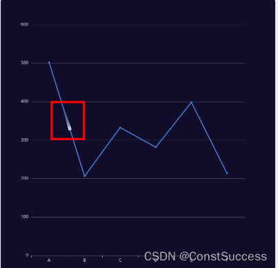
直接放置代码,做详细注释
{

                {
                    animation: true, //控制动画示否开启
                    animationDuration: 3000,
                    animationEasing: "bounceOut", //缓动动画
                    animationThreshold: 8, //动画元素的阈值
                     //控制图表内容上下左右的位置
                    grid: {
                        top: '16%',
                        left: '21%',
                        right: '10%',
                        bottom: '13%',
                    },
                    xAxis: [
                        {
                            type: 'category',
                            boundaryGap: true,
                            data: [],
                            // name: '(天)',
                            axisLabel: {
                                show: true,
                                color: '#DFE8FF',
                                fontSize: 12
                            },
                            axisTick: {
                                show: false
                            },
                            splitLine: {
                                show: false,
                                lineStyle: {
                                    color: ['#435E7D'],
                                    width: 1,
                                    type: 'dashed',
                                }
                            }
                        }
                    ],
                    yAxis: [
                    //第一轴线
                        {
                            type: 'value',
                            name: '',
                            axisTick: {
                                show: false
                            },
                            nameTextStyle: {
                                fontFamily: 'Alibaba PuHuiTi',
                                fontSize: 12,
                                color: '#DFE8FF'
                            },
                            axisLabel: {
                                show: true,
                                color: '#DFE8FF',
                                fontSize: 12
                            },
                            splitLine: {
                                show: true,
                                lineStyle: {
                                    color: ['#435E7D'],
                                    width: 1,
                                    type: 'dashed',
                                }
                            }
                        },
                        //第二轴线
                        {
                            type: 'value',
                            name: '',
                            show: false,
                            axisTick: {
                                show: false
                            },
                            nameTextStyle: {
                                fontFamily: 'Alibaba PuHuiTi',
                                fontSize: 12,
                                color: '#DFE8FF'
                            },
                            axisLabel: {
                                show: true,
                                color: '#DFE8FF',
                                fontSize: 12
                            },
                            splitLine: {
                                show: false,
                                lineStyle: {
                                    color: ['#435E7D'],
                                    width: 1,
                                    type: 'dashed',
                                }
                            }
                        }
                    ],
                    series: [
                    //数据一
                        {
                            data: [],
                            type: 'line',
                            smooth: false,
                            yAxisIndex: 1,
                            symbol: 'none',
                            // symbolSize: 8,
                            itemStyle: {
                                normal: {
                                    color: new echarts.graphic.LinearGradient(
                                        0, 0, 0, 1,
                                        [
                                            { offset: 0, color: '#ADDDFF' },
                                            { offset: 1, color: '#83CBFE' }
                                        ]
                                    )
                                }
                            }
                        },
                        //数据二
                        {
                            data: [],
                            type: 'bar',
                            itemStyle: {
                                normal: {
                                    // barBorderRadius: [10,10,0,0],
                                    color: new echarts.graphic.LinearGradient(
                                        0, 0, 0, 1,
                                        [
                                            { offset: 0, color: '#0084FF3F' },
                                            { offset: 1, color: '#0084FF00' }
                                        ]
                                    )
                                }
                            }
                        },
                        //此处就是设置风险的效果了
                        {
                            showSymbol: false,
                            name: '',
                            type: "lines",
                            polyline: true,
                            smooth: true,
                            coordinateSystem: "cartesian2d",
                            zlevel: 1,
                            //飞线效果
                            effect: {
                                show: true,//是否展示
                                period: 10,//时间
                                trailLength: 0.1,//尾部长度
                                symbolSize: 8,//点大小
                                symbol: 'circle',//点的类型
                            },
                            lineStyle: {
                                color: "#fff",
                                width: 1,
                                opacity: 0,
                                curveness: 0,
                                cap: "round",
                            },
                            data: [{
                                coords: [
                                ]
                            	}
                            ]
                        }
                    ]
                }
3、coords的数据,只需要把x轴和y轴数据一一对应的,其实就是折现上一个点到下一个点的循环跳跃,
['A', 502.84],
['B', 205.97],
['C', 332.79],
['D', 281.55],
['E', 398.35],
['F', 214.02],
4、这个效果只能在非平滑曲线的效果smooth:false
5、react的架构下,如果想在平滑曲线使用此中效果,可以使用第三方插件
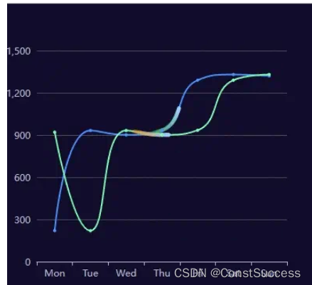
flowline-for-echarts:
$ npm install --save flowline-for-echarts
# `echarts` is the peerDependence of `flowline-for-echarts`, you can install echarts with your own version.
$ npm install --save echarts
import FlowLine from 'flowline-for-echarts'
import type { FlowLineProps } from 'flowline-for-echarts'

const App = () => {

    const flowLineProps: FlowLineProps = {
        id: 'chart',
        lineWidth: 2,
        option: {
            darkMode: true,
            xAxis: {
                type: 'category',
                data: ['Mon', 'Tue', 'Wed', 'Thu', 'Fri', 'Sat', 'Sun']
            },
            yAxis: {
                type: 'value'
            },
            series: [
                {
                    data: [220, 932, 901, 934, 1290, 1330, 1320],
                    type: 'line',
                    smooth: true,
                    colorList: ['#009000', '#9BCEFD']// 流动线条颜色

                },
                {
                    data: [1320, 220, 932, 901, 934, 1290, 1330],
                    type: 'line',
                    smooth: true,
                    colorList: ['#ff9000', '#9BCEFD']// 流动线条颜色
                }
            ]
        }
    }

    return (
        <div style={{ width: 400, height: 400 }}><FlowLine {...flowLineProps} /></div>
    );
};
6、此处只适用于线图,面积图有bug,会在倒数第二个点结束效果
三、柱状图的数据动态
其实就是把x轴和series的第一条数据,去除,让后在下一个在push到最后,将此操作,在定时器中循环执行,并且渲染图表就可以有效果了,就不来代码了。


 1437
1437


 被折叠的 条评论
为什么被折叠?
被折叠的 条评论
为什么被折叠?
 到【灌水乐园】发言


