


 本文介绍了如何通过可视化方法理解概率分布,并探讨了信息理论的基础概念。作者首先展示了如何可视化简单概率分布,接着通过辛普森悖论(Simpson's Paradox)解释了在统计分析中变量交互影响的重要性。文章强调,通过条件概率和概率分布的可视化,可以帮助我们更好地理解复杂关系,揭示隐藏的统计规律。
转载自:http://colah.github.io/posts/2015-09-Visual-Information/
翻译by:Bricker@AI
Visual Information Theory
I love the feeling of having a new way to think about the world. I especially love when there's some vague idea that gets formalized into a concrete concept. Information theory is a prime example of this.
Information theory gives us precise language for describing a lot of things. How uncertain am I? How much does knowing the answer to question A tell me about the answer to question B? How similar is one set of beliefs to another? I've had informal versions of these ideas since I was a young child, but information theory crystallizes them into precise, powerful ideas. These ideas have an enormous variety of applications, from the compression of data, to quantum physics, to machine learning, and vast fields in between.
Unfortunately, information theory can seem kind of intimidating. I don’t think there’s any reason it should be. In fact, many core ideas can be explained completely visually!
我喜欢这种感觉,用新的方式去思考世界。我尤其喜欢,当模糊的想法能够被形式化成具体的概念。其中,信息理论就是一个最好的范例。
信息理论为我们描述诸多事物的提供了精确语言。我有多么的不确定? 如果知道问题A的答案,那么可以让我知道多少关于问题B的答案? 不同观点之间的相似程度如何? 自孩提起,我就已经有过这些朴素想法的非正式版本,而信息理论可以让这些朴素想法变成精确且强大的思想结晶。信息理论有着广泛的应用,涉及数据压缩、量子物理和机器学习,以及介于彼此之间的广阔领域。
不幸的是,信息理论看起来似乎有点高深莫测。但我不这么认为,事实上信息理论的许多核心思想,可以被很好地可视化和形象解释!
Visualizing Probability Distributions
Before we dive into information theory, let's think about how we can visualize simple probability distributions. We’ll need this later on, and it’s convenient to address now. As a bonus, these tricks for visualizing probability are pretty useful in and of themselves!
I’m in California. Sometimes it rains, but mostly there’s sun! Let’s say it’s sunny 75% of the time. It’s easy to make a picture of that:
在我们深入研究信息理论之前,让我们先考虑如何将简单的概率分布可视化。 我们稍后才会用到它,但也适合现在先行解释说明。 作为回报,这些概率可视化的方法本身就非常有用!
我生活在加利福尼亚。 加州有时会下雨,但大多数时候都阳光明媚! 假设加州75%的时间都是晴天,我们很容易得到下图(75% 晴天,25% 雨天):

Most days, I wear a t-shirt, but some days I wear a coat. Let’s say I wear a coat 38% of the time. It’s also easy to make a picture for that!
大多数时候,我穿T恤,但有些时候我要穿外套。假设我有38%的时间是穿外套,我们很容易得到下图(38% 外套,62% T恤):

What if I want to visualize both at the same time? We’ll, it’s easy if they don’t interact – if they’re what we call independent. For example, whether I wear a t-shirt or a raincoat today doesn’t really interact with what the weather is next week. We can draw this by using one axis for one variable and one for the other:
如何同时将天气和衣着两者可视化?如果它们无关,是我们所说的相互独立事件 —— 我们就很容易做到。例如,我 今天穿T恤还是外套,显然跟 下周天气 没什么关系,两者是相互独立的。今天衣着 和 下周天气 这两个变量,我们可以用两个坐标轴x和y分别表示,得到下图:

Notice the straight vertical and horizontal lines going all the way through. That’s what independence looks like! 1 The probability I’m wearing a coat doesn’t change in response to the fact that it will be raining in a week. In other words, the probability that I’m wearing a coat and that it will rain next week is just the probability that I’m wearing a coat, times the probability that it will rain. They don’t interact.
请注意,上图中间的垂直和水平线是正交的,表示事件相互独立!1 也就是我 今天穿外套 的可能性,不随 下周下雨 而改变。 换句话说,我 今天穿外套 且 下周下雨 的可能性p(x,y),就等于我 今天穿外套 的可能性p(x) 乘以 下周下雨 的可能性p(y),他们互不影响。
When variables interact, there’s extra probability for particular pairs of variables and missing probability for others. There’s extra probability that I’m wearing a coat and it’s raining because the variables are correlated, they make each other more likely. It’s more likely that I’m wearing a coat on a day that it rains than the probability I wear a coat on one day and it rains on some other random day.
Visually, this looks like some of the squares swelling with extra probability, and other squares shrinking because the pair of events is unlikely together。But while that might look kind of cool, it’s isn’t very useful for understanding what’s going on.
当变量相互影响,会使得特定的变量pair的可能性增加,其它变量pair的可能性变小。因为变量之间是相关的,所以 今天下雨 且 今天穿外套 的可能性会增加。换句话说,雨天穿外套的可能性,要比随机某天穿外套的可能性更大(因为随机某天会包含晴天,而晴天穿外套可能性小)。
在视觉上,这看起来像一些联合事件所对应的方块,以更高的概率膨胀;而其他方块缩小,因为该联合事件不太可能一起出现。虽然这看起来有点酷,但对于我们更好地理解作用有限。

Instead, let’s focus on one variable like the weather. We know how probable it is that it’s sunny or raining. For both cases, we can look at the conditional probabilities. How likely am I to wear a t-shirt if it’s sunny? How likely am I to wear a coat if it’s raining?
让我们换一种方式,先专注某个给定变量(比如天气)。首先天气有 晴天 和 雨天,且我们知道其概率。然后我们可以来看天气和衣着两者的条件概率:如果天气晴朗,穿T恤的可能性有多大?如果下雨,穿外套的可能性又是多少?

There’s a 25% chance that it’s raining. If it is raining, there’s a 75% chance that I’d wear a coat. So, the probability that it is raining and I’m wearing a coat is 25% times 75% which is approximately 19%. The probability that it’s raining and I’m wearing a coat is the probability that it is raining, times the probability that I’d wear a coat if it is raining. We write this:
假设下雨的概率为25%,下雨时穿外套的概率为75%。那么,下雨 且 我穿外套 的可能性是75%的25%,大约是19%。也即 下雨 且 我穿外套 的可能性,是 下雨 的可能性 P(rain) 乘以 下雨时我穿外套 的可能性 P(coat|rain)。我们这样写:
This is a single case of one of the most fundamental identities of probability theory:
更一般的,我们有以下最基础的概率恒等式:
We’re factoring the distribution, breaking it down into the product of two pieces. First we look at the probability that one variable, like the weather, will take on a certain value. Then we look at the probability that another variable, like my clothing, will take on a certain value conditioned on the first variable.
The choice of which variable to start with is arbitrary. We could just as easily start by focusing on my clothing and then look at the weather conditioned on it. This might feel a bit less intuitive, because we understand that there’s a causal relationship of the weather influencing what I wear and not the other way around… but it still works!
我们将概率分布因式分解,拆分成2个部分。我们先看其中一个变量(如天气)为某个值的概率。然后我们看在给定第一个变量(天气)及其取值的条件下,另一个变量(如衣着)为某个值的条件概率。
选择以哪个变量开始是随意的。之前我们是选择天气作为给定条件,现在假设我们换成衣着作为给定条件进行分析。这可能会让人难以理解,因为我们的因果关系常识是:天气会影响穿着,而不是相反……但它仍然有意义!(注:可以看成根据当天 我的穿着 去推测 当天天气)
Let’s go through an example. If we pick a random day, there’s a 38% chance that I’d be wearing a coat. If we know that I’m wearing a coat, how likely is it that it’s raining? Well, I’m more likely to wear a coat in the rain than in the sun, but rain is kind of rare in California, and so it works out that there’s a 50% chance that it’s raining. And so, the probability that it’s raining and I’m wearing a coat is the probability that I’m wearing a coat (38%), times the probability that it would be raining if I was wearing a coat (50%) which is approximately 19%.
举个例子,如果随便选一天(包含晴雨天),那么我穿外套的几率是38%。但如果已知某天我穿着外套,那么当天下雨(而不是晴天)的可能性有多大呢?嗯,我更可能在雨天穿外套,而不是晴天。但在加州下雨是很少见的(按前面假设为 25%雨天,75%晴天)。
根据联合概率公式,下雨 且 我穿外套 的联合概率P(rain, coat),等于 我 穿外套 的概率P(coat)=38% 乘以 我 穿外套时下雨 的条件概率 P(rain|coat)=50%,大约是19%,反之亦然。
注:保持原意的基础上,改变了最后两句的说明内容和逻辑,方便更好理解。
This gives us a second way to visualize the exact same probability distribution. Note that the labels have slightly different meanings than in the previous diagram: t-shirt and coat are now marginal probabilities, the probability of me wearing that clothing without consideration of the weather. On the other hand, there are now two rain and sunny labels, for the probabilities of them conditional on me wearing a t-shirt and me wearing a coat respectively.
(You may have heard of Bayes’ Theorem. If you want, you can think of it as the way to translate between these two different ways of displaying the probability distribution!)
这就有了第二种方法来可视化该条件分布(如下图)。注意下图中的标签与之前有些不一样:横轴的T恤和外套,现在是边缘概率(marginal probabilities),也即不考虑天气的单个穿衣事件的概率。此外,现在左右有两个晴天和雨天的标签,分别对应穿T恤和穿外套条件下,不同天气事件的概率。
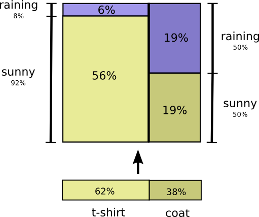
如果你了解贝叶斯定律,你也可以利用它来对两种不同的概率分布表示方法进行转换:
Aside: Simpson’s Paradox (辛普森悖论)
Are these tricks for visualizing probability distributions actually helpful? I think they are! It will be a little while before we use them for visualizing information theory, so I’d like to go on a little tangent and use them to explore Simpson’s paradox. Simpson’s paradox is an extremely unintuitive statistical situation. It’s just really hard to understand at an intuitive level. Michael Nielsen wrote a lovely essay, Reinventing Explanation, which explored different ways to explain it. I’d like to try and take my own shot at it, using the tricks we developed in the previous section.
这些条件概率可视化方法真的有用吗?我想是的!在真正进入信息理论可视化之前,我们来讨论一个稍微离题的问题,使用这些方法探讨辛普森悖论。这个悖论是一种极端情况的统计,从直觉角度较难理解。Michael Nielsen写个一篇有趣的短文《Reinventing Explanation》,探讨了各种解释悖论的方法。在这里,我们尝试用前文提出的可视化方法来解释一下。
Two treatments for kidney stones are tested. Half the patients are given treatment A while the other half are given treatment B. The patients who received treatment B were more likely to survive than those who received treatment A.
假设我们测试了两种肾结石的质量方法。其中50%患者使用治疗方案A,另50%使用方案B。从总体看,接受方案B的患者存活率更高。由此得出的结论1:方案B 优于 方案A,如下图所示:

However, patients with small kidney stones were more likely to survive if they took treatment A. Patients with large kidney stones were also more likely to survive if they took treatment A! how can this be?
另一方面,如果我们按结石大小分组,我们发现肾结石较小的患者,使用方案A比方案B存活率更高;肾结石较大的患者,使用方案A也同样比方案B存活率更高!也即两组都有结论2:方案A 优于 方案B。如何解释结论1和结论2的矛盾现象?
The core of the issue is that the study wasn’t properly randomized. The patients who received treatment A were likely to have large kidney stones, while the patients who received treatment B were more likely to have small kidney stones.
这一问题的关键在于,实验抽样没有做到随机性(是方案A和方案B的患者分布一致)。接受治疗方案A的大结石患者较多(占75%),而B方案中的小结石患者更多(占77%),如下图所示:

As it turns out, patients with small kidney stones are much more likely to survive in general. To understand this better, we can combine the two previous diagrams. The result is a 3-dimensional diagram with the survival rate split apart for small and large kidney stones.
We can now see that in both the small case and the large case, Treatment A beats Treatment B. Treatment B only seemed better because the patients it was applied to were more likely to survive in the first place!
一般而言,小结石(Small)患者总体上存活率会更高。为了更好的理解,我们可以把前面两幅图(患者-方案分布 与 疗效-方案分布)结合到一起。结果形成如下图的三维立体图形,这样大小结石患者的存活率(以及不同方案)差异就能很好的区分了。
这样我们就可以看到,从分组来看,不论是大结石患者、还是小结石患者,治疗方案A都要比方案B更好。从总体看方案B貌似比方案A好的原因,是由于应用方案B的小结石患者人数占比更多,而小结石患者本身更容易存活。

Further Reading
Claude Shannon’s original paper on information theory, A Mathematical Theory of Communication, is remarkably accessible. (This seems to be a recurring pattern in early information theory papers. Was it the era? A lack of page limits? A culture emanating from Bell Labs?)
Cover & Thomas’ Elements of Information Theory seems to be the standard reference. I found it helpful.
Acknowledgments
I’m very grateful to Dan Mané, David Andersen, Emma Pierson and Dario Amodei for taking time to give really incredibly detailed and extensive comments on this essay. I’m also grateful for the comments of Michael Nielsen, Greg Corrado, Yoshua Bengio, Aaron Courville, Nick Beckstead, Jon Shlens, Andrew Dai, Christian Howard, and Martin Wattenberg.
Thanks also to my first two neural network seminar series for acting as guinea pigs for these ideas.
Finally, thanks to the readers who caught errors and omissions. In particular, thanks to Connor Zwick, Kai Arulkumaran, Jonathan Heusser, Otavio Good, and an anonymous commenter.
-
It’s fun to use this to visualize naive Bayesian classifiers, which assume independence…↩
-
But horribly inefficient! If we have an extra symbol to use in our codes, only using it at the end of codewords like this would be a terrible waste.↩
-
I’m cheating a little here. I’ve been using an exponential of base 2 where this is not true, and am going to switch to a natural exponential. This saves us having a lot of log(2)s in our proof, and makes it visually a lot nicer.↩
-
Note that this notation for cross-entropy is non-standard. The normal notation is H(p,q). This notation is horrible for two reasons. Firstly, the exact same notation is also used for joint entropy. Secondly, it makes it seem like cross-entropy is symmetric. This is ridiculous, and I’ll be writing Hq(p) instead.↩
-
Also non-standard notation.↩
-
If you expand the definition of KL divergence, you get:Dq(p)=∑xp(x)log2(p(x)q(x))
That might look a bit strange. How should we interpret it? Well, log2(p(x)q(x)) is just the difference between how many bits a code optimized for q and a code optimized for p would use to represent x. The expression as a whole is the expected difference in how many bits the two codes would use.↩ -
This builds off the set interpretation of information theory layed out in Raymond W. Yeung’s paper A New Outlook on Shannon’s Information Measures.↩
-
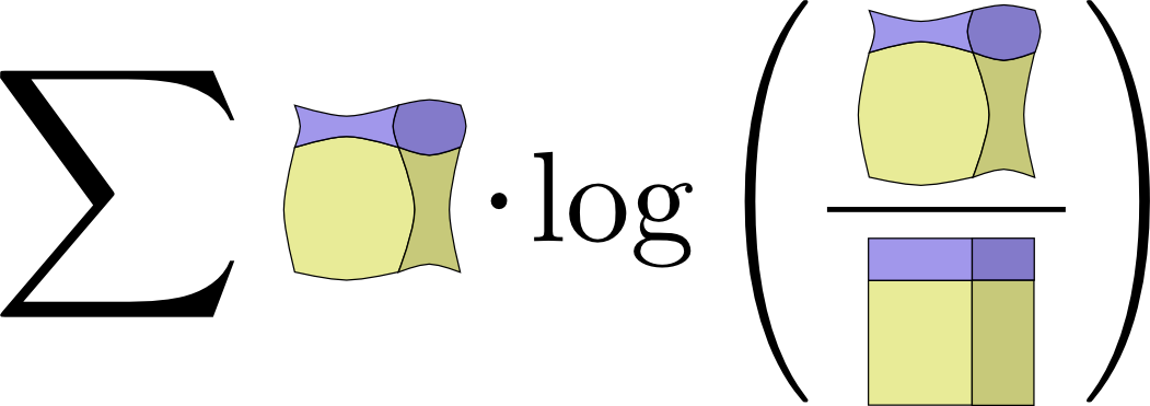
If you expand the definition of mutual information out, you get:
I(X,Y)=∑x,yp(x,y)log2(p(x,y)p(x)p(y))
That looks suspiciously like KL divergence!
What’s going on? Well, it is KL divergence. It’s the KL divergence of P(X,Y) and its naive approximation P(X)P(Y). That is, it’s the number of bits you save representing X and Y if you understand the relationship between them instead of assuming they’re independent.
One cute way to visualize this is to literally picture the ratio between a distribution and its naive approximation:
↩
-
There’s an entire field of quantum information theory. I know precisely nothing about the subject, but I’d bet with extremely high confidence, based on Michael’s other work, that Michael Nielsen and Issac Chuang’s Quantum Computation and Quantum Information is an excellent introduction.↩
-
As someone who knows nothing about statistical physics, I’ll very nervously try to sketch its connection to information theory as I understand it.
After Shannon discovered information theory, many noted suspicious similarities between equations in thermodynamics and equations in information theory. E.T. Jaynes found a very deep and principled connection. Suppose you have some system, and take some measurements like the pressure and temperature. How probable should you think a particular state of the system is? Jaynes suggested we should assume the probability distribution which, subject to the constraints of our measurement, maximizes the entropy. (Note that this “principle of maximum entropy” is much more general than physics!) That is, we should assume the possibility with the most unknown information. Many results can be derived from this perspective.
(Reading the first few sections of Jaynes’ papers (part 1, part 2) I was impressed by how accessible they seem.)
If you’re interested in this connection but don’t want to work through the original papers, there’s a section in Cover & Thomas which derives a statistical version of the Second Law of Thermodynamics from Markov Chains!↩
-
The connection between information theory and gambling was originally laid out by John Kelly in his paper ‘A New Interpretation of Information Rate.’ It’s a remarkably accessible paper, although it requires a few ideas we didn’t develop in this essay.
Kelly had an interesting motivation for his work. He noticed that entropy was being used in many cost functions which had no connection to encoding information and wanted some principled reason for it. In writing this essay, I’ve been troubled by the same thing, and have really appreciated Kelly’s work as an additional perspective. That said, I don’t find it completely convincing: Kelly only winds up with entropy because he considers iterated betting where one reinvests all their capital each bet. Different setups do not lead to entropy.
A nice discussion of Kelly’s connection between betting and information theory can be found in the standard reference on information theory, Cover & Thomas’ ‘Elements of Information Theory.’↩
-
It doesn’t resolve the issue, but I can’t resist offering a small further defense of KL divergence.
There’s a result which Cover & Thomas call Stein’s Lemma, although it seems unrelated to the result generally called Stein’s Lemma. At a high level, it goes like this:
Suppose you have some data which you know comes from one of two probability distributions. How confidently can you determine which of the two distributions it came from? In general, as you get more data points, your confidence should increase exponentially. For example, on average you might become 1.5 times as confident about which distribution is the truth for every data point you see.
How much your confidence gets multiplied depends on how different the distributions are. If they are very different, you might very quickly become confident. But if they’re only very slightly different, you might need to see lots of data before you have even a mildly confident answer.
Stein’s Lemma says, roughly, that the amount you multiply by is controlled by the KL divergence. (There’s some subtlety about the trade off between false-positives and false-negatives.) This seems like a really good reason to care about KL divergence!↩
Comments
Built by Oinkina with Hakyll using Bootstrap, MathJax, Disqus, MathBox.js, Highlight.js, and Footnotes.js.


 被折叠的 条评论
为什么被折叠?
被折叠的 条评论
为什么被折叠?
 到【灌水乐园】发言


