首页
容器属性
- flex-direction:控制布局横向还是纵向(row(默认值)、row-reverse、column、column-reverse)
- justify-content:控制主轴内容居中,靠左,靠右,平均(flex-start(默认值),flex-end,center,space-between,space-evenly,space-around)
- align-items:控制辅轴内容居中,靠上,靠下,平均(normal,stretch【不设置子元素高度时自动拉伸至父元素高度】,flex-satrt,flex-end,center,baseline)
- flex-wrap:控制主轴内容在一行还是多行(nowrap(默认),wrap,wrap-reverse)
- align-content:控制多行内容居中,靠上,靠下,平均(stretch(默认值),flex-start,flex-end,center,space-between,space-evenly,space-around)
- flex-flow:flex-direction与flex-wrap的简写(flex-flow: row wrap)
ITEM属性
- order:(排序,值越小约靠前)
- align-self:覆盖父元素的align-items值,值与父元素值一致
- flex-grow: 决定了flex items如何扩展,值为0或者小数(当flex container 在main axis方向上有剩余得size时,flex-grow属性才会有效)
- flex-shrink:有扩大自然就会有缩小,与上个属性类似
- flex-basis:在分配多余空间之前,项目占据的主轴空间(main size)
- flex:flex-grow || flex-shink||flex-basis的简写
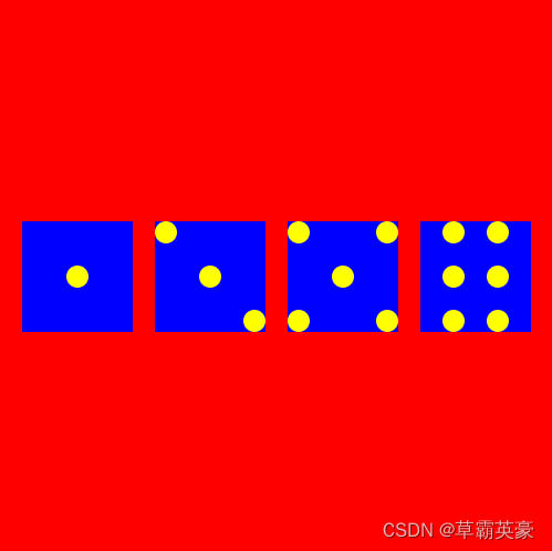
筛子布局
<template>
	<div>
		<div id="content">
			<div class="item one">
				<span class="item-one"></span>
			</div>
			<div class="item two">
				<span class="two1"></span>
				<span class="two2"></span>
				<span class="two3"></span>
			</div>
			<div class="item three">
				<div class="three-one">
					<span></span>
					<span></span>
				</div>
				<div class="three-two">
					<span></span>
				</div>
				<div class="three-three">
					<span></span>
					<span></span>
				</div>
			</div>
			<div class="item four">
				<div class="four-one">
					<span></span>
					<span></span>
					<span></span>
				</div>
				<div class="four-two">
					<span></span>
					<span></span>
					<span></span>
				</div>
			</div>
		</div>
	</div>
</template>

<script>
	export default {
		name: 'HelloWorld'
	}
</script>

<!-- Add "scoped" attribute to limit CSS to this component only -->
<style scoped>
#content{
	width: 500px;
	height: 500px;
	background: red;
	display: flex;
	justify-content: space-evenly;
	align-items: center;
}
.item{
	width:100px;
	height: 100px;
	background: blue;
}
.one{
	justify-content: center;
	align-items: center;
}
.two{
	justify-content: space-between;
}
.two2{
	align-self: center;
}
.two3{
	align-self: flex-end;
}
.three{
	flex-direction: column;
	justify-content: space-between;
}
.three-one ,.three-three{
	justify-content: space-between;
}
.three-two{
	justify-content: center;
}
.four{
	justify-content: space-evenly;
}
.four-one,.four-two{
	flex-direction: column;
	justify-content: space-between;
}
span{
	width:20px;
	height: 20px;
	border-radius: 50%;
	background: yellow;
}
div{
	display: flex;
}
</style>


 1684
1684


 被折叠的 条评论
为什么被折叠?
被折叠的 条评论
为什么被折叠?
 到【灌水乐园】发言


