


前言
在Android应用实际开发中,标题栏是App必不可少的元素之一(当然,不包括游戏),大部分情况下,系统提供的标题栏并不能完全满足我们的需求,就需要手动去编写标题栏布局,那么问题来了,如果是在Activity或者Fragment布局文件里面编写标题栏,那岂不是每一个页面的布局文件都要增加不少的代码,如果想更改一下整个app的标题栏的风格...(十脸蒙蔽),甚至有时候还会可能一个不留神写错了一些属性,导致一些页面的标题栏看起来并不完全一样,用户体验度就悲催了...
需求
那么我们可以通过什么方式来提高我们的效率和质量呢?我想要的效果是这样的:
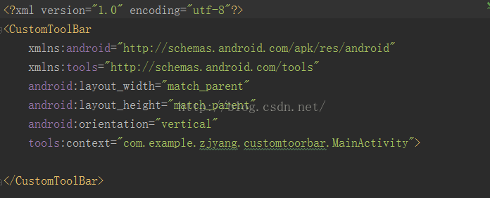
1.可以在每个Activity或Fragment的布局文件的最外层布局直接使用自定义的标题栏布局,然后其他的内容只需要想以往那样直接写在最外层布局里面,像这样:
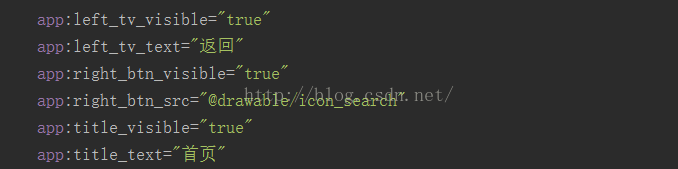
2.可以直接在布局文件中声明显示的文字内容,icon素材,标题内容等,而像背景颜色、字体颜色、字体大小就可以统一成一个地方设置,只要更改一个地方,可以方便更改所有标题栏的风格,像这样:
实现
既然定了模样,那就开始来实现这样一个标题栏,首先思考我们需要的属性,一般的标题栏都是左边一个按钮,右边一个按钮,中间一个标题,当然有些情况下不是按钮而是文字,所以我们可以制定多种属性选择,在values下新建一个attrs.xml文件,往里面添加如下属性:
-
xml version="1.0" encoding="utf-8"
-
<resources>
-
<!--标题栏样式-->
-
<declare-styleable name="CustomToolBar">
-
<!--左按钮是否可见|背景-->
-
<attr name="left_btn_visible" format="boolean"/>
-
<attr name="left_btn_src" format="reference|color"/>
-
<!--左文本是否可见|文本内容-->
-
<attr name="left_tv_visible" format="boolean"/>
-
<attr name="left_tv_text" format="string"/>
-
<!--右边按钮是否可见|背景-->
-
<attr name="right_btn_visible" format="boolean"/>
-
<attr name="right_btn_src" format="reference|color"/>
-
<!--右文本是否可见|文本内容-->
-
<attr name="right_tv_visible" format="boolean"/>
-
<attr name="right_tv_text" format="string"/>
-
<!--标题是否可见|文本内容-->
-
<attr name="title_visible" format="boolean"/>
-
<attr name="title_text" format="string"/>
-
<!--背景-->
-
<attr name="barBackground" format="reference|color"/>
-
</declare-styleable>
-
</resources>
定义好了样式之后,开始编写通用的标题栏布局文件
layout_common_toolbar.xml:
-
xml version="1.0" encoding="utf-8"
-
<LinearLayout xmlns:android="http://schemas.android.com/apk/res/android"
-
android:orientation= "vertical"
-
android:layout_width= "match_parent"
-
android:layout_height= "wrap_content">
-
-
<RelativeLayout
-
android:id= "@+id/toolbar_content_rlyt"
-
android:layout_width= "match_parent"
-
android:layout_height= "50dp"
-
android:paddingLeft= "15dp"
-
android:paddingRight= "15dp"
-
android:background= "@color/bg_toolbar">
-
-
<Button
-
android:id= "@+id/toolbar_left_btn"
-
android:layout_width= "25dp"
-
android:layout_height= "25dp"
-
android:layout_alignParentLeft= "true"
-
android:padding= "50dp"
-
android:gravity= "center"
-
android:layout_centerVertical= "true"
-
android:background= "@drawable/icon_back"
-
android:visibility= "invisible"/>
-
<TextView
-
android:id= "@+id/toolbar_left_tv"
-
android:layout_width= "wrap_content"
-
android:layout_height= "wrap_content"
-
android:layout_alignParentLeft= "true"
-
android:gravity= "center"
-
android:layout_centerVertical= "true"
-
android:textColor= "#fff"
-
android:textSize= "15sp"
-
android:text= "返回"
-
android:visibility= "gone"
-
/>
-
-
<TextView
-
android:id= "@+id/toolbar_title_tv"
-
android:layout_width= "wrap_content"
-
android:layout_height= "match_parent"
-
android:gravity= "center"
-
android:layout_centerInParent= "true"
-
android:singleLine= "true"
-
android:text= "标题"
-
android:textSize= "20sp"
-
android:textColor= "#fff"
-
android:maxEms= "10"
-
android:visibility= "invisible"/>
-
-
<Button
-
android:id= "@+id/toolbar_right_btn"
-
android:layout_width= "25dp"
-
android:layout_height= "25dp"
-
android:layout_alignParentRight= "true"
-
android:gravity= "center"
-
android:layout_centerVertical= "true"
-
android:visibility= "invisible"
-
android:background= "#00000000"
-
android:textSize= "15sp"
-
android:textColor= "#fff"/>
-
-
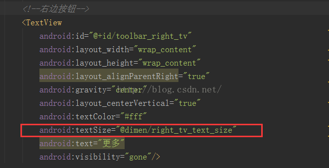
<TextView
-
android:id= "@+id/toolbar_right_tv"
-
android:layout_width= "wrap_content"
-
android:layout_height= "wrap_content"
-
android:layout_alignParentRight= "true"
-
android:gravity= "center"
-
android:layout_centerVertical= "true"
-
android:textColor= "#fff"
-
android:textSize= "15sp"
-
android:text= "更多"
-
android:visibility= "gone"/>
-
-
</RelativeLayout>
-
-
<!--标题栏底部微阴影-->
-
<View
-
android:layout_width= "match_parent"
-
android:layout_height= "0.5dp"
-
android:background= "#AAAAAA"
-
/>
-
-
</LinearLayout>
分析:其实就是左Button、左TextView、中间标题TextView、右边Button、右边TextView以及一个底部的细微的阴影效果
属性声明好了,布局文件也写好了,那接下来自然是在自定义类中设置属性值:
我们想要实现将其作为最外层父布局来写,那肯定里面要容纳子控件,可以通过继承LinearLayout来进行自定义,到时候只需直接往里层继续编写子控件布局。
-
/**
-
* Created by IT_ZJYANG on 2016/9/9.
-
* 标题栏
-
*/
-
public class CustomToolBar extends LinearLayout{
-
-
private Boolean isLeftBtnVisible;
-
private int leftResId;
-
-
private Boolean isLeftTvVisible;
-
private String leftTvText;
-
-
private Boolean isRightBtnVisible;
-
private int rightResId;
-
-
private Boolean isRightTvVisible;
-
private String rightTvText;
-
-
private Boolean isTitleVisible;
-
private String titleText;
-
-
private int backgroundResId;
-
-
public CustomToolBar(Context context) {
-
this(context, null);
-
}
-
-
public CustomToolBar(Context context, AttributeSet attrs) {
-
this(context, attrs, 0);
-
}
-
-
public CustomToolBar(Context context, AttributeSet attrs, int defStyleAttr) {
-
super(context, attrs, defStyleAttr);
-
initView(attrs);
-
}
-
-
/**
-
* 初始化属性
-
* @param attrs
-
*/
-
public void initView(AttributeSet attrs){
-
-
TypedArray typedArray = getContext().obtainStyledAttributes(attrs, R.styleable.CustomToolBar);
-
/**-------------获取左边按钮属性------------*/
-
isLeftBtnVisible = typedArray.getBoolean(R.styleable.CustomToolBar_left_btn_visible, false);
-
leftResId = typedArray.getResourceId(R.styleable.CustomToolBar_left_btn_src, - 1);
-
/**-------------获取左边文本属性------------*/
-
isLeftTvVisible = typedArray.getBoolean(R.styleable.CustomToolBar_left_tv_visible, false);
-
if(typedArray.hasValue(R.styleable.CustomToolBar_left_tv_text)){
-
leftTvText = typedArray.getString(R.styleable.CustomToolBar_left_tv_text);
-
}
-
/**-------------获取右边按钮属性------------*/
-
isRightBtnVisible = typedArray.getBoolean(R.styleable.CustomToolBar_right_btn_visible, false);
-
rightResId = typedArray.getResourceId(R.styleable.CustomToolBar_right_btn_src, - 1);
-
/**-------------获取右边文本属性------------*/
-
isRightTvVisible = typedArray.getBoolean(R.styleable.CustomToolBar_right_tv_visible, false);
-
if(typedArray.hasValue(R.styleable.CustomToolBar_right_tv_text)){
-
rightTvText = typedArray.getString(R.styleable.CustomToolBar_right_tv_text);
-
}
-
/**-------------获取标题属性------------*/
-
isTitleVisible = typedArray.getBoolean(R.styleable.CustomToolBar_title_visible, false);
-
if(typedArray.hasValue(R.styleable.CustomToolBar_title_text)){
-
titleText = typedArray.getString(R.styleable.CustomToolBar_title_text);
-
}
-
/**-------------背景颜色------------*/
-
backgroundResId = typedArray.getResourceId(R.styleable.CustomToolBar_barBackground, - 1);
-
-
typedArray.recycle();
-
-
/**-------------设置内容------------*/
-
View barLayoutView = View.inflate(getContext(), R.layout.layout_common_toolbar, null);
-
Button leftBtn = (Button)barLayoutView.findViewById(R.id.toolbar_left_btn);
-
TextView leftTv = (TextView)barLayoutView.findViewById(R.id.toolbar_left_tv);
-
TextView titleTv = (TextView)barLayoutView.findViewById(R.id.toolbar_title_tv);
-
Button rightBtn = (Button)barLayoutView.findViewById(R.id.toolbar_right_btn);
-
TextView rightTv = (TextView)barLayoutView.findViewById(R.id.toolbar_right_tv);
-
RelativeLayout barRlyt = (RelativeLayout)barLayoutView.findViewById(R.id.toolbar_content_rlyt);
-
-
if(isLeftBtnVisible){
-
leftBtn.setVisibility(VISIBLE);
-
}
-
if(isLeftTvVisible){
-
leftTv.setVisibility(VISIBLE);
-
}
-
if(isRightBtnVisible){
-
rightBtn.setVisibility(VISIBLE);
-
}
-
if(isRightTvVisible){
-
rightTv.setVisibility(VISIBLE);
-
}
-
if(isTitleVisible){
-
titleTv.setVisibility(VISIBLE);
-
}
-
leftTv.setText(leftTvText);
-
rightTv.setText(rightTvText);
-
titleTv.setText(titleText);
-
-
if(leftResId != - 1){
-
leftBtn.setBackgroundResource(leftResId);
-
}
-
if(rightResId != - 1){
-
rightBtn.setBackgroundResource(rightResId);
-
}
-
if(backgroundResId != - 1){
-
barRlyt.setBackgroundColor(getResources().getColor(R.color.bg_toolbar));
-
}
-
//将设置完成之后的View添加到此LinearLayout中
-
addView(barLayoutView, 0);
-
}
-
}
主要看initView方法,在这个方法中主要做两步:
1.获取我们在实际布局文件(比如Activity的布局文件)中设置的属性的值
2.根据这些值来做相应的操作,比如设置是否可见,设置是选用文字还是选用按钮、标题文本内容等等
思路:可以看到,首先通过inflate获取标题栏layout文件,然后再通过findViewById获取子控件(左Button、右Button、标题TextView等等),再根据我们第一步获取的那些属性值对它们进行相应的设置,最后将设置完成的View通过addView(barLayoutView, 0);将其添加到我们的CustomToolBar中的第一个位置,由于CustomToolBar是继承于LinearLayout,所以标题栏View将会处于最上面的位置,并且以后添加的其他子控件将会依次叠加在标题栏下面(如果CustomToolBar是继承于RelativeLayout,到时候添加内层控件时会被标题栏遮住,不是我们想要的效果)
背景颜色是通过调用资源R.color.bg_toolbar,只需在color.xml中定义:
-
<!--标题栏颜色-->
-
<color name="bg_toolbar">#32A082 </color>
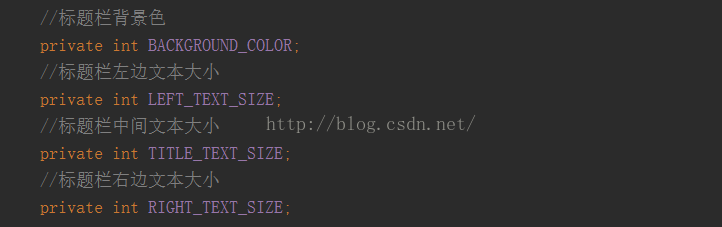
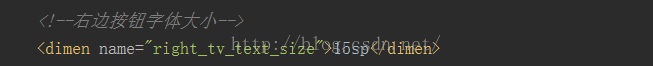
至于字体大小,也可以用同样的方式抽取到dimen.xml中,然后在layout_common_toolbar.xml中对应的控件下引用即可,如:
运用
完成以上步骤,基本定义好了,接下来就是轻松地调用了:
activity_main.xml
-
<com.example.zjyang.customtoorbar.CustomToolBar
-
xmlns:android= "http://schemas.android.com/apk/res/android"
-
xmlns:tools= "http://schemas.android.com/tools"
-
xmlns:app= "http://schemas.android.com/apk/res-auto"
-
android:layout_width= "match_parent"
-
android:layout_height= "match_parent"
-
android:orientation= "vertical"
-
app:left_tv_visible= "true"
-
app:left_tv_text= "返回"
-
app:right_btn_visible= "true"
-
app:right_btn_src= "@drawable/icon_search"
-
app:title_visible= "true"
-
app:title_text= "首页"
-
tools:context= "com.example.zjyang.customtoorbar.MainActivity">
-
-
<TextView
-
android:layout_width= "match_parent"
-
android:layout_height= "match_parent"
-
android:gravity= "center"
-
android:layout_gravity= "center"
-
android:text= "@string/app_name"
-
android:textSize= "20sp"/>
-
-
</com.example.zjyang.customtoorbar.CustomToolBar>
其实在这里无非就是设置自定义属性(是否可见、文本内容),这些都是具体页面所决定的具体内容,而背景颜色等所有标题栏共有的属性则在xml中去配置。
运行效果
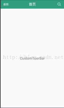
其它页面自然同理设置,只需copy过去,修改一下文案和是否可见,就完成了另外一个页面的标题栏,并且高度颜色什么的也保持了相同的规范,修改这个规范也仅仅只是在资源文件中改一下值,有效提高了开发效率和可维护性。
源码:点此下载


 971
971


 被折叠的 条评论
为什么被折叠?
被折叠的 条评论
为什么被折叠?
 到【灌水乐园】发言


