


比较简单,但是坑比较多,最好自己动手实现一下。
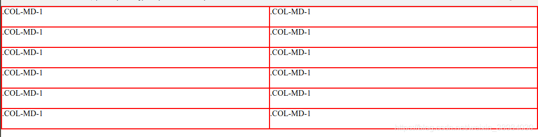
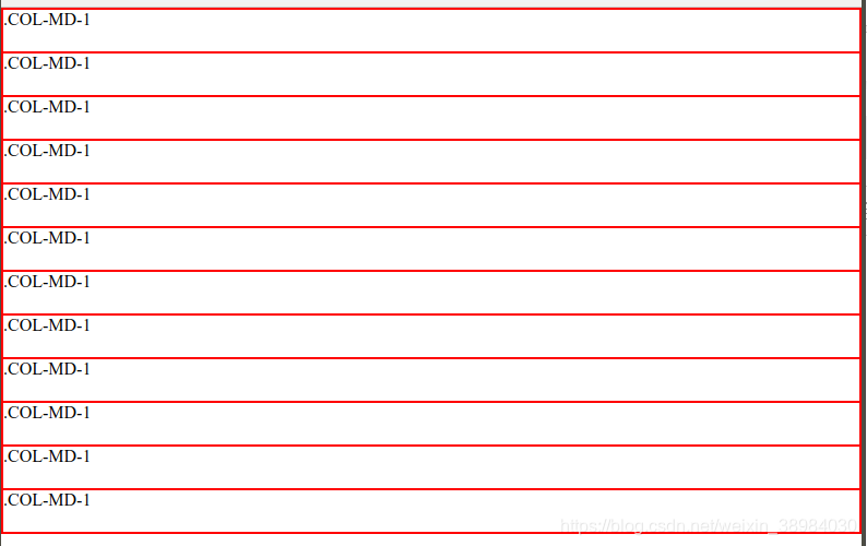
效果图:
1200px以上的屏幕下

1000px的屏幕
800的屏幕
(解析写在代码注释里好了)
html代码:
<div class="row">
    <div class="col-lg-1 col-md-6 col-sm-12">.col-md-1</div>
    <div class="col-lg-1 col-md-6 col-sm-12">.col-md-1</div>
    <div class="col-lg-1 col-md-6 col-sm-12">.col-md-1</div>
    <div class="col-lg-1 col-md-6 col-sm-12">.col-md-1</div>
    <div class="col-lg-1 col-md-6 col-sm-12">.col-md-1</div>
    <div class="col-lg-1 col-md-6 col-sm-12 ">.col-md-1</div>
    <div class="col-lg-1 col-md-6 col-sm-12">.col-md-1</div>
    <div class="col-lg-1 col-md-6 col-sm-12">.col-md-1</div>
    <div class="col-lg-1 col-md-6 col-sm-12">.col-md-1</div>
    <div class="col-lg-1 col-md-6 col-sm-12">.col-md-1</div>
    <div class="col-lg-1 col-md-6 col-sm-12">.col-md-1</div>
    <div class="col-lg-1 col-md-6 col-sm-12">.col-md-1</div>
</div>
css代码:
*{
    margin: 0;
    padding: 0;
}

.row:after{                    /* 解决父元素塌陷问题,可以参考我的另一篇博客*/
    content: '';
    display: block;
    clear: both;
}
.row {
    height: auto;
}
div{
    box-sizing: border-box;          /* 把border包含在width中*/
    height: 40px;
    border: 1px solid red;
}

[class*="col-"]{                     /* 匹配所有"col-" 开头的类*/
    float: left;
}

@media (min-width:768px) {           /* 顺序很重要! 不要会覆盖掉*/
    .col-sm-1 {width: 8.33%;}        /* 十二分之一/
    .col-sm-2 {width: 16.66%;}
    .col-sm-3 {width: 25%;}
    .col-sm-4 {width: 33.33%;}
    .col-sm-5 {width: 41.66%;}
    .col-sm-6 {width: 50%;}
    .col-sm-7 {width: 58.33%;}
    .col-sm-8 {width: 66.66%;}
    .col-sm-9 {width: 75%;}
    .col-sm-10 {width: 83.33%;}
    .col-sm-11 {width: 91.66%;}
    .col-sm-12 {width: 100%;}
}

@media (min-width:992px){

    .col-md-1 {width: 8.33%;}
    .col-md-2 {width: 16.66%;}
    .col-md-3 {width: 25%;}
    .col-md-4 {width: 33.33%;}
    .col-md-5 {width: 41.66%;}
    .col-md-6 {width: 50%;}
    .col-md-7 {width: 58.33%;}
    .col-md-8 {width: 66.66%;}
    .col-md-9 {width: 75%;}
    .col-md-10 {width: 83.33%;}
    .col-md-11 {width: 91.66%;}
    .col-md-12 {width: 100%;}
}

@media (min-width:1200px){
    .col-lg-1 {width: 8.33%;}
    .col-lg-2 {width: 16.66%;}
    .col-lg-3 {width: 25%;}
    .col-lg-4 {width: 33.33%;}
    .col-lg-5 {width: 41.66%;}
    .col-lg-6 {width: 50%;}
    .col-lg-7 {width: 58.33%;}
    .col-lg-8 {width: 66.66%;}
    .col-lg-9 {width: 75%;}
    .col-lg-10 {width: 83.33%;}
    .col-lg-11 {width: 91.66%;}
    .col-lg-12 {width: 100%;}
}


 378
378


 被折叠的 条评论
为什么被折叠?
被折叠的 条评论
为什么被折叠?
 到【灌水乐园】发言


