


引言
在 Android 开发中,Button 是最常见的交互组件之一,它不仅是用户触发操作的主要途径,还承担着传递反馈和提升用户体验的重要角色。无论是简单的点击操作,还是复杂的样式与状态变化,Button 都是构建应用界面时不可或缺的一部分。
本篇博客将深入探讨 Android 中 Button 的使用,从基础的按钮功能到自定义样式,再到复杂的状态管理。特别地,我们将介绍如何通过 StateListDrawable 来实现按钮在不同状态下的外观变化,让你的按钮不仅实用,还能更加灵活和富有互动性。如果你希望提升按钮的视觉效果和用户体验,那么这篇文章将帮助你掌握关键技巧。
Button 的作用和基本用法
Button 用于触发用户的操作,无论是提交表单、进行导航、执行计算,还是触发其他功能,Button都是不可或缺的界面元素。它通过触摸事件与用户互动,能够有效提高应用的交互性和响应性。
主要作用
- 用户交互:通过点击按钮,用户能够激活某些功能或触发操作。
- 触发操作:通过按钮触发某种逻辑操作。
- 反馈效果:按钮的状态和外观也能给用户提供反馈。例如,按钮在点击时改变颜色或形状,用户可以直观地知道自己已经进行了操作。
基本用法
在布局文件中,可以通过以下方式添加一个简单的Button:
    /// 定义一个按钮方法
    public void onButtonClick() {

    }
<Button
android:id="@+id/button_example"
android:layout_width="wrap_content"
android:layout_height="wrap_content"
android:text="Click Me"
android:onClick="onButtonClick" />
- android:id:定义了按钮的唯一标识符,方便在Java代码中引用。
- android:layout_width和android:layout_height:定义按钮的尺寸,通常使用wrap_content或者match_parent来自适应内容或父视图。
- android:text:按钮显示的文本,可以通过该属性设置按钮上的文字。
- android:onClick:通过设置该属性指定点击事件的处理方法。onButtonClick 是一个 Java 方法,当按钮被点击时会被调用。
在 Java 代码中,可以通过findViewById获取到按钮,并为其设置点击事件监听器:
/// 设置按钮
    private void setupButton() {
        findViewById(R.id.button_example).setOnClickListener(new View.OnClickListener() {
                                                                 @Override
                                                                 public void onClick(View v) {

                                                                 }
                                                             }

        );
    }
Button的常见属性
在 Android 开发中,Button 提供了丰富的属性,允许我们自定义文本、颜色、背景、形状等等。以下是最常用的一些属性:
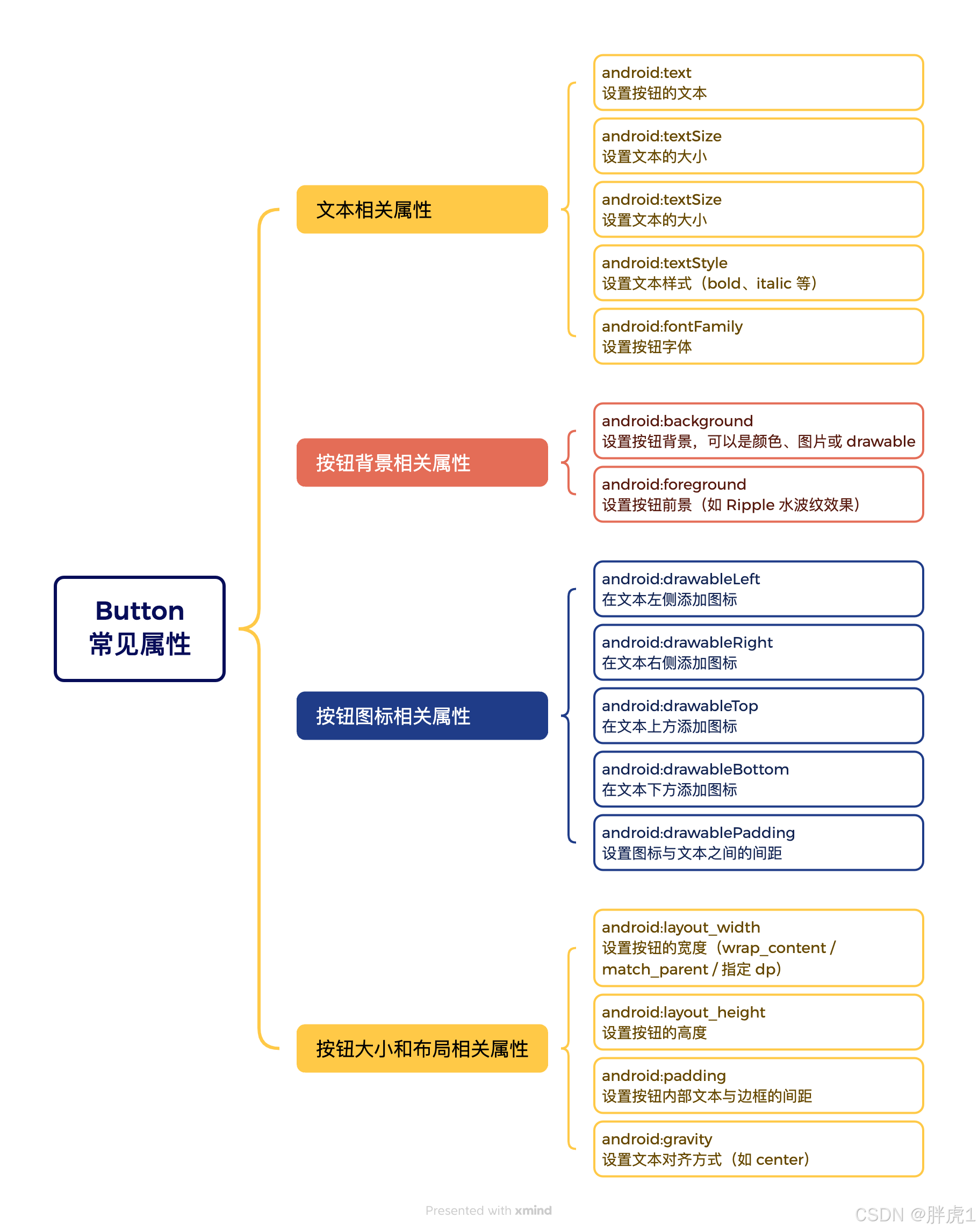
文本相关属性
- android:text:设置按钮的文本。
- android:textSize:设置文本的大小如16sp。
- android:textColor:设置文本颜色。
- android:textStyle:设置文本样式(bold、italic等等)。
- android:fontFamily:设置按钮字体。
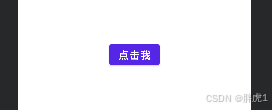
使用实例:
<Button
    android:layout_width="wrap_content"
    android:layout_height="wrap_content"
    android:text="点击我"
    android:textSize="18sp"
    android:textColor="#FFFFFF"
    android:textStyle="bold"
    android:fontFamily="sans-serif" />
效果如下:
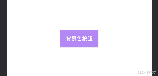
按钮背景相关属性
- android:background:设置按钮背景,可以是颜色、图片或者drawable。
- android:forgeround:设置按钮前景(如Ripple水波纹效果)。
使用示例:
使用颜色当做背景
<Button
    android:layout_width="wrap_content"
    android:layout_height="wrap_content"
    android:text="背景色按钮"
    android:background="@color/blue" />
效果如下:

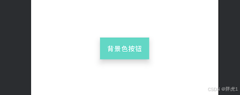
使用selector 设置不同状态的背景
    <Button
        android:layout_width="wrap_content"
        android:layout_height="wrap_content"
        android:text="背景色按钮"
        android:background="@drawable/button_selector"
        app:backgroundTint="@null"/>
button_selector.xml的实现
<selector xmlns:android="http://schemas.android.com/apk/res/android">
    <item android:state_pressed="true" android:drawable="@color/teal_200" />
    <item android:drawable="@color/purple_200" />
</selector>
效果如下:
按钮图标相关属性
- android:drawableLeft:在文本左侧添加图标。
- android:drawableRight:在文本右侧添加图标。
- android:drawableTop:在文本上方添加图标。
- android:drawableBottom:在文本下方添加图标。
- android:drawablePadding:设置图标与文本之间的间距。
使用示例:
<Button
    android:layout_width="wrap_content"
    android:layout_height="wrap_content"
    android:text="带图标按钮"
    android:drawableLeft="@drawable/ic_launcher"
    android:drawablePadding="8dp" />
效果如下:

按钮大小和布局相关属性
- android:layout_width:设置按钮的宽度(wrap_content、match_parent或者指定dp)。
- android:layout_height:设置按钮的高度(wrap_content、match_parent或者指定dp)。
- android:padding:设置按钮内部文本与边框的间距。
- android:gravity:设置文本对齐方式(比如center)。
使用示例:
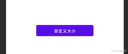
<Button
    android:layout_width="200dp"
    android:layout_height="50dp"
    android:text="自定义大小"
    android:gravity="center"
    android:padding="10dp" />
效果如下:
按钮点击相关属性
- android:clickable:是否可以点击(true、false)。
- android:focusable:是否可以获得焦点。
- android:onClick:直接指定点击事件的方法名。
示例 在 XML 中定义点击事件:
<Button
    android:layout_width="wrap_content"
    android:layout_height="wrap_content"
    android:text="点击事件"
    android:onClick="onButtonClick" />
在MainActivity.java中:
public void onButtonClick(View view) {
    Toast.makeText(this, "按钮被点击了!", Toast.LENGTH_SHORT).show();
}
结语
到这里,我们已经初步了解了 Button 的作用、基本用法以及常见的属性配置。作为 Android 中最常用的 UI 元素之一,Button 不仅能帮助我们实现交互功能,还可以通过不同的样式和属性进行定制,以满足设计需求。无论是调整文本、背景颜色,还是处理点击事件,Button都能提供灵活的方式来增强用户体验。
接下来,我们还会进一步探索 Button 的进阶用法,包括自定义样式、按钮状态管理、与其他 UI 元素的配合等内容。
感谢阅读,祝你在 Android 开发的旅程中顺利前行!


 扫一扫
扫一扫


 1201
1201

 被折叠的 条评论
为什么被折叠?
被折叠的 条评论
为什么被折叠?
 到【灌水乐园】发言


