


ConstraintLayout控件使用全攻略
标签(空格分隔): Android
文章目录
介绍
ConstraintLayout是Google的一个拖拽布局ViewGroup,发布已经由来已久了,甚至新建Activity的页面布局默认就是ConstraintLayout,可见Google对它的推荐态度。总之一句话,用了它各种强大的约束功能,能大大减少布局潜逃,达到布局优化的效果。
在使用ConstraintLayout之前,先进行灵魂三问:ConstraintLayout是什么?为什么要使用ConstraintLayout,它有什么好处?怎么用?

是什么?
约束布局ConstraintLayout 是一个ViewGroup,可以在Api9以上的Android系统使用它,它的出现主要是为了解决布局嵌套过多的问题,以灵活的方式定位和调整小部件。从 Android Studio 2.3 起,官方的模板默认使用 ConstraintLayout。
为什么用ConstraintLayout?
ConstraintLayout的初衷是减少布局嵌套,再复杂的布局也可能由一个ConstraintLayout搞定,再加上近几年支持的属性越来越丰富,而且也是Google极力推荐的,ConstraintLayout在今后的开发和优化中一定会越来越不可或缺。甚至可以在一定程度上适配更多的屏幕尺寸。
怎么用?
↓↓↓
本篇所举例子和属性都是基于2.0.0的beta版,引入方式:
    dependencies{
    	implementation 'androidx.constraintlayout:constraintlayout:2.0.0-beta3'
    }
位置约束
1.相对位置
相对位置是ConstraintLayout最基本的属性,类似于RelativeLayout的相对布局,控制子控件的相对位置。
说起来比较抽象,举个例子:
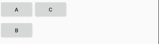
像这样的布局需要在代码中这样写:
	<Button
		android:id="@+id/btn_1"
		android:layout_width="wrap_content"
		android:layout_height="wrap_content"
		android:text="A"
		app:layout_constraintLeft_toLeftOf="parent"
		app:layout_constraintTop_toTopOf="parent" />

	<Button
		android:id="@+id/btn_2"
		android:layout_width="wrap_content"
		android:layout_height="wrap_content"
		android:text="B"
		app:layout_constraintLeft_toLeftOf="parent"
		app:layout_constraintTop_toBottomOf="@+id/btn_1" />

	<Button
		android:id="@+id/btn_3"
		android:layout_width="wrap_content"
		android:layout_height="wrap_content"
		android:text="C"
		app:layout_constraintLeft_toRightOf="@+id/btn_1"
		app:layout_constraintTop_toTopOf="parent" />
可见位置的控制主要是app:layout_constraintTop_toBottomOf="@+id/btn_1"属性实现的,比如这句属性表示:该View的顶部对齐至目标View的底部。
该系列属性大概有12个,分别控制View的top,bottom,left,right,start,end

app:layout_constraintTop_toTopOf=“@+id/xxx”
app:layout_constraintTop_toBottomOf=“@+id/xxx”
app:layout_constraintBottom_toBottomOf=“@+id/xxx”
app:layout_constraintBottom_toTopOf=“@+id/xxx”
app:layout_constraintLeft_toLeftOf=“@+id/xxx”
app:layout_constraintLeft_toRightOf=“@+id/xxx”
app:layout_constraintStart_toStartOf=“@+id/xxx”
app:layout_constraintStart_toEndOf=“@+id/xxx”
app:layout_constraintRight_toRightOf=“@+id/xxx”
app:layout_constraintRight_toLeftOf=“@+id/xxx”
app:layout_constraintEnd_toEndOf=“@+id/xxx”
app:layout_constraintEnd_toStartOf=“@+id/xxx”
其中parent代表父控件,比如让View居中可以这样写:
    app:layout_constraintTop_toTopOf="parent"
    app:layout_constraintLeft_toLeftOf="parent"
    app:layout_constraintRight_toRightOf="parent"
    app:layout_constraintBottom_toBottomOf="parent"
2.强制约束
如果要实现一个这样的布局:

使用ConstraintLayout实现起来代码是这样的:
    <Button
		......
	    android:id="@+id/btn_a"
	    app:layout_constraintStart_toStartOf="parent"
	    app:layout_constraintTop_toTopOf="parent" />

    <Button
	    android:id="@+id/btn_b"
	    ......
	    app:layout_constraintEnd_toEndOf="parent"
	    app:layout_constraintStart_toEndOf="@+id/btn_a"
	    app:layout_constraintTop_toBottomOf="@+id/btn_a" />
本来可以开心的摸鱼了,但有一天A控件的长度变的突然很长,于是出现了下面这样的情况


B控件并没有绝对在A的右边,而且都超出屏幕了,这样下去肯定不行,于是就要用到强制约束来拯救:
app:layout_constrainedWidth=“true”
这时只要将上句代码加入到B控件的xml配置中即可解决,效果:

纵向的纬度对应:
app:layout_constrainedHeight=“true”
3.基线对齐
如果子View是TextView还可以使用基线对齐:
layout_constraintBaseline_toBaselineOf=“@+id/xxx”
来写个例子看下对齐效果:

如果TextView的和大小高度可能不同:


可以看到如果是多行的文字,这个属性只以文字第一行为基线进行对齐。
使用这个属性还是需要注意一下的。
4.圆心定位
圆心定位用一张盗来的图就可以表达的很清楚:


由图可见,圆心定位至少有三个属性来确定约束关系
- app:layout_constraintCircle=“@+id/btn_aa” 被约束控件Id
- app:layout_constraintCircleAngle=“0” 圆心偏移角度,竖直正方向方向为0度。
- app:layout_constraintCircleRadius=“68dp” 圆半径。
由这三个属性就可以共同使用来进行圆心的约束啦。
下面写个例子来试试:
	<--首选确定一个圆心View-->
	<Button
    	android:id="@+id/btn_aa"
        android:layout_width="wrap_content"
        android:layout_height="wrap_content"
        android:layout_marginStart="8dp"
        android:layout_marginTop="88dp"
        android:layout_marginEnd="8dp"
        android:text="圆心"
        app:layout_constraintEnd_toEndOf="parent"
        app:layout_constraintStart_toStartOf="parent"
        app:layout_constraintTop_toTopOf="parent"
		app:layout_constraintBottom_toBottomOf="parent />

	<--约束在圆心0度位置,也就是正上方-->
 	<View
        android:id="@+id/btn_bb"
        android:layout_width="30dp"
        android:layout_height="30dp"
        android:background="@color/colorPrimary"
        app:layout_constraintCircle="@+id/btn_aa"
        app:layout_constraintCircleAngle="0"
        app:layout_constraintCircleRadius="68dp" />

	<--约束在圆心45度位置,也就是右上方-->
    <View
        android:id="@+id/btn_cc"
        android:layout_width="30dp"
        android:layout_height="30dp"
        android:background="@color/colorPrimary"
        app:layout_constraintCircle="@+id/btn_aa"
        app:layout_constraintCircleAngle="45"
        app:layout_constraintCircleRadius="68dp" />
来看下效果:

我又在以上代码上多添加了几个约束,实现了一个钟表效果,其中绿色方块中写的是约束角度。
5.百分比约束
百分比约束的属性有垂直百分比和水平百分比,分别是:
app:layout_constraintHorizontal_bias=“0.3”
app:layout_constraintVertical_bias=“0.3”
水平的百分比约束属性意思是在确定了View的左侧约束点和右侧约束点之后,此时这个View相对于左右约束点的位置时居中的,也就是app:layout_constraintHorizontal_bias=“0.5”,如图:

我将View设置为相对于父布局的水平居中位置,也就是
app:layout_constraintEnd_toEndOf="parent"
app:layout_constraintStart_toStartOf="parent"
此时切换到Design视图,点击该View,然后再右侧可以看到

这样的显示,其中红色箭头所标识的50就代表默认的百分比约束位置。此时可以直接拖动这个浮标来修改水平百分比约束,也可以在代码中添加**app:layout_constraintHorizontal_bias=“0.3”**属性来修改(直接拖动浮标会生成这句代码)。
这就是水平百分比约束的作用,同理,竖直方向上的百分比约束也一样。
写个例子试试:
	<Button
		android:layout_width="wrap_content"
		android:layout_height="wrap_content"
		android:text="youlookwhat"
		app:layout_constraintBottom_toBottomOf="parent"
		app:layout_constraintEnd_toEndOf="parent"
		app:layout_constraintHorizontal_bias="0.2"
		app:layout_constraintStart_toStartOf="parent"
		app:layout_constraintTop_toTopOf="parent"
		app:layout_constraintVertical_bias="0.25" />
此按钮在相对于父布局水平方向20%,相对于父布局竖直方向25%的位置。

6.Chains(链)
一组控件通过双向约束关联起来就形成了链。如图:

链的两端一定是约束于parent的,链的风格由一条链的第一个控件决定:
app:layout_constraintHorizontal_chainStyle=“spread”
layout_constraintHorizontal_chainStyle有三个枚举值:
- spread:均匀分配链所在纬度的所有空间 (默认)
- spread_inside:将第一个元素和最后一个元素放置在边缘上,并均匀分布其余元素
- packed:将链中元素居中在链条的中心
一张图来说明:

- 注意:一条链的属性是由这条链的头结点控制的。
同时链还支持权重,如果将width设置为0dp,并且增加layout_constraintHorizontal_weight属性来设置权重,就可以创建出一条横向的权重链了。
app:layout_constraintHorizontal_weight=“2” :水平方向上控件所占权重
app:layout_constraintVertical_weight=“1” :竖直方向上控件所占权重
举个例子,来创建一个水平方向权重为1,2,1的链:
    <Button
        android:id="@+id/btn_1"
        android:layout_width="0dp"
        android:layout_height="wrap_content"
        android:text="窝窝头"
        app:layout_constraintHorizontal_chainStyle="spread"
        app:layout_constraintHorizontal_weight="1"
        app:layout_constraintLeft_toLeftOf="parent"
        app:layout_constraintRight_toLeftOf="@+id/btn_2"
        app:layout_constraintTop_toTopOf="parent" />

    <Button
        android:id="@+id/btn_2"
        android:layout_width="0dp"
        android:layout_height="wrap_content"
        android:text="一块钱四个"
        app:layout_constraintHorizontal_weight="2"
        app:layout_constraintLeft_toRightOf="@+id/btn_1"
        app:layout_constraintRight_toLeftOf="@+id/btn_3"
        app:layout_constraintTop_toTopOf="parent" />

    <Button
        android:id="@+id/btn_3"
        android:layout_width="0dp"
        android:layout_height="wrap_content"
        android:text="嘿嘿"
        app:layout_constraintHorizontal_weight="1"
        app:layout_constraintLeft_toRightOf="@+id/btn_2"
        app:layout_constraintRight_toRightOf="parent"
        app:layout_constraintTop_toTopOf="parent" />
效果:

7.指定控件宽高百分比大小
ConstantLayout还可以指定子View的百分比尺寸(太强大了吧)。
一起来见证一下这个属性:
app:layout_constraintHeight_percent=“0.5” :高相对于父布局的百分比,取值0~1
app:layout_constraintWidth_percent=“0.5” :宽相对于父布局的百分比
举个例子,将下面的ImageView宽度设为父布局的一半,高度也是父布局的一半:
    <ImageView
	    android:id="@+id/iv_111"
	    android:layout_width="0dp"
	    android:layout_height="0dp"
	    android:scaleType="fitXY"
	    android:src="@mipmap/hentai"
	    app:layout_constraintBottom_toBottomOf="parent"
	    app:layout_constraintHeight_percent="0.5"
	    app:layout_constraintLeft_toLeftOf="parent"
	    app:layout_constraintRight_toRightOf="parent"
	    app:layout_constraintTop_toTopOf="parent"
	    app:layout_constraintWidth_percent="0.5" />
效果:

- 注意:当宽/高设为父布局的百分比后,宽/高也要指定为0dp,否则不会生效。
8.goneMargin(隐藏边距)
当View所依赖的View状态为gone时,goneMarginXXX系列属性设置的间距就开始生效。
layout_goneMarginStart
layout_goneMarginEnd
layout_goneMarginLeft
layout_goneMarginTop
layout_goneMarginRight
layout_goneMarginBottom
比如下面两个View,其中B的位置在A的右侧,并且B距离A有16dp的间距,那就要为B设置属性:layout_marginStart="16dp" 。(因为A不依赖于B,所以为A设置marginEnd不会生效)

问题来了,如果A隐藏了,那么B的间距依然存在:

一半这种情况并不符合预期,解决方式也很简单,为B再设置一个属性:app:layout_goneMarginStart="0dp",效果:

这就是 goneMarginXXX 系列属性的作用,如果一个View所依赖的View隐藏了,就会优先使用goneMargin设置的间距值。
9.指定宽高比
ConstantsLayout还有一个非常有趣的属性:
app:layout_constraintDimensionRatio=“w,16:9”
可以通过该属性来指定子控件的期望宽高比。
举个例子来看,将一个图片宽高比设置为16:9,xml布局:
    <ImageView
    	android:id="@+id/iv_111"
    	android:layout_width="0dp"
    	android:layout_height="wrap_content"
    	android:scaleType="fitXY"
    	android:src="@mipmap/hentai"
    	app:layout_constraintBottom_toBottomOf="parent"
    	app:layout_constraintDimensionRatio="w,16:9"
    	app:layout_constraintLeft_toLeftOf="parent"
    	app:layout_constraintRight_toRightOf="parent"
    	app:layout_constraintTop_toTopOf="parent" />
来看下效果,左图是图片原始效果,右图是指定宽高后的亚子


说明一下,layout_constraintDimensionRatio比例前缀默认为h,思是宽高比例,例如h,3:2意思为宽3:高2,而指定了属性w,3:2,意思就成了高宽比,即高3:宽2。
再说明一下,经过我的测试发现若要成功实现期望宽高比,宽或高一方要有固定的值或wrap_content,另一个属性则要设为0dp,否则该属性不会生效。
辅助类
Group群组
ConstrantLayout提供了Group来标记多个控件的群组,群组可以指定多个控件,并通过控制Group来实现对这多个控件的操作。
Group群组是一个独立的View控件,但不会真正显示在屏幕上,该View最常用的属性是constraint_referenced_ids,用来指定群组中包含的id。
app:constraint_referenced_ids=“btn_a_1,btn_a_2,btn_a_3” :指定群组包含的控件id。
    <androidx.constraintlayout.widget.Group
    	android:id="@+id/group_a"
    	android:layout_width="wrap_content"
    	android:layout_height="wrap_content"
    	app:constraint_referenced_ids="btn_a_1,btn_a_2,btn_a_3" />
举个例子,点击让一个Group群组的控件来显示隐藏:
java代码:
    public void showHide(View view) {
    	groupA.setVisibility((groupA.getVisibility() == View.GONE) ? View.VISIBLE : View.GONE);
    }
xml代码:
    <Button
    	android:id="@+id/btn_a_1"
    	android:layout_width="wrap_content"
    	android:layout_height="wrap_content"
    	android:text="A1"
    	app:layout_constraintLeft_toLeftOf="parent"
    	app:layout_constraintTop_toTopOf="parent" />

    <Button
    	android:id="@+id/btn_a_2"
    	android:layout_width="wrap_content"
    	android:layout_height="wrap_content"
    	android:text="A2"
    	app:layout_constraintLeft_toLeftOf="parent"
    	app:layout_constraintTop_toBottomOf="@+id/btn_a_1" />

    <Button
    	android:id="@+id/btn_a_3"
    	android:layout_width="wrap_content"
    	android:layout_height="wrap_content"
    	android:text="A3"
    	app:layout_constraintLeft_toLeftOf="parent"
    	app:layout_constraintTop_toBottomOf="@+id/btn_a_2" />

    <androidx.constraintlayout.widget.Group
    	android:id="@+id/group_a"
    	android:layout_width="wrap_content"
    	android:layout_height="wrap_content"
    	app:constraint_referenced_ids="btn_a_1,btn_a_2,btn_a_3" />

    <Button
    	android:id="@+id/btn_sh"
    	android:layout_width="wrap_content"
    	android:layout_height="wrap_content"
    	android:onClick="showHide"
    	android:text="显/隐"
    	app:layout_constraintLeft_toLeftOf="parent"
    	app:layout_constraintRight_toRightOf="parent"
    	app:layout_constraintTop_toTopOf="parent" />
看下效果:

Guideline
辅助线Guideline会在预览的时候帮助你完成布局,运行时并不会显示在界面上。
Guideline最常用的两个属性是:
android:orientation=“horizontal” :辅助线方向,有两个枚举值:horizontal和vertical,顾名思义,代表水平和竖直方向。
app:layout_constraintGuide_percent=“0.5” :辅助线相对父布局百分比位置。
Guideline的使用很简单,下面举个例子,来个拍照时常用的黄金分隔辅助线:
    <androidx.constraintlayout.widget.Guideline
    	android:layout_width="wrap_content"
    	android:layout_height="wrap_content"
    	android:orientation="horizontal"
    	app:layout_constraintGuide_percent="0.33" />

    <androidx.constraintlayout.widget.Guideline
    	android:layout_width="wrap_content"
    	android:layout_height="wrap_content"
    	android:orientation="horizontal"
    	app:layout_constraintGuide_percent="0.66" />

    <androidx.constraintlayout.widget.Guideline
    	android:layout_width="wrap_content"
    	android:layout_height="wrap_content"
    	android:orientation="vertical"
    	app:layout_constraintGuide_percent="0.33" />

    <androidx.constraintlayout.widget.Guideline
    	android:layout_width="wrap_content"
    	android:layout_height="wrap_content"
    	android:orientation="vertical"
    	app:layout_constraintGuide_percent="0.66" />
效果:

Barrier屏障
顾名思义就是对需要约束的View控件间施加一个水平或竖直的屏障,来实现一对多或多对多的约束关系。
文字太抽象,还是偷张图来理解:

如图,这也是经常碰到的需求,一个View要同时再几个View的右侧,并且这几个View的长度还是可变的,这时无论依赖哪个单独View都不满足需求。这时候就需要Barrier屏障来满足需求了。
Barrier是一个单独的View,它不会显示在界面上,可以放心大胆的用。
Barrier的属性有:
app:constraint_referenced_ids=“btn_1,btn_2” :列出屏障所包含的View的id,对应于图中左侧的三个View。
app:barrierDirection=“right” :Barrier所在View组的位置,有right,left,top和bottom枚举值可选。
app:barrierMargin=“10dp” :Barrier屏障与控件间间距。
app:barrierAllowsGoneWidgets=“true” :如果Barrier屏障所包含View被设置为Gone,是否影响Barrier位置。如果你不想让Barrier考虑GONE的view,可以通过将属性barrierAllowsGoneWidgets设置 为false(默认为true)来更改此设置。
知道了这四个属性,就可以得心应手的使用Barrier了,举个例子:
	<Button
        android:id="@+id/btn_1"
        android:layout_width="wrap_content"
        android:layout_height="wrap_content"
        android:onClick="grow"
        android:text="窝窝头"
        app:layout_constraintBottom_toBottomOf="parent"
        app:layout_constraintHorizontal_bias="0.2"
        app:layout_constraintLeft_toLeftOf="parent"
        app:layout_constraintTop_toTopOf="parent"
        app:layout_constraintVertical_bias="0.35" />

    <Button
        android:id="@+id/btn_2"
        android:layout_width="wrap_content"
        android:layout_height="wrap_content"
        android:onClick="grow"
        android:text="一块钱四个"
        app:layout_constraintBottom_toBottomOf="parent"
        app:layout_constraintHorizontal_bias="0.2"
        app:layout_constraintLeft_toLeftOf="parent"
        app:layout_constraintTop_toTopOf="parent"
        app:layout_constraintVertical_bias="0.65" />

    <androidx.constraintlayout.widget.Barrier
        android:id="@+id/barrier_1"
        android:layout_width="wrap_content"
        android:layout_height="wrap_content"
        app:barrierAllowsGoneWidgets="true"
        app:barrierDirection="right"
        app:barrierMargin="10dp"
        app:constraint_referenced_ids="btn_1,btn_2" />

    <Button
        android:layout_width="wrap_content"
        android:layout_height="wrap_content"
        android:text="嘿嘿"
        app:layout_constraintBottom_toBottomOf="parent"
        app:layout_constraintLeft_toRightOf="@+id/barrier_1"
        app:layout_constraintTop_toTopOf="parent" />
点击事件:
	public void grow(View view) {
        String str = ((TextView) view).getText().toString();
        str += "~~~";
        ((TextView) view).setText(str);
    }
上面代码表示为窝窝头 和 一块钱四个 两个View创建右侧屏障Barrier_1,嘿嘿约束在Barrier_1屏障的右侧,被屏障包含的窝窝头和一块钱四个宽度发生变化时,约束还是关系不会改变。
效果图:

一不小心就把嘿嘿顶到了窗口外,因为嘿嘿只有错侧约束了Barrier屏障,并没有为右侧添加约束关系,所以才导致这个bug,同时也要注意本篇文章所讲的强制约束属性。
软件开发还是要细心,要有穷尽所有可能情况的习惯,避免低级bug。
参考
https://juejin.im/post/5bac92f2f265da0aba70c1bf#heading-1
https://juejin.im/post/5b013e6f51882542c760dc7b


 336
336

 被折叠的 条评论
为什么被折叠?
被折叠的 条评论
为什么被折叠?
 到【灌水乐园】发言


