


扯一扯:
平常在项目中我们想要对一个控件实现圆角等效果,一般都是在xml布局中新建一个shape文件,在里面进行一系列的操作,然后在对需要使用到的控件进行background操作,例如:
round_textview.xml:
<?xml version="1.0" encoding="utf-8"?>对需要使用到该shape文件的控件进行background操作
这是一个控件,可以这么操作,如果现在又有一个需求,需要另一个textview背景色为蓝色,圆角为5dp,但是我现在只有一个背景色为粉红色圆角为20dp的shape文件,那我还要再重新创建一个背景色为蓝色、圆角为5dp的shape,如果我还有五六个甚至更多的样式呢,他们可能只是背景色或者圆角或者边框等中的某一点不同,如果我们为他们都创建一个shape文件的话有点太麻烦,而且文件太多也不好管理,所以就有了RoundTextView这个控件。
自定义控件RoundTextView
自定义xml属性
在res下的values文件夹中创建文件atts.xml
我们希望可以在xml布局中直接指定填充颜色、圆角大小、边框宽度、边框颜色
<?xml version="1.0" encoding="utf-8"?>类RoundTextView
创建类RoundTextView继承AppCompatTextView
获取xml布局中设置的宽、高、填充色、边框、圆角等参数:
/** * 获取布局中xml定义的属性值 */ @SuppressLint("ResourceType") private void getTypeArr(AttributeSet attrs) { TypedArray myTypedArray = mContext.obtainStyledAttributes(attrs, R.styleable.RoundTextView); backColor = myTypedArray.getColor(R.styleable.RoundTextView_backColor, 0x00000000); radius = (int) myTypedArray.getDimension(R.styleable.RoundTextView_radius, 0f); boderWidth = (int) myTypedArray.getDimension(R.styleable.RoundTextView_border_width, 0f); borderColor = myTypedArray.getColor(R.styleable.RoundTextView_border_color, 0x00000000); myTypedArray.recycle(); TypedArray androidTypedArray = mContext.obtainStyledAttributes(attrs, new int[]{ android.R.attr.layout_width, android.R.attr.layout_height }); width = (int) androidTypedArray.getDimension(0, 0f); height = (int) androidTypedArray.getDimension(1, 0f); androidTypedArray.recycle(); }根据参数设置圆角等效果
/** * 设置圆角等 */ private void setShape() { GradientDrawable gradientDrawable = new GradientDrawable(); //设置矩形 gradientDrawable.setShape(GradientDrawable.RECTANGLE); //设置描边 gradientDrawable.setStroke(boderWidth, borderColor); //设置弧度 gradientDrawable.setCornerRadius(radius); //设置填充颜色 gradientDrawable.setColor(backColor); setBackground(gradientDrawable); }设置默认文字居中
/** * 初始化默认的全局属性 */ private void init() { //设置内部文字居中 setGravity(Gravity.CENTER); }为外界暴露方法,使控件可以通过java代码动态设置相关效果
/*** * 设置填充颜色 * @param backColor */ public void setBackColor(int backColor) { this.backColor = backColor; setShape(); } /** * 设置圆角 * * @param radius */ public void setRadius(int radius) { this.radius = radius; setShape(); } /** * 设置边框宽度 * * @param boderWidth */ public void setBoderWidth(int boderWidth) { this.boderWidth = boderWidth; setShape(); } /** * 设置边框颜色 * * @param borderColor */ public void setBorderColor(int borderColor) { this.borderColor = borderColor; setShape(); }完整代码
package com.dimanche.dmautils.widget;import android.annotation.SuppressLint;import android.content.Context;import android.content.res.TypedArray;import android.graphics.drawable.GradientDrawable;import android.util.AttributeSet;import android.view.Gravity;import androidx.appcompat.widget.AppCompatTextView;import com.dimanche.dmautils.R;public class RoundTextView extends AppCompatTextView { Context mContext; //背景颜色 int backColor; //控件高度 int height; //控件宽度 int width; //圆角大小 int radius; //边框宽度 int boderWidth; //边框颜色 int borderColor; public RoundTextView(Context context) { super(context); mContext = context; init(); setShape(); } public RoundTextView(Context context, AttributeSet attrs) { super(context, attrs); mContext = context; init(); getTypeArr(attrs); setShape(); } public RoundTextView(Context context, AttributeSet attrs, int defStyleAttr) { super(context, attrs, defStyleAttr); mContext = context; init(); getTypeArr(attrs); setShape(); } /*** * 设置填充颜色 * @param backColor */ public void setBackColor(int backColor) { this.backColor = backColor; setShape(); } /** * 设置圆角 * * @param radius */ public void setRadius(int radius) { this.radius = radius; setShape(); } /** * 设置边框宽度 * * @param boderWidth */ public void setBoderWidth(int boderWidth) { this.boderWidth = boderWidth; setShape(); } /** * 设置边框颜色 * * @param borderColor */ public void setBorderColor(int borderColor) { this.borderColor = borderColor; setShape(); } /** * 初始化默认的全局属性 */ private void init() { //设置内部文字居中 setGravity(Gravity.CENTER); } /** * 设置圆角等 */ private void setShape() { GradientDrawable gradientDrawable = new GradientDrawable(); //设置矩形 gradientDrawable.setShape(GradientDrawable.RECTANGLE); //设置描边 gradientDrawable.setStroke(boderWidth, borderColor); //设置弧度 gradientDrawable.setCornerRadius(radius); //设置填充颜色 gradientDrawable.setColor(backColor); setBackground(gradientDrawable); } /** * 获取布局中xml定义的属性值 */ @SuppressLint("ResourceType") private void getTypeArr(AttributeSet attrs) { TypedArray myTypedArray = mContext.obtainStyledAttributes(attrs, R.styleable.RoundTextView); backColor = myTypedArray.getColor(R.styleable.RoundTextView_backColor, 0x00000000); radius = (int) myTypedArray.getDimension(R.styleable.RoundTextView_radius, 0f); boderWidth = (int) myTypedArray.getDimension(R.styleable.RoundTextView_border_width, 0f); borderColor = myTypedArray.getColor(R.styleable.RoundTextView_border_color, 0x00000000); myTypedArray.recycle(); TypedArray androidTypedArray = mContext.obtainStyledAttributes(attrs, new int[]{ android.R.attr.layout_width, android.R.attr.layout_height }); width = (int) androidTypedArray.getDimension(0, 0f); height = (int) androidTypedArray.getDimension(1, 0f); androidTypedArray.recycle(); }}如何使用
在xml布局中
main_activity.xml
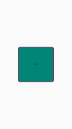
<?xml version="1.0" encoding="utf-8"?>效果:


 扫一扫
扫一扫


 433
433

 被折叠的 条评论
为什么被折叠?
被折叠的 条评论
为什么被折叠?
 到【灌水乐园】发言


