


 这篇博客介绍了如何使用HTML和CSS创建一个菜单按钮,该按钮在点击时会显示三条横线变为叉号,并弹出列表菜单。点击叉号或列表项可以关闭菜单。CSS代码包括了线条的动画效果和菜单的显示隐藏。
使用html+css实现三条横线的菜单按钮,点击弹出列表菜单,菜单按钮变叉,点击叉按钮或点击列表项收回菜单:

点击按钮:
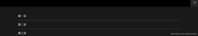
点击叉按钮或者菜单列表项都可以收回菜单。
css代码:
.inner-header{
background-color: rgba(0,0,0,1);
width: 100%;
height: 50px;
position: absolute;
top: 0px;
left: 0px;
}
.inner-header-icon{
color: #ffffff;
height: 50px;
font-size:25px;
text-align: center;
float:right;
width: 50px;
position: relative;
-webkit-transition: background 0.5s;
-moz-transition: background 0.5s;
-o-transition: background 0.5s;
transition: background 0.5s;
}
.inner-header-icon:hover{
background-color: rgba(255,255,255,0.2);
cursor: pointer;
}
.inner-header-icon span{
position: absolute;
left: calc((100% - 25px) / 2);
top: calc((100% - 1px) / 2);
width: 25px;
height: 1px;
background-color: rgba(255,255,255,1);
}
.inner-header-icon span:nth-child(1){
transform: translateY(4px) rotate(0deg);
}
.inner-header-icon span:nth-child(2){
opacity: 0;
}
.inner-header-icon span:nth-child(3){
transform: translateY(-4px) rotate(0deg);
}
.inner-header-icon-click span:nth-child(1){
animation-duration: 0.5s;
animation-fill-mode: both;
animation-name: clickfirst;
}
.inner-header-icon-click span:nth-child(2){
animation-duration: 0.5s;
animation-fill-mode: both;
animation-name: clicksecond;
}
.inner-header-icon-click span:nth-child(3){
animation-duration: 0.5s;
animation-fill-mode: both;
animation-name: clickthird;
}
/*第一条线旋转动画*/
@keyframes clickfirst {
0% {
transform: translateY(4px) rotate(0deg);
}
100% {
transform: translateY(0) rotate(45deg);
}
}
/*第二条线淡入淡出动画动画*/
@keyframes clicksecond {
0% {
opacity: 1;
}
100% {
opacity: 0;
}
}
/*第三条线旋转动画*/
@keyframes clickthird {
0% {
transform: translateY(-4px) rotate(0deg);
}
100% {
transform: translateY(0) rotate(-45deg);
}
}
.inner-header-icon-out span:nth-child(1){
animation-duration: 0.5s;
animation-fill-mode: both;
animation-name: outfirst;
}
.inner-header-icon-out span:nth-child(2){
animation-duration: 0.5s;
animation-fill-mode: both;
animation-name: outsecond;
}
.inner-header-icon-out span:nth-child(3){
animation-duration: 0.5s;
animation-fill-mode: both;
animation-name: outthird;
}
@keyframes outfirst {
0% {
transform: translateY(0) rotate(-45deg);
}
100% {
transform: translateY(-4px) rotate(0deg);
}
}
@keyframes outsecond {
0% {
opacity: 0;
}
100% {
opacity: 1;
}
}
@keyframes outthird {
0% {
transform: translateY(0) rotate(45deg);
}
100% {
transform: translateY(4px) rotate(0deg);
}
}
.inner-nav{
background-color: rgba(0,0,0,0.9);
width: 100%;
position: absolute;
top: 50px;
left: 0px;
padding-top: 30px;
padding-bottom: 80px;
display: none;
}
.inner-nav a{
display: inline-block;
line-height: 50px;
text-decoration: none;
width: 80%;
margin-left: 10%;
color: #FFFFFF;
border-bottom: solid 1px rgba(255,255,255,0.3);
-webkit-transition: all 0.5s;
-moz-transition: all 0.5s;
-o-transition: all 0.5s;
transition: all 0.5s;
font-weight:300;
}
.inner-nav a:hover{
color: rgba(255,255,255,0.4);
border-bottom: solid 1px rgba(255,255,255,0.2);
}
html代码:(使用代码时记得引入jquery-2.1.1.min.js文件)
html>
Title


 扫一扫
扫一扫


 1437
1437

 被折叠的 条评论
为什么被折叠?
被折叠的 条评论
为什么被折叠?
 到【灌水乐园】发言


