


现在社会就需要你这样:
数据视觉化
思想视觉表达
服务流程视觉化
事件现场视觉还原
...
简单的来讲,一切要以图说话。
既要简洁清晰,又要整齐好看,那真的是严重考验我们的技能了。
Python作为这一方面的强者,技术方面自然是不容置疑的。
比如,随手一个小人发射爱心

#2.14from turtle import *from time import sleep def go_to(x, y): up() goto(x, y) down() def head(x,y,r): go_to(x,y) speed(1) circle(r) leg(x,y) def leg(x,y): right(90) forward(180) right(30) forward(100) left(120) go_to(x,y-180) forward(100) right(120) forward(100) left(120) hand(x,y) def hand(x,y): go_to(x,y-60) forward(100) left(60) forward(100) go_to(x, y - 90) right(60) forward(100) right(60) forward(100) left(60) eye(x,y) def eye(x,y): go_to(x-50,y+130) right(90) forward(50) go_to(x+40,y+130) forward(50) left(90) def big_Circle(size): speed(20) for i in range(150): forward(size) right(0.3)def line(size): speed(1) forward(51*size) def small_Circle(size): speed(10) for i in range(210): forward(size) right(0.786) def heart(x, y, size): go_to(x, y) left(150) begin_fill() line(size) big_Circle(size) small_Circle(size) left(120) small_Circle(size) big_Circle(size) line(size) end_fill() def main(): pensize(2) color('red', 'pink') head(-120, 100, 100) heart(250, -80, 1) go_to(200, -300) write("To: 智慧与美貌并存的", move=True, align="left", font=("楷体", 20, "normal")) done() main()皮一下,就很开心?
“那么到底如何在 Python 中绘图?”
曾经这个问题有一个简单的答案:Matplotlib 是唯一的办法。
如今,Python 作为数据科学的语言,有着更多的选择。你应该用什么呢?
今天向你展示四个最流行的 Python 绘图库:Matplotlib、Seaborn、Plotly 和 Bokeh。
再加上两个值得考虑的优秀的后起之秀:Altair,拥有丰富的 API;Pygal,拥有漂亮的 SVG 输出。
我还会看看 Pandas 提供的非常方便的绘图 API。
示例绘图
每个库都采取了稍微不同的方法来绘制数据。
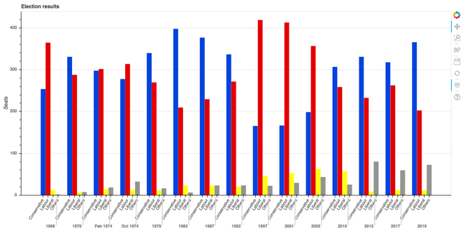
为了比较它们,我将用每个库绘制同样的图,并给你展示源代码。对于示例数据,我选择了这张 1966 年以来英国大选结果的分组柱状图。
Bar chart of British election data
Matplotlib
Matplotlib 是最古老的 Python 绘图库,现在仍然是最流行的。
它创建于 2003 年,是 SciPy Stack 的一部分,SciPy Stack 是一个类似于 Matlab 的开源科学计算库。
Matplotlib 为你提供了对绘制的精确控制。例如,你可以在你的条形图中定义每个条形图的单独的 X 位置。下面是绘制这个图表的代码(你可以在这里运行):
import matplotlib.pyplot as pltimport numpy as npfrom votes import wide asdf#Initialise a figure. subplots() withno args gives one plot. fig, ax = plt.subplots()# A little data preparation years = df['year'] x = np.arange(len(years))#Plot each bar plot. Note: manually calculating the 'dodges' of the bars ax.bar(x - 3*width/2, df['conservative'], width, label='Conservative', color='#0343df') ax.bar(x - width/2, df['labour'], width, label='Labour', color='#e50000') ax.bar(x + width/2, df['liberal'], width, label='Liberal', color='#ffff14') ax.bar(x + 3*width/2, df['others'], width, label='Others', color='#929591')#Customise some display properties ax.set_ylabel('Seats') ax.set_title('UK election results') ax.set_xticks(x) #This ensures we have one tick per year, otherwise we get fewer ax.set_xticklabels(years.astype(str).values, rotation='vertical') ax.legend()#AskMatplotlib to show the plot plt.show()这是用 Matplotlib 绘制的选举结果:
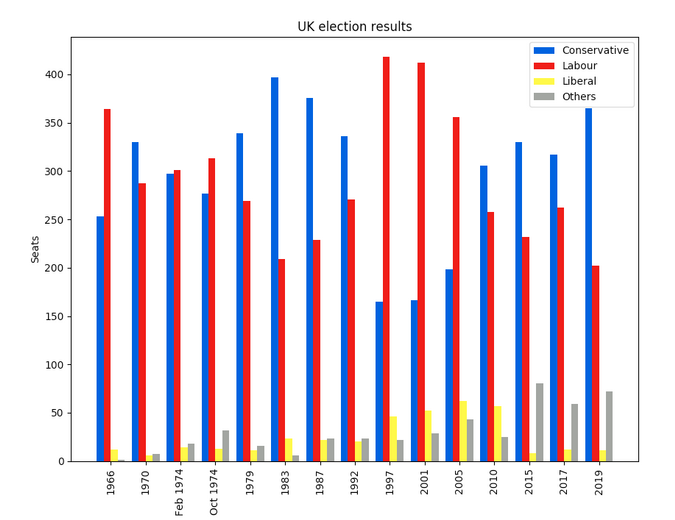
Matplotlib plot of British election data
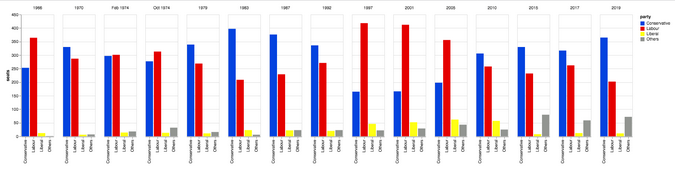
Seaborn
Seaborn 是 Matplotlib 之上的一个抽象层;它提供了一个非常整洁的界面,让你可以非常容易地制作出各种类型的有用绘图。
不过,它并没有在能力上有所妥协!Seaborn 提供了访问底层 Matplotlib 对象的逃生舱口,所以你仍然可以进行完全控制。
Seaborn 的代码比原始的 Matplotlib 更简单(可在此处运行):
import seaborn as snsfrom votes importlongasdf#Some boilerplate to initialise things sns.set() plt.figure()#Thisiswhere the actual plot gets made ax = sns.barplot(data=df, x="year", y="seats", hue="party", palette=['blue', 'red', 'yellow', 'grey'], saturation=0.6)#Customise some display properties ax.set_title('UK election results') ax.grid(color='#cccccc') ax.set_ylabel('Seats') ax.set_xlabel(None) ax.set_xticklabels(df["year"].unique().astype(str), rotation='vertical')#AskMatplotlib to show it plt.show()并生成这样的图表:
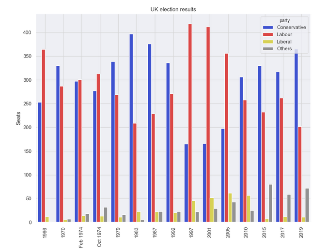
Seaborn plot of British election data
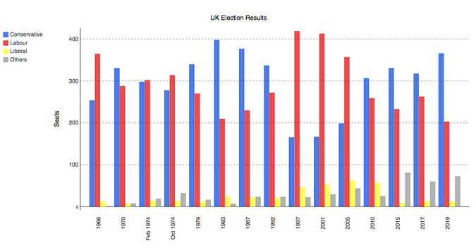
Plotly
Plotly 是一个绘图生态系统,它包括一个 Python 绘图库。它有三个不同的接口:
1. 一个面向对象的接口。 2. 一个命令式接口,允许你使用类似 JSON 的数据结构来指定你的绘图。 3. 类似于 Seaborn 的高级接口,称为 Plotly Express。Plotly 绘图被设计成嵌入到 Web 应用程序中。Plotly 的核心其实是一个 JavaScript 库!它使用 D3 和 stack.gl 来绘制图表。
你可以通过向该 JavaScript 库传递 JSON 来构建其他语言的 Plotly 库。官方的 Python 和 R 库就是这样做的。在 Anvil,我们将 Python Plotly API 移植到了 Web 浏览器中运行。
这是使用 Plotly 的源代码(你可以在这里运行):
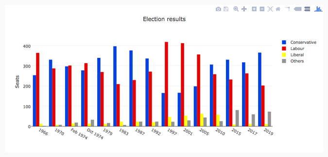
import plotly.graph_objects as gofrom votes import wide asdf#Get a convenient list of x-values years = df['year'] x = list(range(len(years)))#Specify the plots bar_plots = [ go.Bar(x=x, y=df['conservative'], name='Conservative', marker=go.bar.Marker(color='#0343df')), go.Bar(x=x, y=df['labour'], name='Labour', marker=go.bar.Marker(color='#e50000')), go.Bar(x=x, y=df['liberal'], name='Liberal', marker=go.bar.Marker(color='#ffff14')), go.Bar(x=x, y=df['others'], name='Others', marker=go.bar.Marker(color='#929591')),]#Customise some display properties layout = go.Layout( title=go.layout.Title(text="Election results", x=0.5), yaxis_title="Seats", xaxis_tickmode="array", xaxis_tickvals=list(range(27)), xaxis_ticktext=tuple(df['year'].values),)#Make the multi-bar plot fig = go.Figure(data=bar_plots, layout=layout)#TellPlotly to render it fig.show()选举结果图表:
Plotly plot of British election data
Bokeh
Bokeh(发音为 “BOE-kay”)擅长构建交互式绘图,所以这个标准的例子并没有将其展现其最好的一面。和 Plotly 一样,Bokeh 的绘图也是为了嵌入到 Web 应用中,它以 HTML 文件的形式输出绘图。
下面是使用 Bokeh 的代码(你可以在这里运行):
from bokeh.io import show, output_filefrom bokeh.models importColumnDataSource, FactorRange, HoverToolfrom bokeh.plotting import figurefrom bokeh.transform import factor_cmapfrom votes importlongasdf#Specify a file to write the plot to output_file("elections.html")#Tuples of groups(year, party) x = [(str(r[1]['year']), r[1]['party']) for r indf.iterrows()] y = df['seats']#Bokeh wraps your data in its own objects to support interactivity source = ColumnDataSource(data=dict(x=x, y=y))#Create a colourmap cmap = {'Conservative': '#0343df','Labour': '#e50000','Liberal': '#ffff14','Others': '#929591',} fill_color = factor_cmap('x', palette=list(cmap.values()), factors=list(cmap.keys()), start=1, end=2)#Make the plot p = figure(x_range=FactorRange(*x), width=1200, title="Election results") p.vbar(x='x', top='y', width=0.9, source=source, fill_color=fill_color, line_color=fill_color)#Customise some display properties p.y_range.start = 0 p.x_range.range_padding = 0.1 p.yaxis.axis_label = 'Seats' p.xaxis.major_label_orientation = 1 p.xgrid.grid_line_color = None图表如下:
Bokeh plot of British election data
Altair
Altair 是基于一种名为 Vega 的声明式绘图语言(或“可视化语法”)。这意味着它具有经过深思熟虑的 API,可以很好地扩展复杂的绘图,使你不至于在嵌套循环的地狱中迷失方向。
与 Bokeh 一样,Altair 将其图形输出为 HTML 文件。这是代码(你可以在这里运行):
import altair as altfrom votes importlongasdf#Set up the colourmap cmap = {'Conservative': '#0343df','Labour': '#e50000','Liberal': '#ffff14','Others': '#929591',}#Cast years to stringsdf['year'] = df['year'].astype(str)#Here's where we make the plot chart = alt.Chart(df).mark_bar().encode( x=alt.X('party', title=None), y='seats', column=alt.Column('year', sort=list(df['year']), title=None), color=alt.Color('party', scale=alt.Scale(domain=list(cmap.keys()), range=list(cmap.values()))) ) # Save it as an HTML file. chart.save('altair-elections.html')结果图表:
Altair plot of British election data
Pygal
Pygal 专注于视觉外观。它默认生成 SVG 图,所以你可以无限放大它们或打印出来,而不会被像素化。Pygal 绘图还内置了一些很好的交互性功能,如果你想在 Web 应用中嵌入绘图,Pygal 是另一个被低估了的候选者。
代码是这样的(你可以在这里运行它):
import pygalfrom pygal.style importStylefrom votes import wide asdf#Define the style custom_style = Style( colors=('#0343df', '#e50000', '#ffff14', '#929591') font_family='Roboto,Helvetica,Arial,sans-serif', background='transparent', label_font_size=14,)#Set up the bar plot, ready for data c = pygal.Bar( title="UK Election Results", style=custom_style, y_title='Seats', width=1200, x_label_rotation=270,)#Add four data sets to the bar plot c.add('Conservative', df['conservative']) c.add('Labour', df['labour']) c.add('Liberal', df['liberal']) c.add('Others', df['others'])#Define the X-labels c.x_labels = df['year']#Writethis to an SVG file c.render_to_file('pygal.svg')绘制结果:
Pygal plot of British election data
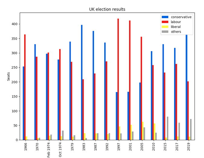
Pandas
Pandas 是 Python 的一个极其流行的数据科学库。它允许你做各种可扩展的数据处理,但它也有一个方便的绘图 API。因为它直接在数据帧上操作,所以 Pandas 的例子是本文中最简洁的代码片段,甚至比 Seaborn 的代码还要短!
Pandas API 是 Matplotlib 的一个封装器,所以你也可以使用底层的 Matplotlib API 来对你的绘图进行精细的控制。
这是 Pandas 中的选举结果图表。代码精美简洁!
from matplotlib.colors importListedColormapfrom votes import wide asdf cmap = ListedColormap(['#0343df', '#e50000', '#ffff14', '#929591']) ax = df.plot.bar(x='year', colormap=cmap) ax.set_xlabel(None) ax.set_ylabel('Seats') ax.set_title('UK election results') plt.show()绘图结果:
Python 提供了许多绘制数据的方法,无需太多的代码。
虽然你可以通过这些方法快速开始创建你的绘图,但它们确实需要一些本地配置。
下面分享几个实例操作:
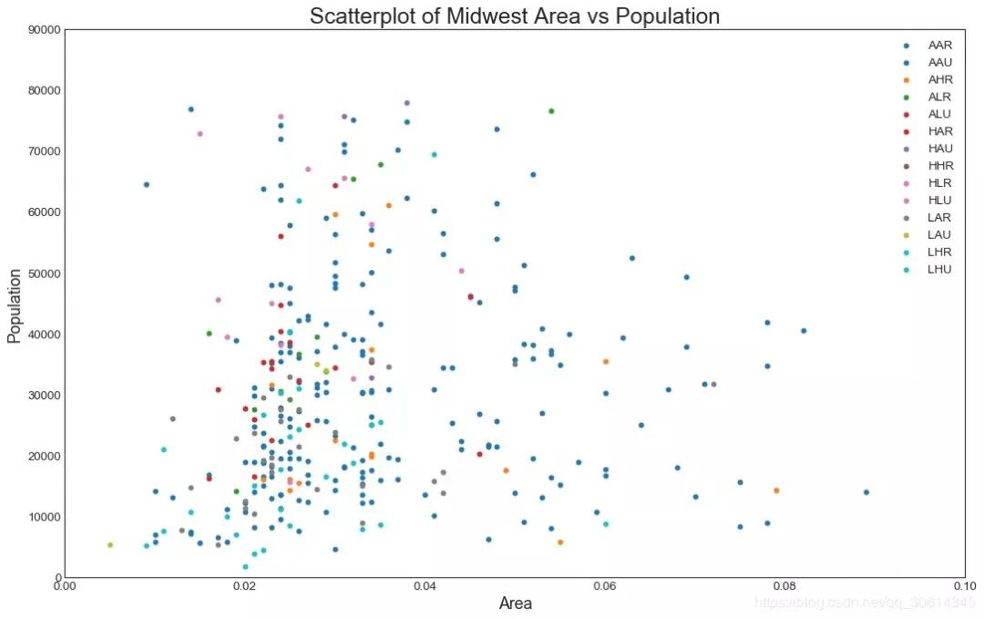
1. 散点图Scatteplot是用于研究两个变量之间关系的经典和基本图。如果数据中有多个组,则可能需要以不同颜色可视化每个组。在Matplotlib,你可以方便地使用。
# Import dataset
midwest = pd.read_csv("https://raw.githubusercontent.com/selva86/datasets/master/midwest_filter.csv")

# Prepare Data
# Create as many colors as there are unique midwest['category']
categories = np.unique(midwest['category'])
colors = [plt.cm.tab10(i/float(len(categories)-1)) for i in range(len(categories))]

# Draw Plot for Each Category
plt.figure(figsize=(16, 10), dpi= 80, facecolor='w', edgecolor='k')

for i, category in enumerate(categories):
    plt.scatter('area', 'poptotal',
                data=midwest.loc[midwest.category==category, :],
                s=20, c=colors[i], label=str(category))

# Decorations
plt.gca().set(xlim=(0.0, 0.1), ylim=(0, 90000),
              xlabel='Area', ylabel='Population')

plt.xticks(fontsize=12); plt.yticks(fontsize=12)
plt.title("Scatterplot of Midwest Area vs Population", fontsize=22)
plt.legend(fontsize=12)
plt.show()
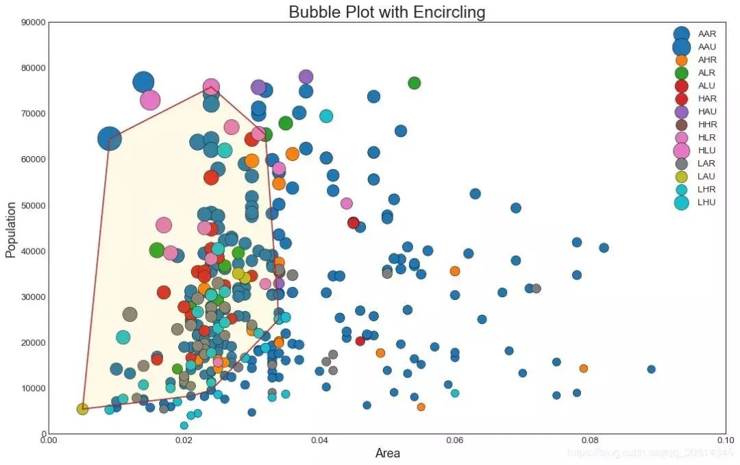
2. 带边界的气泡图有时,您希望在边界内显示一组点以强调其重要性。在此示例中,您将从应该被环绕的数据帧中获取记录,并将其传递给下面的代码中描述的记录。encircle()
from matplotlib import patches
from scipy.spatial import ConvexHull
import warnings; warnings.simplefilter('ignore')
sns.set_style("white")

# Step 1: Prepare Data
midwest = pd.read_csv("https://raw.githubusercontent.com/selva86/datasets/master/midwest_filter.csv")

# As many colors as there are unique midwest['category']
categories = np.unique(midwest['category'])
colors = [plt.cm.tab10(i/float(len(categories)-1)) for i in range(len(categories))]

# Step 2: Draw Scatterplot with unique color for each category
fig = plt.figure(figsize=(16, 10), dpi= 80, facecolor='w', edgecolor='k')

for i, category in enumerate(categories):
    plt.scatter('area', 'poptotal', data=midwest.loc[midwest.category==category, :], s='dot_size', c=colors[i], label=str(category), edgecolors='black', linewidths=.5)

# Step 3: Encircling
# https://stackoverflow.com/questions/44575681/how-do-i-encircle-different-data-sets-in-scatter-plot
def encircle(x,y, ax=None, **kw):
if not ax: ax=plt.gca()
    p = np.c_[x,y]
    hull = ConvexHull(p)
    poly = plt.Polygon(p[hull.vertices,:], **kw)
    ax.add_patch(poly)

# Select data to be encircled
midwest_encircle_data = midwest.loc[midwest.state=='IN', :]

# Draw polygon surrounding vertices
encircle(midwest_encircle_data.area, midwest_encircle_data.poptotal, ec="k", fc="gold", alpha=0.1)
encircle(midwest_encircle_data.area, midwest_encircle_data.poptotal, ec="firebrick", fc="none", linewidth=1.5)

# Step 4: Decorations
plt.gca().set(xlim=(0.0, 0.1), ylim=(0, 90000),
              xlabel='Area', ylabel='Population')

plt.xticks(fontsize=12); plt.yticks(fontsize=12)
plt.title("Bubble Plot with Encircling", fontsize=22)
plt.legend(fontsize=12)
plt.show()
3. 带线性回归最佳拟合线的散点图如果你想了解两个变量如何相互改变,那么最合适的线就是要走的路。下图显示了数据中各组之间最佳拟合线的差异。要禁用分组并仅为整个数据集绘制一条最佳拟合线,请从下面的调用中删除该参数。
# Import Data
df = pd.read_csv("https://raw.githubusercontent.com/selva86/datasets/master/mpg_ggplot2.csv")
df_select = df.loc[df.cyl.isin([4,8]), :]

# Plot
sns.set_style("white")
gridobj = sns.lmplot(x="displ", y="hwy", hue="cyl", data=df_select,
                     height=7, aspect=1.6, robust=True, palette='tab10',
                     scatter_kws=dict(s=60, linewidths=.7, edgecolors='black'))

# Decorations
gridobj.set(xlim=(0.5, 7.5), ylim=(0, 50))
plt.title("Scatterplot with line of best fit grouped by number of cylinders", fontsize=20)
每个回归线都在自己的列中。
或者,您可以在其自己的列中显示每个组的最佳拟合线。你可以通过在里面设置参数来实现这一点。
# Import Data
df = pd.read_csv("https://raw.githubusercontent.com/selva86/datasets/master/mpg_ggplot2.csv")
df_select = df.loc[df.cyl.isin([4,8]), :]

# Each line in its own column
sns.set_style("white")
gridobj = sns.lmplot(x="displ", y="hwy",
                     data=df_select,
                     height=7,
                     robust=True,
                     palette='Set1',
                     col="cyl",
                     scatter_kws=dict(s=60, linewidths=.7, edgecolors='black'))

# Decorations
gridobj.set(xlim=(0.5, 7.5), ylim=(0, 50))
plt.show()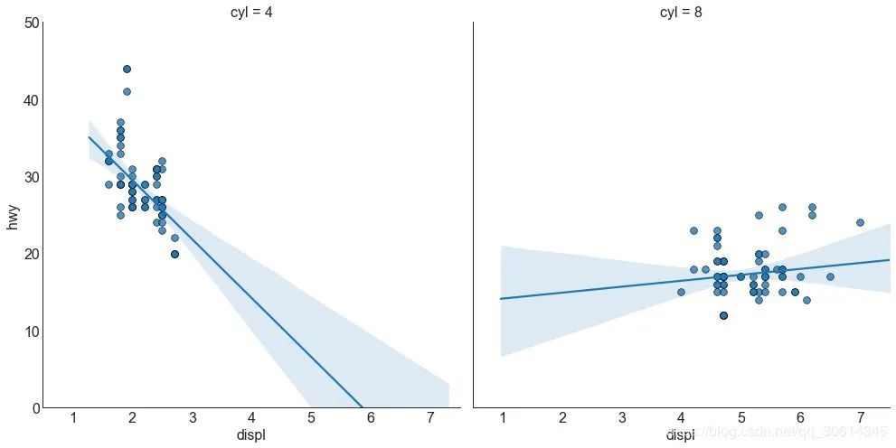
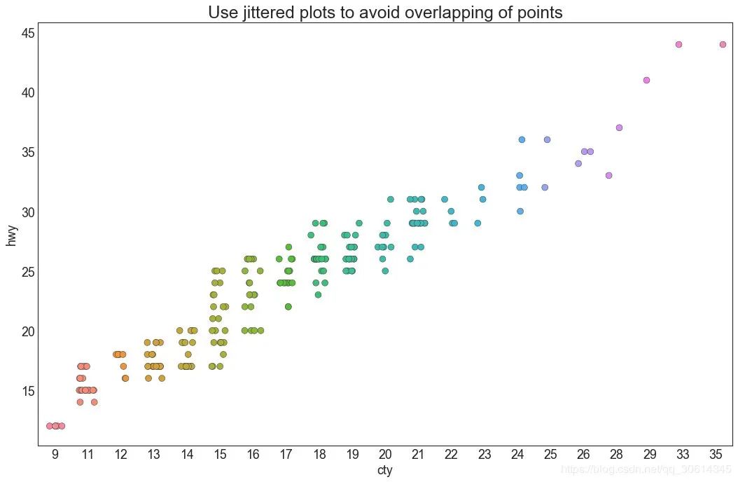
4. 抖动图通常,多个数据点具有完全相同的X和Y值。结果,多个点相互绘制并隐藏。为避免这种情况,请稍微抖动点,以便您可以直观地看到它们。这很方便使用
# Import Data
df = pd.read_csv("https://raw.githubusercontent.com/selva86/datasets/master/mpg_ggplot2.csv")

# Draw Stripplot
fig, ax = plt.subplots(figsize=(16,10), dpi= 80)
sns.stripplot(df.cty, df.hwy, jitter=0.25, size=8, ax=ax, linewidth=.5)

# Decorations
plt.title('Use jittered plots to avoid overlapping of points', fontsize=22)
plt.show()
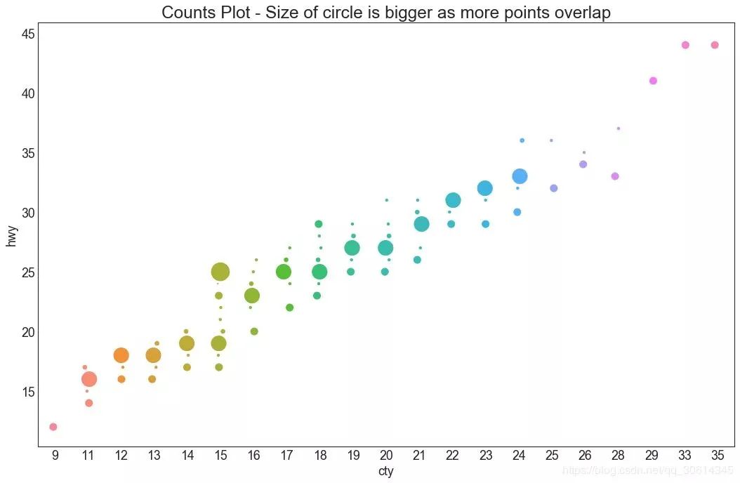
5. 计数图避免点重叠问题的另一个选择是增加点的大小,这取决于该点中有多少点。因此,点的大小越大,周围的点的集中度就越大。
# Import Data
df = pd.read_csv("https://raw.githubusercontent.com/selva86/datasets/master/mpg_ggplot2.csv")
df_counts = df.groupby(['hwy', 'cty']).size().reset_index(name='counts')

# Draw Stripplot
fig, ax = plt.subplots(figsize=(16,10), dpi= 80)
sns.stripplot(df_counts.cty, df_counts.hwy, size=df_counts.counts*2, ax=ax)

# Decorations
plt.title('Counts Plot - Size of circle is bigger as more points overlap', fontsize=22)
plt.show()
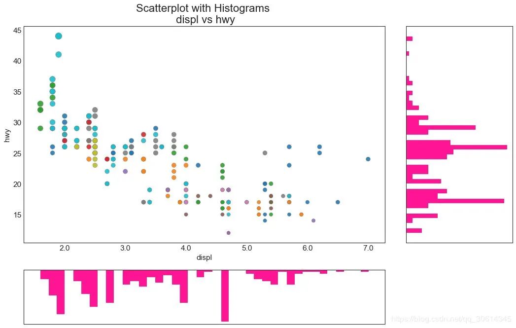
6. 边缘直方图边缘直方图具有沿X和Y轴变量的直方图。这用于可视化X和Y之间的关系以及单独的X和Y的单变量分布。该图如果经常用于探索性数据分析(EDA)。
# Import Data
df = pd.read_csv("https://raw.githubusercontent.com/selva86/datasets/master/mpg_ggplot2.csv")

# Create Fig and gridspec
fig = plt.figure(figsize=(16, 10), dpi= 80)
grid = plt.GridSpec(4, 4, hspace=0.5, wspace=0.2)

# Define the axes
ax_main = fig.add_subplot(grid[:-1, :-1])
ax_right = fig.add_subplot(grid[:-1, -1], xticklabels=[], yticklabels=[])
ax_bottom = fig.add_subplot(grid[-1, 0:-1], xticklabels=[], yticklabels=[])

# Scatterplot on main ax
ax_main.scatter('displ', 'hwy', s=df.cty*4, c=df.manufacturer.astype('category').cat.codes, alpha=.9, data=df, cmap="tab10", edgecolors='gray', linewidths=.5)

# histogram on the right
ax_bottom.hist(df.displ, 40, histtype='stepfilled', orientation='vertical', color='deeppink')
ax_bottom.invert_yaxis()

# histogram in the bottom
ax_right.hist(df.hwy, 40, histtype='stepfilled', orientation='horizontal', color='deeppink')

# Decorations
ax_main.set(title='Scatterplot with Histograms  displ vs hwy', xlabel='displ', ylabel='hwy')
ax_main.title.set_fontsize(20)
for item in ([ax_main.xaxis.label, ax_main.yaxis.label] + ax_main.get_xticklabels() + ax_main.get_yticklabels()):
    item.set_fontsize(14)

xlabels = ax_main.get_xticks().tolist()
ax_main.set_xticklabels(xlabels)
plt.show()


 4616
4616


 被折叠的 条评论
为什么被折叠?
被折叠的 条评论
为什么被折叠?
 到【灌水乐园】发言


