


前言
NG-NEST介绍
今天我们来介绍自定义主题和 Theme 组件。
自定义主题
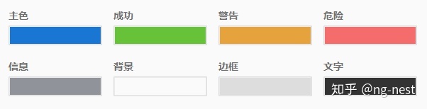
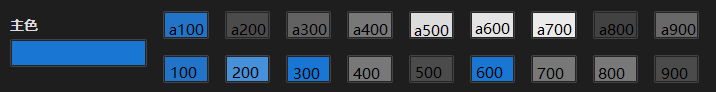
目前组件库中提供了以下颜色的自定义:
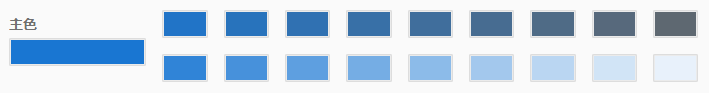
并且每一种颜色都自动做了对应的渐变色(加深和变浅):
通过主色与另外一种颜色的混合实现,核心方法在 lib/ng-nest/ui/core/theme/theme.service.ts 中:
// weight 用来设置权重(0-1)
export function mixColors(color1: string, color2: string, weight: number) {
  let rgb1 = toRgb(color1);
  let rgb2 = toRgb(color2);
  let weight1 = weight;
  let weight2 = 1 - weight;
  let result: { r: number; g: number; b: number };

  const inRange = (num: number) => {
    return num > 255 ? 255 : num < 0 ? 0 : num;
  };

  result = {
    r: inRange(Math.round(rgb1.r * weight1 + rgb2.r * weight2)),
    g: inRange(Math.round(rgb1.g * weight1 + rgb2.g * weight2)),
    b: inRange(Math.round(rgb1.b * weight1 + rgb2.b * weight2))
  };

  return result;
}
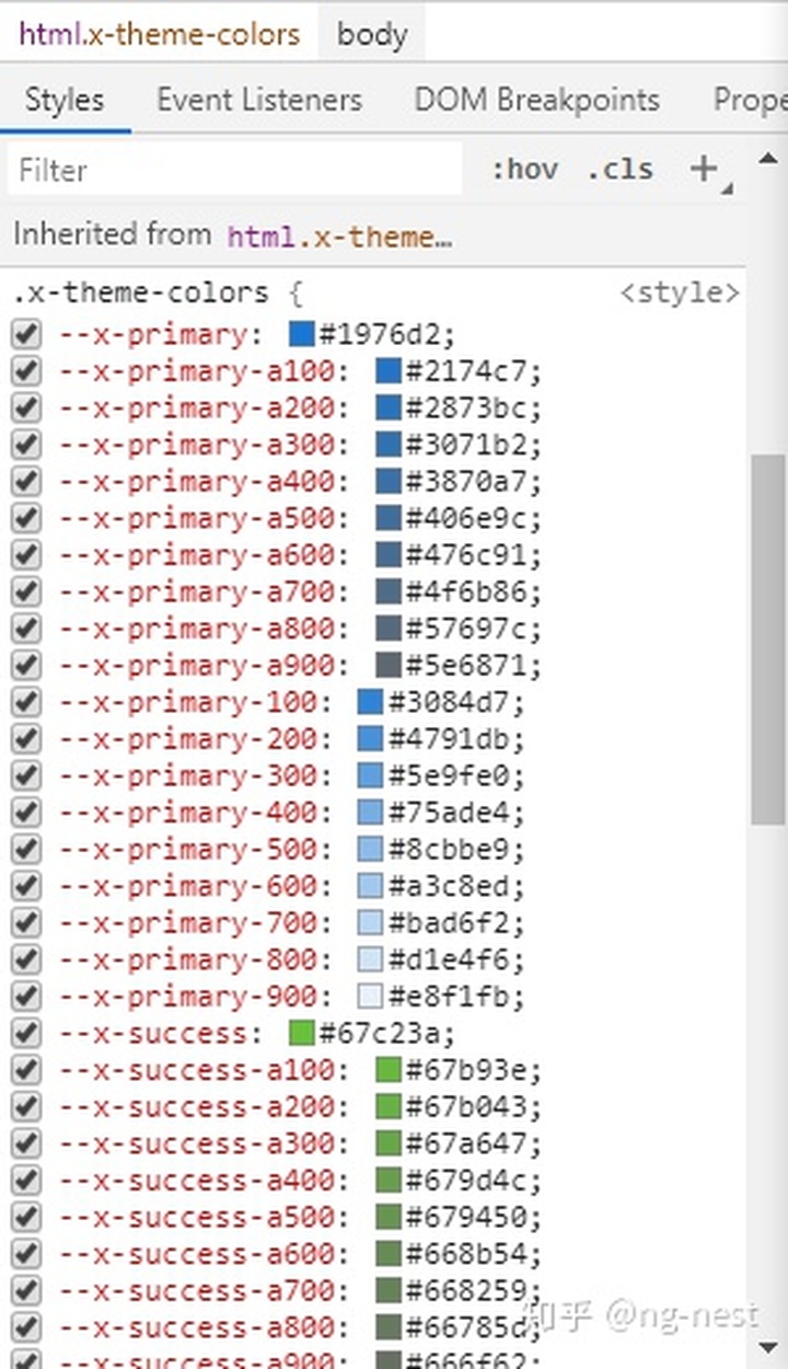
生成的颜色将会以变量的方式保存在样式表中:
然后所有的组件通过使用此变量来设置颜色,改变此变量的颜色即改变相关组件的颜色。
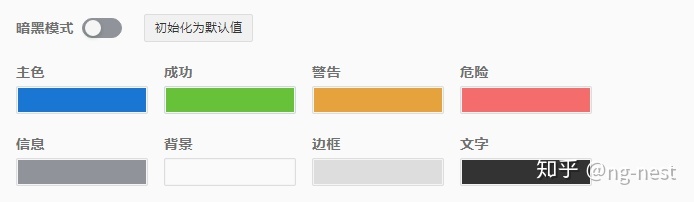
暗黑模式
在暗黑模式下除了背景色外,其它颜色的部分值是经过了特殊处理:
定义的取值和交换原则如下:(按 1-2-3-4 的顺序执行)
// 1
export const X_THEME_BACKGROUNDS = [-0.2, -0.3, -0.4];

// 2
export const X_THEME_TEXTS = [
  [-0.5, 0],
  [-0.6, 0.2],
  [-0.7, 0.4]
];

// 3
export const X_THEME_BORDERS = [
  [-0.8, 0],
  [-0.9, 0.2]
];

// 4
export const X_THEME_EXCHANGES = [
  [-0.1, -0.1],
  [0.1, -0.1],
  [0.2, 0.2],
  [0.3, 0],
  [0.4, -0.4],
  [0.5, -0.2],
  [0.6, 0],
  [0.7, -0.4],
  [0.8, -0.4],
  [0.9, -0.2]
];
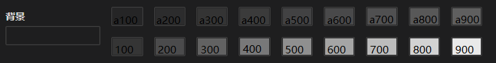
这里 0.1 对应 100,-0.1 对应 a100,0 对应各自的基础色
- 主色里面的 a200,a300,a400 取背景色的 200,300,400
- 主色里面的 a500,a600,a700 取文字颜色的 0,200,400
- 主色里面的 a800,a900 取边框颜色的 0,200
- 在主色里面重新取色,a100 = a100,100 = a100,200 = 200,300 = 0 ......
经过上面的步骤计算出各自对应的暗黑风格颜色。
Theme 组件
在组件库中提供了一个 theme.service.ts 的服务用来处理颜色,theme 组件就是通过调用此服务来实现颜色切换。
先看对应的模板文件: lib/ng-nest/ui/theme/theme.component.html
<div class="x-theme">
  <x-row>
    <x-col [style.width.rem]="8" *ngIf="showDark">
      <x-switch direction="row" label="暗黑模式" [(ngModel)]="dark" (ngModelChange)="darkChanges($event)"></x-switch>
    </x-col>
    <x-col [style.width.rem]="8">
      <x-button (click)="default()">初始化为默认值</x-button>
    </x-col>
  </x-row>
  <x-form [formGroup]="formGroup" [controls]="controls" [width]="width" span="2" space="1"></x-form>
</div>- 定义暗黑风格的切换开关和初始化默认值的按钮
- 定义了一个 form 的表单来显示我们的颜色面板,用法:Form 表单
接下来看对应的 theme.component.ts 文件:
export class XThemeComponent extends XThemeProperty implements OnInit, OnDestroy {
  // 定义 FormGroup 表单对象
  formGroup = new FormGroup({});
  theme: XTheme = {
    colors: {}
  };
  width = '45rem';
  beforeColors: XColorsTheme = {};
  currentColors: XColorsTheme = {};
  darkBeforeColors: XColorsTheme = {};
  // 定义表单控件,全部是颜色选择控件
  // 如果设置参数 showDetail ,将会显示我们的渐变色控件,默认会创建对应的控件,不显示
  controls: XControl[] = [
    { control: 'color-picker', id: 'primary', label: '主色', span: 5 },
    { control: 'color-picker', id: 'success', label: '成功', span: 5 },
    { control: 'color-picker', id: 'warning', label: '警告', span: 5 },
    { control: 'color-picker', id: 'danger', label: '危险', span: 5 },
    { control: 'color-picker', id: 'info', label: '信息', span: 5 },
    { control: 'color-picker', id: 'background', label: '背景', span: 5 },
    { control: 'color-picker', id: 'border', label: '边框', span: 5 },
    { control: 'color-picker', id: 'text', label: '文字', span: 5 }
  ];

  value: XColorsTheme = {};

  themeService: XThemeService;

  private _unSubject = new Subject<void>();

  writeValue(value: XColorsTheme) {
    this.value = value;
    if (this.value && Object.keys(this.value).length > 0) {
      this.theme = { colors: this.themeService.getDefineColors(Object.assign({}, X_THEME_COLORS, this.value), '', this.dark as boolean) };
      this.formGroup.patchValue(this.theme.colors as XColorsTheme);
    }
    this.cdr.detectChanges();
  }

  constructor(public configService: XConfigService, public cdr: ChangeDetectorRef) {
    super();
    this.themeService = this.configService.themeService;
  }

  ngOnInit() {
    // 获取当前颜色
    this.theme = this.configService.getTheme(true);
    // 设置表单控件
    this.setControls();
    // 设置默认颜色
    this.setDefaultColors();
    this.controls.map((x: XControl) => {
      x.value = (this.theme.colors as XColorsTheme)[x.id];
    });
  }

  ngAfterViewInit() {
    // 监听表单值(颜色)变化,通过 debounceTime 防抖。
    // 颜色变化后同时设置我们的主题颜色,即重新设置我们的样式变量
    this.formGroup.valueChanges.pipe(debounceTime(100), takeUntil(this._unSubject)).subscribe((x: XColorsTheme) => {
      this.beforeColors = this.currentColors;
      let changes = this.getChanges(x);
      if (this.isOneAndInColorKeys(changes)) {
        let [key, value] = Object.entries(changes)[0];
        let colors = !this.dark ? this.themeService.setRoot(key, value, '') : this.themeService.setDarkRoot(key, value, '');
        Object.assign(x, colors);
        this.currentColors = x;
        this.formGroup.patchValue(x);
      } else {
        this.currentColors = x;
        this.value = x;
        this.configService.setTheme({ colors: x });
      }
    });
  }

  ngOnDestroy(): void {
    this._unSubject.next();
    this._unSubject.unsubscribe();
  }

  setDefaultColors() {
    this.beforeColors = this.theme.colors as XColorsTheme;
    this.currentColors = this.beforeColors;
    this.darkBeforeColors = this.beforeColors;
  }

  setControls() {
    // 通过颜色的权重来创建我们的渐变色控件
    [...this.controls].forEach((control, index) => {
      let addControls: XControl[] = [];
      control.span = !this.showDetail ? 6 : 5;
      this.width = !this.showDetail ? '36rem' : '45rem';
      for (let amount of this.amounts) {
        addControls.push({
          control: 'color-picker',
          id: `${control.id}${this.themeService.getSuffix(amount as number)}`,
          label: '',
          hidden: !this.showDetail
        });
      }
      // 对应位置插入我们添加的控件
      this.controls.splice(index * this.amounts.length + index + 1, 0, ...addControls);
    });
  }

  // 还原默认值,我们在全局配置中设置的颜色
  default() {
    this.dark = false;
    let colors = this.themeService.getDefineColors(Object.assign({}, X_THEME_COLORS), '', this.dark);
    this.beforeColors = colors;
    this.currentColors = colors;
    this.formGroup.patchValue(colors);
    this.defaultClick.emit(colors);
    this.cdr.detectChanges();
  }

  // 判断改变的只有一种颜色,并且是主色(主色改变会切换对应的渐变色)
  // 表单改变的时候可能一次改变多个值,比如暗黑风格切换
  isOneAndInColorKeys(colors: XColorsTheme) {
    const keys = Object.keys(colors);
    if (keys.length === 1 && X_THEME_COLOR_KEYS.includes(keys[0])) {
      return true;
    }
    return false;
  }

  // 获取表单中改变的颜色
  getChanges(colors: XColorsTheme) {
    let result: XColorsTheme = {};
    for (let color in colors) {
      if (colors[color] !== this.beforeColors[color]) {
        result[color] = colors[color];
      }
    }
    return result;
  }

  // 暗黑风格切换,设置表单中的颜色
  darkChanges($event: Event) {
    let colors = this.darkBeforeColors as XColorsTheme;
    if (this.dark) {
      this.beforeColors = this.formGroup.value;
      this.darkBeforeColors = this.formGroup.value;
      colors = this.themeService.getDefineColors(
        Object.assign({}, this.themeService.getColorsInProperty(X_THEME_COLORS), X_THEME_DARK_COLORS),
        '',
        this.dark as boolean
      );
    }
    this.formGroup.patchValue(colors);
    this.darkChange.emit(this.dark);
  }
}
总结
本次主要介绍了主题切换的功能,具体的用法可以查看:主题定制。
theme 组件其实就是对主题功能的进一步应用,它就是一个表单组件,绑定的值就是我们对应的主题颜色。
下一次将介绍 Form 表单 组件的实现原理:
https://github.com/NG-NEST/ng-nest(欢迎 Star 了解最新信息)


 970
970


 被折叠的 条评论
为什么被折叠?
被折叠的 条评论
为什么被折叠?
 到【灌水乐园】发言


