


前言
本文目标在于利用
最近在处理某一组成绩数据的时候,涉及了柱状图的画法,因此此处进行一下记录。
加载库
import matplotlib.pyplot as plt
import matplotlib.font_manager as mfm
from matplotlib import style

style.use('ggplot')  # 加载'ggplot'风格

# 加载中文字体
font_path = "/System/Library/Fonts/STHeiti Light.ttc" # 本地字体链接
prop = mfm.FontProperties(fname=font_path)
单一柱图
其中
total = [3, 5, 6, 7, 8, 6, 4, 3, 3, 22, 4, 8, 7, 13, 7, 7, 15, 10, 6, 52, 8, 2, 3, 26, 1, 1, 0, 2, 0, 3]如果直接对于上述数据执行下述代码,将得到如下结果。
plt.bar(range(len(total)), total)
plt.title('单一柱图', fontproperties=prop)
plt.savefig("单一柱图.png", dpi=700, fontproperties=prop)
plt.show()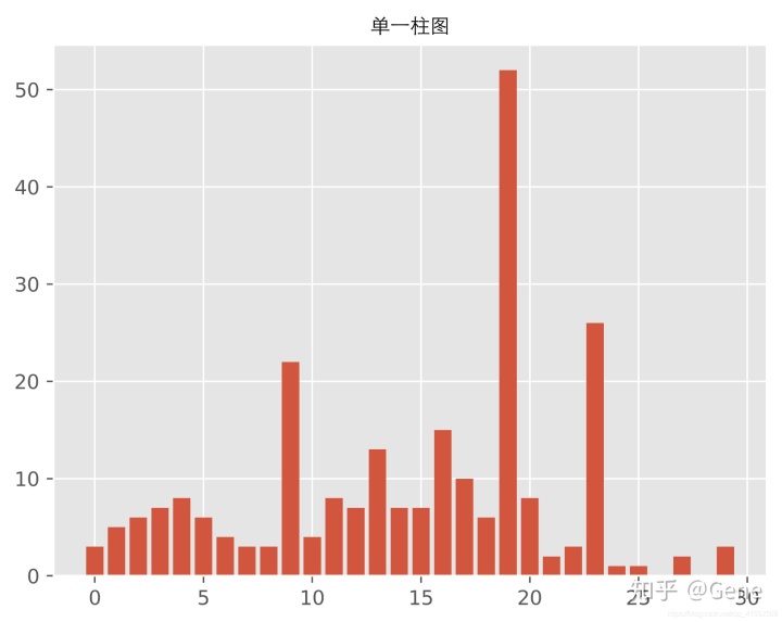
不难发现,上述结果的效果不好。首先第一点,分数段是
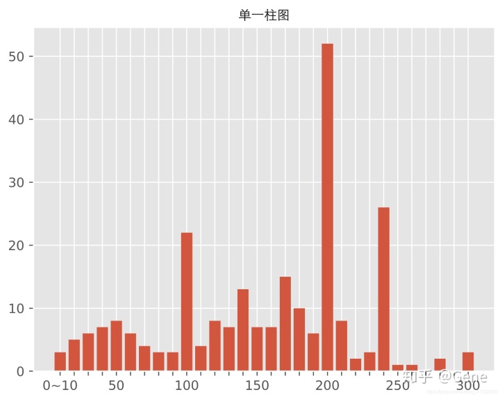
自定义横坐标
因此我们选择自定义横坐标的方式来进行效果改进,具体代码如下。
x_labels = []

for item in range(0, 300, 10):
   x = item + 10
   if x == 10:
       x_labels.append("{}~{}".format(0, 10))
   elif x % 50 == 0:
       x_labels.append("{}".format(x))
   else:
       x_labels.append(None)

x = range(len(total))
plt.bar(x, total)
plt.title('单一柱图', fontproperties=prop)
plt.xticks(x, x_labels)
plt.savefig("单一柱图.png", dpi=700, fontproperties=prop)
plt.show()
我们在
多柱图
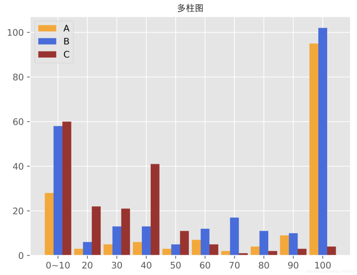
在展示完单一柱图之后,我们进入多柱同时显示的代码内容。首先是数据内容的展示,
A = [[28, 3, 5, 6, 3, 7, 2, 4, 9, 95],
     [58, 6, 13, 13, 5, 12, 17, 11, 10, 102],
     [60, 22, 21, 41, 11, 5, 1, 2, 3, 4]]
然后我们执行下述代码即可得到下述多柱图。
# 生成横坐标
x_labels = []
for item in range(0, 100, 10):
   x = item + 10
   if x == 10:
       x_labels.append("{}~{}".format(0, 10))
   else:
       x_labels.append("{}".format(x))
# 生成横坐标范围
x = np.arange(10)
# 生成多柱图
plt.bar(x + 0.00, A[0], color='orange', width=0.3, label="A")
plt.bar(x + 0.30, A[1], color='royalblue', width=0.3, label="B")
plt.bar(x + 0.60, A[2], color='brown', width=0.3, label="C")
# 图片名称
plt.title('多柱图', fontproperties=prop)
# 横坐标绑定
plt.xticks(x + 0.30, x_labels)
# 生成图片
plt.legend(loc="best")
plt.savefig("多柱图.png", dpi=700, fontproperties=prop)
plt.show()
后记
至此,Python 柱状图 的基础操作就介绍完毕了,本文也算是对于上一篇 《Python 画图基础操作详解》 文章的一个补充,不过仍然还有很多其他类型图的画法没有介绍,感兴趣的朋友可以继续深入研究!
最后祝大家画图快乐,在 Python 的画图之路上更进一步!


 407
407


 被折叠的 条评论
为什么被折叠?
被折叠的 条评论
为什么被折叠?
 到【灌水乐园】发言


