


在Web中给文本添加下划线常常出现在链接的文本上,早期一般使用text-decoration属性给文本添加下划线、删除线等。除了text-decoration之外,CSS还有很多技术方案可以给文本添加下划线效果,比如border-bottom、box-shadow、background-image等。对于Web开发者而言,更庆幸的是,CSS还有更多的,更灵活的特性实现文本下划线的效果。在这篇文章中,将和大家一起聊聊CSS中其他的特性怎么实现一个更有创意的效果。
新的text-decoration特性
text-decoration并不是一个新特性,在CSS 2.1中,text-decoration就可以使用none、underline、overline和line0-through给文本添加下划线、删除线等效果。只不过,在新的CSS规范中(CSS Text Decoration Module Level 3 和 Level 4)添加了一些新特性。比如:
text-decoration-line: none | [ underline || overline || line-through || blink ]
text-decoration-style: solid | double | dotted | dashed | wavy
text-decoration-color:
text-decoration-thickness: auto | from-font |
text-decoration-skip: none | [ objects || [ spaces | [ leading-spaces || trailing-spaces ] ] || edges || box-decoration ]
text-decoration-skip-ink: auto| none
其中text-decoration-line、text-decoration-style和text-decoration-color还可以简写成text-decoration:
text-decoration: || ||
除些之外,还新增了text-underline-position和text-underline-offset属性给文本设置下划线样式:
text-underline-position: auto | [ under || [ left | right ] ]
text-underline-offset: auto |
来看一个简单的示例:
自定义下划线效果
文章开头就提到过,除了使用text-decoration-*和text-underline-*属性可以给文本添加下划线效果之外,还可以使用一些其他方法来给文本添加自定义下划线的效果,比如下面两篇文章中提到的方法:
随着CSS的Clipping和Masking技术越来越成熟,我们可以配合CSS的伪元素实现一些更有创意的下划线效果。
使用clip-path给文本添加下划线
div {
width: 200px;
height: 200px;
background-color: #f36;
animation: melt-enter 2s ease-in alternate infinite,melt-leave 4s ease-out 2s alternate infinite;
cursor: pointer
}
@keyframes melt-enter {
0% {
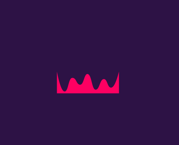
clip-path: path('M0 -0.12C8.33 -8.46 16.67 -12.62 25 -12.62C37.5 -12.62 35.91 0.15 50 -0.12C64.09 -0.4 62.5 -34.5 75 -34.5C87.5 -34.5 87.17 -4.45 100 -0.12C112.83 4.2 112.71 -17.95 125 -18.28C137.29 -18.62 137.76 1.54 150.48 -0.12C163.19 -1.79 162.16 -25.12 174.54 -25.12C182.79 -25.12 191.28 -16.79 200 -0.12L200 -34.37L0 -34.37L0 -0.12Z');
}
100% {
clip-path: path('M0 199.88C8.33 270.71 16.67 306.13 25 306.13C37.5 306.13 35.91 231.4 50 231.13C64.09 230.85 62.5 284.25 75 284.25C87.5 284.25 87.17 208.05 100 212.38C112.83 216.7 112.71 300.8 125 300.47C137.29 300.13 137.76 239.04 150.48 237.38C163.19 235.71 162.16 293.63 174.54 293.63C182.79 293.63 191.28 262.38 200 199.88L200 0.13L0 0.13L0 199.88Z');
}
}
@keyframes melt-leave {
0% {
clip-path: path('M0 0C8.33 -8.33 16.67 -12.5 25 -12.5C37.5 -12.5 36.57 -0.27 50 0C63.43 0.27 62.5 -34.37 75 -34.37C87.5 -34.37 87.5 -4.01 100 0C112.5 4.01 112.38 -18.34 125 -18.34C137.62 -18.34 138.09 1.66 150.48 0C162.86 -1.66 162.16 -25 174.54 -25C182.79 -25 191.28 -16.67 200 0L200 200L0 200L0 0Z');
}
100% {
clip-path: path('M0 200C8.33 270.83 16.67 306.25 25 306.25C37.5 306.25 36.57 230.98 50 231.25C63.43 231.52 62.5 284.38 75 284.38C87.5 284.38 87.5 208.49 100 212.5C112.5 216.51 112.38 300.41 125 300.41C137.62 300.41 138.09 239.16 150.48 237.5C162.86 235.84 162.16 293.75 174.54 293.75C182.79 293.75 191.28 262.5 200 200L200 200L0 200L0 200Z');
}
}
效果如下:
如果你的浏览器没看到任何效果的话,请更换Firefox 63+浏览器查阅,你将会看到下面这样的效果:
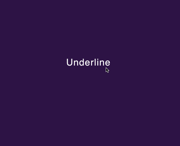
将这个创意放到文本下划线中也是可以的,只不过需要借助CSS的伪元素:
div {
display: inline-flex;
font-size: 30px;
position: relative;
cursor: pointer;
&::after {
content: '';
position: absolute;
top: calc(100% + 6px);
left: 0;
right: 0;
height: 10px;
background-color: currentColor;
animation: 2s melt-enter;
}
&:hover::after {
color: #f36;
animation: 2s melt-leave;
}
}
效果如下:
使用SVG实现自定义下划线效果
使用clip-path给文本添加下划线效果,可以帮助我们实现很多具有创意的效果,还可以配合CSS的animation来实现带有动画效果的下划线。其实,除了上面提到的方案之外,我们还可以在background-image中使用SVG给文本添加很多与众不同的下划线效果。比如:
上面的示例中引用像下面这样的一个使用SVG绘制的线条:
.st0{fill:#f3bc34}


 1745
1745


 被折叠的 条评论
为什么被折叠?
被折叠的 条评论
为什么被折叠?
 到【灌水乐园】发言


