


Python实现可视化(六)--柱状图
python实现柱状图可视化
已知:数据基础格式为dataframe

# 加载基础包
import matplotlib.pyplot as plt
import pandas as pd

# x轴刻度
x = ['0', '1', '2', '3', '4', '5', '6', '7', '8', '9', '10', '11', '12', '13', '14', '15', '16', '17', '18',
     '19', '20', '21', '22', '23']
height1 = list(df_final[df_final['index'] == '0']['占比'])
plt.bar(x, +np.array(height1), color='black', width=0.5)
height2 = list(df_final[df_final['index'] == '0.2']['占比'])
plt.bar(x, +np.array(height2), bottom=np.array(height1), color='grey', width=0.5)	#bottom决定纵向位置
height3 = list(df_final[df_final['index'] == '0.4']['占比'])
plt.bar(x, +np.array(height3), bottom=np.array(height1) + np.array(height2), color='darkturquoise', width=0.5)
height4 = list(df_final[df_final['index'] == '0.6']['占比'])
plt.bar(x, +np.array(height4), bottom=np.array(height1) + np.array(height2) + np.array(height3), color='blue', width=0.5)
height5 = list(df_final[df_final['index'] == '0.8']['占比'])
plt.bar(x, +np.array(height5), bottom=np.array(height1) + np.array(height2) + np.array(height3) + np.array(height4),
        color='purple', width=0.5)
height6 = list(df_final[df_final['index'] == '1']['占比'])
plt.bar(x, +np.array(height6), bottom=np.array(height1) + np.array(height2) + np.array(height3) + np.array(height4)
                                      + np.array(height5), color='gold', width=0.5)
height7 = list(df_final[df_final['index'] == '1.5']['占比'])
plt.bar(x, +np.array(height7),  bottom=np.array(height1) + np.array(height2) + np.array(height3) + np.array(height4)
                                      + np.array(height5) + np.array(height6), color='darkorange', width=0.5)
height8 = list(df_final[df_final['index'] == 'plus']['占比'])
plt.bar(x, +np.array(height8), bottom=np.array(height1) + np.array(height2) + np.array(height3) + np.array(height4)
                                      + np.array(height5) + np.array(height6) + + np.array(height7), color='red', width=0.5)

plt.legend(['0', '1', '2', '3', '4', '5', '6', '7'],
			ncol=1, 	# 图例要排成多少列
			loc=2,		# 图例的中心点
			bbox_to_anchor=(1.01, 1.0),		# 偏移的百分比
			borderaxespad=0.,
			fontsize=16,
			title="图例标题")  # 图例标题
plt.xlabel('时间', fontsize=20)
plt.ylabel('占比', fontsize=20)
plt.title('累积条形图', fontsize=20)
plt.tick_params(labelsize=20)   # 设置坐标轴刻度
plt.tight_layout()  # 调整画布窗口
plt.show()
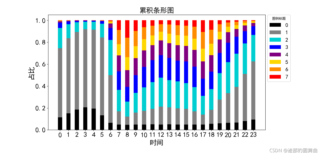
最终输出的结构图如下


 7190
7190


 被折叠的 条评论
为什么被折叠?
被折叠的 条评论
为什么被折叠?
 到【灌水乐园】发言


