


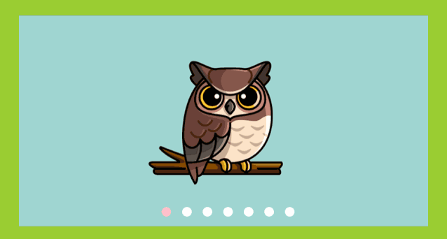
首先看效果:
html代码:
<div class="box"> <input type="radio" name="btn" id="btn1" checked> <input type="radio" name="btn" id="btn2"> <input type="radio" name="btn"id="btn3"> <input type="radio" name="btn" id="btn4"> <input type="radio" name="btn" id="btn5"> <input type="radio" name="btn" id="btn6"> <input type="radio" name="btn" id="btn7"> <label for="btn1">label> <label for="btn2">label> <label for="btn3">label> <label for="btn4">label> <label for="btn5">label> <label for="btn6">label> <label for="btn7">label> <ul> <li><img src="images/1.png" alt="" />li> <li><img src="images/2.png" alt="" />li> <li><img src="images/3.png" alt="" />li> <li><img src="images/4.png" alt="" />li> <li><img src="images/5.png" alt="" />li> <li><img src="images/6.png" alt="" />li> <li><img src="images/7.png" alt="" />li> ul> div> css代码:
body{ background-color: yellowgreen; display: flex; justify-content: center; align-items: center; /* vh就是当前屏幕可见高度的1%,也就是说,height:100vh == height:100%; 但是当元素没有内容时候,设置height:100%,该元素不会被撑开,此时高度为0, 但是设置height:100vh,该元素会被撑开屏幕高度一致。 */ height: 100vh;}/*这里用了响应式,即大于320px以上则执行这个代码*/@media screen and (min-width:320px){ .box { width: 857px; height: 441px; } label{ position: absolute; width: 20px; height: 20px; border-radius: 50% ; bottom: 20px; background-color: #fff; }}/*屏幕小于320px则下面这个代码执行*/@media screen and (max-width:320px){ .box { width: 514.2px; height: 167.58px; } img{ width: 38%; height: 100%; } label{ position: absolute; width: 10px; height: 10px; border-radius: 50% ; bottom: 10px; background-color: #fff; }}.box{ position: relative; overflow: hidden;}input { display: none;}/*设置小圆点*//* label{ position: absolute; width: 20px; height: 20px; border-radius: 50% ; bottom: 20px; background-color: #fff;}*//* 属性选择器*/label[for="btn1"]{ left: 35%;}label[for="btn2"] { left: 40%;}label[for="btn3"] { left: 45%;}label[for="btn4"] { left: 50%;}label[for="btn5"] { left: 55%;}label[for="btn6"] { left: 60%;}label[for="btn7"] { left: 65%;}ul{ display: flex; /*计算图片的总长*/ width: calc(875px*7); transition: all 0.5s;}ul li{ list-style-type: none;}#btn1:checked ~ul{ margin-left: 0;}#btn2:checked ~ ul { margin-left: -857px;}#btn3:checked ~ ul { margin-left: calc(-857px * 2);}#btn4:checked ~ ul { margin-left: calc(-857px * 3);}#btn5:checked ~ ul { margin-left: calc(-857px * 4);}#btn6:checked ~ ul { margin-left: calc(-857px * 5);}#btn7:checked ~ ul { margin-left: calc(-857px * 6);}#btn1:checked ~ label[for="btn1"] { background-color: pink;}#btn2:checked ~ label[for="btn2"] { background-color: pink;}#btn3:checked ~ label[for="btn3"] { background-color: pink;}#btn4:checked ~ label[for="btn4"] { background-color: pink;}#btn5:checked ~ label[for="btn5"] { background-color: pink;}#btn6:checked ~ label[for="btn6"] { background-color: pink;}#btn7:checked ~ label[for="btn7"] { background-color: pink;}完整代码可在公众号回复1123获得。


 264
264


 被折叠的 条评论
为什么被折叠?
被折叠的 条评论
为什么被折叠?
 到【灌水乐园】发言


