


页面样式
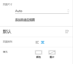
页面尺寸
在Axure 9中,由于有了负坐标(负空间)系的特性。同时也为移动端设计提供了常见的页面尺寸大小。主要分为we、IOS(苹果)手机设备、Android (安卓)手机设备的常见尺寸。
Axure 9提供了手机端的设计尺寸,最显著的就是优化了手机端的预览。
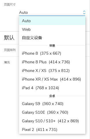
- Auto :不做尺寸限制
- web:限制宽度为1024 px(像素)的网页界面
- 苹果:提供了常见的iPhone 8、iPhone 8 Plus、iPhone X/XS 、iPhone XR/XS Max 、IPad 4(平板)的设计尺寸。(注:按照设计中的@1X的设计规范像素提供,比较常用的时iPhone 8、iPhone X/XS )
- 安卓:Galaxy S9 、Galaxy S10
 最低0.47元/天 解锁文章


 2084
2084


 被折叠的 条评论
为什么被折叠?
被折叠的 条评论
为什么被折叠?
 到【灌水乐园】发言


