


使用 css 实现下面效果:

把效果分解.
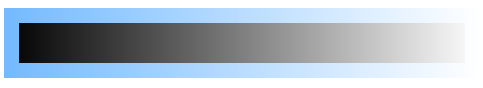
代码1:
.helper1 {
height: 40px;
padding: 15px;
background: -webkit-linear-gradient( right, #fff 0%, #000 100%), -webkit-linear-gradient( right, #fff 0%, #74baff 100% );
}
效果:

原因:
background 如果存在多个 image(gradient) 时, 显示层级是降低的. 即先的越靠前越优先显示.
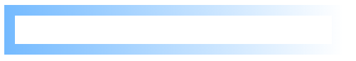
代码2:
.helper2 {
height: 40px;
padding: 15px;
background: -webkit-linear-gradient( right, #fff 0%, #000 100%), -webkit-linear-gradient( right, #fff 0%, #74baff 100% );
background-clip: content-box, padding-box;
}
效果:
原因:
background-clip 对 background 进行裁剪.
content-box: background 只显示在内容区.
border-box: background 从 border 位置开始显示.
background 图片(gradient)越向后书写的, 起始位置越渐近 border. 这样后定义的背景不会被先定义的完全覆盖.
重写代码2: 使用白色做背景. 代码3:
.helper3 {
height: 40px;
padding: 15px;
background: -webkit-linear-gradient( right, #fff 0%, #fff 100%), -webkit-linear-gradient( right, #fff 0%, #74baff 100% );
background-clip: content-box, padding-box;
}
代码 4:
.helper4 {
height: 40px;
padding: 15px;
padding-bottom: 0;
width: 100px;
box-sizing: border-box;
border-radius: 50px 50px 0 0;
background: -webkit-linear-gradient( right, #fff 0%, #fff 100%), -webkit-linear-gradient( right, #fff 0%, #74baff 100% );
background-clip: content-box, padding-box;
}
效果:

原因:
圆一周的效果不同, 因此上下两部分分开实现 - 添加 padding-bottom: 0; 即仅实现上半部分.
设置 width 指定 loading 圆尺寸. 使用 box-sizing 节省计算.
border-radius 把 loading 形状设置成圆.
实现上半部分效果, 下半部分相似. (借助:before/:after伪元素)
效果要求做了 rotate!
最终效果:


 248
248


 被折叠的 条评论
为什么被折叠?
被折叠的 条评论
为什么被折叠?
 到【灌水乐园】发言


