


Bootstrap的重置表现为,去掉本身样式,然后给元素添加其它样式,额外的样式需要通过明确的.class类来规范。。
重置CSS的原因:
- 重置浏览器默认值,使用
rem作为尺寸规格单位,代替em用于指定可缩放的组件的间隔与缝隙。 - 最大化避免使用
margin-top,防止使用它造成的垂直外排版(边距)混乱所造成之意想不到结果。更重要的是,一个单一方向的margin是一个简单的构思模型。 - 为了易于跨设备缩放,
block块元素必须使用rem作为margin的单位。 - 保持
font相关属性最小的声明,尽可能地使用inherit属性,不影响容器溢出。
重置CSS中选择覆盖和重定义了哪些元素?
1、table元素
原本样式:
<!DOCTYPE html>
<html>

<head>
	<meta charset="UTF-8">
	<meta name="viewport" content="width=device-width, initial-scale=1, shrink-to-fit=no">
	<title>重置样式</title>
	<style>
		body {
			padding-bottom: 1000px;
		}
	</style>
</head>

<body>
	<table>
		<tr>
			<td>周一</td>
			<td>周二</td>
			<td>周三</td>
		</tr>
	</table>
</body>

</html>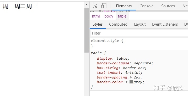
使用Bootstrap重置后的样式:
<!DOCTYPE html>
<html>

<head>
	<meta charset="UTF-8">
	<meta name="viewport" content="width=device-width, initial-scale=1, shrink-to-fit=no">
	<link rel="stylesheet" href="https://stackpath.bootstrapcdn.com/bootstrap/4.3.1/css/bootstrap.min.css"
		integrity="sha384-ggOyR0iXCbMQv3Xipma34MD+dH/1fQ784/j6cY/iJTQUOhcWr7x9JvoRxT2MZw1T" crossorigin="anonymous">
	<title>重置样式</title>
	<style>
		body {
			padding-bottom: 1000px;
		}
	</style>
</head>

<body>
	<table>
		<tr>
			<td>周一</td>
			<td>周二</td>
			<td>周三</td>
		</tr>
	</table>
</body>

</html>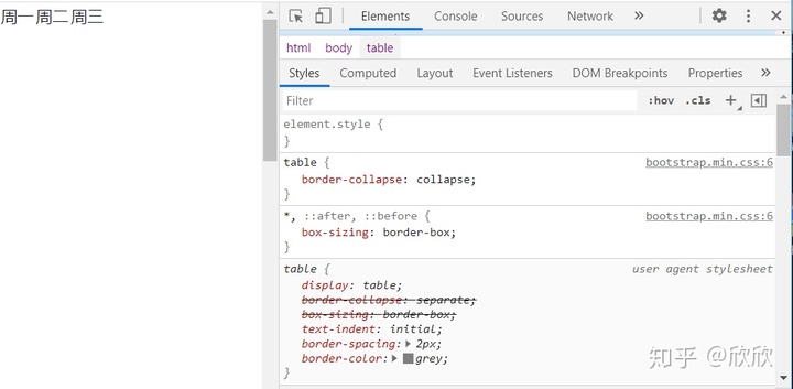
加上额外的样式后:
<!DOCTYPE html>
<html>

<head>
	<meta charset="UTF-8">
	<meta name="viewport" content="width=device-width, initial-scale=1, shrink-to-fit=no">
	<link rel="stylesheet" href="https://stackpath.bootstrapcdn.com/bootstrap/4.3.1/css/bootstrap.min.css"
		integrity="sha384-ggOyR0iXCbMQv3Xipma34MD+dH/1fQ784/j6cY/iJTQUOhcWr7x9JvoRxT2MZw1T" crossorigin="anonymous">
	<title>重置样式</title>
	<style>
		body {
			padding-bottom: 1000px;
		}
	</style>
</head>

<body>
	<table class="table table-bordered">
		<tr>
			<td>周一</td>
			<td>周二</td>
			<td>周三</td>
		</tr>
	</table>
</body>

</html>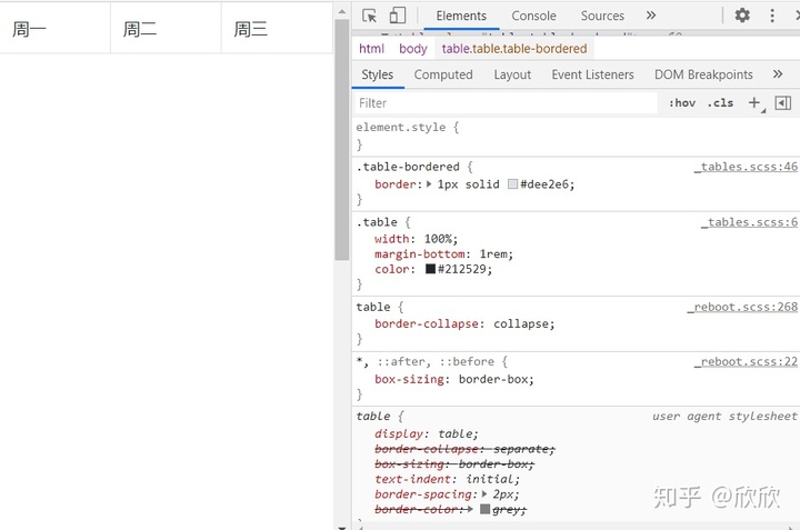
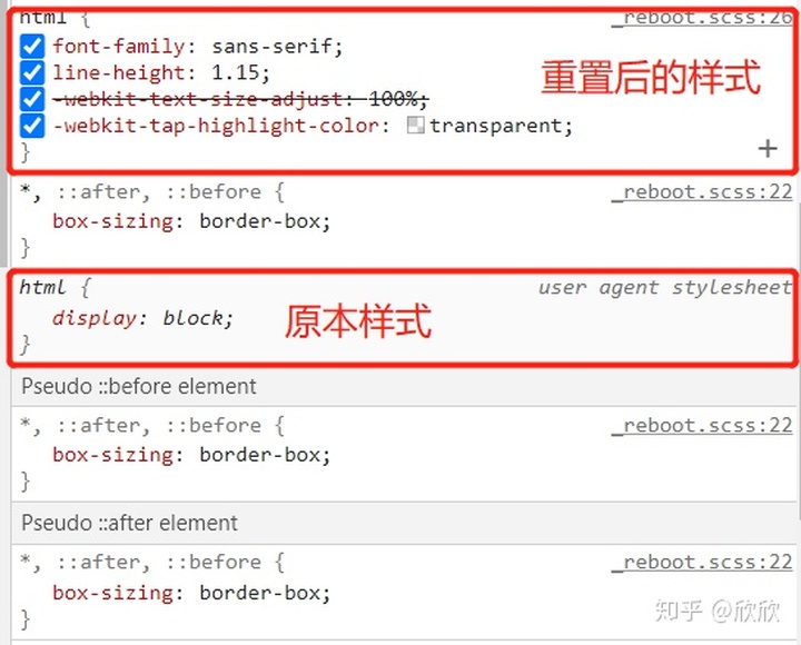
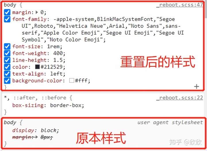
2、页面默认元素 html、body
为提供更好的页面展示效果,Bootstrap v4 更新了<html> and<body>元素的一些属性。
- 全局性地将每一个元素的
box-sizing属性(包括*:before、*:after都设置border-box-以确保DIV元素自身定义的宽度不会因为border或padding而超过。 <html>根元素没有声明font-size属性,但被假定为16px大小(这是目前Chrome等浏览器默认值),然后在此基础上采用font-size:1rem的比例应用于<body>上,使媒体查询能够轻松的实现缩放,最大程序保障用户偏好和易于访问。<body>元素被赋予一个全局性的font-family和line-height,其下面的诸多表单元素也继承此属性,以防止字体大小错位冲突。- 为了安全起见,
<body>的background-color的默认值赋为#fff。
html:
body:
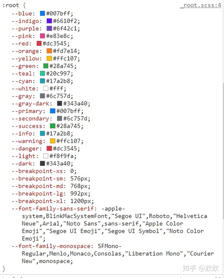
根节点元素还被赋予了很多值:
使用方式:
<!DOCTYPE html>
<html>

<head>
	<meta charset="UTF-8">
	<meta name="viewport" content="width=device-width, initial-scale=1, shrink-to-fit=no">
	<link rel="stylesheet" href="https://stackpath.bootstrapcdn.com/bootstrap/4.3.1/css/bootstrap.min.css"
		integrity="sha384-ggOyR0iXCbMQv3Xipma34MD+dH/1fQ784/j6cY/iJTQUOhcWr7x9JvoRxT2MZw1T" crossorigin="anonymous">
	<title>重置样式</title>
	<style>
		body {
			padding-bottom: 1000px;
		}

		.testVal {
			width: 100px;
			height: 100px;
			background: var(--blue);
		}
	</style>
</head>

<body>
	<div class="testVal"></div>
</body>

</html>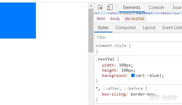
3、标题和段落元素
所有标题和段落元素(如说<h1>以及<p>都被重置,系统移除它们的上外边距margin-top定义,标题添加外边距为margin-bottom: .5rem,段落元素<p>添加了外边距margin-bottom:1rem以形成简洁行距。
原本样式:
<!DOCTYPE html>
<html>

<head>
	<meta charset="UTF-8">
	<meta name="viewport" content="width=device-width, initial-scale=1, shrink-to-fit=no">
	<title>重置样式</title>
	<style>
		body {
			padding-bottom: 1000px;
		}
	</style>
</head>

<body>
	<h1>陈学辉</h1>
	<h2>陈学辉</h2>
	<h3>陈学辉</h3>
	<p>陈学辉</p>
</body>

</html>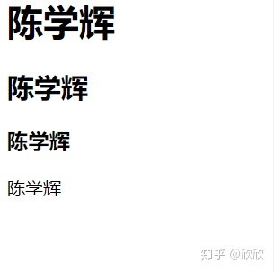
使用Bootstrap重置后的样式:
<!DOCTYPE html>
<html>

<head>
	<meta charset="UTF-8">
	<meta name="viewport" content="width=device-width, initial-scale=1, shrink-to-fit=no">
	<link rel="stylesheet" href="https://stackpath.bootstrapcdn.com/bootstrap/4.3.1/css/bootstrap.min.css"
		integrity="sha384-ggOyR0iXCbMQv3Xipma34MD+dH/1fQ784/j6cY/iJTQUOhcWr7x9JvoRxT2MZw1T" crossorigin="anonymous">
	<title>重置样式</title>
	<style>
		body {
			padding-bottom: 1000px;
		}
	</style>
</head>

<body>
	<h1>陈学辉</h1>
	<h2>陈学辉</h2>
	<h3>陈学辉</h3>
	<p>陈学辉</p>
</body>

</html>
4、列表元素
移除所有的列表元素(<ul>、<ol>、 and<dl>)的外边距margin-top,并设置为margin-bottom: 1rem,被嵌套的子列表没margin-bottom值。
- ul:
原本样式:
<!DOCTYPE html>
<html>

<head>
	<meta charset="UTF-8">
	<meta name="viewport" content="width=device-width, initial-scale=1, shrink-to-fit=no">
	<title>重置样式</title>
	<style>
		body {
			padding-bottom: 1000px;
		}
	</style>
</head>

<body>
	<ul>
		<li>red</li>
		<li>
			<ul>
				<li>green</li>
			</ul>
		</li>
	</ul>
</body>

</html>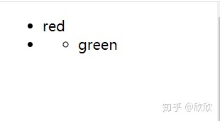
使用Bootstrap重置后的样式:
<!DOCTYPE html>
<html>

<head>
	<meta charset="UTF-8">
	<meta name="viewport" content="width=device-width, initial-scale=1, shrink-to-fit=no">
	<link rel="stylesheet" href="https://stackpath.bootstrapcdn.com/bootstrap/4.3.1/css/bootstrap.min.css"
		integrity="sha384-ggOyR0iXCbMQv3Xipma34MD+dH/1fQ784/j6cY/iJTQUOhcWr7x9JvoRxT2MZw1T" crossorigin="anonymous">
	<title>重置样式</title>
	<style>
		body {
			padding-bottom: 1000px;
		}
	</style>
</head>

<body>
	<ul>
		<li>red</li>
		<li>
			<ul>
				<li>green</li>
			</ul>
		</li>
	</ul>
</body>

</html>
- ol:
原本样式:
<!DOCTYPE html>
<html>

<head>
	<meta charset="UTF-8">
	<meta name="viewport" content="width=device-width, initial-scale=1, shrink-to-fit=no">
	<title>重置样式</title>
	<style>
		body {
			padding-bottom: 1000px;
		}
	</style>
</head>

<body>
	<ol>
		<li>red</li>
		<li>
			<ol>
				<li>green</li>
			</ol>
		</li>
	</ol>
</body>

</html>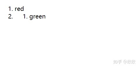
使用Bootstrap重置后的样式:
<!DOCTYPE html>
<html>

<head>
	<meta charset="UTF-8">
	<meta name="viewport" content="width=device-width, initial-scale=1, shrink-to-fit=no">
	<link rel="stylesheet" href="https://stackpath.bootstrapcdn.com/bootstrap/4.3.1/css/bootstrap.min.css"
		integrity="sha384-ggOyR0iXCbMQv3Xipma34MD+dH/1fQ784/j6cY/iJTQUOhcWr7x9JvoRxT2MZw1T" crossorigin="anonymous">
	<title>重置样式</title>
	<style>
		body {
			padding-bottom: 1000px;
		}
	</style>
</head>

<body>
	<ol>
		<li>red</li>
		<li>
			<ol>
				<li>green</li>
			</ol>
		</li>
	</ol>
</body>

</html>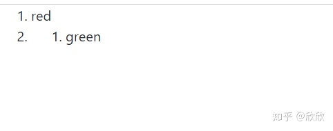
- dl:
原本样式:
<!DOCTYPE html>
<html>

<head>
	<meta charset="UTF-8">
	<meta name="viewport" content="width=device-width, initial-scale=1, shrink-to-fit=no">
	<title>重置样式</title>
	<style>
		body {
			padding-bottom: 1000px;
		}
	</style>
</head>

<body>
	<dl>
		<dt>穷</dt>
		<dd>穷,汉语常用字,读作qióng或者gōng,最早见于甲骨文,造字本义为身居洞穴,身体被迫弯屈、不自由,后引申为物质上困顿的、不得志的、贫困的,又引申为追究、终结、尽、完等。(基本信息栏参考资料:)</dd>
	</dl>
</body>

</html>
使用Bootstrap重置后的样式:
<!DOCTYPE html>
<html>

<head>
	<meta charset="UTF-8">
	<meta name="viewport" content="width=device-width, initial-scale=1, shrink-to-fit=no">
	<link rel="stylesheet" href="https://stackpath.bootstrapcdn.com/bootstrap/4.3.1/css/bootstrap.min.css"
		integrity="sha384-ggOyR0iXCbMQv3Xipma34MD+dH/1fQ784/j6cY/iJTQUOhcWr7x9JvoRxT2MZw1T" crossorigin="anonymous">
	<title>重置样式</title>
	<style>
		body {
			padding-bottom: 1000px;
		}
	</style>
</head>

<body>
	<dl>
		<dt>穷</dt>
		<dd>穷,汉语常用字,读作qióng或者gōng,最早见于甲骨文,造字本义为身居洞穴,身体被迫弯屈、不自由,后引申为物质上困顿的、不得志的、贫困的,又引申为追究、终结、尽、完等。(基本信息栏参考资料:)</dd>
	</dl>
</body>

</html>
5、pre预先格式化文本元素
pre标签可定义预格式化的文本。被包围在pre>标签元素中的文本通常会保留空格和换行符。而文本也会呈现为等宽字体。- bootstrap重置了
pre元素,移除了它的margin-top属性并用rem作为margin-bottom的单位。
原本样式:
<!DOCTYPE html>
<html>
<head>
<meta charset="UTF-8">
<meta name="viewport" content="width=device-width, initial-scale=1, shrink-to-fit=no">
<title>重置样式</title>
<style>
body {
padding-bottom: 1000px;
}
</style>
</head>
<body>
<pre><html>
<head>
</pre>
</body>
</html>
使用Bootstrap重置后的样式:
<!DOCTYPE html>
<html>
<head>
<meta charset="UTF-8">
<meta name="viewport" content="width=device-width, initial-scale=1, shrink-to-fit=no">
<link rel="stylesheet" href="https://stackpath.bootstrapcdn.com/bootstrap/4.3.1/css/bootstrap.min.css"
integrity="sha384-ggOyR0iXCbMQv3Xipma34MD+dH/1fQ784/j6cY/iJTQUOhcWr7x9JvoRxT2MZw1T" crossorigin="anonymous">
<title>重置样式</title>
<style>
body {
padding-bottom: 1000px;
}
</style>
</head>
<body>
<pre><html>
<head>
</pre>
</body>
</html>
6、表格元素
微调了表格的样式,样式化了<caption>,且确保text-align属性一致。
原本样式:
<!DOCTYPE html>
<html>

<head>
	<meta charset="UTF-8">
	<meta name="viewport" content="width=device-width, initial-scale=1, shrink-to-fit=no">
	<title>重置样式</title>
</head>

<body>
	<table>
		<caption>课程表</caption>
		<tr>
			<td>周一</td>
			<td>周二</td>
			<td>周三</td>
		</tr>
	</table>
</body>

</html>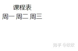
使用Bootstrap重置后的样式:
<!DOCTYPE html>
<html>

<head>
	<meta charset="UTF-8">
	<meta name="viewport" content="width=device-width, initial-scale=1, shrink-to-fit=no">
	<link rel="stylesheet" href="https://stackpath.bootstrapcdn.com/bootstrap/4.3.1/css/bootstrap.min.css"
		integrity="sha384-ggOyR0iXCbMQv3Xipma34MD+dH/1fQ784/j6cY/iJTQUOhcWr7x9JvoRxT2MZw1T" crossorigin="anonymous">
	<title>重置样式</title>
</head>

<body>
	<table>
		<caption>课程表</caption>
		<tr>
			<td>周一</td>
			<td>周二</td>
			<td>周三</td>
		</tr>
	</table>
</body>

</html>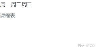
7、Forms表单元素
<fieldset>去除了边框、内填充、外边距属性,所以它们可以轻松地用作单一的输入框或者输入框组的放入容器中使用。<legend>和fieldset字段集一样,也已被重新设计过,显示为不同种类的标题。<label>加上了display: inline-block属性,从而可以被用户赋予margin属性进行布局调用。<input>、<select>、<textarea>s、<button>基本本来都被规范化处理了,同时重置移除了它们的margin,并且设置了inline-height: inherit属性。<textarea>被修改为只能竖直方向上调整大小,因为水平方向上调整大小经常会“破坏”页面布局
原本样式:
<!DOCTYPE html>
<html>

<head>
	<meta charset="UTF-8">
	<meta name="viewport" content="width=device-width, initial-scale=1, shrink-to-fit=no">
	<title>重置样式</title>
</head>

<body>
	<form>
		<fieldset>
			<legend>标题</legend>
		</fieldset>
		<p>
			<label for="">用户名:</label>
			<input type="text">
		</p>
		<p>
			<button>敢点么</button>
			<select name="" id="">
				<option value="">北京</option>
				<option value="">上海</option>
				<option value="">广州</option>
			</select>
		</p>
		<p>
			<textarea name="" id="" cols="30" rows="10"></textarea>
		</p>
	</form>
</body>

</html>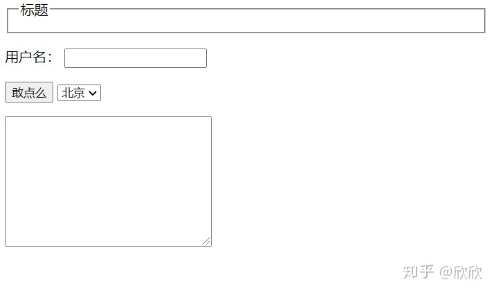
使用Bootstrap重置后的样式:
<!DOCTYPE html>
<html>

<head>
	<meta charset="UTF-8">
	<meta name="viewport" content="width=device-width, initial-scale=1, shrink-to-fit=no">
	<link rel="stylesheet" href="https://stackpath.bootstrapcdn.com/bootstrap/4.3.1/css/bootstrap.min.css"
		integrity="sha384-ggOyR0iXCbMQv3Xipma34MD+dH/1fQ784/j6cY/iJTQUOhcWr7x9JvoRxT2MZw1T" crossorigin="anonymous">
	<title>重置样式</title>
</head>

<body>
	<form>
		<fieldset>
			<legend>标题</legend>
		</fieldset>
		<p>
			<label for="">用户名:</label>
			<input type="text">
		</p>
		<p>
			<button>敢点么</button>
			<select name="" id="">
				<option value="">北京</option>
				<option value="">上海</option>
				<option value="">广州</option>
			</select>
		</p>
		<p>
			<textarea name="" id="" cols="30" rows="10"></textarea>
		</p>
	</form>
</body>

</html>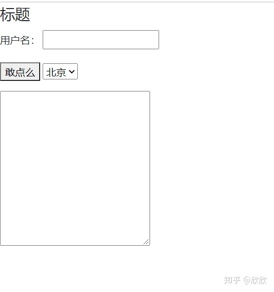


 1442
1442


 被折叠的 条评论
为什么被折叠?
被折叠的 条评论
为什么被折叠?
 到【灌水乐园】发言


