


I have a dataframe like this,
col1 col2 col3
A east 5
A west 7
A east 1
A east 6
B east 2
B west 9
B east 8
...
Z west 4
I know how to groupby and made histogram by using
df[df.col1.isin(ix)].groupby('col1').hist()
How can I get a 2 levels groupby and draw histograms by using the dataframe above?
For each col1 group histogram I want them in a separate plot. But for each col2 group. I hope them in one like this.
For example, the final results will be 26 histograms from A-Z. Each inside has 2 plots(east&west).
解决方案pandas.DataFrame.sort_values on col1 will also order the plot sequence from A to Z
Data:
import string
import numpy as np
import pandas as pd
import random
alpha_list = [random.choice(list(string.ascii_uppercase)) for _ in range(10_000)]
coor_list = [random.choice(['east', 'west']) for _ in range(10_000)]
rand_val = [np.random.randint(10) for _ in range(10_000)]
df = pd.DataFrame({'col1': alpha_list, 'col2': coor_list, 'col3': rand_val})
df.sort_values(by='col1', inplace=True)
col1 col2 col3
A west 1
A east 3
A west 9
A west 5
A west 7
A east 1
A east 5
A west 2
A east 2
A west 2
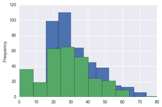
Plot:
g = sns.FacetGrid(df, col='col1', hue='col2', col_wrap=7)
g.map(sns.distplot, 'col3', hist_kws=dict(edgecolor='black'), bins=range(0, 11, 1), kde=False)
plt.xlabel('Value Range')
plt.ylabel('Frequency')
plt.legend()
plt.xticks(range(1, 11, 1))
plt.show()

if you want tick labels on each graph, put the following code on the line before plt.show():
for ax in g.axes.flatten():
ax.tick_params(labelbottom=True)


 4017
4017


 被折叠的 条评论
为什么被折叠?
被折叠的 条评论
为什么被折叠?
 到【灌水乐园】发言


