


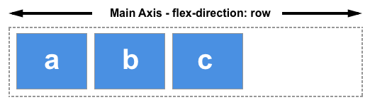
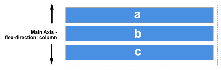
主要概念:使用flex布局的时候,首先要注意两根轴线-主轴和交叉轴。主轴由flex-direction定义,另一个垂直于主轴为交叉轴。
主轴:
flex-direction:row/row-reverse/column/column-reserve;
如果flex-direction选择了row/row-reverse,主轴就会沿水平方向延伸。
如果flex-direction选择了column/column-reserve,主轴就会沿垂直方向延伸。
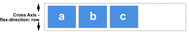
交叉轴:
交叉轴垂直于主轴,所以如果你的flex-direction (主轴) 设成了 row 或者 row-reverse 的话,交叉轴的方向就是沿着列向下的。
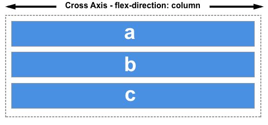
如果主轴方向设成了 column 或者 column-reverse,交叉轴就是水平方向。
flexbox 的特性是沿着主轴或者交叉轴对齐之中的元素。
示例:
.box {
  display: flex;
  flex-direction: row-reverse;//row column column-reverse  row-reverse
}
<div class="box">
  <div>One</div>
  <div>Two</div>
  <div>Three</div>
</div>
用flex-wrap实现多行flex容器:
为了实现多行效果,为属性flex-wrap添加一个属性值wrap。
.box {
  display: flex;
  flex-wrap: wrap;//wrap指的是允许换行 nowrap指的是不允许换行
}
<div class="box">
  <div>One</div>
  <div>Two</div>
  <div>Three</div>
</div>
上边的flex-direction和flex-wrap简写属性为flex-flow,第一个指定的值为 flex-direction ,第二个指定的值为 flex-wrap。
.box {
  display: flex;
  flex-flow: row wrap;
}
<div class="box">
  <div>One</div>
  <div>Two</div>
  <div>Three</div>
</div>
flex还有三个属性:flex-grow flex-shrink flex-basis,这三个属性很少单独使用,flex 简写形式允许把三个数值按这个顺序书写 — flex-grow, flex-shrink, flex-basis。
第一个数值是 flex-grow。赋值为正数的话是让元素增加所占空间
第二个数值是flex-shrink — 正数可以让它缩小所占空间,但是只有在flex元素总和超出主轴才会生效
最后一个数值是 flex-basis
.box {
  display: flex;
}
.one {
  flex: 1 1 auto;
}
.two {
  flex: 1 1 auto;
}
.three {
  flex: 1 1 auto;
}
<div class="box">
  <div class="one">One</div>
  <div class="two">Two</div>
  <div class="three">Three</div>
</div>
上边的属性还有简写:
flex: initial
flex: auto
flex: none
flex: <positive-number>
flex: initial 是把flex元素重置为Flexbox的初始值,它相当于 flex: 0 1 auto。在这里 flex-grow 的值为0,所以flex元素不会超过它们 flex-basis 的尺寸。flex-shrink 的值为1, 所以可以缩小flex元素来防止它们溢出。flex-basis 的值为 auto. Flex元素尺寸可以是在主维度上设置的,也可以是根据内容自动得到的。
flex: auto 等同于 flex: 1 1 auto;和上面的 flex:initial 基本相同,但是这种情况下,flex元素在需要的时候既可以拉伸也可以收缩。
flex: none 可以把flex元素设置为不可伸缩。它和设置为 flex: 0 0 auto 是一样的。元素既不能拉伸或者收缩,但是元素会按具有 flex-basis: auto 属性的flexbox进行布局。
你在教程中常看到的 flex: 1 或者 flex: 2 等等。它相当于flex: 1 1 0。元素可以在flex-basis为0的基础上伸缩。
示例:
.box {
  display: flex;
}
.one {
  flex: 1;
}
.two {
  flex: 1;
}
.three {
  flex: 1;
}
<div class="box">
  <div class="one">One</div>
  <div class="two">Two</div>
  <div class="three">Three</div>
</div>
元素的对齐和空间分配
align-item使元素在交叉轴方向对齐,有四个属性值:
- stretch:初始值
- flex-start:使flex元素按照flex容器顶部对齐
- flex-end:使flex元素按照flex容器底部对齐
- center:居中对齐
.box {
  display: flex;
  align-items: flex-start;
}
<div class="box">
  <div>One</div>
  <div>Two</div>
  <div>Three
      <br>has
      <br>extra
      <br>text
  </div>
</div>
justify-content使元素在主轴上对齐,有六个属性值:
stretch:初始值flex-start:使flex元素按照flex容器起始线排列flex-end:使flex元素按照flex容器终止线排列center:居中对齐space-around:把元素排列好之后的剩余空间拿出来,平均分配到元素之间,每个元素的左右空间相等space-between:把元素排列好之后的剩余空间拿出来,平均分配到元素之间,每个元素之间间隔相等
.box {
  display: flex;
  justify-content: flex-start;
}
<div class="box">
  <div>One</div>
  <div>Two</div>
  <div>Three</div>
</div>


 323
323


 被折叠的 条评论
为什么被折叠?
被折叠的 条评论
为什么被折叠?
 到【灌水乐园】发言


