


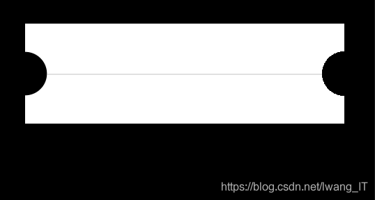
方式一:
.content{
background-color: #000000;
position: absolute;
width: 100%;
top: 0;
bottom: 0;
}
.line_1{
margin: 30px 30px 0 30px;
height: 72px;
display: flex;
justify-content: center;
align-items: center;
z-index: 99;
/* 半圆 */
background-color: #FFFFFF;
background: radial-gradient(circle at 0 50%, transparent 16px, #FFFFFF 16px,#FFFFFF 16px) left top,
radial-gradient(circle at 100% 50%, transparent 16px, #FFFFFF 16px) right top;
background-size: 51% 100%; /*以父元素的百分比来设置背景图像的宽度和高度 */
background-repeat: no-repeat;
}
.line_1 view{
height: 1px;
margin-left: 16px;
margin-right: 16px;
width: 100%;
background-color:#E0E0E0 ;
}
方式二:

.content{
background-color: #000000;
position: absolute;
width: 100%;
top: 0;
bottom: 0;
display: flex;
justify-content: center;
align-items: center;
}
.Container{
width: 200px;
height: 100px;
/* circle关键字指定渐变的形状是一个圆形
at来指定起始点位置(渐变的中心位置)
*/
background-image: radial-gradient(circle at 100px 50px,transparent 0%, transparent 8px,#fff 8px, #fff 100%);
/* 背景色定位 */
background-position: 100px center;
}


 3718
3718


 被折叠的 条评论
为什么被折叠?
被折叠的 条评论
为什么被折叠?
 到【灌水乐园】发言


