


进入我的主页,查看更多CSS的分享!
首先呢,先去看文档,了解flex是什么,这里不做赘述。
当然,可以看下面的代码示例,辅助你理解。
一、row
将子元素在水平方向进行布局:
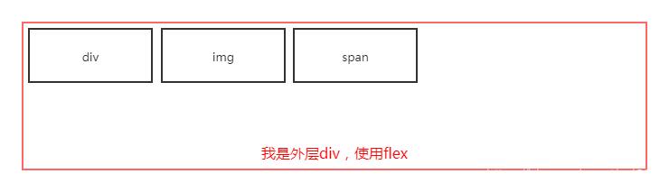
1. 垂直方向靠顶部,水平方向靠左侧
.row-ll { display: flex;/* 定义flex */ flex-direction: row;/* 默认值*/ align-items: flex-start;/* 默认值*/ justify-content: flex-start;/* 默认值*/}示例:
我是div
![]() text
text
2. 垂直方向靠顶部,水平方向居中
.row-lc { display: flex; flex-direction: row; align-items: flex-start; justify-content: center;}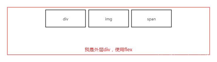
3.垂直方向靠顶部,水平方向两端对齐
.row-lsb { display: flex; flex-direction: row; align-items: flex-start; justify-content: space-between;}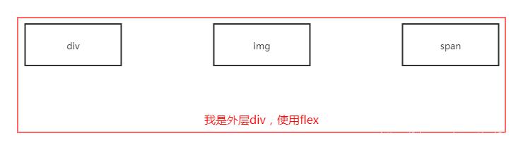
4. 垂直方向靠顶部,水平方向平均分隔(中间间隔的宽度为两边间隔宽度的2倍)
.row-lsa { display: flex; flex-direction: row; align-items: flex-start; justify-content: space-around;}
5. 垂直方向靠顶部,水平方向平均分隔(间隔距离相等)
.row-lse { display: flex; flex-direction: row; align-items: flex-start; justify-content: space-evenly;}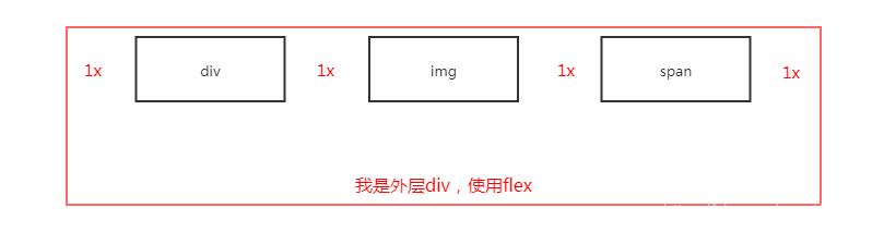
6. 垂直方向靠顶部,水平方向靠右侧
.row-le { display: flex; flex-direction: row; align-items: flex-start; justify-content: flex-end;}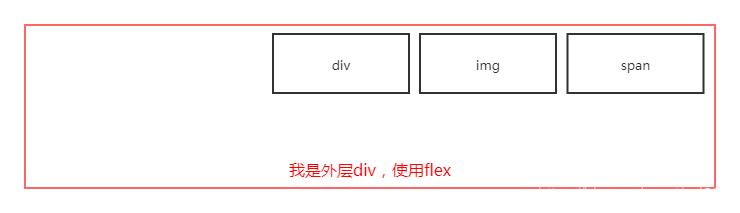
7. 垂直方向可以设置为:靠顶部、居中、靠底部
前面6个是(垂直方向)靠顶部的效果,且(垂直方向)居中、靠底部的代码类似,如下:
/* 垂直方向居中,水平方向靠左侧 */.row-cl { display: flex; flex-direction: row; align-items: cenetr; justify-content: flex-start;}/* 垂直方向居中,水平方向居中 */.row-cc { display: flex; flex-direction: row; align-items: cenetr; justify-content: cenetr;}/* 垂直方向居中,水平方向平均间隔(中间间隔的宽度为两边间隔宽度的2倍) */.row-csa { display: flex; flex-direction: row; align-items: cenetr; justify-content: space-around;}/* 垂直方向居中,水平方向两端对齐 */.row-csb { display: flex; flex-direction: row; align-items: cenetr; justify-content: space-between;}/* 垂直方向居中,水平方向平均间隔(间隔距离相等) */.row-cse { display: flex; flex-direction: row; align-items: cenetr; justify-content: space-evenly;}/* 垂直方向居中,水平方向靠右侧 */.row-ce { display: flex; flex-direction: row; align-items: cenetr; justify-content: flex-end;}/* 垂直方向居底部,水平方向靠左侧 */.row-el { display: flex; flex-direction: row; align-items: flex-end; justify-content: flex-start;}/* 垂直方向居底部,水平方向居中 */.row-ec { display: flex; flex-direction: row; align-items: flex-end; justify-content: cenetr;}/* 垂直方向居底部,水平方向平均间隔 */.row-esa { display: flex; flex-direction: row; align-items: flex-end; justify-content: space-around;}/* 垂直方向居底部,水平方向两端对齐 */.row-esb { display: flex; flex-direction: row; align-items: flex-end; justify-content: space-between;}/* 垂直方向居底部,水平方向平均间隔 */.row-ese { display: flex; flex-direction: row; align-items: flex-end; justify-content: space-evenly;}/* 垂直方向居底部,水平方向靠右侧 */.row-ee { display: flex; flex-direction: row; align-items: flex-end; justify-content: flex-end;}二、column
将子元素在垂直方向进行布局:
1. 垂直方向靠顶部,水平方向靠左侧
.col-ll { display: flex; flex-direction: column; align-items: flex-start; justify-content: flex-start;}2. 垂直方向靠居中,水平方向靠左侧
.col-lc { display: flex; flex-direction: column; align-items: flex-start; justify-content: center;}3. 垂直方向两端对齐,水平方向靠左侧
.col-lsb { display: flex; flex-direction: column; align-items: flex-start; justify-content: space-between;}4. 垂直方向平均间隔(中间间隔的宽度为两边间隔宽度的2倍),水平方向靠左侧
.col-lsa { display: flex; flex-direction: column; align-items: flex-start; justify-content: space-around;}5. 垂直方向平均间隔(间隔距离相等),水平方向靠左侧
.col-lse { display: flex; flex-direction: column; align-items: flex-start; justify-content: space-evenly;}6. 垂直方向靠底部,水平方向靠左侧
.col-le { display: flex; flex-direction: column; align-items: flex-start; justify-content: flex-end;}7. 水平方向可以设置为:靠顶部、居中、靠底部
前面6个是(水平方向)靠顶部的效果,且(水平方向)居中、靠底部的代码类似,如下:
/* 垂直方向靠顶部,水平方向居中 */.col-cl { display: flex; flex-direction: column; align-items: center; justify-content: flex-start;}/* 垂直方向居中,水平方向居中 */.col-cc { display: flex; flex-direction: column; align-items: center; justify-content: center;}/* 垂直方向平均间隔,水平方向居中 */.col-csa { display: flex; flex-direction: column; align-items: center; justify-content: space-around;}/* 垂直方向两端对齐,水平方向居中 */.col-csb { display: flex; flex-direction: column; align-items: center; justify-content: space-between;}/* 垂直方向平均间隔,水平方向居中 */.col-cse { display: flex; flex-direction: column; align-items: center; justify-content: space-evenly;}/* 垂直方向靠底部,水平方向居中 */.col-ce { display: flex; flex-direction: column; align-items: center; justify-content: flex-end;}/* 垂直方向靠顶部,水平方向靠底部 */.col-cl { display: flex; flex-direction: column; align-items: flex-end; justify-content: flex-start;}/* 垂直方向居中,水平方向靠底部 */.col-cc { display: flex; flex-direction: column; align-items: flex-end; justify-content: center;}/* 垂直方向平均间隔,水平方向靠底部 */.col-csa { display: flex; flex-direction: column; align-items: flex-end; justify-content: space-around;}/* 垂直方向两端对齐,水平方向靠底部 */.col-csb { display: flex; flex-direction: column; align-items: flex-end; justify-content: space-between;}/* 垂直方向平均间隔,水平方向靠底部 */.col-cse { display: flex; flex-direction: column; align-items: flex-end; justify-content: space-evenly;}/* 垂直方向靠底部,水平方向靠底部 */.col-ce { display: flex; flex-direction: column; align-items: flex-end; justify-content: flex-end;}三、更多属性
菜鸟教程(https://www.runoob.com/css3/css3-flexbox.html)
四、代码太多了也有重复,好乱啊
我参考了vuetify的预置css,flex.css可以这么写:
.d-flex { display: flex;}.flex-row { flex-direction: row;}.flex-wrap { flex-wrap: wrap;}.flex-wrap-reverse { flex-wrap: wrap-reverse;}.flex-row-reverse { flex-direction: row-reverse;}.flex-column { flex-direction: column;}.flex-column-reverse { flex-direction: column-reverse;}.align-start { align-items: flex-start;}.align-center { align-items: center;}.align-end { align-items: flex-end;}.justify-start { justify-content: flex-start;}.justify-center { justify-content: center;}.justify-space-around { justify-content: space-around;}.justify-space-between { justify-content: space-between;}.justify-space-evenly { justify-content: space-evenly;}示例:
垂直居中,水平居中
垂直居中,水平两端对齐
有补充请在评论区留言。


 1万+
1万+


 被折叠的 条评论
为什么被折叠?
被折叠的 条评论
为什么被折叠?
 到【灌水乐园】发言


