


 flex +rem
移
动
端
网
页
flex +rem
移
动
端
网
页
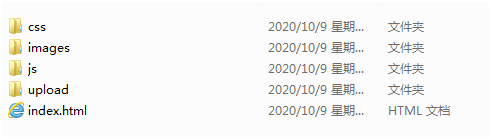
1. 新建项目文件夹:
例如:国美H5
新建一个项目文件夹----------- 国美H5
里面新建 css文件: 移动端初始化样式nomal.css ----- 自己的样式index.css
新建不更换图片的文件夹 ---------- images
新建常换的图片文件夹 ------------ upload
新建js文件夹 --------------- flexible.js
新建首页文件 ------------ index.html
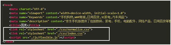
2. 用vsCode打开项目文件夹
进入首页文件index.html , 先引入css文件 和 js文件
然后进入index.css, 写移动端body的范围及其居中样式:
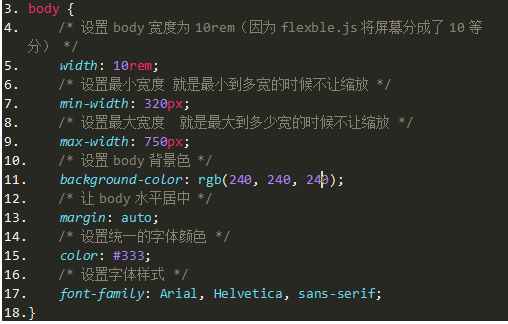
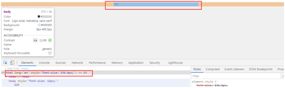
3 . 测试样式引入是否正确
在body里面输入 1234 ,运行index.html,打开控制台,用箭头点击body查看body的范围以及查看是否居中显示,在查看控制台中的body标签里面是否显示出flexble.Js划分好的字体大小,若有,则正确,没有则说明js没有引入成功。
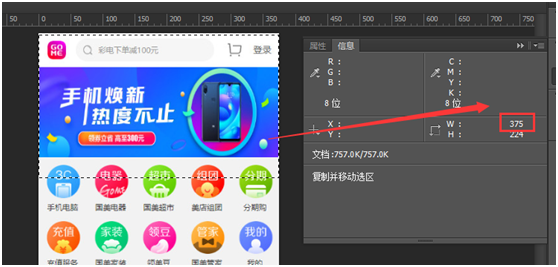
4. 确定1rem的值
用ps打开设计图,必须 测量设计图的总宽度(375)。 然后用这个总宽度除以10(flexble.js划分10等分),除出来的数就是1rem的数据。
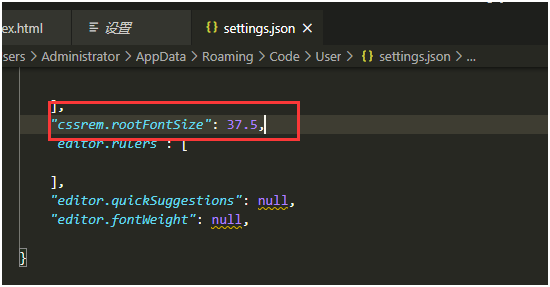
然后再vsCode里面打开设置(Ctrl+,),点击文本编辑器 ---- 字体 --- 在seting.Json中编辑 ----- "cssrem.rootFontSize": 16, ----- 把这个16改成刚才除号的数据
例如:一张设计图的总宽度是375px,那么375 / 10 == 37.5
那么就在编辑器设置里面把16改成37.5
然后,单位就换算好了,当输入px是就会自动转换为rem为单位
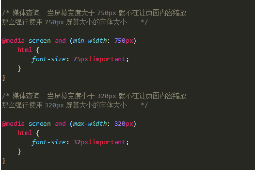
5. 限制缩放范围
用媒体查询限定当屏幕缩放到多大的时候 body内容不再缩放,这里写的字体大小也是刚才除出来的数字 37.5(因为权重不够需要加important)
6. 开始写页面
写页面的时候和pc端一样,必须测量准每一个盒子的宽高,然后再编辑器里面输入测出来的宽高,就会有自动转成rem出来,就把rem那个写上即可。
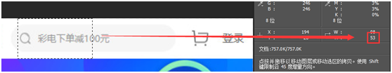
例如:测量出头部高度等53px ,那么直接输入53px,自动弹出53px / 37.5之后的值,写上这个即可。
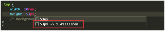
此时,这个盒子已经出现,而且自适应。
至此,准备工作完毕。
总结:
必须用设计图的宽度来确定1rem == 多少px
测量完设计图的总宽度,然后除以10,除出来的数字就是1rem的px等量值
这个值只适合当前设计图的尺寸,也就是说,每做一个移动端的页面,先要测量设计图的总宽度,才能确定1rem的值等于多少,这样才能是准确的。
每一个设计图的宽度不同,所以,每换设计图都要重新测量宽度,重新确定1rem的值。
而不是,自己按照750px的宽度去写,把1rem调成75px,然后设计图的宽度是375px,那么这个时候,写出来的单位就会不对,导致页面变形。
就是要根据设计图的宽度去确定1rem的值。
布局需要注意的地方:
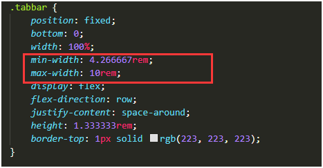
只要在移动端有固定定位的盒子,必须要给这个盒子加最大宽度和最小宽度,如果不加,这个盒子因为不占位置而不以body为父级定位,而是以窗口为准,所以出现错位的情况。
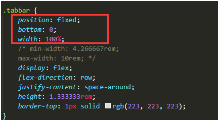
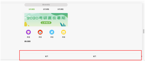
那么我们就需要给这个固定定位的盒子设置最大宽度和最小宽度来约束住这个不占位的盒子,这样就不会出现固定定位的盒子错位的情况。
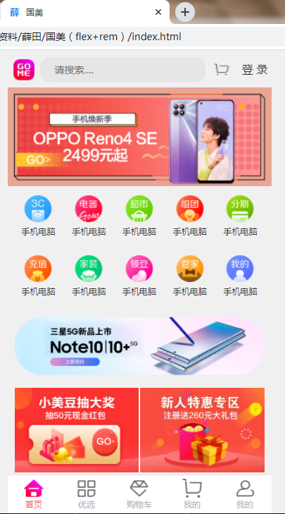
国美首页制作案例:
搜索框部分:
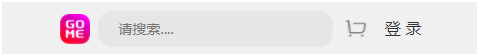
给一个大盒子,里面有四个小盒子,宽100%,高是测量的值,输入px自动转换rem,给背景,给大盒子设置display:flex; align-items :center;侧轴居中(也就是垂直居中)
logo,购物车,登录三个小盒子各占1份,高度测量自转rem,搜索框占5份,各自给个背景,实现划分。
然后,给每个小盒子填入内容,小盒子里面若有一个元素,就用text-algin 和 行高 line-height进行水平垂直居中,若有多个元素,那么就给小盒子写一个display:flex;
让它来控制里面的多个元素。注意主轴的设置。
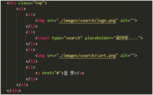
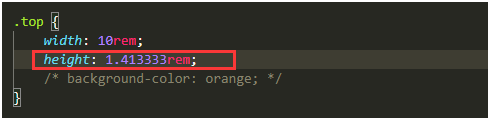
.top {
width: 10rem;
height: 1.413333rem;
/* background-color: orange; */
}
.top ul {
display: flex;
font-size: 0.373333rem;
}
.top ul li:nth-child(1) {
flex: 1;
display: flex;
justify-content: center;
align-items: center;
height: 1.466667rem;
/* background-color: red; */
/* text-align: center; */
}
.top ul li:nth-child(1) img {
/* flex: 1; */
width: 0.8rem;
height: .8rem;
}
.top ul li:nth-child(2) {
flex: 5;
display: flex;
align-items: center;
height: 1.466667rem;
/* background-color: rgb(102, 255, 0); */
}
.top ul li:nth-child(2) input {
width: 100%;
height: 0.96rem;
background-color: rgb(230, 230, 230);
border-radius: 0.38rem;
border: none;
padding-left: 0.533333rem;
}
.top ul li:nth-child(3) {
flex: 1;
display: flex;
justify-content: center;
align-items: center;
height: 1.466667rem;
/* background-color: rgb(55, 0, 255); */
}
.top ul li:nth-child(3) img {
width: 0.64rem;
height: 0.533333rem;
}
.top ul li:nth-child(4) {
flex: 1;
height: 1.466667rem;
/* background-color: red; */
text-align: center;
line-height: 1.466667rem;
font-size: 0.426667rem;
color: #333;
}
.top ul li:nth-child(4) a {
color: #333;
}
Banner部分:
<div class="banner">
<img src="./images/upload/banner.jpg" id="jdt" alt="">
div>
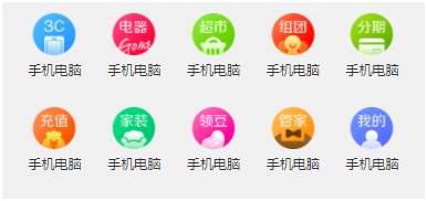
Nav导航栏部分:
<nav>
<ul>
<li>
<a href="#">
<span class="nav_pic">
<img src="./images/nav/nav01.png" alt="">
span>
<span class="nav_text">手机电脑span>
a>
li>
<li>
<a href="#">
<span class="nav_pic">
<img src="./images/nav/nav02.png" alt="">
span>
<span class="nav_text">手机电脑span>
a>
li>
<li>
<a href="#">
<span class="nav_pic">
<img src="./images/nav/nav03.png" alt="">
span>
<span class="nav_text">手机电脑span>
a>
li>
<li>
<a href="#">
<span class="nav_pic">
<img src="./images/nav/nav04.png" alt="">
span>
<span class="nav_text">手机电脑span>
a>
li>
<li>
<a href="#">
<span class="nav_pic">
<img src="./images/nav/nav05.png" alt="">
span>
<span class="nav_text">手机电脑span>
a>
li>
<li>
<a href="#">
<span class="nav_pic">
<img src="./images/nav/nav06.png" alt="">
span>
<span class="nav_text">手机电脑span>
a>
li>
<li>
<a href="#">
<span class="nav_pic">
<img src="./images/nav/nav07.png" alt="">
span>
<span class="nav_text">手机电脑span>
a>
li>
<li>
<a href="#">
<span class="nav_pic">
<img src="./images/nav/nav08.png" alt="">
span>
<span class="nav_text">手机电脑span>
a>
li>
<li>
<a href="#">
<span class="nav_pic">
<img src="./images/nav/nav09.png" alt="">
span>
<span class="nav_text">手机电脑span>
a>
li>
<li>
<a href="#">
<span class="nav_pic">
<img src="./images/nav/nav10.png" alt="">
span>
<span class="nav_text">手机电脑span>
a>
li>
ul>
nav>
nav {
width: 10rem;
height: 4.48rem;
/* background-color: red; */
padding: 0 0.266667rem;
}
nav ul {
display: flex;
flex-direction: row;
justify-content: space-between;
flex-wrap: wrap;
/* align-content: space-around; */
}
nav ul li {
/* flex: ; */
width: 1.546667rem;
height: 2rem;
/* background-color: green; */
margin: 0.133333rem 0.133333rem;
}
nav ul li a {
/* flex: ; */
display: block;
width: 1.546667rem;
height: 2rem;
/* background-color: rgb(255, 230, 0); */
text-align: center;
font-size: 0.373333rem;
}
nav ul li a .nav_pic {
width: 1.466667rem;
height: 1.52rem;
}
nav ul li a .nav_pic img {
width: 100%;
/* height: 1.52rem; */
margin: 0.133333rem 0 0.053333rem;
}
nav ul li a .nav_text {
font-size: 0.32rem;
color: #333;
}
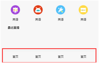
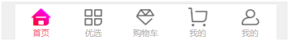
Tabbar 部分:
<div class="tabbar">
<ul>
<li>
<a href="#">
<img src="./images/footer/footer01.png" alt="">
<div class="tabbar_text" style="color: #f35b74;">
首页
div>
a>
li>
<li>
<a href="#">
<img src="./images/footer/footer02.png" alt="">
<div class="tabbar_text">
优选
div>
a>
li>
<li>
<a href="#">
<img src="./images/footer/footer03.png" alt="">
<div class="tabbar_text">
购物车
div>
a>
li>
<li>
<a href="#">
<img src="./images/footer/footer04.png" alt="">
<p class="tabbar_text">
我的
p>
a>
li>
<li>
<a href="#">
<img src="./images/footer/footer05.png" alt="">
<div class="tabbar_text">
我的
div>
a>
li>
ul>
div>
.tabbar {
height: 1.466667rem;
background-color: #fff;
border-top: 0.04rem solid #e4e4e4;
position: fixed;
width: 100%;
min-width: 320px;
max-width: 375px;
bottom: 0;
}
.tabbar ul {
display: flex;
flex-direction: row;
align-items: center;
}
.tabbar ul li {
display: flex;
flex-direction: row;
align-items: center;
flex: 1;
/* background-color: red; */
}
.tabbar ul li a {
display: block;
width: 100%;
height: 1.2rem;
/* background-color: purple; */
text-align: center;
}
.tabbar ul li a img {
width: 0.8rem;
height: 0.746667rem;
/* background-color: black; */
margin-top: 0.133333rem;
}
.tabbar ul li a .tabbar_text {
text-align: center;
font-size: 0.32rem;
width: 100%;
height: 12px;
color: rgb(180, 180, 180);
}
 END
END
 2020-10-13 薛田移动端网页总结


 2493
2493


 被折叠的 条评论
为什么被折叠?
被折叠的 条评论
为什么被折叠?
 到【灌水乐园】发言


