


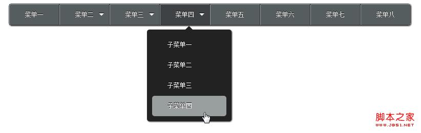
效果图如下:
代码如下:
复制代码
代码如下:
纯html+css导航*{
margin:0;
padding:0;
}
.clear:after {
clear: both;
content: ".";
display: block;
height: 0;
visibility: hidden;
}
nav{
display:inline-block;
border:1px solid #505255;
border-bottom: 1px solid #282C2F;
-moz-border-radius: 5px;
-webkit-border-radius: 5px;
margin:50px;
-webkit-box-shadow:1px 1px 3px #292929;
-moz-box-shadow:1px 1px 3px #292929;
}
li{
list-style:none;
float:left;
border-right: 1px solid #2E3235;
position: relative;
/*background: -moz-linear-gradient(top, #fff, #555D5F 2% ,#555D5F 50%,#3E4245 100%);
background: -webkit-gradient(linear, 0 0, 0 100%, from(#fff), color-stop(2%, #555D5F), color-stop(50%, #555D5F),to(#3E4245));*/
background:#555D5F;
}
li:hover{
/*background: -moz-linear-gradient(top, #fff, #3E4245 2% ,#555D5F 80%,#555D5F 100%);
background: -webkit-gradient(linear, 0 0, 0 100%, from(#fff), color-stop(2%, #3E4245), color-stop(80%, #3E4245),to(#555D5F));*/
background:#3E4245;
-moz-transition: background 1s ease-out;
-webkit-transition: background 1s ease-out;
}
li a{
display:block;
height:40px;
line-height:40px;
padding:0 30px;
font-size:12px;
color:#fff;
text-shadow: 0px -1px 0px #000;
text-decoration:none;
white-space:nowrap;
border-left: 1px solid #999E9F;
border-top: 1px solid #999E9F;
-moz-border-top-left-radius: 2px;
-webkit-border-top-left-radius: 2px;
z-index:100;
}
li > a{
position:relative;
}
li.first a{
-moz-border-radius-topleft: 4px;
-moz-border-radius-bottomleft: 4px;
-webkit-border-top-left-radius: 4px;
-webkit-border-bottom-left-radius: 4px;
}
li.last{
border-right: 0 none;
}
dl{
position:absolute;
display:block;
top:40px;
left: -25px;
width:165px;
background:#222222;
-moz-border-radius: 5px;
-webkit-border-radius: 5px;
-webkit-box-shadow:1px 1px 3px #292929;
-moz-box-shadow:1px 1px 3px #292929;
z-index:10;
}
li:hover dl{
top:50px;
display:block;
width:145px;
padding:10px;
}
dl a{
background:transparent;
border:0 none;
-moz-border-radius: 5px;
-webkit-border-radius: 5px;
-moz-transition: background 0.5s ease-out;
-webkit-transition: background 0.5s ease-out;
z-index:50;
}
dl a:hover{
color:#FFF;
background:#999E9F;
-moz-transition: background 0.3s ease-in-out, color 0.3s ease-in-out;
-webkit-transition: background 0.3s ease-in-out, color 0.3s ease-in-out;
}
dd{
margin-top:-40px;
opacity:0;
width:145px;
-webkit-transition-property:all;
/*-webkit-transition-timing-function: cubic-bezier(5,0,5,0);*/
-moz-transition-property: all;
/*-moz-transition-timing-function: cubic-bezier(5,0,5,0);*/
/*-webkit-transition-delay:5s;
-moz-transition-delay:5s;*/
}
li:hover dd{
margin-top:0;
opacity:1;
}
li dd:nth-child(1){
-webkit-transition-duration: 0.1s;
-moz-transition-duration: 0.1s;
}
li dd:nth-child(2){
-webkit-transition-duration: 0.2s;
-moz-transition-duration: 0.2s;
}
li dd:nth-child(3){
-webkit-transition-duration: 0.3s;
-moz-transition-duration: 0.3s;
}
li dd:nth-child(4){
-webkit-transition-duration: 0.4s;
-moz-transition-duration: 0.4s;
}
dt{
display:none;
margin-top:-25px;
padding-top:15px;
height:10px;
}
li:hover dt{
display:block;
}
.Darrow{
float:right;
margin:18px 10px 0 0;
border-width:5px;
border-color:#FFF transparent transparent transparent;
border-style:solid;
width:0;
height:0;
line-height:0;
overflow:hidden;
cursor:pointer;
text-shadow: 0px -1px 0px #000;
-webkit-box-shadow:0px -1px 0px #000;
-moz-box-shadow:0px -1px 0px #000;
}
.arrow{
margin:0 auto;
margin-top:-5px;
display:block;
width:10px;
height:10px;
background:#222222;
-webkit-transform: rotate(45deg);
-moz-transform: rotate(45deg);
}
声明:本文原创发布php中文网,转载请注明出处,感谢您的尊重!如有疑问,请联系admin@php.cn处理


 587
587


 被折叠的 条评论
为什么被折叠?
被折叠的 条评论
为什么被折叠?
 到【灌水乐园】发言


