


 本文列举了50个Matplotlib的图表实例,涵盖关联、偏差、排序和分布四大类别,如散点图、发散型条形图、面积图等,帮助数据分析师深入理解变量间的关系和数据分布。每个图表都有详细解释,是Matplotlib可视化的宝贵资源。
在数据分析和可视化中最有用的 50 个 Matplotlib 图表。 这些图表列表允许您使用 python 的 matplotlib 和 seaborn 库选择要显示的可视化对象。
介绍
这些图表根据可视化目标的7个不同情景进行分组。 例如,如果要想象两个变量之间的关系,请查看“关联”部分下的图表。 或者,如果您想要显示值如何随时间变化,请查看“变化”部分,依此类推。
有效图表的重要特征:
- 在不歪曲事实的情况下传达正确和必要的信息。
- 设计简单,您不必太费力就能理解它。
- 从审美角度支持信息而不是掩盖信息。
- 信息没有超负荷。
准备工作
在代码运行前先引入下面的设置内容。 当然,单独的图表,可以重新设置显示要素。
# !pip install brewer2mplimport numpy as npimport pandas as pdimport matplotlib as mplimport matplotlib.pyplot as pltimport seaborn as snsimport warnings; warnings.filterwarnings(action='once')large = 22; med = 16; small = 12params = {'axes.titlesize': large, 'legend.fontsize': med, 'figure.figsize': (16, 10), 'axes.labelsize': med, 'axes.titlesize': med, 'xtick.labelsize': med, 'ytick.labelsize': med, 'figure.titlesize': large}plt.rcParams.update(params)plt.style.use('seaborn-whitegrid')sns.set_style("white")%matplotlib inline# Versionprint(mpl.__version__) #> 3.0.0print(sns.__version__) #> 0.9.03.0.20.9.0一、关联 (Correlation)
关联图表用于可视化2个或更多变量之间的关系。 也就是说,一个变量如何相对于另一个变化。
1 散点图(Scatter plot)
散点图是用于研究两个变量之间关系的经典的和基本的图表。 如果数据中有多个组,则可能需要以不同颜色可视化每个组。 在 matplotlib 中,您可以使用 plt.scatterplot() 方便地执行此操作。
# Import datasetmidwest = pd.read_csv("https://raw.githubusercontent.com/selva86/datasets/master/midwest_filter.csv")# Prepare Data# Create as many colors as there are unique midwest['category']categories = np.unique(midwest['category'])colors = [plt.cm.tab10(i/float(len(categories)-1)) for i in range(len(categories))]# Draw Plot for Each Categoryplt.figure(figsize=(16, 10), dpi= 80, facecolor='w', edgecolor='k')for i, category in enumerate(categories): plt.scatter('area', 'poptotal', data=midwest.loc[midwest.category==category, :], s=20, cmap=colors[i], label=str(category)) # "c=" 修改为 "cmap=",Python数据之道 备注# Decorationsplt.gca().set(xlim=(0.0, 0.1), ylim=(0, 90000), xlabel='Area', ylabel='Population')plt.xticks(fontsize=12); plt.yticks(fontsize=12)plt.title("Scatterplot of Midwest Area vs Population", fontsize=22)plt.legend(fontsize=12) plt.show() 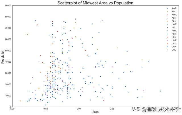
2 带边界的气泡图(Bubble plot with Encircling)
有时,您希望在边界内显示一组点以强调其重要性。 在这个例子中,你从数据框中获取记录,并用下面代码中描述的 encircle() 来使边界显示出来。
from matplotlib import patchesfrom scipy.spatial import ConvexHullimport warnings; warnings.simplefilter('ignore')sns.set_style("white")# Step 1: Prepare Datamidwest = pd.read_csv("https://raw.githubusercontent.com/selva86/datasets/master/midwest_filter.csv")# As many colors as there are unique midwest['category']categories = np.unique(midwest['category'])colors = [plt.cm.tab10(i/float(len(categories)-1)) for i in range(len(categories))]# Step 2: Draw Scatterplot with unique color for each categoryfig = plt.figure(figsize=(16, 10), dpi= 80, facecolor='w', edgecolor='k') for i, category in enumerate(categories): plt.scatter('area', 'poptotal', data=midwest.loc[midwest.category==category, :], s='dot_size', cmap=colors[i], label=str(category), edgecolors='black', linewidths=.5) # "c=" 修改为 "cmap=",Python数据之道 备注# Step 3: Encircling# https://stackoverflow.com/questions/44575681/how-do-i-encircle-different-data-sets-in-scatter-plotdef encircle(x,y, ax=None, **kw): if not ax: ax=plt.gca() p = np.c_[x,y] hull = ConvexHull(p) poly = plt.Polygon(p[hull.vertices,:], **kw) ax.add_patch(poly)# Select data to be encircledmidwest_encircle_data = midwest.loc[midwest.state=='IN', :] # Draw polygon surrounding vertices encircle(midwest_encircle_data.area, midwest_encircle_data.poptotal, ec="k", fc="gold", alpha=0.1)encircle(midwest_encircle_data.area, midwest_encircle_data.poptotal, ec="firebrick", fc="none", linewidth=1.5)# Step 4: Decorationsplt.gca().set(xlim=(0.0, 0.1), ylim=(0, 90000), xlabel='Area', ylabel='Population')plt.xticks(fontsize=12); plt.yticks(fontsize=12)plt.title("Bubble Plot with Encircling", fontsize=22)plt.legend(fontsize=12) plt.show() 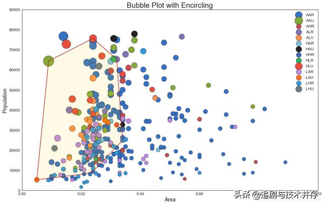
3 带线性回归最佳拟合线的散点图 (Scatter plot with linear regression line of best fit)
如果你想了解两个变量如何相互改变,那么最佳拟合线就是常用的方法。 下图显示了数据中各组之间最佳拟合线的差异。 要禁用分组并仅为整个数据集绘制一条最佳拟合线,请从下面的sns.lmplot()调用中删除hue ='cyl’参数。
# Import Datadf = pd.read_csv("https://raw.githubusercontent.com/selva86/datasets/master/mpg_ggplot2.csv")df_select = df.loc[df.cyl.isin([4,8]), :]# Plotsns.set_style("white")gridobj = sns.lmplot(x="displ", y="hwy", hue="cyl", data=df_select, height=7, aspect=1.6, robust=True, palette='tab10', scatter_kws=dict(s=60, linewidths=.7, edgecolors='black'))# Decorationsgridobj.set(xlim=(0.5, 7.5), ylim=(0, 50))plt.title("Scatterplot with line of best fit grouped by number of cylinders", fontsize=20)plt.show()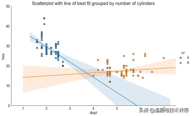
针对每列绘制线性回归线
或者,可以在其每列中显示每个组的最佳拟合线。 可以通过在 sns.lmplot() 中设置 col=groupingcolumn 参数来实现,如下:
# Import Datadf = pd.read_csv("https://raw.githubusercontent.com/selva86/datasets/master/mpg_ggplot2.csv")df_select = df.loc[df.cyl.isin([4,8]), :]# Each line in its own columnsns.set_style("white")gridobj = sns.lmplot(x="displ", y="hwy", data=df_select, height=7, robust=True, palette='Set1', col="cyl", scatter_kws=dict(s=60, linewidths=.7, edgecolors='black'))# Decorationsgridobj.set(xlim=(0.5, 7.5), ylim=(0, 50))plt.show()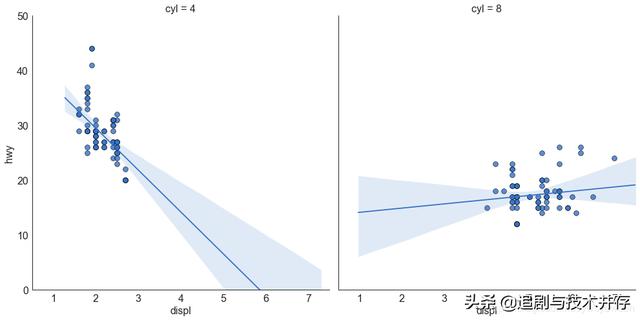
4 抖动图 (Jittering with stripplot)
通常,多个数据点具有完全相同的 X 和 Y 值。 结果,多个点绘制会重叠并隐藏。 为避免这种情况,请将数据点稍微抖动,以便您可以直观地看到它们。 使用 seaborn 的 stripplot() 很方便实现这个功能。
# Import Datadf = pd.read_csv("https://raw.githubusercontent.com/selva86/datasets/master/mpg_ggplot2.csv")# Draw Stripplotfig, ax = plt.subplots(figsize=(16,10), dpi= 80) sns.stripplot(df.cty, df.hwy, jitter=0.25, size=8, ax=ax, linewidth=.5)# Decorationsplt.title('Use jittered plots to avoid overlapping of points', fontsize=22)plt.show() 最低0.47元/天 解锁文章


 345
345

 被折叠的 条评论
为什么被折叠?
被折叠的 条评论
为什么被折叠?
 到【灌水乐园】发言


