


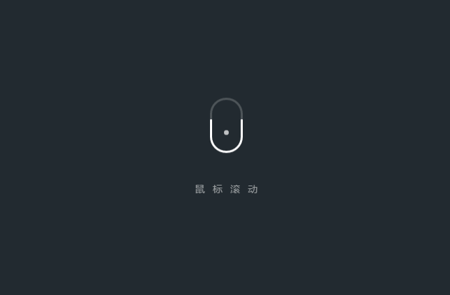
一款提示鼠标滚动的CSS3动画,既有动画效果又有文字提示,简单又大气,适合用在需要鼠标滚动才能看到效果的场景,喜欢的童鞋请收下把。
查看演示
下载资源:
12
次 下载资源
下载积分:
10
积分
页面的head部分,除了使用了:before和:after的CSS选择器外,还用了比较多的关键帧动画,部分代码如下: body {
display: -webkit-box;
display: -ms-flexbox;
display: flex;
-webkit-box-orient: vertical;
-webkit-box-direction: normal;
-ms-flex-direction: column;
flex-direction: column;
-webkit-box-align: center;
-ms-flex-align: center;
align-items: center;
-webkit-box-pack: center;
-ms-flex-pack: center;
justify-content: center;
height: 100vh;
background-color: #222a30;
}
p {
margin-top: 50px;
font-family: 'Microsoft YaHei','Lantinghei SC','Open Sans',Arial,'Hiragino Sans GB','STHeiti','WenQuanYi Micro Hei','SimSun',sans-serif;
letter-spacing: 12px;
text-indent: 12px;
color: #ffffff;
-webkit-animation: colorText 5s ease-out infinite, nudgeText 5s ease-out infinite;
animation: colorText 5s ease-out infinite, nudgeText 5s ease-out infinite;
}
.mouse {
background: #4e5559 -webkit-linear-gradient(transparent 0%, transparent 50%, #ffffff 50%, #ffffff 100%);
background: #4e5559 linear-gradient(transparent 0%, transparent 50%, #ffffff 50%, #ffffff 100%);
position: relative;
width: 52px;
height: 88px;
background-size: 100% 100%;
border-radius: 100px;
background-size: 225%;
-webkit-animation: colorSlide 5s linear infinite, nudgeMouse 5s ease-out infinite;
animation: colorSlide 5s linear infinite, nudgeMouse 5s ease-out infinite;
}
.mouse:before, .mouse:after {
content: "";
position: absolute;
top: 0;
right: 0;
bottom: 0;
left: 0;
margin: auto;
}
.mouse:before {
width: 46px;
height: 82px;
background-color: #222a30;
border-radius: 100px;
}
.mouse:after {
background-color: #ffffff;
width: 10px;
height: 10px;
border-radius: 100%;
-webkit-animation: trackBallSlide 5s linear infinite;
animation: trackBallSlide 5s linear infinite;
}
@-webkit-keyframes colorSlide {
0% {
background-position: 0% 100%;
}
20% {
background-position: 0% 0%;
}
21% {
background-color: #4e5559;
}
29.99% {
background-color: #ffffff;
background-position: 0% 0%;
}
30% {
background-color: #4e5559;
background-position: 0% 100%;
}
50% {
background-position: 0% 0%;
}
51% {
background-color: #4e5559;
}
59.99% {
background-color: #ffffff;
background-position: 0% 0%;
}
60% {
background-color: #4e5559;
background-position: 0% 100%;
}
80% {
background-position: 0% 0%;
}
81% {
background-color: #4e5559;
}
89.99%, 100% {
background-color: #ffffff;
}
}
页面的body部分,一个div容器放鼠标滚动动画,另一个p标签显示文字提示内容,代码如下:
鼠标滚动


 530
530


 被折叠的 条评论
为什么被折叠?
被折叠的 条评论
为什么被折叠?
 到【灌水乐园】发言


