


居中是面试中常考的问题,涉及到 文字居中 和 块元素 居中两种。
先介绍一下几个常见的属性,了解他们的含义再介绍用法
1. 常见的属性
vertical-align: center、text-align: center、margin: 0 auto
vertical-align用来指定行内元素(inline)或表格单元格(table-cell)元素的垂直对齐方式。text-alignCSS属性定义行内内容(例如文字)如何相对它的块父元素对齐。
margin: 0 auto 设置对象上下间距为0,左右自动。是为了让DIV在浏览器中水平居中。布局居中、水平居中,均加入margin:0 auto即可。
关于margin: auto 的工作原理:https://www.hongkiat.com/blog/css-margin-auto/
2. 块元素居中
下面所有的示例的html如下:
<div class="outer">
    <div class="inner">居中</div>
</div>
后面仅展示样式代码,html代码不再赘述
2.1 块元素水平居中 margin: 0 auto
<style>
    .outer{
        width: 500px;
        height: 500px;
        background-color: pink;
    }
    .inner{
        height: 100px;
        width:100px;
        background-color: gray;
        margin: 0 auto;
    }
</style>
2.2 块元素垂直水平居中 position+transform
.outer{
        width: 500px;
        height: 500px;
        background-color: pink;
        position: relative;
    }
    .inner{
        height: 100px;
        width:100px;
        background-color: gray;
        position: absolute;
        top: 50%;
        left: 50%;
        transform: translate(-50%, -50%);
    }
之前看了很多文档都会这样写,没多长时间就忘了,这里仔细掰扯一下原因。
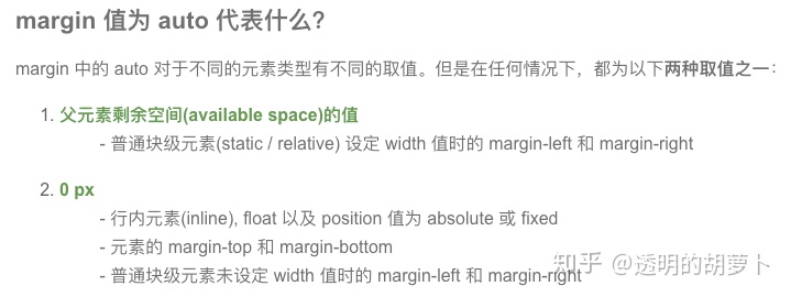
- 首先看到outer的样式中有 position:relative;众所周知,relative属性表示该元素相对其在文档流中正常的位置而言。为什么这里需要加上这一句呢?当我们把这一行注释掉,页面是这样的:
显而易见,此时的inner相对html根元素居中了,所以如果不给outer加position:relative;inner 的样式position:absolute表示相对父元素位置固定,并且脱离正常的文档流,此时灰色的块元素的父亲元素就是html根元素。
- top:50%, left: 50%,transform: translate(-50%, -50%)
假如此时的样式代码是这样的:
.outer{
width: 500px;
height: 500px;
background-color: pink;
position: relative;
}
.inner{
height: 100px;
width:100px;
background-color: gray;
position: absolute;
top: 50%;
left: 50%;
/*transform: translate(-50%, -50%);*/
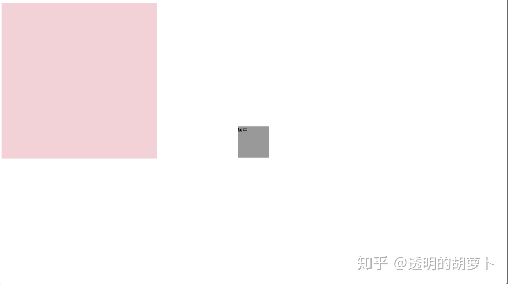
}页面是这样的:
此时的灰色矩形并没有居中,如果将transform: translate(-50%, -50%)这行注释去掉,灰色矩形就正常居中了,符合预期效果~
这里的 transform: translate(-50%, -50%) 就是将灰色矩形想 左边 移动 50%的矩形的宽和向上50%高的距离。
transform:translate(X, Y) 当X和Y是正值(具体数值)的时候就向右和下分别移动X和Y的距离。如果是负值,就向相反的方向移动。
2.3 flex 块元素垂直水平居中
.outer{
        width: 500px;
        height: 500px;
        background-color: pink;
        display: flex;
        /*使得子项目水平居中*/
        justify-content: center;
        /*使得子项目垂直居中*/
        align-items: center;
    }
    .inner{
        height: 100px;
        width:100px;
        background-color: gray;
    }
2.4 块元素垂直水平居中:position+top+left+right+bottom+margin
如果没有设置margin: auto,效果就不符合预期;top:0,left:0,right:0,bottom:0本质目的,是让子盒子四边与父容器间距为0,然后margin: auto平分剩余空间
If all three of 'left', 'width', and 'right' are 'auto': First set any 'auto' values for 'margin-left' and 'margin-right' to 0......
If none of the three is 'auto': If both 'margin-left' and 'margin-right' are 'auto', solve the equation under the extra constraint that the two margins get equal values, unless this would make them negative......
If all three of 'top', 'height', and 'bottom' are auto, set 'top' to the static position and apply rule number three below.
If none of the three are 'auto': If both 'margin-top' and 'margin-bottom' are 'auto', solve the equation under the extra constraint that the two margins get equal values. https://www. w3.org/TR/CSS21/visudet .html#abs-non-replaced-width
.outer{
        width: 500px;
        height: 500px;
        background-color: pink;
        position: relative;
    }
    .inner{
        height: 100px;
        width:100px;
        background-color: gray;
        position: absolute;
        top: 0;
        left: 0;
        right: 0;
        bottom: 0;
        margin: auto;
    }
3.文字居中
父元素设置text-align: center, 内部的文字水平居中
如何垂直居中呢?常用的方法是设置line-height等于height的值
<style>
    .outer{
        width: 500px;
        height: 500px;
        background-color: pink;
        text-align: center;
        line-height: 500px;
    }

</style>
<div class="outer">
    居中
</div>
题外话:意外发现一种向中间对齐的方式:
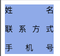
<style>
    .outer{
        width: 100px;
        height: 100px;
        background-color: cornflowerblue;
        display: inline-block;
        text-align-last: justify;
    }

</style>
<div class="outer">
    姓名
    <p>联系方式</p>
    <p>手机号</p>
</div>


 274
274


 被折叠的 条评论
为什么被折叠?
被折叠的 条评论
为什么被折叠?
 到【灌水乐园】发言


