


文档:https://cn.vuejs.org/v2/guide/forms.html#ad
基本用法
使用vue脚手架
- 安装Nodejs
- 安装yarn:https://yarn.bootcss.com/docs/install/#windows-stable
- 安装 Vue CLI
npm install -g @vue/cli
# OR
yarn global add @vue/cli- 创建项目:
vue create . - yes 后回车
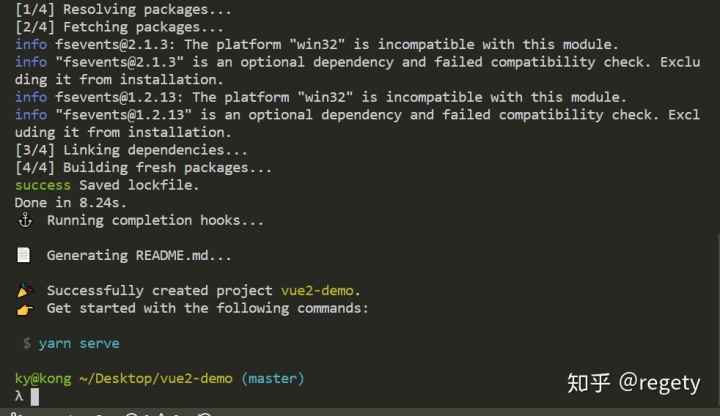
安装完毕,接下来可以运行 vue代码了,运行 yarn serve 实时预览
input
//尝试着对message进行修改:
<input v-model="message" placeholder="edit me">
<p>Message is: {{ message }}</p>

export default {
  name: 'App',
  data(){
    return {
      message: 'hi'
    }
  }
}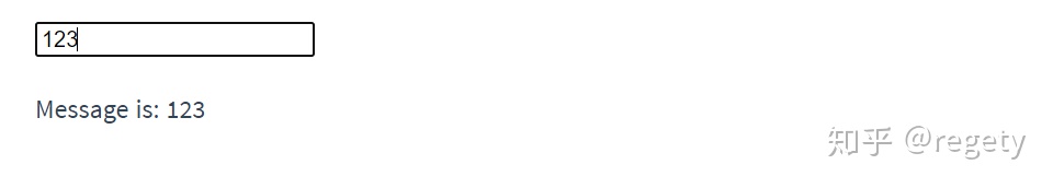
改内存的东西页面会跟着改变,这就是双向绑定
textarea
<textarea v-model="message" placeholder="edit me"></textarea>
<p>Message is: {{ message }}</p>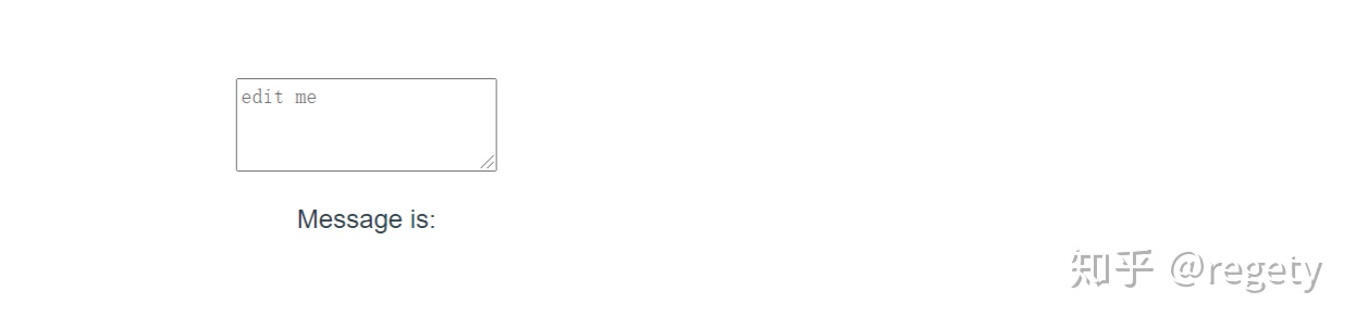
checkbox
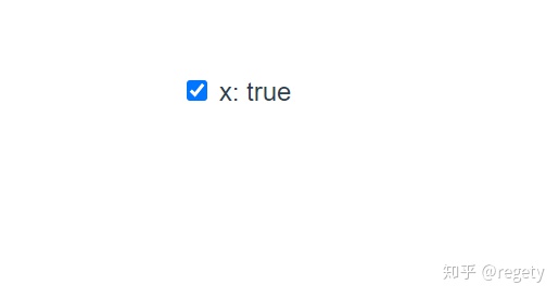
// 单个绑定布尔值
<label>
<input type="checkbox" v-model="x">
<span>x: {{x}}</span>
</label>
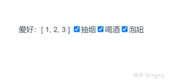
// 多个绑定数组
// 单选框用radio,最好加上name,表示是一组的
<div id="app">
爱好:{{x}}
<label>
<input name="want" type="checkbox" v-model="x" :value="1">
<span>抽烟</span>
</label>
<label>
<input name="want" type="checkbox" v-model="x" :value="2">
<span>喝酒</span>
</label>
<label>
<input name="want" type="checkbox" v-model="x" :value="3">
<span>泡妞</span>
</label>
</div>
export default {
name: 'App',
data(){
return {
x: []
}
}
}
select
<div id="app">
    想要:{{x}}
    <hr />
    <select v-model="x">
      <option v-for="item in array" :value="item.value" :key="item.value">{{item.text}}</option>
    </select>
</div>

export default {
  name: 'App',
  data(){
    return {
      array: [
        {text: '抽烟', value: 1},
        {text: '喝酒', value: 2},
        {text: '泡妞', value: 3}
      ],
      x: ""
    }
  }
}
// 多选用 multiple,shift+点击,ctrl+点击
form
<div id="app">
    登录
    <form @submit.prevent="onSubmit" action="">
      <label for="">
        <span>用户名</span>
        <input type="text" v-model="user.username" />
      </label>
       <label for="">
        <span>密码</span>
        <input type="password" v-model="user.password"/>
      </label>
      <button type="submit">登录</button>
  </form>
</div>

export default {
  name: 'App',
  data(){
    return {
      user:{
        username: '',
        password: ''
      },
      x: ""
    }
  },
  methods: {
  	onSubmit(){
      console.log(this.user)
    }
  }
}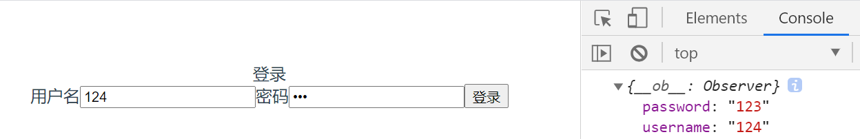
想要回车提交必须要有form和button
修饰符
.lazy
<input type="text" v-model.lazy="user.username" />
// 不那么快变化
默认使用 input 事件,input时间包括键盘、鼠标、任何输入设备的输入
.number
只要数字
<input type="text" v-model.number="user.username" />
// 只要数字的名字,如果数据类型是number,那么最好使用.number修饰符
.trim
去掉多余空格
<input type="text" v-model.trim="user.username" />
v-model
等价写法
文档:https://cn.vuejs.org/v2/guide/components-custom-events.html#%E8%87%AA%E5%AE%9A%E4%B9%89%E7%BB%84%E4%BB%B6%E7%9A%84-v-model
<input type="text" v-model.trim="user.username" />
// 相当于
<input type="text" :value="user.username" @input="user.username = $event.target.value"/>
// 如果是 .sync 的话就直接等于 $eventv-model等价写法就是绑定:value等于一个东西,然后@input让这个东西等于 $event.target.value
自定义input
<template>
  <div class="red wrapper">
    <input :value="value" @input="onInput" />
  </div>
</template>

<script>
export default {
  name: 'MyInput',
  props: {
    value: {
      type: String
    }
  },
  methods: {
    onInput(e){
      const value = e.target.value
      this.$emit('input', value)
    }
  }
}
// 要么使用 :value 与 @input 组合,要么使用 v-model
使用 Ant-Design-Vue
安装与引入使用
npm install ant-design-vue --save
// 或者
yarn add ant-design-vue

// 全局引用
import Antd from 'ant-design-vue';
import 'ant-design-vue/dist/antd.css';
Vue.use(Antd);

// 局部引用
import { Button, message } from 'ant-design-vue';
Vue.use(Button);
Vue.prototype.$message = message;
登录框
<template>
  <a-form
    id="components-form-demo-normal-login"
    :form="form"
    class="login-form"
    @submit="handleSubmit"
  >
    <a-form-item>
      <a-input
        v-decorator="[
          'userName',
          { rules: [{ required: true, message: 'Please input your username!' }] },
        ]"
        placeholder="Username"
      >
        <a-icon slot="prefix" type="user" style="color: rgba(0,0,0,.25)" />
      </a-input>
    </a-form-item>
    <a-form-item>
      <a-input
        v-decorator="[
          'password',
          { rules: [{ required: true, message: 'Please input your Password!' }] },
        ]"
        type="password"
        placeholder="Password"
      >
        <a-icon slot="prefix" type="lock" style="color: rgba(0,0,0,.25)" />
      </a-input>
    </a-form-item>
    <a-form-item>
      <a-checkbox
        v-decorator="[
          'remember',
          {
            valuePropName: 'checked',
            initialValue: true,
          },
        ]"
      >
        Remember me
      </a-checkbox>
      <a class="login-form-forgot" href="">
        Forgot password
      </a>
      <a-button type="primary" html-type="submit" class="login-form-button">
        Log in
      </a-button>
      Or
      <a href="">
        register now!
      </a>
    </a-form-item>
  </a-form>
</template>

<script>
export default {
  beforeCreate() {
    this.form = this.$form.createForm(this, { name: 'normal_login' });
  },
  methods: {
    handleSubmit(e) {
      e.preventDefault();
      this.form.validateFields((err, values) => {
        if (!err) {
          console.log('Received values of form: ', values);
        }
      });
    },
  },
};
</script>
<style>
#components-form-demo-normal-login .login-form {
  max-width: 300px;
}
#components-form-demo-normal-login .login-form-forgot {
  float: right;
}
#components-form-demo-normal-login .login-form-button {
  width: 100%;
}
</style>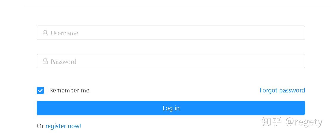
校验规则
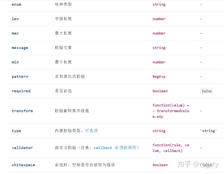
校验示例:
v-decorator="[
  'password',
  { rules: [{ required: true, message: '你丫没填密码!'},{ min: 8, message: '密码最少8个字符,'}, {pattern: /[a-zA-z]/, message: '必须包含至少一个字母'}] }
]"
具体用法看文档:https://antdv.com/docs/vue/introduce-cn/


 扫一扫
扫一扫
 5310
5310

 被折叠的 条评论
为什么被折叠?
被折叠的 条评论
为什么被折叠?
 到【灌水乐园】发言


