


一、文本样式
1. 文字超出部分显示省略号
单行文本的溢出显示省略号(一定要有宽度)
 p{
    width:200rpx;
    overflow: hidden;
    text-overflow:ellipsis;
    white-space: nowrap;
 }
复制代码
多行文本溢出显示省略号
p {
    display: -webkit-box;
    -webkit-box-orient: vertical;
    -webkit-line-clamp: 3;
    overflow: hidden;
 }
复制代码
2. 文字垂直居中
单行文字的垂直居中
解决方案:line-height 方法
height 和 line-height 同样的高度
.box{
    width:200px;
    height:100px;
    line-height:100px;
}
多行文字的垂直居中
解决方案:vertical-align 方法
.box{
  width:500px;
  height:100px;
  vertical-align:middle;
  display:table-cell;
}
复制代码
3. 首行缩进
<p style="text-indent:2em;">这是一段内容文字,这是一段内容文字</p>
复制代码
4. 首字下沉
p:first-letter{
     font-size:40px;
     float: left;
     color:red;
  }
复制代码
5. 中英文自动换行
- word-break:break-all;只对英文起作用,以字母作为换行依据
- word-wrap:break-word; 只对英文起作用,以单词作为换行依据
- white-space:pre-wrap; 只对中文起作用,强制换行
- white-space:nowrap; 强制不换行,都起作用
p{
word-wrap: break-word;
white-space: normal;
word-break: break-all;
}
复制代码
6. 文字阴影
text-shadow 为网页字体添加阴影,通过对text-shadow属性设置相关的属性值。
属性与值的说明如下:
text-shadow: [X-offset,Y-offset,Blur,Color];
X-offset:指阴影居于字体水平偏移的位置。
Y-offset:指阴影居于字体垂直偏移的位置。
Blur:指阴影的模糊值。
color:指阴影的颜色;
h1
{
text-shadow: 5px 5px 5px #FF0000;
}
复制代码
体验一下
7. 设置 input 中 placeholder 的字体样式
input::-webkit-input-placeholder { /* Chrome/Opera/Safari */
  color: red;
}
input::-moz-placeholder { /* Firefox 19+ */
  color: red;
}
input:-ms-input-placeholder { /* IE 10+ */
  color: red;
}
input:-moz-placeholder { /* Firefox 18- */
  color: red;
}
复制代码
二、布局样式
1. div 垂直居中
  <div class="box-wrap">
     <div class="box"></div>
  </div>
复制代码
固定高宽 div 垂直居中
.box{
    position: absolute;
    top: 50%;
    left: 50%;
    background-color: red;
    width: 100px;
    height: 100px;
    margin: -50px 0 0 -50px;
  }
复制代码
不固定高宽 div 垂直居中的方法
- 方法一:伪元素和 inline-block / vertical-align(兼容 IE8)
.box-wrap:before {
      content: '';
      display: inline-block;
      height: 100%;
      vertical-align: middle;
      margin-right: -0.25em; //微调整空格
   }
.box {
     display: inline-block;
     vertical-align: middle;
   }
复制代码- 方法二:flex(不兼容 ie8 以下)
.box-wrap {
     height: 300px;
     justify-content:center;
     align-items:center;
     display:flex;
     background-color:#666;
   }
复制代码- 方法三:transform(不兼容 ie8 以下)
 .box-wrap {
     width:100%;
     height:300px;
     background:rgba(0,0,0,0.7);
     position:relative;
  }
.box{
    position:absolute;
    left:50%;
    top:50%;
    transform:translateX(-50%) translateY(-50%);
    -webkit-transform:translateX(-50%) translateY(-50%);
  }
复制代码- 方法四:设置 margin:auto(该方法得严格意义上的非固定宽高,而是 50%的父级的宽高。)
.box-wrap {
    position: relative;
    width:100%;
    height:300px;
    background-color:#f00;
}
.box-content{
    position: absolute;
    top:0;
    left:0;
    bottom:0;
    right:0;
    width:50%;
    height:50%;
    margin:auto;
    background-color:#ff0;
}
复制代码
2. 清除浮动
- 方法一:父级 div 定义 height 原理:父级 div 手动定义 height,就解决了父级 div 无法自动获取到高度的问题。
优点:简单,代码少,容易掌握
缺点:只适合高度固定的布局,要给出精确的高度,如果高度和父级 div 不一样时,会产生问题
建议:不推荐使用,只建议高度固定的布局时使用
评分:★★☆☆☆
<style type="text/css">
.div1{background:#000080;border:1px solid red;/*解决代码*/height:200px;}
.div2{background:#800080;border:1px solid red;height:100px;margin-top:10px}
.left{float:left;width:20%;height:200px;background:#DDD}
.rightright{float:rightright;width:30%;height:80px;background:#DDD}
</style>

<div class="div1">
    <div class="left">Left</div>
    <div class="right">Right</div>
</div>
<div class="div2">
    div2
</div>
复制代码- 方法二:结尾处加空 div 标签 clear:both
原理:添加一个空 div,利用 css 提高的 clear:both 清除浮动,让父级 div 能自动获取到高度
优点:简单,代码少,浏览器支持好,不容易出现怪问题
缺点:不少初学者不理解原理;如果页面浮动布局多,就要增加很多空 div,让人感觉很不爽
建议:不推荐使用,但此方法是以前主要使用的一种清除浮动方法
评分:★★★☆☆
<style type="text/css">
.div1{background:#000080;border:1px solid red;}
.div2{background:#800080;border:1px solid red;height:100px;margin-top:10px}
.left{float:left;width:20%;height:200px;background:#DDD}
.rightright{float:rightright;width:30%;height:80px;background:#DDD}
/*清除浮动代码*/
.clearfloat:after{display:block;clear:both;content:"";visibility:hidden;height:0}
.clearfloat{zoom:1}
</style>

<div class="div1 clearfloat">
    <div class="left">Left</div>
    <div class="right">Right</div>
</div>
<div class="div2">
    div2
</div>
复制代码- 方法三:父级 div 定义 overflow:hidden
原理:必须定义 width 或 zoom:1,同时不能定义 height,使用 overflow:hidden 时,浏览器会自动检查浮动区域的高度
优点:简单,代码少,浏览器支持好
缺点:不能和 position 配合使用,因为超出的尺寸的会被隐藏。
建议:只推荐没有使用 position 或对 overflow:hidden 理解比较深的朋友使用。
评分:★★★☆☆
<style type="text/css">
.div1{background:#000080;border:1px solid red;/*解决代码*/width:98%;overflow:hidden}
.div2{background:#800080;border:1px solid red;height:100px;margin-top:10px;width:98%}
.left{float:left;width:20%;height:200px;background:#DDD}
.rightright{float:rightright;width:30%;height:80px;background:#DDD}
</style>

<div class="div1">
    <div class="left">Left</div>
    <div class="right">Right</div>
</div>
<div class="div2">
    div2
</div>
复制代码来源:http://blog.csdn.net/qq_42354773…
三、CSS 常见问题
1. IOS 页面滑动卡顿
body,html{
    -webkit-overflow-scrolling: touch;
}
复制代码
2. css 滚动条仿 ios
::-webkit-scrollbar{
    width: 5px;
    height: 5px;
  }
::-webkit-scrollbar-thumb{
    border-radius: 1em;
    background-color: rgba(50,50,50,.3);
  }
::-webkit-scrollbar-track{
    border-radius: 1em;
    background-color: rgba(50,50,50,.1);
  }

复制代码
3. 实现隐藏滚动条同时又可以滚动
.demo::-webkit-scrollbar {
display: none; /* Chrome Safari */
}
.demo {
scrollbar-width: none; /* firefox */
-ms-overflow-style: none; /* IE 10+ */
overflow-x: hidden;
overflow-y: auto;
}
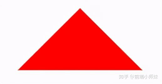
复制代码3. CSS 绘制三角形
实现一个简单的三角形
div {
    width: 0;
    height: 0;
    border-width: 0 40px 40px;
    border-style: solid;
    border-color: transparent transparent red;
}
复制代码
效果如下:
实现带边框的三角形
<div id="blue"><div>

#blue {
    position:relative;
    width: 0;
    height: 0;
    border-width: 0 40px 40px;
    border-style: solid;
    border-color: transparent transparent blue;
}
#blue:after {
    content: "";
    position: absolute;
    top: 1px;
    left: -38px;
    border-width: 0 38px 38px;
    border-style: solid;
    border-color: transparent transparent yellow;
}
复制代码
效果如下:
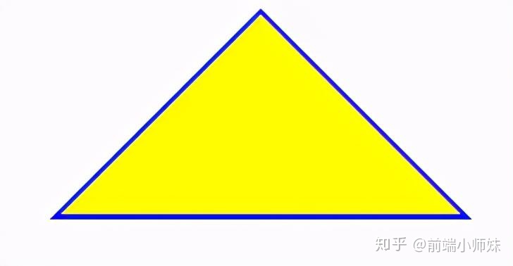
注: 如果想绘制右直角三角,则将左 border 设置为 0;如果想绘制左直角三角,将右 border 设置为 0 即可(其它情况同理)。
来源:http://www.jianshu.com/p/9a463d50e…
4. 表格边框合并
table,tr,td{
  border: 1px solid #666;
}
table{
  border-collapse: collapse;
}
复制代码
5. CSS 选取第 n 个标签元素
- first-child first-child 表示选择列表中的第一个标签。
- last-child last-child 表示选择列表中的最后一个标签
- nth-child(3) 表示选择列表中的第 3 个标签
- nth-child(2n) 这个表示选择列表中的偶数标签
- nth-child(2n-1) 这个表示选择列表中的奇数标签
- nth-child(n+3) 这个表示选择列表中的标签从第 3 个开始到最后。
- nth-child(-n+3) 这个表示选择列表中的标签从 0 到 3,即小于 3 的标签。
- nth-last-child(3) 这个表示选择列表中的倒数第 3 个标签。
使用方法:
li:first-child{}
复制代码
6. onerror 处理图片异常
使用 onerror 异常处理时,若 onerror 的图片也出现问题,则图片显示会陷入死循环,所以要在赋值异常图片之后,将地址置空
<img onerror="this.src='url;this.onerror=null'" />
复制代码
7. 移动端软键盘变为搜索方式
默认情况下软键盘上该键位为前往或者确认等文字,要使其变为搜索文字,需要在 input 上加上 type 声明:
<form action="#">
    <input type="search" placeholder="请输入..." name="search" />
</form>

复制代码
需要一个 form 标签套起来,并且设置 action 属性,这样写完之后输入法的右下角就会自动变成搜索
同时,使用了 search 类型后,搜索框上会默认自带删除按钮
如需屏蔽,可以使用如下方式:
 input[type="search"]::-webkit-search-cancel-button{
     -webkit-appearance: none;
  }
作者:Yushia
链接:https://juejin.im/post/6894070137218203656
来源:掘金
著作权归作者所有。商业转载请联系作者获得授权,非商业转载请注明出处。


 2万+
2万+

 被折叠的 条评论
为什么被折叠?
被折叠的 条评论
为什么被折叠?
 到【灌水乐园】发言


