


一、引言
关于WPF早在一年前就已经看过《深入浅出WPF》这本书,当时看完之后由于没有做笔记,以至于我现在又重新捡起来并记录下学习的过程,本系列将是一个WPF快速入门系列,主要介绍WPF中主要的几个不同的特性,如依赖属性、命令、路由事件等。
在正式介绍之前,我还想分享下为什么我又要重新捡起来WPF呢?之前没有记录下来的原来主要是打算走互联网方向的,后面发现互联网方向经常加班,又累,有时候忙的连自己写了什么都不知道的,所以后面机缘巧合地进了一家外企,在外企不像互联网行业那样,比较清楚,有更多的时间去理清楚自己所学习到的知识,其中同时也发现了WPF的重要性和应用场景,在一些美资企业和印度的公司,客户端都非常喜欢用WPF来做演示的客户端,所以,自然走上外企这条路,所以就打算好好研究下WPF了,所以也就有了这个系列。
二、WPF的自我介绍
Windows Presentation Foudation,WPF是下一代显示系统,用来生成能带给用户震撼视觉体验的Windows客户端应用程序。WPF的核心是一个与分辨率无关并且基于向量的程序引擎,目的在于利用现代图形硬件的优势。WPF在.NET Framework 3.0中被微软引入到.NET Framework类库中,并且在.NET 3.5、4.0 和4.5都有所更新。WPF可以理解为是实现下一代Windows 桌面应用程序的技术,在之前我们通常会使用MFC或Winform来实现Windows桌面程序。
WPF除了引入了新的API之前,还引入了一些新的概念,这些新的概念会在本系列中一一介绍。众所周知,在实现桌面应用程序之前,第一步必然是对窗体进行布局,WPF为了更好地实现布局,提供了很多布局控件,下面就让我们一起去看看WPF布局组件。
三、WPF布局详解
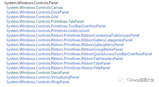
WPF的布局控件都继承于System.Windows.Controls.Panel这个类,本文主要介绍在Panel基类下的几个常用的布局控件。下图是布局控件的继承关系:
3.1 WPF布局过程
WPF布局包括两个阶段:一个测量(measure)阶段和一个排列(arrange)阶段。在测量阶段,容器遍历所有子元素,并询问子元素它们所期望的大小。在排列阶段,容器在合适的位置放置子元素。WPF布局可以理解为一个递归过程,它会递归对布局控件内的每个子元素进行大小调整,定位和绘制,最后进行呈现,直到递归所有子元素为止,这样也就完成了整个布局过程。
布局系统为每个子元素完成了两个处理过程:测量处理和排列处理。每个Panel都提供了自己的MeasureOverride和ArrangeOverride方法,以实现自己特定的布局行为。所以,你如果想自定义布局控件,也可以重新这两个方法来达到,关于自定义布局控件会在后面介绍到。
3.2 Canvas 布局控件
Canvas面板是最轻量级的布局容器,它不会自动调整内部元素的排列和大小,不指定元素位置,元素将默认显示在画布的左上方。Canvas主要用来画图。Canvas默认不会自动裁剪超过自身范围的内容,即溢出的内容会显示在Canvas外面,这是因为Canvas的ClipToBounds属性默认值是false,我们可以显式地设置为true来裁剪多出的内容。下面XAML代码简单演示了Canvas面板的使用。
<Canvas Margin="10,10,10,10" Background="White" > <Rectangle Name="rect" Canvas.Left="300" Canvas.Top="180" Fill="Black" Stroke="Red" Width="200" Height="200"/> <Ellipse Name="el" Canvas.Left="160" Canvas.Top="150" Fill="Azure" Stroke="Green" Width="180" Height="180"/> Canvas>上面XAML实现的效果如下图所示:
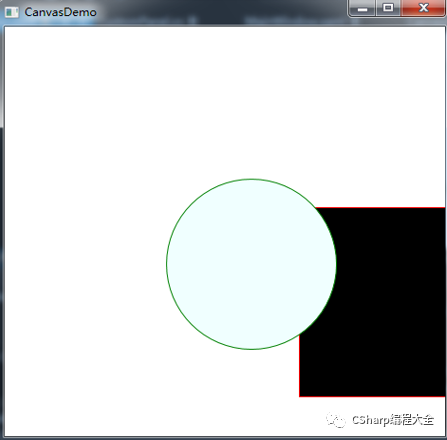
其中,矩形的右边区域以溢出Canvas面板区域,如向右拉动边框,此时Canvas会拉伸以填满可用空间,此时就可以看到矩形溢出的部分。但Canvas面板内的控件不会改变其尺寸和位置。对应的C#代码实现如下所示:
public partial class CanvasDemo : Window { public CanvasDemo() { InitializeComponent(); Canvas canv = new Canvas(); canv.Margin = new Thickness(10, 10, 10, 10); canv.Background = new SolidColorBrush(Colors.White); // 把canv添加为窗体的子控件 this.Content = canv; // Rectangle Rectangle rect = new Rectangle(); rect.Fill = new SolidColorBrush(Colors.Black); rect.Stroke = new SolidColorBrush(Colors.Red); rect.Width = 200; rect.Height = 200; rect.SetValue(Canvas.LeftProperty, (double)300); rect.SetValue(Canvas.TopProperty, (double)180); canv.Children.Add(rect); // Ellipse Ellipse el = new Ellipse(); el.Fill = new SolidColorBrush(Colors.Azure); el.Stroke = new SolidColorBrush(Colors.Green); el.Width = 180; el.Height = 180; el.SetValue(Canvas.LeftProperty, (double)160); // 必须转换为double,否则执行会出现异常 // 详细介绍见:http://msdn.microsoft.com/zh-cn/library/system.windows.controls.canvas.top(v=vs.110).aspx el.SetValue(Canvas.TopProperty, (double)150); el.SetValue(Panel.ZIndexProperty, -1); canv.Children.Add(el); // Print Zindex Value int zRectIndex = (int)rect.GetValue(Panel.ZIndexProperty); int zelIndex = (int)el.GetValue(Panel.ZIndexProperty); Debug.WriteLine("Rect ZIndex is: {0}", zRectIndex); Debug.WriteLine("Ellipse ZIndex is: {0}", zelIndex); } }从上面可以看出,即使C#代码可以实现完全一样的效果,但是需要书写更多的代码,所以,在平时开发中,对于控件的布局,一般采用XAML的方式,C#代码一般用于在运行时加载某个控件到界面中的实现。
3.3 StackPanel 布局控件
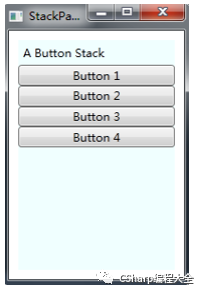
StackPanel就是将子元素按照堆栈的形式一一排列,可以通过设置StackPanel的Orientation属性设置两种排列方式:横排(Horizontal,该值为默认值)和竖排(Vertical)。纵向的StackPanel每个元素默认宽度与面板一样宽,反之横向是高度和面板一样高。如果包含的元素超过了面板控件,它会被截断多出的内容。可以通过Orientation属性来设置StackPanel是横排(设置其值为Vertical)还是竖排(设置其值为Horizontal)。下面XAML代码演示了StackPanel的使用:
<Window x:Class="WPFLayoutDemo.StackPanelDemo" xmlns="http://schemas.microsoft.com/winfx/2006/xaml/presentation" xmlns:x="http://schemas.microsoft.com/winfx/2006/xaml" Title="StackPanel" Height="300" Width="200"> <StackPanel Margin="10,10,10,10" Background="Azure"> <Label>A Button StackLabel> <Button Content="Button 1">Button> <Button>Button 2Button> <Button>Button 3Button> <Button Content="Button 4">Button> StackPanel>Window>对应的C#实现代码如下所示:
public partial class StackPanelDemo : Window { public StackPanelDemo() { InitializeComponent(); StackPanel sp = new StackPanel(); sp.Margin = new Thickness(10, 10, 10, 10); sp.Background = new SolidColorBrush(Colors.Azure); sp.Orientation = Orientation.Vertical; // 把sp添加为窗体的子控件 this.Content = sp; // Label Label lb = new Label(); lb.Content = "A Button Stack"; sp.Children.Add(lb); // Button 1 Button btn1 = new Button(); btn1.Content = "Button 1"; sp.Children.Add(btn1); // Button 2 Button btn2 = new Button(); btn2.Content = "Button 2"; sp.Children.Add(btn2); // Button 3 Button btn3 = new Button(); btn3.Content = "Button 3"; sp.Children.Add(btn3); // Button 4 Button btn4 = new Button(); btn4.Content = "Button 4"; sp.Children.Add(btn4); } }上面代码的实现效果如下图所示:
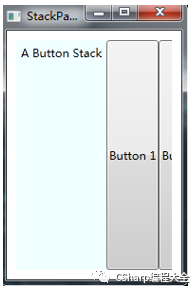
如果将StackPanel的Orientation属性设置为“Horizontal”的话,此时的效果如下图所示:
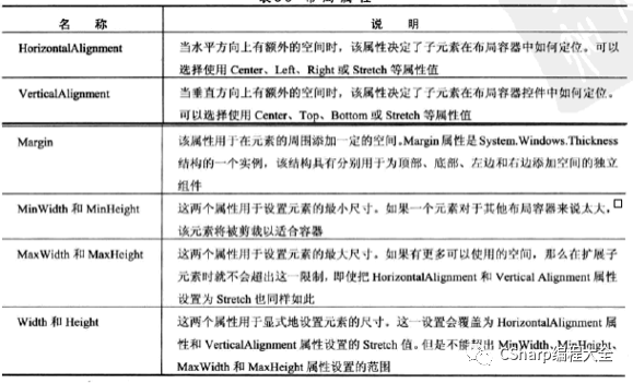
管布局由容器决定,但子元素仍然有一定的决定权,布局面板支持一些布局属性,以便与子元素结合使用,在下图中列出了这些布局属性:
3.4 WrapPanel 布局控件
WrapPanel面板在可能的空间中,一次以一行或一列的方式布置控件。默认情况下,WrapPanel.Orientation属性设置为Horizontal,控件从左向右进行排列,然后再在下一行中排列,但你可将WrapPanel.Orientation设置为Vertical,从而在多个列中放置元素。与StackPanel面板不同,WrapPanel面板实际上用来控制用户界面中一小部分的布局细节,并非用于控制整个窗口布局。
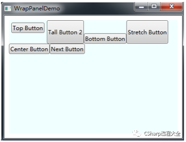
下面示例中定义了一系列具有不同对齐方式的按钮,并将这些按钮放在一个WrapPanel面板中。

<Window x:Class="WPFLayoutDemo.WrapPanelDemo" xmlns="http://schemas.microsoft.com/winfx/2006/xaml/presentation" xmlns:x="http://schemas.microsoft.com/winfx/2006/xaml" Title="WrapPanelDemo" Height="300" Width="500"> <WrapPanel Margin="10" Background="Azure"> <Button VerticalAlignment="Top" Margin="5">Top ButtonButton> <Button MinHeight="50"> Tall Button 2Button> <Button VerticalAlignment="Bottom">Bottom ButtonButton> <Button>Stretch ButtonButton> <Button VerticalAlignment="Center">Center ButtonButton> <Button>Next ButtonButton> WrapPanel>Window>
下图显示了如何对这些按钮进行换行以适应WrapPanel面板的当前尺寸,WrapPanel面板的当前尺寸由包含它的窗口尺寸决定的。在上面的例子中,WrapPanel面板水平地创建一系列假象的行,每一行的搞定都被设置为所包含元素中最高元素的高度。其他空间可能被拉伸以适应该高度,或根据VerticalAlignment属性设置进行对齐。
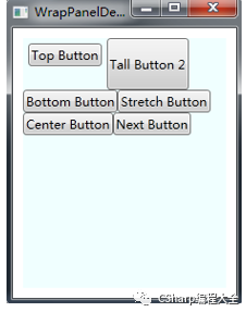
当缩小窗口大小时,对应的WrapPanel也会改变,从而改变WrapPanel面板中控件的排列,具体效果如下图所示:
3.5 DockPanel 布局控件
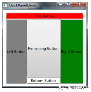
DockPanel面板定义一个区域,在此区域中,你可以使子元素通过锚点的形式进行排列。DockPanel类似于WinForm中Dock属性的功能。对于在DockPanel中的元素的停靠可以通过Panel.Dock的附加属性来设置,如果设置LastChildFill属性为true,则最后一个元素将填充剩余的所有空间。
下面XAML代码演示了DockPanel控件的使用:
<Window x:Class="WPFLayoutDemo.DockPanelDemo" xmlns="http://schemas.microsoft.com/winfx/2006/xaml/presentation" xmlns:x="http://schemas.microsoft.com/winfx/2006/xaml" Title="DockPanelDemo" Height="300" Width="300"> <DockPanel Margin="10" Background="Azure" LastChildFill="True"> <Button DockPanel.Dock="Top" Background="Red">Top ButtonButton> <Button DockPanel.Dock="Left" Background="Gray">Left ButtonButton> <Button DockPanel.Dock="Right" Background="Green">Right ButtonButton> <Button DockPanel.Dock="Bottom" Background="White">Bottom ButtonButton> <Button>Remaining ButtonButton> DockPanel>Window>运行的效果如下图所示:
.6 Grid 布局控件
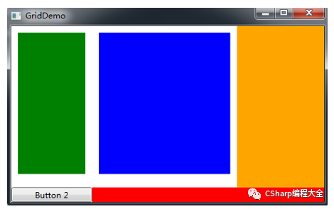
Grid比起其他Panel,功能是最多最为复杂的布局控件。它由列元素集合和行元素集合两种元素组成。而放在Grid面板中的元素必须显式采用附加属性定义其所在行和列,否则元素均默认放置在第0行第0列。下面XAML演示了Grid面板的使用:
<Window x:Class="WPFLayoutDemo.GridDemo" xmlns="http://schemas.microsoft.com/winfx/2006/xaml/presentation" xmlns:x="http://schemas.microsoft.com/winfx/2006/xaml" Title="GridDemo" Height="300" Width="480"> <Grid Width="Auto" Height="Auto"> <Grid.RowDefinitions> <RowDefinition Height="*"/> <RowDefinition Height="Auto"/> Grid.RowDefinitions> <Grid.ColumnDefinitions> <ColumnDefinition Width="120"/> <ColumnDefinition Width="150"/> <ColumnDefinition Width="*"/> <ColumnDefinition Width="2*"/> Grid.ColumnDefinitions> <Rectangle Grid.Row="0" Grid.Column="0" Fill="Green" Margin="10,10,10,20"/> <Rectangle Grid.Row="0" Grid.Column="1" Grid.ColumnSpan="2" Fill="Blue" Margin="10,10,10,20"/> <Rectangle Grid.Row="0" Grid.Column="4" Fill="Orange"/> <Button Grid.Row="1" Grid.Column="0">Button 2Button> <Rectangle Grid.Row="1" Grid.Column="1" Grid.ColumnSpan="3" Fill="Red"/> Grid>Window>定义Grid的列宽和行高可采用固定、自动和按比例三种方式定义。
第一种:固定长度——宽度不够时,元素会被裁剪,单位是pixel;
第二种:自动长度——自动匹配行中最宽元素的高度。
第三种:比例长度——"*"表示占用剩余的全部宽度或高度,两行都是*,则将剩余高度平分。像上面的一个2*,一个*,表示前者2/3宽度。
其运行效果如下图所示:
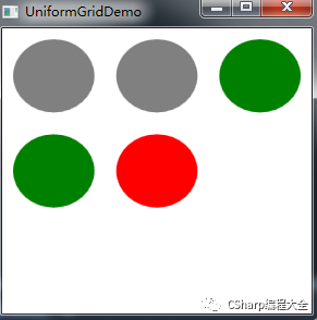
3.7 UniformGrid 布局控件
UniformGrid是Grid简化版本,不像Grid面板,UniformGrid不需要预先定义行集合和列集合,反而,通过简单设置Rows和Columns属性来设置尺寸。每个单元格始终具有相同的大小。UniformGrid每个单元格只能容纳一个元素,将自动按照在其内部的元素个数,自动创建行和列,并通过保存相同的行列数。
下面XAML演示了UniformGrid控件的使用:
<Window x:Class="WPFLayoutDemo.UniformGridDemo" xmlns="http://schemas.microsoft.com/winfx/2006/xaml/presentation" xmlns:x="http://schemas.microsoft.com/winfx/2006/xaml" Title="UniformGridDemo" Height="300" Width="300"> <UniformGrid> <Ellipse Margin="10" Fill="Gray"/> <Ellipse Margin="10" Fill="Gray"/> <Ellipse Margin="10" Fill="Green"/> <Ellipse Margin="10" Fill="Green"/> <Ellipse Margin="10" Fill="Red"/> UniformGrid>Window>在上面,并没有显示指定UniformGrid的行和列数,此时UniformGrid将自动按照元素的个数,自动创建行和列。运行效果如下图所示。最好是显式指定Rows和Columns属性,这样才能确保布局是按照你的思路去进行的。
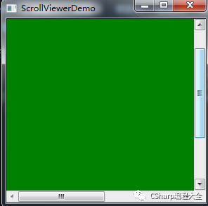
3.8 ScrollViewer 控件
通常用户界面中的内容比计算机屏幕的显示区域大的时候,可以利用ScrollViewer控件可以方便地使应用程序中的内容具备滚动功能。具体的使用示例如下所示:
<Window x:Class="WPFLayoutDemo.ScrollViewerDemo" xmlns="http://schemas.microsoft.com/winfx/2006/xaml/presentation" xmlns:x="http://schemas.microsoft.com/winfx/2006/xaml" Title="ScrollViewerDemo" Height="300" Width="300"> <Grid> <ScrollViewer HorizontalScrollBarVisibility="Visible" VerticalScrollBarVisibility="Auto"> <Rectangle Width="500" Height="400" Fill="Green"/> ScrollViewer> Grid>Window>运行效果如下图所示:
四、布局综合运用
前
前面例子都是单独介绍每个布局控件的,然而在实际开发中,程序的界面布局都是由多个布局控件一起来完成的,这里演示一个综合实验的小例子。要实现的效果图如下所示:
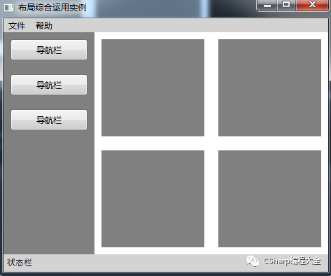
具体的XAML代码实现如下所示:
<Window x:Class="WPFLayoutDemo.MainWindow" xmlns="http://schemas.microsoft.com/winfx/2006/xaml/presentation" xmlns:x="http://schemas.microsoft.com/winfx/2006/xaml" WindowStartupLocation="CenterScreen" Title="布局综合运用实例" Height="400" Width="480"> <DockPanel Width="Auto" Height="Auto" LastChildFill="True"> <Menu Width="Auto" Height="20" Background="LightGray" DockPanel.Dock="Top"> <MenuItem Header="文件"> <MenuItem Header="保存"/> <Separator/> <MenuItem Header="退出"/> MenuItem> <MenuItem Header="帮助"> <MenuItem Header="关于本产品"/> MenuItem> Menu> <StackPanel Width="Auto" Height="25" Background="LightGray" Orientation="Horizontal" DockPanel.Dock="Bottom"> <Label Width="Auto" Height="Auto" Content="状态栏" FontFamily="Arial" FontSize="12"/> StackPanel> <StackPanel Width="130" Height="Auto" Background="Gray" DockPanel.Dock="Left"> <Button Margin="10" Width="Auto" Height="30" Content="导航栏"/> <Button Margin="10" Width="Auto" Height="30" Content="导航栏"/> <Button Margin="10" Width="Auto" Height="30" Content="导航栏"/> StackPanel> <Grid Width="Auto" Height="Auto" Background="White"> <Grid.ColumnDefinitions> <ColumnDefinition Width="*"/> <ColumnDefinition Width="*"/> Grid.ColumnDefinitions> <Grid.RowDefinitions> <RowDefinition Height="*"/> <RowDefinition Height="*"/> Grid.RowDefinitions> <Rectangle Fill="Gray" Margin="10,10,10,10" Grid.Row="0" Grid.Column="0"/> <Rectangle Fill="Gray" Margin="10,10,10,10" Grid.Row="0" Grid.Column="1"/> <Rectangle Fill="Gray" Margin="10,10,10,10" Grid.Row="1" Grid.Column="0"/> <Rectangle Fill="Gray" Margin="10,10,10,10" Grid.Row="1" Grid.Column="1"/> Grid> DockPanel>Window>五、自定义布局控件
在实际开发中,自然少不了自定义控件的开发,下面介绍下如何自定义布局控件。在前面介绍过布局系统的工作原理是先测量后排列,测量即是确定面板需要多大空间,排列则是定义面板内子元素的排列规则。所以,要实现自定义布局控件,需要继承于Panel类并重写MeasureOverride和ArrangeOverride方法即可,下面实现了一个简单的自定义布局控件:
namespace CustomLayoutControl{ public class CustomStackPanel: Panel { public CustomStackPanel() : base() { } // 重写默认的Measure方法 // avaiableSize是自定义布局控件的可用大小 protected override Size MeasureOverride(Size availableSize) { Size panelDesiredSize = new Size(); foreach (UIElement child in this.InternalChildren) { child.Measure(availableSize); // 子元素的期望大小 panelDesiredSize.Width += child.DesiredSize.Width; panelDesiredSize.Height += child.DesiredSize.Height; } return panelDesiredSize; } // 重写默认的Arrange方法 protected override Size ArrangeOverride(Size finalSize) { double x = 10; double y = 10; foreach (UIElement child in this.InternalChildren) { // 排列子元素的位置 child.Arrange(new Rect(new Point(x, y), new Size(finalSize.Width - 10, child.DesiredSize.Height))); y += child.RenderSize.Height + 5; } return finalSize; } }}控件的最终大小和位置是由该控件和父控件共同完成的,父控件会先给子控件提供可用大小(MeasureOverride中availableSize参数),子控件再反馈给父控件一个自己的期望值(DesiredSize),父控件最后根据自己所拥有的空间大小与子控件期望的值分配一定的空间给子控件并返回自己的大小。这个过程是通过MeasureOverride和ArrangeOverride这两个方法共同完成的,这里需要注意:父控件的availableSize是减去Margin、Padding等的值。
接下来,创建一个测试上面自定义布局控件的WPF项目,然后添加自定义布局控件的程序集,然后在WPF项目中MainWindows添加如下代码:
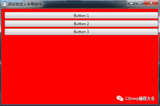
<Window x:Class="TestCustomerPanel.MainWindow" xmlns="http://schemas.microsoft.com/winfx/2006/xaml/presentation" xmlns:x="http://schemas.microsoft.com/winfx/2006/xaml" xmlns:custom="clr-namespace:CustomLayoutControl;assembly=CustomLayoutControl" Title="测试自定义布局控件" Height="350" Width="525"> <custom:CustomStackPanel Background="Red"> <Button Content="Button 1">Button> <Button Content="Button 2">Button> <Button Content="Button 3">Button> custom:CustomStackPanel>Window>运行成功后的效果如下图所示:
六、小结
到这里,WPF布局的内容就介绍结束了,这里最后只是简单地定义了一个类似StackPanel的布局控件,你还可以自定义更加复杂的布局控件
参考链接:https://www.cnblogs.com/zhili/p/WPFLayout.html


 1789
1789


 被折叠的 条评论
为什么被折叠?
被折叠的 条评论
为什么被折叠?
 到【灌水乐园】发言


