


1.先说外边距的重合如何产生的:
2个div垂直排列时,上面的div1设置了10px下外边距,下面的div2设置了20px的上外边距,这个时候div1和div2垂直方向的边距就会重合在一起,他们之间垂直方向的距离就会以边距大的值为准,所有这时垂直距离为20px,而不是10px+20px=30px。
<!DOCTYPE html>
<html lang="en">
<head>
 <meta charset="UTF-8">
 <meta name="viewport" content="width=device-width, initial-scale=1.0">
 <title>Document</title>
 <style>
 .d1{
 width: 100px;height: 100px;background-color: green;
 margin-bottom: 10px;
        }
 .d2{
 width: 100px;height: 100px;background-color: purple;
 margin-top: 20px;
        }
 </style>
</head>
<body>
 <div class="d1"></div>
 <div class="d2"></div>
</body>
</html>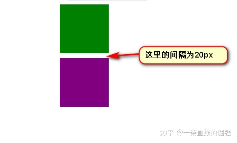
解决的方法:1.设计的时候规避,尽量单方面设置
2.其中一个使用padding来设置。
注意:只有垂直方向的时候才会存在,水平方向的时候不存在这种情况
2.再来说外边距溢出如何产生:
当父盒子没有设置边框的时候,同时内部的子盒子上边沿与父盒子上边沿重合时,这个时候就给外边距溢出提供了条件。如果这个时候给子盒子设置10px上外边距,子盒子不会相对于父盒子向下移动10px,而是父盒子向下移动10px。
<!DOCTYPE html>
<html lang="en">
<head>
 <meta charset="UTF-8">
 <meta name="viewport" content="width=device-width, initial-scale=1.0">
 <title>Document</title>
 <style>
 .d1{
 width: 100px;height: 100px;background-color: green;
        }
 .d2{
 width: 100px;height: 100px;background-color: purple;
        }
 .d3{
 width: 50px;height: 50px;background-color: blue;
 margin-top: 10px;
        }
 </style>
</head>
<body>
 <div class="d1"></div>
 <div class="d2">
      <div class="d3">
 </div>
 </div>
</body>
</html>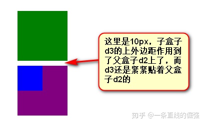
解决方法:1.给父元素添加上边框,弊端(增加了父元素实际占地高度)
2.给父元素添加上内边距,弊端(增加了父元素实际占地高度)
3.给父元素添加overflow:hidden/auto,弊端(如果想要溢出可见,就不行了)
最佳办法:4.给父元素添一个大儿子,这个大儿子必须table。
<div class="d2">
     <table></table>     <!-- 这里多了页面结构也不太好 -->
     <div class="d3">
</div>
最佳最佳办法:5.使用CSS3伪元素::before给父元素添加内容
.d2::before{
     content:"";
     display:table;
}          //这个的原理就是第4种方法
3.最后来说一说高度坍塌是如何产生的:
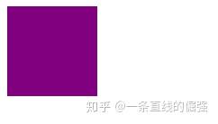
当父盒子没有设置高度时,他的高度是由他的内容撑开。一旦他的所有子元素脱离文档流,那么父元素就找到高度,就会变为0。
<!DOCTYPE html>
<html lang="en">
<!DOCTYPE html>
<html lang="en">
<head>
    <meta charset="UTF-8">
    <meta name="viewport" content="width=device-width, initial-scale=1.0">
    <title>Document</title>
    <style>
        .parent{
            width: 200px;background-color: green;
        }
        .child{
            width: 100px;height: 100px;background-color: purple;
            /* float: left; */
        }

    </style>
</head>
<body>
    <div class="parent">
        <div class="child"></div>
    </div>
</body>
</html>
解决方法:直接上最佳
  .parent::after{
            content: "";
            display: block;
            clear: both;
        }    //他的实质就是在最后父元素的最后添加一个块级小儿子,同时给他清除浮动


 1102
1102


 被折叠的 条评论
为什么被折叠?
被折叠的 条评论
为什么被折叠?
 到【灌水乐园】发言


