


两三年没有登录upwok的账号了,基本上已经被frozen了。这两天想找点事做,就去浏览了一下以前设置好的job feed,刚好看到一个做数据可视化的,练练手找找感觉吧。
这个是我看到的Job Descrption,直接上图:

于是我自己做了一个Excel的样板,和他给的表格样子差不多:

数据都是我用python的随机函数填的,下一步就是读取这个Excel文件,因为做的时候只是图快,没有去比较各个lib的优劣,选了个名字好记的 openpyxl,用起来还是比较方便:
import 取到数据还需要整理一下格式,这里用到pandas:
import numpy as np
import matplotlib.pyplot as plt
from matplotlib import rc
import pandas as pd

raw_data = {'greenBars': green_bar, 'orangeBars': orange_bar,'blueBars': blue_bar}
df = pd.DataFrame(raw_data)
再然后就是matplotlib的常规操作了,这里说一个编程思想吧,以前读书的时候,c语言的老师叫我们编程,把编程什么的吹得神乎其神,让我们觉得简直是艺术和技术都要登峰造极的人才能驾驭这项工作,以为函数什么的都是要背的,以为学编程就得手写代码几万行才算入门,以为所有的程序员都必须自己一个字符一个字符的自己敲代码,记不住的东西不能查,不能看,不能借用别人的。反正那个时候被灌输的好多好多现在看来ridiculous的观念,真的是晚开窍了很多年。这里强调一下,是我本科的时候。
不扯远了,后面这一段就是我从matplotlib官网粘贴的,当然,修改了一点点以适应我的这个脚本:
# Create green Bars
plt.bar(r, greenBars, color='#b5ffb9', edgecolor='white', width=barWidth)
# Create orange Bars
plt.bar(r, orangeBars, bottom=greenBars, color='#f9bc86', edgecolor='white', width=barWidth)
# Create blue Bars
plt.bar(r, blueBars, bottom=[i+j for i,j in zip(greenBars, orangeBars)], color='#a3acff', edgecolor='white', width=barWidth)
# Show graphic
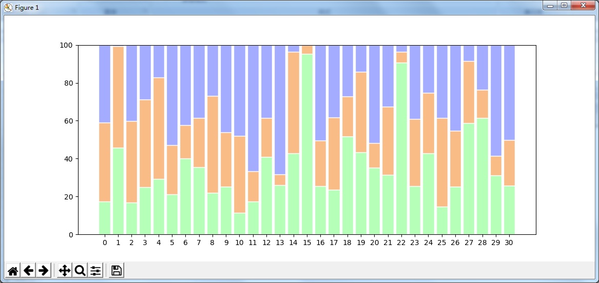
plt.show()最后出了一个效果,这个图表似乎叫做 Percentage Stacked Bar Chart:


 173
173


 被折叠的 条评论
为什么被折叠?
被折叠的 条评论
为什么被折叠?
 到【灌水乐园】发言


