


0.篇首
本篇文章继续在 Iris 的基础上做数据可视化处理。在前两篇文章中,我们分别使用了直方图、KDE 以及一个十分抽象的三维图展示了 Iris 数据集。这些图都很清晰地把三个 Species 区分开来。但是,每一个 Specie 内部的数据分布又是怎么样呢?
本篇文章将从统计学常用的几个概念出发,引出今天的主角 —— 箱形图
1.箱形图
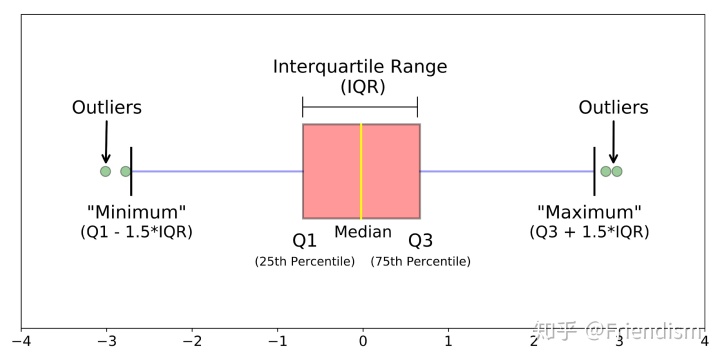
首先,统计学中,针对一个数据样本,我们往往会用平均数 mean(表明资料中各观测值相对集中较多的中心位置,易受极端值的影响,是反映数据集中趋势的一项指标)、众数 mode(指一组数据中出现次数最多的变量值,不受极端值的影响,一组数据可能没有众数或有几个众数)、中位数 median(另外一种反映数据中心位置的指标,其确定方法是将所有数据以由小到大的顺序排列,位于中央的数据值就是中位数,不受极端值的影响)、四分位数 quartile(一组数据中,把所有数值由小到大排列并分成四等份,处于三个分割点位置的数据就是四分位数,不受极端值的影响。四分位数在统计学中的箱线图绘制方面应用较为广泛)以及最大值、最小值等
以上大部分的概念,我们都会在一张图中看到它们,这张图就是箱形图 Box-plot!又称为盒须图、盒式图或箱线图,是一种用作显示一组数据分散情况资料的统计图。它主要用于反映原始数据分布的特征,还可以进行多组数据分布特征的比较。箱线图的绘制方法是:先找出一组数据的最大值、最小值、中位数和两个四分位数;然后,连接两个四分位数画出箱体;再将上边缘和下边缘与箱体相连接,中位数在箱体中间
下面介绍seaborn 中的 boxplot 用法:
A box plot (or box-and-whisker plot) shows the distribution of quantitative data in a way that facilitates comparisons between variables or across levels of a categorical variable. The box shows the quartiles of the dataset while the whiskers extend to show the rest of the distribution, except for points that are determined to be “outliers” using a method that is a function of the inter-quartile range.
seaborn.boxplot(x=None, y=None, hue=None, data=None, order=None, hue_order=None, orient=None, color=None, palette=None, saturation=0.75, width=0.8, dodge=True, fliersize=5, linewidth=None, whis=1.5, ax=None, **kwargs)
基础参数:
x, y, hue:names of variables indataor vector data, optional
Inputs for plotting long-form data. See examples for interpretation.
data:DataFrame, array, or list of arrays, optional
Dataset for plotting. If x and y are absent, this is interpreted as wide-form. Otherwise it is expected to be long-form.
但是仅仅是 boxplot 并不能直观地看出数据的分布以及我们之后要介绍的 outliers ,所以我们要引入散点图 stripplot 。seaborn 中的 stripplot 用法如下:
seaborn.stripplot(x=None, y=None, hue=None, data=None, order=None, hue_order=None, jitter=True, dodge=False, orient=None, color=None, palette=None, size=5, edgecolor='gray', linewidth=0, ax=None, **kwargs)
介绍完用法,我们贴代码!
# One way we can extend this plot is adding a layer of individual points on top of
# it through Seaborn's striplot
#
# We'll use jitter=True so that all the points don't fall in single vertical lines
# above the species
#
# Saving the resulting axes as ax each time causes the resulting plot to be shown
# on top of the previous axes
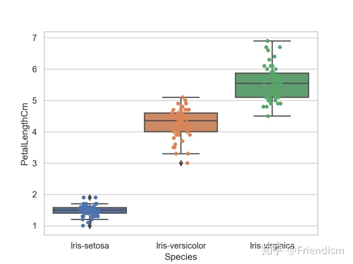
ax = sns.boxplot(x="Species", y="PetalLengthCm", data=iris)
ax = sns.stripplot(x="Species", y="PetalLengthCm", data=iris, jitter=True, edgecolor="gray")贴完代码,上图
2.总结
不难看出,通过关键的5个黑线,即最大值、最小值、中位数和两个四分位数,这组箱形图很直观地反映了三类鸢尾花品种的分布特征。有意思的是,在 Iris-setosa 的最值之外,有几个“越线”的 outliers 格外引入瞩目,这些 outliers 就是不符合该品种鸢尾花主要特征的“异常”数据,因此我们也可以通过箱形图找出数据中的异常值。
但是,这里的 outliers 并不让我陌生,因为,它们是机器学习分类模型的常客。在分类模型中,我们认为模型的输出是离散的,出现异常值是很正常的。例如,本篇使用的 Iris 数据集中就存在 PetalLength 较短,但仍然被认为是 Iris-setosa 的数据。
那么什么是机器学习的分类模型?分类模型是如何将数据分类的呢?我们又如何去评估这些分类模型的好坏呢?
没错,数据分析-机器学习系列即将开启!
参考链接:
seaborn.boxplot - seaborn 0.10.1 documentationseaborn.pydata.org

作者:钴铬氢气
20/08/2020


 6028
6028


 被折叠的 条评论
为什么被折叠?
被折叠的 条评论
为什么被折叠?
 到【灌水乐园】发言


