


 聚类分析Cluster聚类概念梳理 简要而言,聚类分析试图将相似的对象划归入同一个簇中,将不相似的对象划归到不同的簇中。其聚类分析的依据是,在样本数据中发现的描述特征及其关系并以此来划分具体的簇。想要达到的终极目标是组内的对象相互之间是相似的(相关性大),而不同组中的对象之间是尽可能不相似的(相关性小或根本不相关)[即,组内相似性越大,组间差别越大,所得到的聚类分析结果越好]...
聚类分析


Cluster聚类概念梳理
简要而言,聚类分析试图将相似的对象划归入同一个簇中,将不相似的对象划归到不同的簇中。其聚类分析的依据是,在样本数据中发现的描述特征及其关系并以此来划分具体的簇。想要达到的终极目标是组内的对象相互之间是相似的(相关性大),而不同组中的对象之间是尽可能不相似的(相关性小或根本不相关)[即,组内相似性越大,组间差别越大,所得到的聚类分析结果越好]
近似的(Clustering)也可以看作为一种特殊的分类,它使用分类(或簇标号)标记来创建对象,但是有时在已有的样本数据集中,没有明确给出单个数据样本所需要的明确划分分类标号,故我们只能从原始的样本数据中设法导出这些标号。
监督分类(Supervised Classification):使用原本已知类型(或特征)标号的数据来建立模型。进而对新的,无标记的数据对象进行分类标记。
非监督分类(Unsupervised Classification):典型的例子,就是本次介绍的聚类算法,原始的样本数据没有预先定义所需要的已知类型(或特征)标号,但是其产生的结果与分类相同,故称作非监督分类。
K-Means均值算法
K-Means算法中,每个簇的质心是定义聚类原型的核心点位,默认选择K个需要的初始质心(可有随机数生成)不要求来源于样本数据集,K也即用户指定的所期望最终的簇的个数,每个样本数据点都被收归至离其最近的质心的分类簇中,而同一个质心所收归的样本数据点集合为一个簇,之后根据每次分类的结果,求均值更新每一个簇的新的质心位置,之后重复上述的样本数据点分类和质心变更步骤,直至簇内部的数据点不再变化(或等价称质心不再改变)
K-Means示范代码如下:
# To support both python 2 and python 3from __future__ import division, print_function, unicode_literals# To plot pretty figuresimport matplotlibimport matplotlib.pyplot as plt%matplotlib inline%config InlineBackend.figure_format = 'svg'import numpy as npfrom scipy.spatial.distance import cdistfrom sklearn.datasets.samples_generator import make_blobs #聚类数据生成器from sklearn.metrics import silhouette_score #聚类的轮廓系数评估指标def create_self_build_data(): #生成测试的随机样本数据集合 x,y = make_blobs(n_samples=1000, n_features=2, centers=[[-1,0],[0,1],[1,0],[0,-1]], cluster_std=[0.4,0.2,0.2,0.2], random_state=4426) #绘制测试使用的样本数据图例 plt.figure() plt.scatter(x[:,0],x[:,1], c='green', s=20) plt.xlabel('x1') plt.ylabel('x2') plt.title('Build Data Visualization') plt.savefig("Build Data Visualization.jpg") plt.show() return xclass KMeans(object): def __init__(self, n_clusters): #K-means算法初始化的参数,类簇中心的个数 self.n_clusters = n_clusters def fit(self, X, iter_max=100): I = np.eye(self.n_clusters) #选择中心点(质心)的位置 centers = X[np.random.choice(len(X), self.n_clusters, replace=False)] for _ in range(iter_max): prev_centers = np.copy(centers) D = cdist(X, centers) #cdist(X, centers, metric='euclidean')默认使用欧几里得距离计算 cluster_index_num = np.argmin(D, axis=1) #按照axis的要求返回最小的数/最大的数的下标 cluster_index = I[cluster_index_num] centers = np.sum(X[:, None, :] * cluster_index[:, :, None], axis=0) / np.sum(cluster_index, axis=0)[:, None] if np.allclose(prev_centers, centers): break self.centers = centers return centers def predict(self, X): D = cdist(X, self.centers) return np.argmin(D, axis=1)def visualize(x,centers,res,i): if i==1: plt.figure(figsize=(20,10)) plt.subplot(3,4,i) plt.scatter(x[:, 0], x[:, 1], c=res, s=15, marker='v') plt.scatter(centers[:, 0], centers[:, 1], c='red', s=30, marker='*') plt.title('Kmeans for Building Data(K:Cluster size={})'.format(i)) if i ==12: plt.savefig('Kmeans for Building_data.jpg') plt.show()if __name__ == '__main__': data = create_self_build_data() score = [0] x =[] for i in range(1,13): k = KMeans(i) centers = k.fit(data) res = k.predict(data) if not i==1: #通过使用不同的K值,使用SC轮廓系数评估其聚类结果,并将评估结果保存在score数组中 score.append(silhouette_score(data,res, metric='euclidean')) visualize(data,centers,res,i) x.append(i) print("输出依据轮廓系数评估的聚类结果:", score) plt.figure() plt.xlabel("K") plt.ylabel("Score") plt.title("The effects of different K values on scoring") plt.plot(x,score, c='r')代码实验结果如下:

[随机生成的测试样本数据图例]
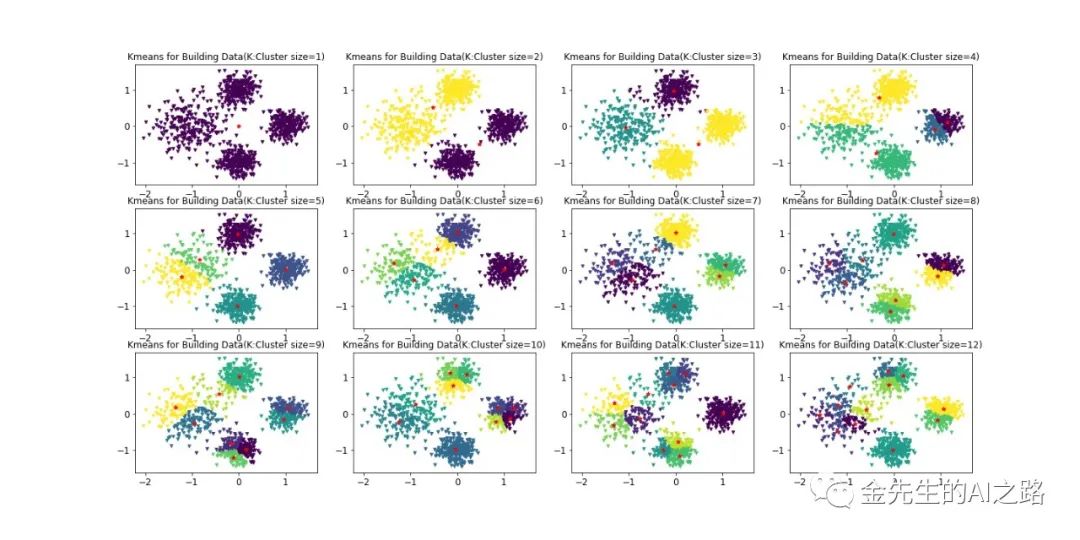
[依据质心个数(簇个数)1~12最终划分的聚类簇图例]
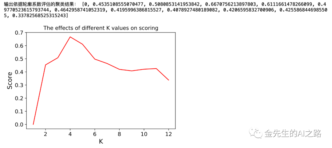
[输出依据轮廓系数评估的聚类结果]
Hint:
轮廓系数计算规则:针对样本空间中的一个特定样本,计算它与所在聚类其它样本的平均距离a,以及该样本与距离最近的另一个聚类中所有样本的平均距离b,该样本的轮廓系数为(b-a)/max(a, b),将整个样本空间中所有样本的轮廓系数取算数平均值,作为聚类划分的性能指标s。
轮廓系数的区间为:[-1, 1] 结果值接近-1代表分类效果差,接近1代表分类效果好。近似为0代表聚类重叠,没有很好的划分聚类。
结论:故由上图最后的轮廓数据与聚类质心对应个数可得,当簇个数为4的时候,K-Means算法分类精度达到最大
最大期望算法/EM(Expectation Maximization)算法
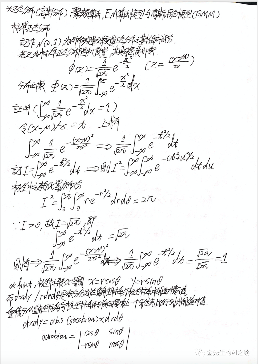
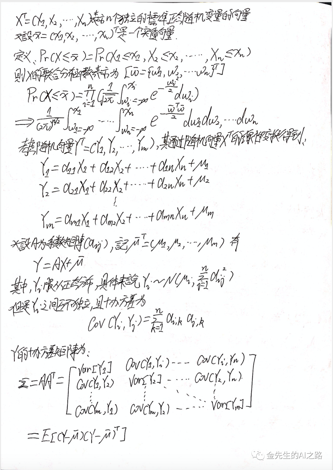
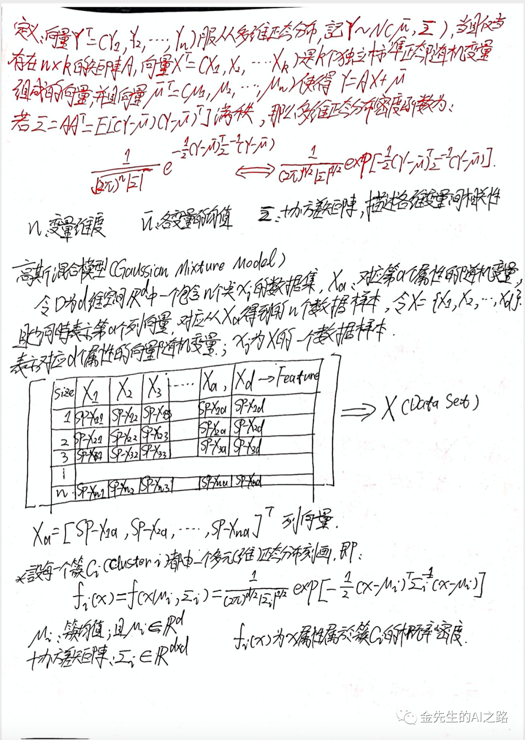
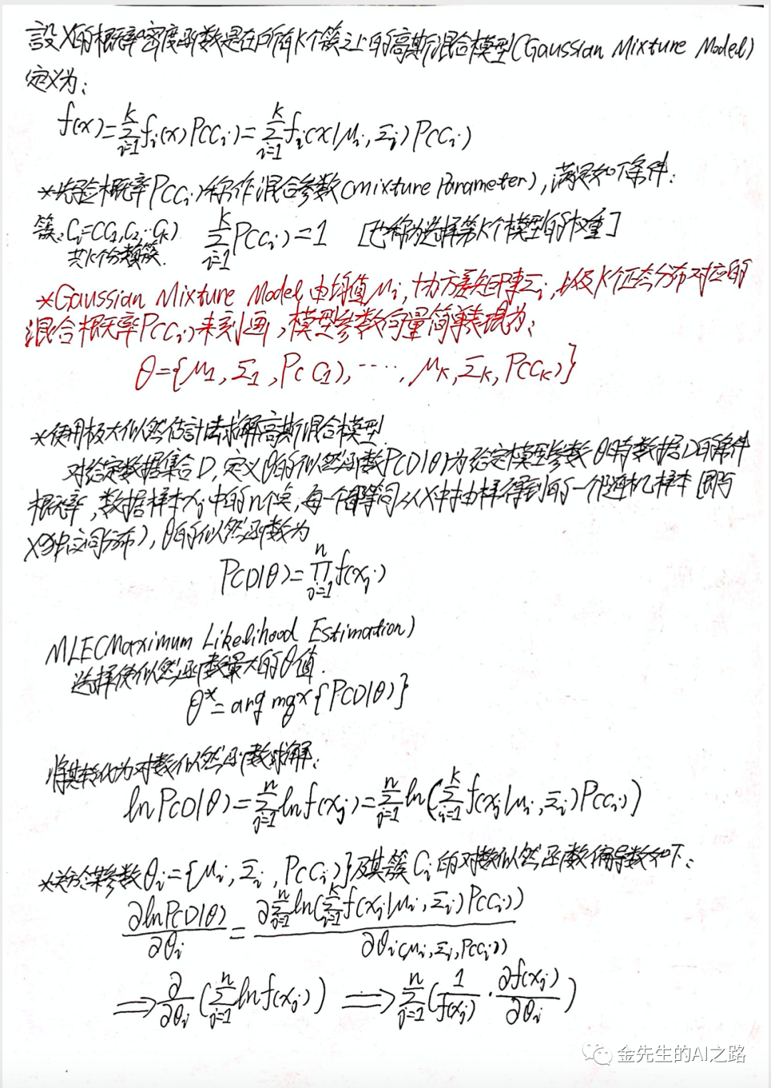
为后续引出的GMM(Gaussian Mixture Model)高斯混合模型做铺垫,正态分布/高维正态分布及其EM算法的数学公式推导,请参考如下笔记整理

 最低0.47元/天 解锁文章


 618
618


 被折叠的 条评论
为什么被折叠?
被折叠的 条评论
为什么被折叠?
 到【灌水乐园】发言


