


Matplotlib 中文手册:Matplotlib 绘图示例
Matplotlib
Matplotlib 演示
在这里,你能够找到大量的演示图及其生成代码。
线段图
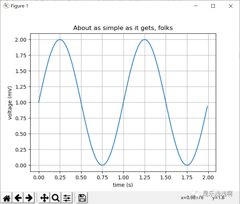
以下是使用 plot() 命令创建带有文本标签的线段图演示:
import matplotlib
import matplotlib.pyplot as plt
import numpy as np
# Data for plotting
t = np.arange(0.0, 2.0, 0.01)
s = 1 + np.sin(2 * np.pi * t)
fig, ax = plt.subplots()
ax.plot(t, s)
ax.set(xlabel='time (s)', ylabel='voltage (mV)',
title='About as simple as it gets, folks')
ax.grid()
fig.savefig("test.png")
plt.show()
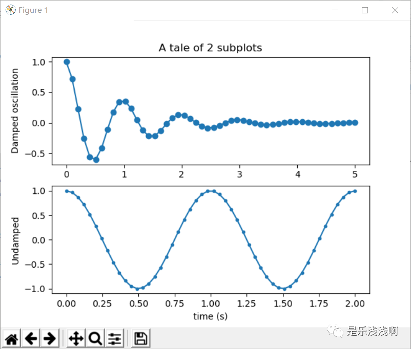
多子图
使用 subpolot() 创建多个子图。
import numpy as np
import matplotlib.pyplot as plt
x1 = np.linspace(0.0, 5.0)
x2 = np.linspace(0.0, 2.0)
y1 = np.cos(2 * np.pi * x1) * np.exp(-x1)
y2 = np.cos(2 * np.pi * x2)
plt.subplot(2, 1, 1)
plt.plot(x1, y1, 'o-')
plt.title('A tale of 2 subplots')
plt.ylabel('Damped oscillation')
plt.subplot(2, 1, 2)
plt.plot(x2, y2, '.-')
plt.xlabel('time (s)')
plt.ylabel('Undamped')
plt.show()
影像
Matplotlib 能够使用 imshow() 命令显示图像。
import numpy as np
import matplotlib.cm as cm
import matplotlib.pyplot as plt
import matplotlib.cbook as cbook
from matplotlib.path import Path
from matplotlib.patches import PathPatch
w, h = 512, 512
with cbook.get_sample_data('ct.raw.gz', asfileobj=True) as datafile:
s = datafile.read()
A = np.fromstring(s, np.uint16).astype(float).reshape((w, h))
A /= A.max()
fig, ax = plt.subplots()
extent = (0, 25, 0, 25)
im = ax.imshow(A, cmap=plt.cm.hot, origin='upper', extent=extent)
markers = [(15.9, 14.5), (16.8, 15)]
x, y = zip(*markers)
ax.plot(x, y, 'o')
ax.set_title('CT density')
plt.show()
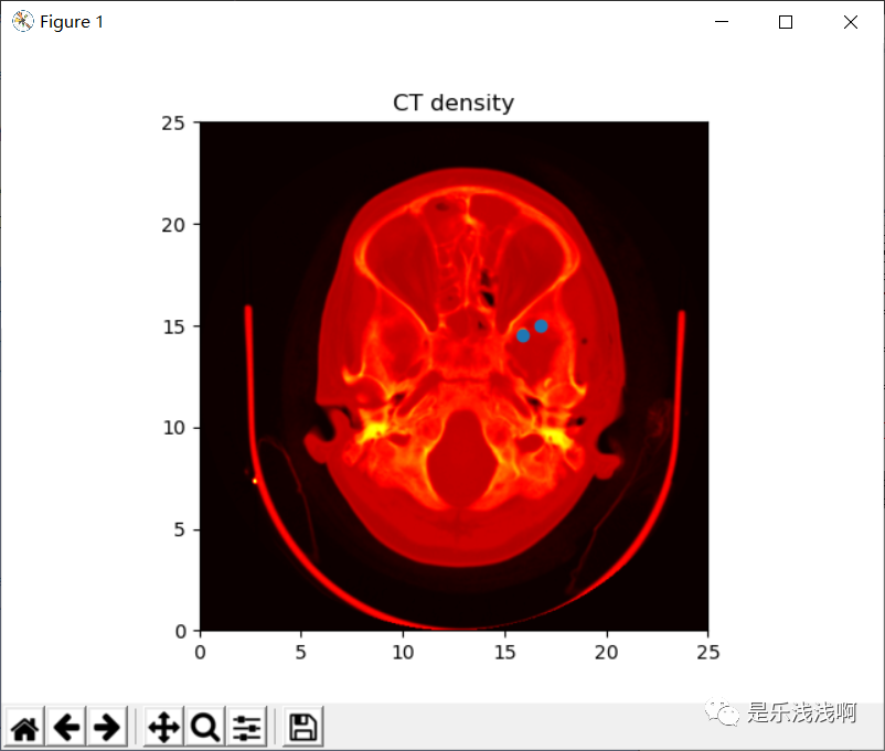
这里使用 imshow() 展示了一个 CT 影像。
轮廓与伪彩色
即便是水平间距不均匀,pcolormesh() 函数也能够对二维数组进行彩色显示;contour() 函数是另一种对相同数据的显色方法。【原文没有提及 contourf() 函数,这里我提一下,它和 contour() 差不多,都是用来绘制三维图像的,但是 contour() 不会对轮廓线间隙填充颜色,而 contourf() 会对其内进行填充,具体可以看下图,我做了三图对比,原文只有两图。】
import matplotlib
import matplotlib.pyplot as plt
from matplotlib.colors import BoundaryNorm
from matplotlib.ticker import MaxNLocator
import numpy as np
# 首先进行缩放,以提高分辨率
dx, dy = 0.05, 0.05
# 生成二维网格
y, x = np.mgrid[slice(1, 5 + dy, dy),
slice(1, 5 + dx, dx)]
z = np.sin(x)**10 + np.cos(10 + y*x) * np.cos(x)
z = z[:-1, :-1]
levels = MaxNLocator(nbins=15).tick_values(z.min(), z.max())
cmap = plt.get_cmap('PiYG')
norm = BoundaryNorm(levels, ncolors=cmap.N, clip=True)
fig, (ax0, ax1, ax2) = plt.subplots(nrows=3)
im = ax0.pcolormesh(x, y, z, cmap=cmap, norm=norm)
fig.colorbar(im, ax=ax0)
ax0.set_title('pcolormesh with levels')
cf = ax1.contourf(x[:-1, :-1] + dx/2.,
y[:-1, :-1] + dy/2., z, levels=levels,
cmap=cmap)
fig.colorbar(cf, ax=ax1)
ax1.set_title('contourf with levels')
# 两函数对比
cf1= ax2.contour(x[:-1, :-1] + dx/2.,
y[:-1, :-1] + dy/2., z, levels=levels,
cmap=cmap)
fig.colorbar(cf1, ax=ax2)
ax2.set_title('contour with levels')
fig.tight_layout()
plt.show()
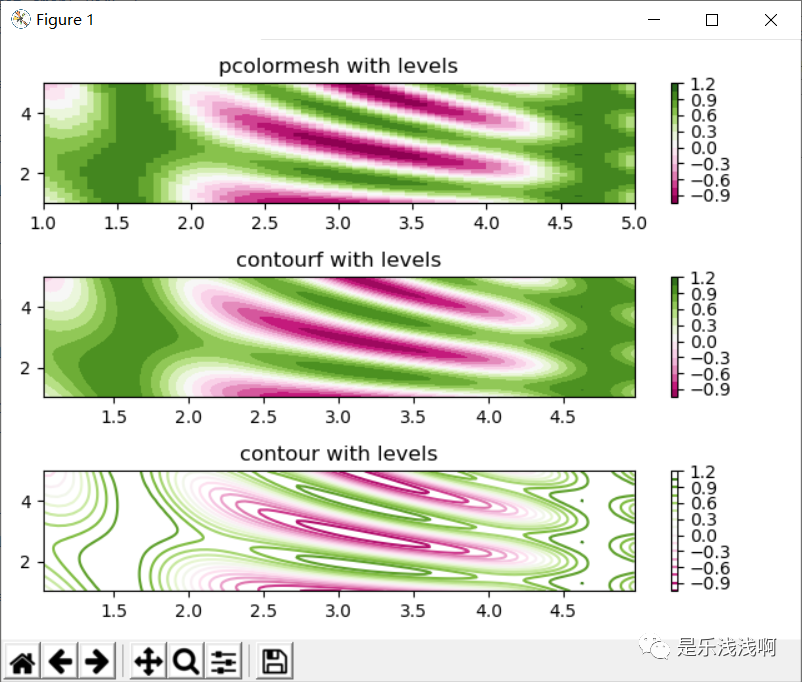
pcolormesh()contourf()contour()
直方图
使用 hist() 函数能够自动生成直方图。
import matplotlib
import numpy as np
import matplotlib.pyplot as plt
np.random.seed(19680801)
# example data
mu = 100 # mean of distribution
sigma = 15 # standard deviation of distribution
x = mu + sigma * np.random.randn(437)
num_bins = 50
fig, ax = plt.subplots()
# the histogram of the data
n, bins, patches = ax.hist(x, num_bins, density
 最低0.47元/天 解锁文章


 被折叠的 条评论
为什么被折叠?
被折叠的 条评论
为什么被折叠?
 到【灌水乐园】发言


