


上周五的职业技能等级认定考试,社保局弄的一个考试,强制都必须参加,我的是四级试题,大佬他们都是三级高级水准的题目。上午理论,下午上机实操,其中上机题是完成一个静态页面。
因为周末帮洋仔写项目代码还有打球,所以没时间码字,正好现在得空整理总结一下。
题目如下,其实前端基础不扎实的可以拿这个练练手。

实现效果如下:
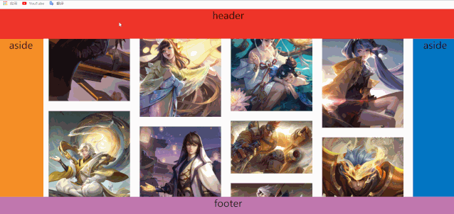
圣杯布局是特指三行布局,头尾固定,中间内容分三列,左右固定,中心自适应。
这里布局没有使用拿手的flex实现,而是用了上周刚看的grid网格布局实现。
划水的时候多学学新技术,以后跳槽面试更方便。
网格布局的确很强大,因为属性太多还没完全掌握,相关总结还要再积累积累才能写。
html
class="container">
class="item item-1">header class="item item-2">aside class="item item-3"> class="item item-4">aside class="item item-5">footercss
.container { height: 100vh; display: grid; grid-template-columns: 150px auto 150px; grid-template-rows: 100px auto 100px; overflow: hidden;}.item { font-size: 2em; text-align: center;}.item-1 { background-color: #ef342a; grid-column-start: span 3;}.item-2 { background-color: #f68f26;}.item-4 { background-color: #0376c2;}.item-5 { background-color: #c077af; grid-column-start: span 3;}.item-3 { background-color: #fff;}根据题目要求,在item-3中需要实现一个瀑布流布局。
所谓瀑布流,又称瀑布流式布局。在视觉表现为参差不齐的多栏布局,随着页面滚动条向下滚动,这种布局还会不断加载数据块并附加至当前尾部。
在item-3中加入图片列表,题目还要求点击图片显示图片名称,再顺便写个弹窗。
<div class="item item-3"> <ul id="flow-box" class="flow-box"> <li class="box" onclick="handleClick('小鱼儿')"> <div class="imgWrap"><img src="./images/庄周.jpg" />div> li> ... ul>div> ...<div class="modelWrap" id="modelWrap"> <div class="modelCon"> <div class="deleteIcon" onclick="closeModel()">div> <div id="picTitle">div> div>div> css
.item-3 { position: relative; background-color: #fff; max-height: 100vh; overflow-y: auto; overflow-x: auto; width: calc(100vw - 300px);}.item-3::-webkit-scrollbar { display: none;}.item-3 .box { width: 295px; position: absolute; border: solid 1px #efefef; list-style: none; box-shadow: 0 0 5px #ccc; margin: 6px;}.item-3 .box div{ padding: 10px; width: 100%;}.item-3 .box:hover .imgWrap{ display: flex; align-items: center; justify-content: center; padding: 0px; position: relative;}.item-3 .box img { display: block; width: 100%; cursor: pointer;}.modelWrap { width: 100%; height: 100%; position: absolute; top: 0; left: 0; display: none; align-items: center; justify-content: center; background-color: rgba(51, 51, 51, 0.6);}.modelWrap .modelCon { width: 500px; height: 300px; background-color: #fff; box-shadow: 0 0 5px #ccc; border-radius: 10px; position: relative; display: flex; align-items: center; justify-content: center; font-size: 24px; font-weight: bold;}.modelCon .deleteIcon { position: absolute; top: 10px; right: 10px; width: 30px; height: 30px; background-image: url(./icon/delete.png); background-repeat: no-repeat; background-size: 100%; z-index: 10; cursor: pointer;}js
// gap:间距function flow(gap) { var pageWidth = document.documentElement.offsetWidth; var container = document.getElementById("flow-box"); var itemBox = container.getElementsByTagName("li"); var itemWidth = itemBox[0].offsetWidth + gap; var column = Math.floor((pageWidth-300) / itemWidth); container.style.width = itemWidth * column - gap + "px"; var liLen = itemBox.length; var lenArr = []; for (var i = 0; i < liLen; i++) { lenArr.push(itemBox[i].offsetHeight); } var oArr = []; for (var i = 0; i < column; i++) { itemBox[i].style.top = "0"; itemBox[i].style.left = itemWidth * i + "px"; oArr.push(lenArr[i]); } for (var i = column; i < liLen; i++) { var x = getMin(oArr); itemBox[i].style.top = oArr[x] + gap + "px"; itemBox[i].style.left = itemWidth * x + "px"; oArr[x] = lenArr[i] + oArr[x] + gap; }}window.onload = function () { flow(10) };let timer;window.onresize = function () { clearTimeout(timer); timer = setTimeout(function () { flow(10); }, 200);}function getMin(arr) { var a = arr[0]; var b = 0; for (var k in arr) { if (arr[k] < a) { a = arr[k]; b = k; } } return b;}// 图片点击事件function handleClick(params) { const modelWrap = document.getElementById("modelWrap"); modelWrap.style.display = "flex"; const picTitle = document.getElementById("picTitle"); picTitle.innerHTML = params;}// 关闭弹窗function closeModel(params) { const modelWrap = document.getElementById("modelWrap"); modelWrap.style.display = "none";}


 1830
1830


 被折叠的 条评论
为什么被折叠?
被折叠的 条评论
为什么被折叠?
 到【灌水乐园】发言


