


 本文详细介绍了Android中公共控件的概念及其重要性,解释了为何使用公共控件库以提高效率和保持一致性。接着,探讨了Theme和Style的区别和用法,包括它们在XML、主题和样式中的优先级。通过示例展示了属性定义、赋值和解析的过程,帮助读者理解Android UI设计的底层原理。
目录
公共控件
何为公共控件
公共控件,不单是作为一个公用的控件仓库的存在,一个合格的公共控件库,不应该只是为了向项目或产品提供一些在多场景使用的,可被封装为一个单独UI视图的控件。而应该在提供这些可被重用、具有公共样式的控件的同时,为整个产品乃至整个生态提供一个具有约束效用的标准。
这个标准 不单单只是像圆角大中小的dp值,红橙黄绿颜色在亮暗状态下的色值等这些细节到 默认属性值 的东西,还应该对当前使用控件库的 应用的UI设计、交互行为进行一些统一的定义和约束。 比如带图片的交互项需要加圆角阴影、应用个人中心相关的信息应该通过侧栏抽屉隐藏、界面设置相关的快捷菜单栏应该放置在右上角并用统一的icon表示,等等。这也是为何一个公共控件库在提供一些公用控件的同时,还应该提供一些在产品研发过程中常用的主题、样式、以及默认属性,并且在提供的UI设计图中在细节交互,UI显示等方面保持相同或相似的样式。
为何要使用公共控件库
正如上文所述,使用公共控件库能为产品提供许多的好处:
- 公共控件库可以将很多使用场景多、业务逻辑耦合性较低的一些自定义控件或模块(例如layout之类)抽离出来并由控件库统一定制,能够做到最大效率的重用
- 公共控件库可以对基础的、常用的控件预定义基本的样式,保证在应用使用的时候,在基础上进行定制,可以达到在未订制的属性保持统一性。这种优点有什么好处呢,研发可以只需要关注不同点的修改,而不需要关注到所有的属性。
- 如上文所说公共控件能够为产品乃至产品所属的整个生态提供一个UI视图的标准,这样不仅能让产品内部的各个模块、或是当前生态中的各个产品之间具有联系,而且能够保证在UI风格上的统一,甚至对于用户在使用此类产品时的学习成本,产生一定程度上的降低。
两种控件集成方式的优劣势
对于我们OS来说,控件库可以由两种方式去提供:
通过aar包提供或直接集成在OS中提供。
两种方式各有各的优点:
- 通过OS提供的话,可以保证只需要在一个地方集成,在当前OS上运行的应用皆可调用控件库中提供的支持,但坏处则在于应用只能在当前OS使用,如果脱离当前OS,则需要重新在UI上进行设计。
- 通过aar提供的话,则弥补了OS提供的缺点,应用可以直接把公共控件库通过aar集成到自己的应用包内,让控件库成为应用的一部分,完全脱离OS的限制,对于外发应用来说更方便。但是缺点也有,就是集成aar包的同时,肯定会增加应用的安装包大小,特别是在控件库较大而应用较小,或应用只使用控件库中的小部分控件的情况下,直接集成整个aar其实是一种不划算的行为
而且aar集成和OS集成在更新迭代方面也还有些许不同,各有优劣。aar包集成方式下,在更新aar包之后可以还沿用原来的aar包进行开发,避免公共控件包更迭之后出现应用无法运行的情况,但如果在必要迭代的情况,则会一处更新,处处修改的情况,只要引入aar包的项目则都需要更新aar包的引用版本。而OS集成的优劣则和aar包集成恰恰相反
如果使用aar包集成的方式去引入公共控件的话,最重要的行为就是缩减aar大小,尤其是减少资源文件,比如图片之类的导入,尽量选择xml绘图、SVG矢量图、mipmap等(这个之后专门细讲)
何为Theme(主题)和Style(风格)
何为theme和style?
对于初识者来说,theme和style是两个很相似的东西,相似点在于:
- 两者都是定义在xml文件中的
<style> </style>标签下的属性集合 - 两者都是用来对
属性值(attr)进行设置 - 两者都可作用于View,以对View的内部属性预设或更改
这样来看,就更迷糊了,既然这两者的使用场景和使用方式都相似,为何不能将两者合二为一,不仅没有那么多的规则,用起来也不会出现顾此失彼的情况。
其实不然,theme和style虽然如此相似,但是用法和使用场景却有很多差异,而且二者其实是一个从属的关系,而且也不能将两者混为一谈,应该将两者配合使用,来达到将应用的UI样式和逻辑架构分离开来的目的。
展开来讲, theme主题,顾名思义,是一个用来定义一个应用(Application)或单个Activity整体UI样式的属性集合,而style风格,是用来约束单个View控件风格的集合。
打个不恰当的比喻,就如同买房装修,你想要整个家有一个整体的主题(欧式主题、皇家主题),这个整体的主题,就是通过Theme来约束,而你买家具家电,常理来说也是要服务于你所定义的整体主题(比如欧式主题下,家里的墙纸家装要整理偏黑白灰的颜色,家具家电要小巧且美观,灯色要冷光或中性,最好来点小装饰什么的。而在皇家主题下,家里的家具要给人一种大气、富丽堂皇的感觉,沙发要大,灯要亮要暖光),这就是Style的行为。而这些沙发的style、照明器具的style、家具的style等,又共同构成了整个家的欧式或皇家Theme。
为何要使用Theme和Style
就如上文所说,使用Theme,可以让你的Application或单个Activity保持着一种风格,且当你需要修改整个Application的主题时(比如从亮色主题切换到暗色主题),你只需要在指定主题的地方直接修改所指向的主题,那么你的应用整体样式就会发生改变。如果不使用主题,而是自己去在定义每个view的xml文件或代码中显式的去指定确切的属性值的时候,那么当你需要修改整体的风格样式的时候,那可有得你忙得了,leader跟你一起review代码到深夜,建立了浓厚的关系。
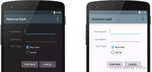
图为 Theme.AppCompat (左)和 Theme.AppCompat.Light(右)两个主题分别应用在一个Activity上的情况
可以看到,单纯通过修改主题,即可让Activity在背景颜色、所有View字体颜色均发生改变且符合一种整体样式
而style则更细,通过style,你可以单个修改某一个控件的样式定义,比如你需要修改button的整体样式,把大Button的圆角半径从6dp改到12dp,但小button不做修改,这时你就只需在style名为Widget.Button.Large(此举例说明,并非实际情况)中,将之前定义的圆角属性值从6dp改为12dp,那么所有使用了这个style的Large Button,在应用没有在xml中覆盖属性值(这个之后细说)的情况下,圆角都会发生修改。
当然,如果是单个的应用或Activity,去指定Theme和Style可能看不出两者的优点,但比如在整个项目的所有应用,或整个OS系统下,控件需要保持一个整体的风格情况下的时候,这就体现出了Theme和Style的优势来了,你可以将项目中常用的控件通过Style的方式去预定义他们的属性值,然后将这些Style组合起来共同实现整个项目中应用的整体样式(比如google的Material Design,将控件都预定义各自Material的style,然后共同组成材料设计的主题)
<style name="Theme.Material">
......
    <item name="alertDialogStyle">@style/AlertDialog.Material</item>
    <item name="buttonStyle">@style/Widget.Material.Button</item>
    <item name="switchStyle">@style/Widget.Material.CompoundButton.Switch</item>
......
</style>
如上,“Theme.Material”定义了默认的Material主题(还有Light、NoActionBar之类的材料主题),而在主题中,将Button、Switch、Dialog等单个控件的style样式,通过单个的Material控件样式去指定。
比如我们将其中buttonStyle指定的Style单独拿来看,可以看到style中预定义了Button的background(背景)、minWidth(最小宽度)、minHeight(最小高度)、textAppearance(字体样式)等属性
<style name="Widget.Material.Button">
    <item name="background">@drawable/btn_default_material</item>
    <item name="textAppearance">?attr/textAppearanceButton</item>
    <item name="minHeight">48dip</item>
    <item name="minWidth">88dip</item>
    <item name="stateListAnimator">@anim/button_state_list_anim_material</item>
    <item name="focusable">true</item>
    <item name="clickable">true</item>
    <item name="gravity">center_vertical|center_horizontal</item>
</style>
可以看到,当我们把Application的主题指定为Theme.Material之后,当前应用下的所有控件(确切说是所有在主题中设置了样式的控件),在没有额外覆盖属性的情况下,全都应用了主题和样式中设定的属性值,使得这些控件遵循整个主题的统一风格样式
属性(Attribute)
Attribute(以下简称Attr)即为应用的属性,它是代表应用属性的最小单元,它可以是某类控件的一个属性(TextView的textSize、Button的background),也可以是Activity、Application的某个属性(Application的icon、Activity的Theme),可以是系统定义好的可以直接使用的属性,也可以是我们自己定义的属性。通常来说,除去Application中的某些特殊属性,其它的大部分属性,都是和视图相关,且由Theme和Style来共同控制的。
一个Attr的使用一般分为三步:
- 在Attrs.xml文件中定义
- 在theme、style、或使用它的xml文件中对其进行赋值
- 在使用它的类中对其进行解析并应用(比如在View中解析background属性并将其作为背景)
示例:
比如我们自定义了一个控件SMTUIButton(继承自Button),我们需要一个SMTUIButtonStyle的属性用作于定义SMTUIButton的Style(风格)。
- 首先在当前module的res/values/目录下创建一个attrs.xml文件,用于放置我们要声明的attr
- 在attrs.xml文件中通过
<attr></attr>标签声明我们的自定义属性SMTUIButtonStyle,注意要放置在<resources></resources>标签内,表明这是一个资源。
<resources>
    <attr name="SMTUIButtonStyle" format="reference"/>
</resources>
如上,需注意的点是,attr具有name(名称)和format(格式)两个属性,name具有唯一性且必须声明,format作为对属性格式的约束,可不声明也可声明多个,如果不声明则需要在获取属性的时候判定当前属性的格式,声明多个则表示当前属性可以以多种格式赋值,format有如下十种选择(<attr>标签内为示例)
<!-- float 浮点值 表示attr是浮点数类型,取值只能是浮点数或整数。 -->
<attr name="alpha" format="float" />

<!-- dimension 表示attr是尺寸类型,例如取值16px、16dp,也可以使用一个指向类型的资源<dimen> -->
<attr name="padding" format="dimension" />

<!-- boolean 表示attr是布尔类型的值,取值只能是true或false。 -->
<attr name="clickable" format="boolean" />

<!-- string 表示attr是字符串类型。 -->
<attr name="tag" format="string" />

<!-- integer 表示attr是整数类型,取值只能是整数,不能是浮点数。例如:progressbar的progress属性 -->
<attr name="progress" format="integer" />

<!-- fraction 表示attr是百分数类型,取值只能以%结尾,例如30%、120.5%等。例如:InsetDrawable的inset属性,即支持fraction -->
<attr name="inset"  format="fraction|dimension"/>

<!-- color 表示attr是颜色类型,例如#ff0000,也可以使用一个指向Color的资源,比如@android:color/background_dark,但是不能用0xffff0000这样的值。例如window的statusBarColor属性 -->
<attr name="statusBarColor" format="color" />

<!-- reference 表示attr的值只能指向某一资源的ID,例如取值@id/textView。 -->
<attr name="id" format="reference" />

<!-- enum 表示attr是枚举类型,在定义enum类型的attr时,可以将attr的format设置为enum,也可以不用设置attr的format属性,但是必须在attr节点下面添加一个或多个enum节点。取值时只能取其中一个枚举值,enum节点需声明name和value -->
<attr name="visibility">
    <enum name="visible" value="0" />
    <enum name="invisible" value="1" />
    <enum name="gone" value="2" />
</attr>

<!-- flag 表示attr是bit位标记,flag与enum有相似之处,定义了flag的attr,在设置值时,可以通过符号 | 设置多个值,而且每个值都对应一个bit位,这样通过按位或操作符 | 可以将多个值合成一个值,我们一般在用flag表示某个字段支持多个特性,需要注意的是,要想使用flag类型,可以不用在attr上设置format为flag,直接在attr节点下面添加flag节点即可,flag节点需声明name和value。例如:layout_gravity -->
<attr name="layout_gravity">
    <flag name="top" value="0x30" />
    <flag name="bottom" value="0x50" />
    <flag name="left" value="0x03" />
    <flag name="right" value="0x05" />
    ......
</attr>
- 在theme、style、或使用它的xml文件中对其进行赋值
例如在theme中对其赋值一个已声明的style资源
<style name="SMTUIBase" parent="SMTUIAppConfigTheme">
    <item name="SMTUIButtonStyle">@style/SMTUIBase.Button</item>
    ......
</style>
- 最后在需要使用它的地方获取它的值.
SMTUIButton.java
//例如在SMTUIButton类的构造函数中将其作为参数传入构造函数中
public SMTUIButton(Context context, AttributeSet attrs) {
    this(context, attrs, R.attr.SMTUIButtonStyle);
}
demo_layout.xml:
<!-- 在xml中将其声明为SMTUIButton的style -->
<com.smartisan.smtui.layout.SMTUIButton
    android:layout_width="wrap_content"
    android:layout_height="wrap_content"
    style="?attr/SMTUIButtonStyle"/>
可以看到,声明的attr在代码中的调用方式为R.attr.xxx,在xml中的调用方式为 ?attr/xxx。为何会出现这样的差别呢?
(一)首先,在代码中通过R.attr.xxx的方式去调用,是因为在编译res文件的时候,会生成一个R文件,此文件会将res下的资源匹配一个静态的id,我们通过R.xxx.xxx的方式去获取资源时其实就是通过这个静态id去获取资源,在Android Studio3.6之后,R文件现在是单独打包成 R.jar存在build目录下,具体地址为 build/intermediates/compile_and_runtime_not_namespaced_r_class_jar/(debug/release)/R.jar
我们将R.jar文件解压之后,进入我们应用的路径下,可找到一个R.class文件 R/com/example/myapplication/R.class
打开便可看到我们声明属性的资源id
public static final int SMTUIButtonStyle = 2130837504;
(二)在xml中调用则有些蹊跷,我们通常引用一个资源的时候都是通过 @ 符号去做引用,为何引用attr属性时前面需要改为 ? ,因为res/values/attrs.xml 中声明的attr属性 都是在theme中去做的赋值,而在不同theme中的赋值可能不同,且有可能不会赋值,所以用 ? 符号表示值的不确定性,而通过 @ 引用的资源都是事先声明好的资源,不存在值的不确定性
在attr使用过程中需要注意的点是:
- attr具有名称唯一性
- declare-styleable标签下可引用已存在的attr
- attr具有名称唯一性:
当我们在声明attr的name时,需要注意,当前attr的name在整个module中名称必须是唯一的,如果发生和其它声明的attr重名的情况,会出现编译报错。
例如:我们在另一个attrs.xml文件中声明一个SMTUIButtonStyle属性
<attr name="SMTUIButtonStyle" format="reference" />
即使format声明相同(reference),也会出现编译报错
Duplicate resources
所以我们在定义新的属性名称的时候,一定要遵循命名规范:
- 在命名时添加规范性前缀,如:smtui_ 等
- 将单属于某一个集合的属性,声明在其
<declare-styleable></declare-styleable>标签下
第二条可能有些难以理解,这里单纯举个例子
在attrs.xml下定义一个名为SMTUIButton的属性集合,并在标签下声明三个属性
<declare-styleable name="SMTUIButton">
    <attr name="button_text" format="string|reference"/>
    <attr name="button_color" format="color|reference"/>
    <attr name="button_width" format="dimension"/>
</declare-styleable>
然后我们查看编译出来的R.class文件
public static final int[] SMTUIButton = new int[]{2130837584, 2130837585, 2130837586};
public static final int SMTUIButton_button_color = 0;
public static final int SMTUIButton_button_text = 1;
public static final int SMTUIButton_button_width = 2;
可以看到,在R文件中生成了一个size为3的 变量名为SMTUIButton的int数组,数组中即为上文中声明变量的资源id,同时还生成了添加SMTUIButton_ 前缀的三个int值,可以发现,变量名已经发生了修改,添加了集合名前缀。其实,在潜移默化中,调用方式也发生了修改,之前声明在外部的attr可以直接通过R.attr.xxx来调用,但现在声明在declare-styleable内部的attr,则需要通过R.styleable.xxx(例如R.styleable.SMTUIButton_button_color)来调用。
且根据google原生提供的规范标准,最好将这些声明在declare-styleable中的控件属性,统一在style中做赋值,并在外部声明一个XXXStyle的属性,来引用这个style。(因为一般来讲,我们会把声明在外部的attr属性,认为是属于theme的成分,而把declare-styleable内部的attr属性,认为是属于控件独有)例如:
attrs.xml
<resources>
<!-- 可把它看作是属于theme的属性,用于约束SMTUIButton的整体风格 -->
    <attr name="SMTUIButtonStyle" format="reference"/>

    <!-- 可把它们看作是属于SMTUIButton的内部属性,用于规范SMTUIButton的局部表现 -->
    <declare-styleable name="SMTUIButton">
        <attr name="button_text" format="string|reference"/>
        <attr name="button_color" format="color|reference"/>
        <attr name="button_width" format="dimension"/>
    </declare-styleable>
</resources>
styles.xml
<style name="SMTUI.SMTUIButton">
    <item name="button_color">#FFFFFF</item>
    <item name="button_text">Button</item>
    <item name="button_width">126dp</item>
</style>
themes.xml
<style name="Theme.SMTUI">
    <item name="SMTUIButtonStyle">@style/SMTUI.SMTUIButton</item>
</style>
- declare-styleable标签下可引用已存在的attr:
即当我们在一个attrs.xml文件中定义了一个attr后,当我们需要在一个declare-styleable标签内使用这个attr时,我们可以直接在其中声明这个attr并应用相同的名字,那么这个attr便从外部引用到了declare-styleable标签内。需要注意的是,在被传递的declare-styleable内,不能再次声明其format,否则会编译报错
Build:failed:Found item Attr/button_text more than one time
示例:
<resources>
    <attr name="text" format="string|reference"/>

    <declare-styleable name="SMTUIImageView">
        <attr name="width" format="dimension"/>
    </declare-styleable>

    <declare-styleable name="SMTUIButton">
        <attr name="text" />
        <attr name="width" />
        <attr name="button_color" format="color|reference"/>
    </declare-styleable>
</resources>
如上所示,我们分别在resources标签下和SMTUIImageView的declare-styleable标签下定义了width和text的attr属性,然后我们可以直接在SMTUIButton的declare-styleable标签下直接引用这两个attr
且当我们引用直接定义在resources标签下的属性时,如果此属性在theme中有赋值,那么如果我们没有在style或xml中覆盖这个值,我们在使用的地方通过R.styleable.xxx获取时则会获取到theme中的赋值。
如何定义Theme和Style
创建新的style和theme其实是类似的
- 首先需要在res/values中创建用于存放样式的styles.xml和用于存放主题的themes.xml
- 使用
<style></style>标签用于声明新的style和theme,二者在标签的使用上没有任何区别
(1)通过name字段声明其名称,需要注意的是,名称必须具有唯一性
(2)通过parent字段声明其继承的style和theme,可以为空,但如果声明则将会继承父style/theme的所有属性值。也可通过符号.来声明其父style/theme,此为<style>标签的特殊继承方式,子style/theme会继承最后一个句点左侧名称的父style/theme
例如有:@style/Widget.Button.Small 其继承链为:
Widget
Widget.Button
Widget.Button.Small
需要注意的是,当同时通过 . 符号和 parent 共同指定父style/theme的时候, parent 关键字会覆盖 . 符号
- 通过
<item>标签来添加需要在 style/theme 中赋值的属性,可以是父集合中未赋值的attr,也可以是父集合中已经赋值的attr,若已赋值,则会在子集合中被覆盖。通过name来指定需要赋值的attr,item标签的值即为attr被赋的值,例如:
<style name="Widget">
    <item name="textAppearance">?textAppearance</item>
</style>

<style name="Widget.Button">
    <item name="background">@drawable/btn_default</item>
    <item name="focusable">true</item>
    <item name="clickable">true</item>
    <item name="textAppearance">?attr/textAppearanceSmallInverse</item>
    <item name="textColor">@color/primary_text_light</item>
    <item name="gravity">center_vertical|center_horizontal</item>
</style>

<style name="Widget.Button.Small">
    <item name="background">@drawable/btn_default_small</item>
</style>
虽然并未显式声明,但 Widget.Button.Small 其实具有其父style的所有属性值,且例如其中的textAppearance为其父style所覆盖后的值,而background则为其自身覆盖后的值
- 最后在xml中通过@style/xxx 或 在代码中通过 R.style.xxx的方式 即可引用到声明的新style/theme
需要注意的是,在代码中引用时需要将 . 句点符号改为 _ 下划线符号,例如:
代码中:
android.R.style.Widget_Button_Small
xml中:
@android:style/Widget.Button.Small
因为此style为原生style,所以在代码使用时需要在前面加 android. 在xml中引用时需要加 android: ,同样的,像layout_width等这些常用的属性,其实都是原生声明的属性,所以我们在xml中赋值时都添加了 android: 前缀
- 创建自己的样式时,应始终扩展框架或支持库中的现有样式,以保持与平台界面样式的兼容性。要扩展样式,请使用
parent属性指定要扩展的样式。然后,您可以替换继承的样式属性并添加新属性。 - 不过,您应始终继承 Android 支持库中的核心应用样式。为提供与 Android 4.0(API 级别 14)及更高版本的兼容性,支持库中的样式会针对每个版本中可用的界面属性优化各个样式。支持库样式的名称通常与平台样式相似,但包含
AppCompat - 更多theme overlay技巧可查看 Google themes overlay
属性在xml、theme、style等之间的优先级
想必大家早有疑问,既可以在theme中直接赋值一个attr,又可以在style中赋值后并传递给theme,还可以直接在layout.xml中直接指定这个属性的值,那么问题来了,到底哪个方式指定的属性值才是最终的赋值,这些赋值方式之间,又存在什么优先级呢?
可以肯定的是,这些赋值方式之间,确实有优先级,在解答这个问题之前,我们先看一下这些属性值是怎么工作的,位于不同位置赋值的属性,他们又是在什么地方被解析出来并使用的
首先,我们看一下style和theme在指定之后是如何被使用的
Theme的使用方式(含源码相关)
我们一般使用theme,有三种常用方式
- 通过在AndroidManifest中的
<application>标签下,给整个应用指定android:theme - 在AndroidManifest中的
<activity>标签下,给单个Activity指定android:theme - 在layout.xml文件下给单个控件指定android:theme(但其实我们不经常这样做)
但其实还有其它的方式,比如构造一个ContextThemeWrapper的对象传入控件的构造函数之类的做法让单个控件实现某个特殊的Theme。这里我们暂时先不讨论。
那么我们看一看这三个常用的方法,其实都大同小异,都是通过原生声明的theme属性去指定theme。那么指定了这个theme之后又如何被单个控件所持有,然后让控件能够读取其中的属性值为自己所使用呢,大概还是得进入到控件内部,从控件的构造方法去寻找。毕竟不管是从xml标签解析,还是通过代码初始化控件,这里都是控件“梦开始的地方”。
不妨拿最常用的TextView来看:
这是TextView的前三个构造函数和第四个构造函数的函数头:
public TextView(Context context) {
    this(context, null);
}

public TextView(Context context, @Nullable AttributeSet attrs) {
    this(context, attrs, com.android.internal.R.attr.textViewStyle);
}

public TextView(Context context, @Nullable AttributeSet attrs, int defStyleAttr) {
    this(context, attrs, defStyleAttr, 0);
}

public TextView(
        Context context, @Nullable AttributeSet attrs, int defStyleAttr, int defStyleRes)
一般我们通过代码构造控件,调用第一种构造函数
第二种构造函数是我们通过xml添加时,系统默认调用,第二个参数attrs,即为xml中解析出的属性集合
可以发现,在第二个构造函数中传入了一个textViewStyle的attr值,此属性值的局部变量名为defStyleAttr,即为我们上文提到的 默认style的属性,根据google的规范标准,此attr用于指定当前控件的style样式,在theme中指向一个已经声明好的style,再看第三个构造函数传入的int值0,此属性值的局部变量名为defStyleRes,猜测可能是作为控件的默认style属性id传入,我们暂时先不管这两个变量,继续往下看第四个构造函数内部:
public TextView(Context context, @Nullable AttributeSet attrs, int defStyleAttr, int defStyleRes) {
    super(context, attrs, defStyleAttr, defStyleRes);
    ......
    final Resources.Theme theme = context.getTheme();
    TypedArray a = theme.obtainStyledAttributes(
            attrs, com.android.internal.R.styleable.TextView, defStyleAttr, defStyleRes);
    for (int i = 0; i < n; i++) {
        int attr = a.getIndex(i);
        switch (attr) {
        case com.android.internal.R.styleable.TextView_editable:
            editable = a.getBoolean(attr, editable);
            break;
        case com.android.internal.R.styleable.TextView_width:
            setWidth(a.getDimensionPixelSize(attr, -1));
            break;
        case com.android.internal.R.styleable.TextView_hint:
            hint = a.getText(attr);
            break;
        case com.android.internal.R.styleable.TextView_text:
            textIsSetFromXml = true;
            mTextId = a.getResourceId(attr, Resources.ID_NULL);
            text = a.getText(attr);
            break;
            ......
        }
        ......
    }
}
可以看到,这边直接通过Context的getTheme方法拿到一个Resources.Theme对象,根据上下文看,这应该就是我们指定的theme的实体类了
然后通过类的obtainStyledAttributes方法拿到一个TypeArray对象,查看TypeArrays类的注释可以知道,这就是一个存储数据的容器,可以方便的通过其提供的getXXX(getInt、getBoolean)方法获取数据。之后就是循环取数据的环节了。好家伙,很快啊,拿theme、取数据,一看就是有备而来。看来theme在一开始就封装在传入的Context对象中。
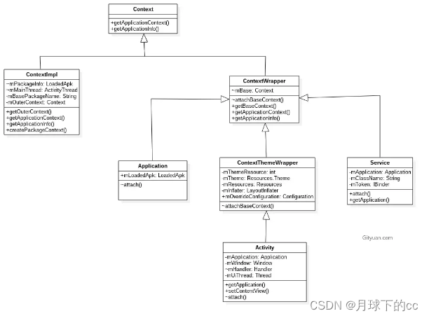
我们深入Context的getTheme方法:
public abstract Resources.Theme getTheme();
抽象方法,具体实现位于ContextThemeWrapper
这个ContextThemeWrapper类又是什么角色?
这是从gityuan 处拿的关于Context继承关系的类图,可以看到的确如此,ContextThemeWrapper作为Context的孙子类,封装了和主题相关的各种属性,Activity是直接继承自它,而Application和Service则是继承自其父类ContextWrapper。这也能从侧面粗略解释为何用Application和Service的Context构造的控件和指定的theme样式不同的问题
我们继续查看:
public Resources.Theme getTheme() {
    if (mTheme != null) {
        return mTheme;
    }

    mThemeResource = Resources.selectDefaultTheme(mThemeResource,
            getApplicationInfo().targetSdkVersion);
    initializeTheme();

    return mTheme;
}
注意看其中的Resources.selectDefaultTheme(mThemeResource,getApplicationInfo().targetSdkVersion); 方法传入了一个themeResource的int值和当前application的sdk版本号
public static int selectDefaultTheme(int curTheme, int targetSdkVersion) {
    return selectSystemTheme(curTheme, targetSdkVersion,
            com.android.internal.R.style.Theme,
            com.android.internal.R.style.Theme_Holo,
            com.android.internal.R.style.Theme_DeviceDefault,    com.android.internal.R.style.Theme_DeviceDefault_Light_DarkActionBar);
}
然后调用到Resources类的静态方法selectSystemTheme 并传入了一堆theme resource id(com.android.internal.R.style.ThemeXXXX):
public static int selectSystemTheme(int curTheme, int targetSdkVersion, int orig, int holo,
        int dark, int deviceDefault) {
    if (curTheme != ID_NULL) {
        return curTheme;
    }
    if (targetSdkVersion < Build.VERSION_CODES.HONEYCOMB) {
        return orig;
    }
    if (targetSdkVersion < Build.VERSION_CODES.ICE_CREAM_SANDWICH) {
        return holo;
    }
    if (targetSdkVersion < Build.VERSION_CODES.N) {
        return dark;
    }
    return deviceDefault;
}
此方法内部实现:判定传入的themeResourceId是否有效,如果有效则直接返回,否则根据当前的targetSdkVersion版本来返回当前版本的默认theme resource id
那看来我们指定的theme是存储在ContextThemeWrapper的mThemeResource int变量中,然后通过此ResourceId生成Resources.Theme对象,具体实现位于之后的initializeTheme方法中,此处就不细讲了,不是我们关心的重点。
我们继续查看mThemeResource的赋值位置
ContextThemeWrapper.java:
public void setTheme(int resid) {
    if (mThemeResource != resid) {
        mThemeResource = resid;
        initializeTheme();
    }
}
查看此方法的调用位置:
位于ActivityThread的performLaunchActivity方法中,对于Activity启动流程比较熟悉的同学都知道,此方法是Activity启动流程中比较重要的方法
private Activity performLaunchActivity(ActivityClientRecord r, Intent customIntent) {
    ......
    int theme = r.activityInfo.getThemeResource();
    if (theme != 0) {
    activity.setTheme(theme);
    }
    ......
}
继续查看ActivityInfo的getThemeResource方法
public final int getThemeResource() {
    return theme != 0 ? theme : applicationInfo.theme;
}
可以看到,在ActivityInfo无theme的情况下,返回ApplicationInfo里的theme,存在的情况下则返回ActivityInfo的theme,这也是为何我们在不单独指定Activity的android:theme属性的时候会使用Application的theme
我们继续查看ActivityInfo变量theme的赋值位置:
位于PackageParser.java中:
private Activity parseActivity(Package owner, Resources res,
        XmlResourceParser parser, int flags, String[] outError, CachedComponentArgs cachedArgs,
        boolean receiver, boolean hardwareAccelerated)
        throws XmlPullParserException, IOException {
        ......
        Activity a = new Activity(cachedArgs.mActivityArgs, new ActivityInfo());
        a.info.theme = sa.getResourceId(R.styleable.AndroidManifestActivity_theme, 0);
        ......
}
R.styleable.AndroidManifestActivity_theme是不是很熟悉,这不就是上文提到的通过标签声明属性的java代码获取方式么,我们不妨去xml中找一找这个属性:
全局搜一下declare-styleable的name前缀AndroidManifestActivity
其位于frameworks/base/core/res/res/values/attrs_manifest.xml文件内,一看名字,就知道是和AndroidManifest的属性相关:
<!-- The overall theme to use for an activity.  Use with either the
     application tag (to supply a default theme for all activities) or
     the activity tag (to supply a specific theme for that activity).

     <p>This automatically sets
     your activity's Context to use this theme, and may also be used
     for "starting" animations prior to the activity being launched (to
     better match what the activity actually looks like).  It is a reference
     to a style resource defining the theme.  If not set, the default
     system theme will be used. -->
<attr name="theme" format="reference" />

<declare-styleable name="AndroidManifestApplication" parent="AndroidManifest">
    ......
    <attr name="theme" />
    ......
</declare-styleable>

<declare-styleable name="AndroidManifestActivity" parent="AndroidManifestApplication">
    ......
    <attr name="theme" />
    ......
</declare-styleable>
查看顶部的注释可知,这就是我们在AndroidManifest.xml文件中<Application>和<Activity>标签下指定的theme
我们回到PackageParser的parserActivity方法,查看他的调用链:
可以看到是从parseBaseApplication方法调用过来的,我们查看一下此方法:
/**
 * Parse the {@code application} XML tree at the current parse location in a
 * <em>base APK</em> manifest.
 * <p>
 * When adding new features, carefully consider if they should also be
 * supported by split APKs.
 */
@UnsupportedAppUsage
private boolean parseBaseApplication(Package owner, Resources res,
        XmlResourceParser parser, int flags, String[] outError)
    throws XmlPullParserException, IOException {
    if (tagName.equals("activity")) {
        Activity a = parseActivity(owner, res, parser, flags, outError, cachedArgs, false,
            owner.baseHardwareAccelerated);
    ......
    }
}
这不就是应用安装过程中对AndroidManifest文件下< activity >标签的解析过程么?
方法头部的注释也说明了此方法的作用,是用来解析manifest文件的< application >标签的,那既然如此,< application >标签下的theme属性应该也是在此进行解析赋值的吧
我们方法内部尝试搜一下上文的R.styleable.AndroidManifestApplication_theme,果然存在
ai.theme = sa.getResourceId(
        com.android.internal.R.styleable.AndroidManifestApplication_theme
我们查看一下ai.theme具体是什么,果然是ApplicationInfo内部的theme变量:
/**
 * A style resource identifier (in the package's resources) of the
 * default visual theme of the application.  From the "theme" attribute
 * or, if not set, 0.
 */
public int theme;
这不就是前文ActivityInfo::getThemeResource方法判定中,ActivityInfo的theme不存在时返回的ApplicationInfo.theme么
至此,Application的theme从指定到获取并使用的整个流程便已经理清了:
应用程序安装: PackageParser.parseBaseApkCommon 解析APK PackageParser.parseBaseApplication 解析Manifest文件,并将解析的theme存入ApplicationInfo和ActivityInfo的theme变量中
Activity启动: ActivityThread.performLaunchActivity 从ActivityInfo中取出theme并存入activity对象的mThemeResource中(同时也是ContextThemeWrapper对象)并生成Resource.Theme对象持有
控件初始化: 从传入的Activity Context对象取出theme,并调用其obtainStyledAttributes方法取出theme中的属性值并设置
layout.xml内view标签下的android:theme又是如何解析呢,这边就不细讲了,感兴趣的同学可以自己去查看一下:
在Activity onCreate的时候会去setContentView,在其中解析xml文件并实例化View的时候会去将view标签下的theme属性和现有的context一起包装为一个ContextThemeWrapper类并最终传入View的构造函数中
为何android:theme在layout.xml声明会同时作用于子View,也是在此处
在Activity onCreate的时候,会调用setContentView方法,传入我们的layout resId(也就是layout.xml的资源Id):
public void setContentView(@LayoutRes int layoutResID) {
    getWindow().setContentView(layoutResID);
    initWindowDecorActionBar();
}
此时会调用getWindow(具体实现为PhoneWindow类)的setContentView,我们需要注意的是在这个Activity持有的PhoneWindow对象初始化时会传入一个Context对象,具体位于Activity的attach方法中:
@UnsupportedAppUsage
final void attach(...) {
    ......
    mWindow = new PhoneWindow(this, window, activityConfigCallback);
    ......
}
public PhoneWindow(Context context, Window preservedWindow,
        ActivityConfigCallback activityConfigCallback) {
    this(context);
    ......
}

public PhoneWindow(Context context) {
    super(context);
    mLayoutInflater = LayoutInflater.from(context);
    mRenderShadowsInCompositor = Settings.Global.getInt(context.getContentResolver(),
            DEVELOPMENT_RENDER_SHADOWS_IN_COMPOSITOR, 1) != 0;
    // Smt: @Feature [485463] TNT init code {@
    mTNT = TntImplFactory.createImpl(ITntPhoneWindow.class, this);
    // @}
}
此context就是activity本身,其中封装了当前activity在启动时从activityInfo中取出的themeResource(见上文),并用以初始化我们之后解析xml文件所使用的解析类LayoutInflater
我们继续看PhoneWIndow的setContentView:
public void setContentView(int layoutResID) {
    ......
    mLayoutInflater.inflate(layoutResID, mContentParent);
    ......
}
public View inflate(@LayoutRes int resource, @Nullable ViewGroup root, boolean attachToRoot) {
    ......
    XmlResourceParser parser = res.getLayout(resource);
    try {
        return inflate(parser, root, attachToRoot);
    } finally {
        parser.close();
    }
}

public View inflate(XmlPullParser parser, @Nullable ViewGroup root, boolean attachToRoot) {
    synchronized (mConstructorArgs) {
        final Context inflaterContext = mContext;
        final AttributeSet attrs = Xml.asAttributeSet(parser);
        ...
        try {
            ...
            if (TAG_MERGE.equals(name)) {
                ...
            } else {
                // Temp is the root view that was found in the xml
                final View temp = createViewFromTag(root, name, inflaterContext, attrs);
                ...
                // Inflate all children under temp against its context.
                rInflateChildren(parser, temp, attrs, true);
                ...
        } catch (XmlPullParserException e) {
            ...
        } finally {
           ...
        }
        return result;
    }
}
首先根据传入的xml资源文件获取对应的xml解析器(XmlResourceParser),然后调用inflate方法去解析当前的xml文件,我们可以看上面的第二个方法中的逻辑,忽略其它的判定逻辑直接看主要流程:
- 首先调用Xml类的静态方法asAttributeSet从xml解析器中获取出我们在xml中设置的属性
- 然后在根布局不为< merge >标签的情况下,会调用createViewFromTag实例化根布局的view,我们需要注意的是:此处传入的context(inflaterContext)即为上文中初始化时传入的activity本身,其中封装有我们设置在activity上的theme
- 最后调用 rInflateChildren 去解析下面的孩子节点
看起来很复杂,其实此处除了root节点之外,其它的节点的解析最终都会走到 rInflate 方法中,然后通过 createViewFromTag 去实例化当前节点的对象,并调用 rInflateChildren 去解析其下的子节点,通过深度优先遍历,最终解析完整个xml文件的view树,而root节点则如上文所示,是直接调用的createViewFromTag 和 rInflateChildren 方法。
那我们直接先来看上文中的 createViewFromTag 方法,需要注意的是此方法的第三个函数传入的context上下文为activity的context上下文,而attrs则为我们在第一步中从解析器里获取的xml文件中设置的属性
private View createViewFromTag(View parent, String name, Context context, AttributeSet attrs) {
    return createViewFromTag(parent, name, context, attrs, false);
}

View createViewFromTag(View parent, String name, Context context, AttributeSet attrs, boolean ignoreThemeAttr) {
    ......
    // Apply a theme wrapper, if allowed and one is specified.
    if (!ignoreThemeAttr) {
        final TypedArray ta = context.obtainStyledAttributes(attrs, ATTRS_THEME);
        final int themeResId = ta.getResourceId(0, 0);
        if (themeResId != 0) {
            context = new ContextThemeWrapper(context, themeResId);
        }
        ta.recycle();
    }

    try {
        View view = tryCreateView(parent, name, context, attrs);

        if (view == null) {
            final Object lastContext = mConstructorArgs[0];
            mConstructorArgs[0] = context;
            try {
                if (-1 == name.indexOf('.')) {
                    view = onCreateView(context, parent, name, attrs);
                } else {
                    view = createView(context, name, null, attrs);
                }
            } finally {
                mConstructorArgs[0] = lastContext;
            }
        }

        return view;
    } catch (InflateException e) {
        ......
    }
    ......
}
需要关注的点不多:
- 首先调用 obtainStyledAttributes 去获取我们所设置的属性,通过传入的第二个参数 ATTRS_THEME 可知,获取的是我们在xml文件中设置的theme属性,如果获取到的值不为 0 ,则调用ContextThemeWrapper的构造函数将新的theme封装在context中,若为0,则context中还是封装的之前的theme
- 然后传入新的context去createView
这就是我们在layout.xml文件中view标签下的android:theme属性的解析封装流程
我们继续回到上一步,在createViewFromTag之后,会调用rInflateChildren去解析子节点的view
rInflateChildren(parser, temp, attrs, true);

final void rInflateChildren(XmlPullParser parser, View parent, AttributeSet attrs,boolean finishInflate) throws XmlPullParserException, IOException {
    rInflate(parser, parent, parent.getContext(), attrs, finishInflate);
}
传入的temp即为root节点
然后调用rInflate去解析,可以看到,此处传入的context为parent节点(当前也就是root节点)的context
void rInflate(XmlPullParser parser, View parent, Context context,
        AttributeSet attrs, boolean finishInflate) throws XmlPullParserException, IOException {
    final int depth = parser.getDepth();
    int type;
    boolean pendingRequestFocus = false;
    while (((type = parser.next()) != XmlPullParser.END_TAG ||
            parser.getDepth() > depth) && type != XmlPullParser.END_DOCUMENT) {
        if (type != XmlPullParser.START_TAG) {
            continue;
        }
        final String name = parser.getName();
        if (TAG_REQUEST_FOCUS.equals(name)) {
            pendingRequestFocus = true;
            consumeChildElements(parser);
        } else if (TAG_TAG.equals(name)) {
            parseViewTag(parser, parent, attrs);
        } else if (TAG_INCLUDE.equals(name)) {
            if (parser.getDepth() == 0) {
                throw new InflateException("<include /> cannot be the root element");
            }
            parseInclude(parser, context, parent, attrs);
        } else if (TAG_MERGE.equals(name)) {
            throw new InflateException("<merge /> must be the root element");
        } else {
            final View view = createViewFromTag(parent, name, context, attrs);
            final ViewGroup viewGroup = (ViewGroup) parent;
            final ViewGroup.LayoutParams params = viewGroup.generateLayoutParams(attrs);
            rInflateChildren(parser, view, attrs, true);
            viewGroup.addView(view, params);
        }
    }
    if (pendingRequestFocus) {
        parent.restoreDefaultFocus();
    }
    if (finishInflate) {
        parent.onFinishInflate();
    }
}
关键点不多,正常的view标签会直接走到else下:
- 首先还是调用 createViewFromTag 去create当前节点的view,可以看到,传入的context即为方法中传入的parent的context,我们知道,在 createViewFromTag 中会去解析attrs中的context,如果解析不到,就还是使用当前的context。这就是为什么
我们不在子节点中设置android:theme属性的话,子节点就还是会使用父节点的theme(xml文件中的android:theme属性会同时作用于子节点) - 然后调用rInflateChildren去解析子节点的view
- 最后通过addView将当前节点的view添加到parent中
Style的使用方式
style的使用方式在前文theme使用方式的流程中也粗略提了一下,也就是在控件的第二个构造函数中传入的defStyleAttr
public TextView(Context context, @Nullable AttributeSet attrs) {
    this(context, attrs, com.android.internal.R.attr.textViewStyle);
}

public TextView(Context context, @Nullable AttributeSet attrs, int defStyleAttr);
我们不妨查看一下View.java中关于此变量的注释:
* @param defStyleAttr An attribute in the current theme that contains a
*        reference to a style resource that supplies default values for
*        the view. Can be 0 to not look for defaults.
此变量的作用是为当前的控件视图提供默认style,我们查看一下TextView的默认StyleAttr(R.attr.textViewStyle)的声明位置和赋值位置:
位于frameworks/base/core/res/res/values/attrs.xml
<declare-styleable name="Theme">
    <!-- Default TextView style. -->
    <attr name="textViewStyle" format="reference" />
    ......
</declare-styleable>
一目了然,此属性是直接属于theme标签下的属性,用于设定TextView的默认样式
我们再查看一下它的赋值位置,全局搜一下
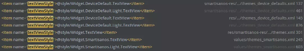
很多地方啊,随便点开一个看,都是位于<style>标签下做的赋值,此<style>是作为一个theme的存在,通过命名就可以看出,且在不同的theme中,所指定的textView的defStyle也不同
<style name="Theme.Holo">
    ......
    <item name="starStyle">@style/Widget.Holo.CompoundButton.Star</item>
    <item name="tabWidgetStyle">@style/Widget.Holo.TabWidget</item>
    <item name="textViewStyle">@style/Widget.Holo.TextView</item>
    ......
</style>
Widget.Holo.TextView
<style name="Widget.Holo.TextView" parent="Widget.TextView" />

<style name="Widget.TextView">
    <item name="textAppearance">?attr/textAppearanceSmall</item>
    <item name="textSelectHandleLeft">?attr/textSelectHandleLeft</item>
    <item name="textSelectHandleRight">?attr/textSelectHandleRight</item>
    <item name="textSelectHandle">?attr/textSelectHandle</item>
    <item name="textEditPasteWindowLayout">?attr/textEditPasteWindowLayout</item>
    <item name="textEditNoPasteWindowLayout">?attr/textEditNoPasteWindowLayout</item>
    <item name="textEditSidePasteWindowLayout">?attr/textEditSidePasteWindowLayout</item>
    <item name="textEditSideNoPasteWindowLayout">?attr/textEditSideNoPasteWindowLayout</item>
    <item name="textEditSuggestionItemLayout">?attr/textEditSuggestionItemLayout</item>
    <item name="textEditSuggestionContainerLayout">?attr/textEditSuggestionContainerLayout</item>
    <item name="textEditSuggestionHighlightStyle">?attr/textEditSuggestionHighlightStyle</item>
    <item name="textCursorDrawable">?attr/textCursorDrawable</item>
    <item name="breakStrategy">high_quality</item>
    <item name="hyphenationFrequency">@dimen/config_preferredHyphenationFrequency</item>
</style>
可以看出,在holo主题下,textViewStyle预设了一堆TextView的属性值,所以,在不同的theme下,textView也会出现不同的样式风格
那么在xml中指定android:theme和style有什么区别么:
其实是有区别的:
google官方文档给出的解释是:
当视图在xml中指定了style属性,只有添加了 style 属性的元素才会收到这些样式属性,任何子视图都不会应用这些样式。如果希望子视图继承样式,则应该改为应用具有 android:theme 属性的样式。
属性赋值方式及优先级
最后我们看一下View的第四个构造函数
/**
* Perform inflation from XML and apply a class-specific base style from a
* theme attribute or style resource. This constructor of View allows
* subclasses to use their own base style when they are inflating.
* <p>
* When determining the final value of a particular attribute, there are
* four inputs that come into play:
* <ol>
* <li>Any attribute values in the given AttributeSet.
* <li>The style resource specified in the AttributeSet (named "style").
* <li>The default style specified by <var>defStyleAttr</var>.
* <li>The default style specified by <var>defStyleRes</var>.
* <li>The base values in this theme.
* </ol>
* <p>
* Each of these inputs is considered in-order, with the first listed taking
* precedence over the following ones. In other words, if in the
* AttributeSet you have supplied <code><Button * textColor="#ff000000"></code>
* , then the button's text will <em>always</em> be black, regardless of
* what is specified in any of the styles.
*
* @param context The Context the view is running in, through which it can
* access the current theme, resources, etc.
* @param attrs The attributes of the XML tag that is inflating the view.
* @param defStyleAttr An attribute in the current theme that contains a
* reference to a style resource that supplies default values for
* the view. Can be 0 to not look for defaults.
* @param defStyleRes A resource identifier of a style resource that
* supplies default values for the view, used only if
* defStyleAttr is 0 or can not be found in the theme. Can be 0
* to not look for defaults.
* @see #View(Context, AttributeSet, int)
*/
public View(Context context, @Nullable AttributeSet attrs, int defStyleAttr, int defStyleRes);
在注释中给出了指定属性的几种方式以及他们的优先级:
- 任何在AttributeSet中直接设置的属性(即layout.xml中直接设置的属性值)
- 在AttributeSet中指定的style里设置的属性(即layout.xml中控件标签下设置的style=“@style/XXX”)
- defStyleAttr指定的默认style中设置的属性
- defStyleRes指定的默认style
- theme中指定的属性值
我们不妨通过一个demo来验证他们的优先级
首先我们声明一个类MyTextView继承自TextView,方便我们进行属性的定制和解析
然后我们在attrs.xml文件中声明如下六个自定义属性
attr.xml
<resources>
    <!-- MyTextView默认样式 -->
    <attr name="MyTextViewStyle" format="reference"/>

    <!-- MyTextView自定义属性 -->
    <declare-styleable name="MyTextView">
        <attr name="my_attr_1" format="string"/>
        <attr name="my_attr_2" format="string"/>
        <attr name="my_attr_3" format="string"/>
        <attr name="my_attr_4" format="string"/>
        <attr name="my_attr_5" format="string"/>
    </declare-styleable>
</resources>
之后我们声明一个Theme用作DemoActivity的 android:theme
theme中指定了五个自定义属性的值为Def Theme,并指定了我们MyTextView控件的默认style(defStyleAttr)
AndroidManifest.xml:
<activity android:name=".MainActivity" android:theme="@style/AppTheme.Default">
theme.xml:
<resources>
    <style name="AppTheme.Default">
        <item name="MyTextViewStyle">@style/DefStyle</item>

        <item name="my_attr_1">Def Theme</item>
        <item name="my_attr_2">Def Theme</item>
        <item name="my_attr_3">Def Theme</item>
        <item name="my_attr_4">Def Theme</item>
        <item name="my_attr_5">Def Theme</item>
    </style>
</resources>
style.xml
<style name="DefStyle">
    <item name="my_attr_1">Def Style Attr</item>
    <item name="my_attr_2">Def Style Attr</item>
    <item name="my_attr_3">Def Style Attr</item>
</style>
在MyTextView类的构造函数中,则指定了一个defStyleRes,并在init函数中去解析这些自定义属性并显示出来
public class MyTextView extends TextView {

    public MyTextView(Context context) {
        this(context,null);
    }

    public MyTextView(Context context, @Nullable AttributeSet attrs) {
        this(context, attrs, R.attr.MyTextViewStyle);
    }

    public MyTextView(Context context, @Nullable AttributeSet attrs, int defStyleAttr) {
        this(context, attrs, defStyleAttr ,R.style.DefStyleRes);
    }

    public MyTextView(Context context, @Nullable AttributeSet attrs, int defStyleAttr, int defStyleRes) {
        super(context, attrs, defStyleAttr, defStyleRes);
        init(context, attrs, defStyleAttr, defStyleRes);
    }

    private void init(Context context, @Nullable AttributeSet attrs, int defStyleAttr, int defStyleRes) {
        TypedArray typedArray = context.obtainStyledAttributes(
                attrs, R.styleable.MyTextView, defStyleAttr, defStyleRes);
        String mAttr1 = typedArray.getString(R.styleable.MyTextView_my_attr_1);
        String mAttr2 = typedArray.getString(R.styleable.MyTextView_my_attr_2);
        String mAttr3 = typedArray.getString(R.styleable.MyTextView_my_attr_3);
        String mAttr4 = typedArray.getString(R.styleable.MyTextView_my_attr_4);
        String mAttr5 = typedArray.getString(R.styleable.MyTextView_my_attr_5);
        StringBuilder stringBuilder = new StringBuilder();
        stringBuilder.append(mAttr1);
        stringBuilder.append("\n");
        stringBuilder.append(mAttr2);
        stringBuilder.append("\n");
        stringBuilder.append(mAttr3);
        stringBuilder.append("\n");
        stringBuilder.append(mAttr4);
        stringBuilder.append("\n");
        stringBuilder.append(mAttr5);
        setText(stringBuilder);
        typedArray.recycle();
    }
}
defStyleRes如下
style.xml
<style name="DefStyleRes">
    <item name="my_attr_1">Def Style Res</item>
    <item name="my_attr_2">Def Style Res</item>
    <item name="my_attr_3">Def Style Res</item>
    <item name="my_attr_4">Def Style Res</item>
</style>
最后我们在xml中添加我们的控件MyTextView
设置了自定义style并给第一个attr赋值
<com.example.themedemo.MyTextView
    app:my_attr_1="XML Def"
    style="@style/XMLStyle"
    android:layout_width="wrap_content"
    android:layout_height="wrap_content" />
xml中自定义style如下
<style name="XMLStyle">
    <item name="my_attr_1">XML Style</item>
    <item name="my_attr_2">XML Style</item>
</style>
效果如下
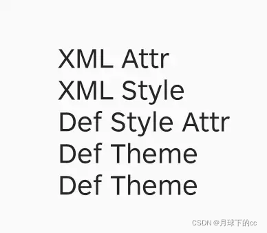
| theme | defStyleRes | defStyleAttr | XML style | XML attr | 结果 | |
|---|---|---|---|---|---|---|
| my_attr_1 | Def Theme | Def Style Res | Def Style Attr | XML Style | XML Attr | XML Attr |
| my_attr_2 | Def Theme | Def Style Res | Def Style Attr | XML Style | XML Style | |
| my_attr_3 | Def Theme | Def Style Res | Def Style Attr | Def Style Attr | ||
| my_attr_4 | Def Theme | Def Style Res | Def Theme | |||
| my_attr_5 | Def Theme | Def Theme |
可以看到:
my_attr_1值为XML Attr:说明在layout.xml中直接指定Attr优先级最高
my_attr_2为XML Style:说明在layout.xml中指定style优先级其次
my_attr_3为Def Style Attr:说明在defStyleAttr指定的优先级第三
my_attr_4为Def Theme:为何defStyleRes内的赋值未生效???
my_attr_5为DefTheme:说明theme中指定的优先级最后???
其它现象都能合理解释,为何my_attr_4的值和my_attr_5相同?均为Def Theme,难道defStyleRes的优先级才是最后?
我们再会去看看defStyleRes的注释:
* @param defStyleRes A resource identifier of a style resource that
*        supplies default values for the view, used only if
*        defStyleAttr is 0 or can not be found in the theme. Can be 0
*        to not look for defaults.
原来必须要defStyleAttr为0或未在theme中找到(这里是指第三个构造函数未传入defStyleAttr或theme中未找到defStyleAttr),也就是调用第三个构造函数主动传入的defStyleAttr未在theme中指定)时才生效
我们不妨把第二个构造函数的第三个值传0
public MyTextView(Context context, @Nullable AttributeSet attrs) {
    this(context, attrs, 0);
}
效果如下:
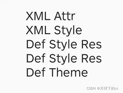
果然,defStyleRes生效了,看来defStyleRes的优先级确实高于theme中直接指定attr值,但前提是desStyleAttr为0
文档引用:
Google官方文档Theme和Style相关:https://developer.android.google.cn/guide/topics/ui/look-and-feel/themes#Theme
Gityuan Context相关:http://gityuan.com/2017/04/09/android_context/
Google themes overlay:https://medium.com/androiddevelopers/android-styling-themes-overlay-1ffd57745207


 扫一扫
扫一扫


 被折叠的 条评论
为什么被折叠?
被折叠的 条评论
为什么被折叠?
 到【灌水乐园】发言


