


前言
今天给大家介绍一个很酷的 Python 手绘风格可视化神包:cutecharts
和 Matplotlib 、pyecharts 等常见的图表不同,使用这个包可以生成看起来像手绘的各种图表,在一些特殊场景下使用效果可能会更好。
GitHub 地址:
https://github.com/chenjiandongx/cutecharts
它的画风是这样的: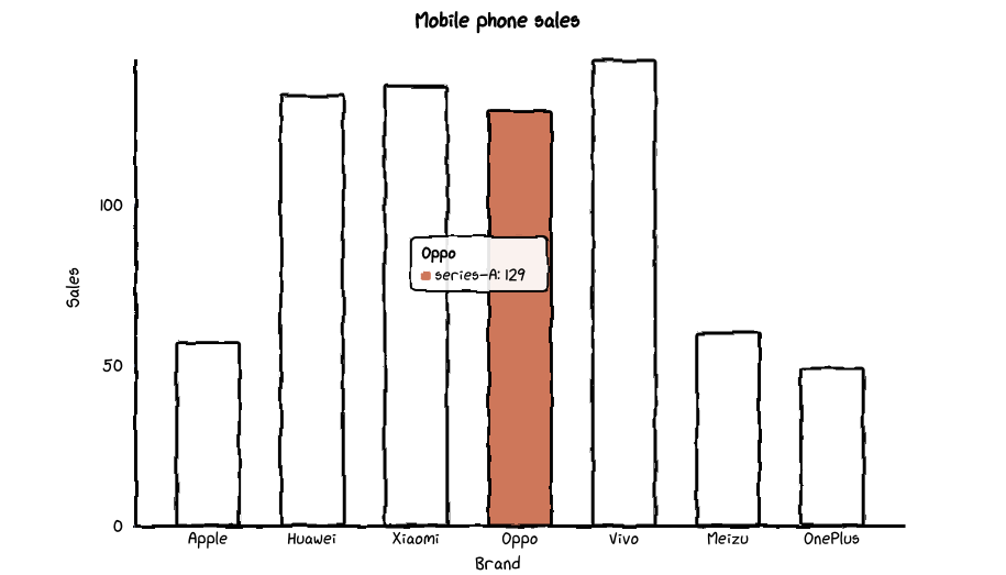
cutecharts是由pyecharts作者chenjiandongx开源的一个轻量级的项目;目前支持
Bar,Line,Pie,Radar,Scatter五种图表;支持
Page组合图表;
安装
pip install cutecharts;
Line——基本示例
支持的参数直接参考源码中的注释就好~
def set_options(
        self,
        labels: Iterable,
        x_label: str = "",
        y_label: str = "",
        y_tick_count: int = 3,
        legend_pos: str = "upLeft",
        colors: Optional[Iterable] = None,
        font_family: Optional[str] = None,
    ):
        """
        :param labels: X 坐标轴标签数据
        :param x_label: X 坐标轴名称
        :param y_label: Y 坐标轴名称
        :param y_tick_count: Y 轴刻度分割段数
        :param legend_pos: 图例位置,有 "upLeft", "upRight", "downLeft", "downRight" 可选
        :param colors: label 颜色数组
        :param font_family: CSS font-family
        """


def add_series(self, name: str, data: Iterable):
        """
        :param name: series 名称
        :param data: series 数据列表
        """
基本示例
from cutecharts.charts import Line
# 虚假数据
x_data = ['Apple', 'Huawei', 'Xiaomi', 'Oppo', 'Vivo', 'Meizu', 'OnePlus']
y_data_1 = [57, 134, 137, 129, 145, 60, 49]
y_data_2 = [114, 55, 27, 101, 125, 27, 105]


chart = Line("Mobile phone sales")
chart.set_options(
    labels=x_data,
    x_label="Brand",
    y_label="Sales",
)
chart.add_series("series-A", y_data_1)
chart.add_series("series-B", y_data_2)
chart.render_notebook()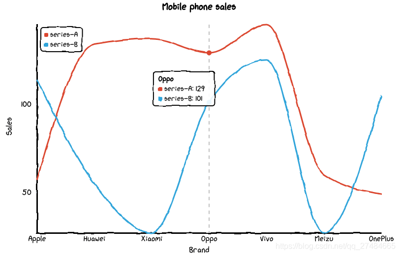
修改图例位置
from cutecharts.charts import Line
# 虚假数据
x_data = ['Apple', 'Huawei', 'Xiaomi', 'Oppo', 'Vivo', 'Meizu', 'OnePlus']
y_data_1 = [57, 134, 137, 129, 145, 60, 49]
y_data_2 = [114, 55, 27, 101, 125, 27, 105]


chart = Line("Mobile phone sales")
chart.set_options(
    labels=x_data,
    x_label="Brand",
    y_label="Sales",
    legend_pos="upRight"
)
chart.add_series("series-A", y_data_1)
chart.add_series("series-B", y_data_2)
chart.render_notebook()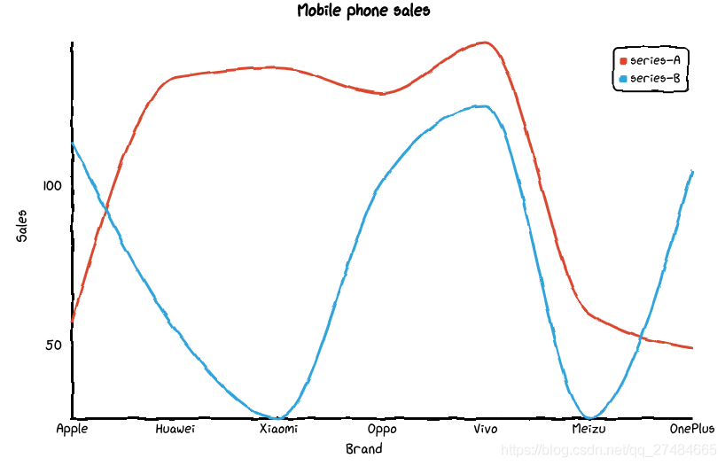
Bar——基本示例
不支持多个系列的数据~
def set_options(
        self,
        labels: Iterable,
        x_label: str = "",
        y_label: str = "",
        y_tick_count: int = 3,
        colors: Optional[Iterable] = None,
        font_family: Optional[str] = None,
    ):
        """
        :param labels: X 坐标轴标签数据
        :param x_label: X 坐标轴名称
        :param y_label: Y 坐标轴名称
        :param y_tick_count: Y 轴刻度分割段数
        :param colors: label 颜色数组
        :param font_family: CSS font-family
        """


def add_series(self, name: str, data: Iterable):
        """
        :param name: series 名称
        :param data: series 数据列表
        """
基本示例
# 虚假数据
x_data = ['Apple', 'Huawei', 'Xiaomi', 'Oppo', 'Vivo', 'Meizu', 'OnePlus']
y_data = [57, 134, 137, 129, 145, 60, 49]


chart = Bar("Mobile phone sales")
chart.set_options(
    labels=x_data,
    x_label="Brand",
    y_label="Sales",
    colors=Faker.colors
)
chart.add_series("series-A", y_data)


chart.render_notebook()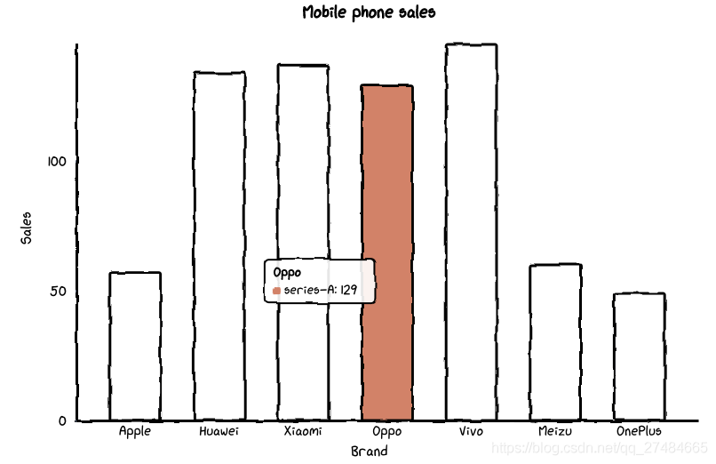
Pie——基本示例
def set_options(
        self,
        labels: Iterable,
        inner_radius: float = 0.5,
        legend_pos: str = "upLeft",
        colors: Optional[Iterable] = None,
        font_family: Optional[str] = None,
    ):
        """
        :param labels: 数据标签列表
        :param inner_radius: Pie 图半径
        :param legend_pos: 图例位置,有 "upLeft", "upRight", "downLeft", "downRight" 可选
        :param colors: label 颜色数组
        :param font_family: CSS font-family
        """


def add_series(self, data: Iterable):
        """
        :param data: series 数据列表
        """
基本示例
# 虚假数据
x_data = ['Apple', 'Huawei', 'Xiaomi', 'Oppo', 'Vivo', 'Meizu', 'OnePlus']
y_data = [57, 134, 137, 129, 145, 60, 49]


chart = Pie("Mobile phone sales")
chart.set_options(
    labels=x_data,
    colors=Faker.colors
)
chart.add_series(y_data)


chart.render_notebook()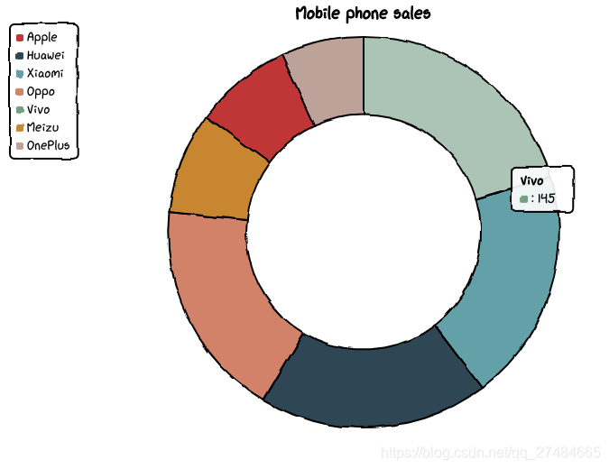
修改内圈半径
# 虚假数据
x_data = ['Apple', 'Huawei', 'Xiaomi', 'Oppo', 'Vivo', 'Meizu', 'OnePlus']
y_data = [57, 134, 137, 129, 145, 60, 49]


chart = Pie("Mobile phone sales")
chart.set_options(
    labels=x_data,
    inner_radius=0,
    colors=Faker.colors
)
chart.add_series(y_data)


chart.render_notebook()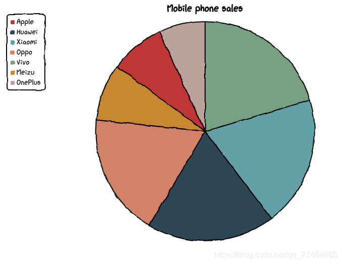
Radar——基本示例
参考代码注释:
def set_options(
        self,
        labels: Iterable,
        is_show_label: bool = True,
        is_show_legend: bool = True,
        tick_count: int = 3,
        legend_pos: str = "upLeft",
        colors: Optional[Iterable] = None,
        font_family: Optional[str] = None,
    ):
        """
        :param labels: 数据标签列表
        :param is_show_label: 是否显示标签
        :param is_show_legend: 是否显示图例
        :param tick_count: 坐标系分割刻度
        :param legend_pos: 图例位置,有 "upLeft", "upRight", "downLeft", "downRight" 可选
        :param colors: label 颜色数组
        :param font_family: CSS font-family
        """


def add_series(self, name: str, data: Iterable):
        """
        :param name: series 名称
        :param data: series 数据列表
        """
基本示例
# 虚假数据
x_data = ['Apple', 'Huawei', 'Xiaomi', 'Oppo', 'Vivo', 'Meizu', 'OnePlus']
y_data_1 = [57, 134, 137, 129, 145, 60, 49]
y_data_2 = [114, 55, 27, 101, 125, 27, 105]


chart = Radar("Mobile phone sales")
chart.set_options(
    labels=x_data,
    is_show_legend=True,
    colors=Faker.colors
)
chart.add_series("series-A", y_data_1)
chart.add_series("series-B", y_data_2)
chart.render_notebook()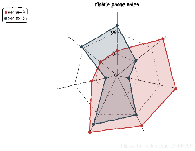
Scatter——基本示例
def set_options(
        self,
        x_label: str = "",
        y_label: str = "",
        x_tick_count: int = 3,
        y_tick_count: int = 3,
        is_show_line: bool = False,
        dot_size: int = 1,
        time_format: Optional[str] = None,
        legend_pos: str = "upLeft",
        colors: Optional[Iterable] = None,
        font_family: Optional[str] = None,
    ):
        """
        :param x_label: X 坐标轴名称
        :param y_label: Y 坐标轴名称
        :param x_tick_count: X 轴刻度分割段数
        :param y_tick_count: Y 轴刻度分割段数
        :param is_show_line: 是否将散点连成线
        :param dot_size: 散点大小
        :param time_format: 日期格式
        :param legend_pos: 图例位置,有 "upLeft", "upRight", "downLeft", "downRight" 可选
        :param colors: label 颜色数组
        :param font_family: CSS font-family
        """


def add_series(self, name: str, data: Iterable):
        """
        :param name: series 名称
        :param data: series 数据列表,[(x1, y1), (x2, y2)]
        """
基本示例
# 随机生成数据
data_1 = [(random.randint(0, 100), random.randint(0, 100)) for _ in range(100)]
data_2 = [(random.randint(0, 100), random.randint(0, 100)) for _ in range(100)]


chart = Scatter("random dot")
chart.set_options(
    x_label = "I'm x-label",
    y_label = "I'm x-yabel",
    x_tick_count = 3,
    y_tick_count = 3,
    is_show_line = False,
    dot_size = 1,
    legend_pos = "upLeft",
    colors=Faker.colors
)
chart.add_series("series-A", data_1)
chart.add_series("series-A", data_2)
chart.render_notebook()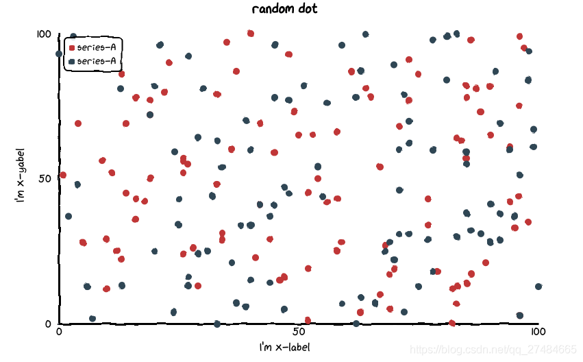
点连线
# 随机生成数据
data_1 = [(random.randint(0, 100), random.randint(0, 100)) for _ in range(10)]
data_2 = [(random.randint(0, 100), random.randint(0, 100)) for _ in range(10)]


chart = Scatter("random dot")
chart.set_options(
    x_label = "I'm x-label",
    y_label = "I'm x-yabel",
    x_tick_count = 3,
    y_tick_count = 3,
    is_show_line = True,
    dot_size = 1,
    legend_pos = "upLeft",
    colors=Faker.colors
)
chart.add_series("series-A", data_1)
chart.add_series("series-A", data_2)
chart.render_notebook()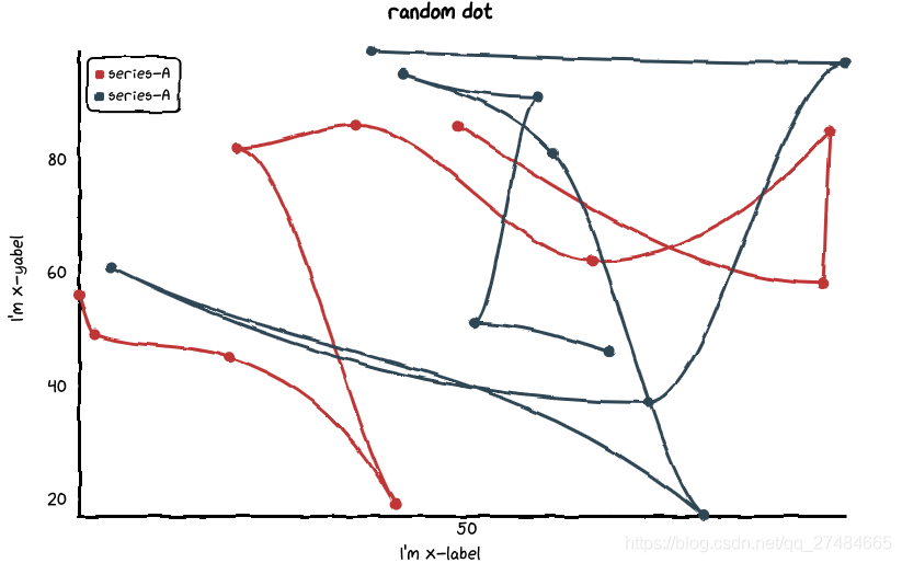
组合图表——Page
# 虚假数据
x_data = ['Apple', 'Huawei', 'Xiaomi', 'Oppo', 'Vivo', 'Meizu', 'OnePlus']
y_data = [57, 134, 137, 129, 145, 60, 49]


chart_1 = Pie("Mobile phone sales")
chart_1.set_options(
    labels=x_data,
    inner_radius=0.6,
    colors=Faker.colors
)
chart_1.add_series(y_data)


chart_2 = Bar("Mobile phone sales")
chart_2.set_options(
    labels=x_data,
    x_label="Brand",
    y_label="Sales",
    colors=Faker.colors
)
chart_2.add_series("series-A", y_data)


page = Page()
page.add(chart_1, chart_2)
page.render_notebook()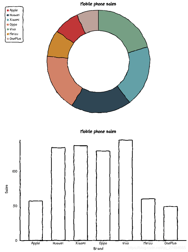
原文链接:https://blog.csdn.net/qq_27484665/article/details/115472329

各位伙伴们好,詹帅本帅搭建了一个个人博客和小程序,汇集各种干货和资源,也方便大家阅读,感兴趣的小伙伴请移步小程序体验一下哦!(欢迎提建议)
推荐阅读


 445
445


 被折叠的 条评论
为什么被折叠?
被折叠的 条评论
为什么被折叠?
 到【灌水乐园】发言


