语法:
none|<length>|none|[<shadow>,]*<shadow>
或
none|<color>|[,<color>]*
取值简单说明:
<style type="text/css">
p{
    text-align:center;
    margin:0;
    font-family:helvetica,arial,sans-serif;
    color:#999;
    font-size:80px;
    font-weight:bold;
    text-shadow:0.1em 0.1em #333;//右下角阴影
    text-shadow:-0.1em -0.1em #333;//左上角阴影
    text-shadow:-0.1em 0.1em #333;//左下角阴影
    text-shadow:0.1em 0.1em 0.3em #333;//增加模糊效果的阴影
    text-shadow:0.1em 0.1em 0.3em black;//定义文本阴影效果
}
</style>
**简单小结:**text-shadow属性的第一个值表示水平位移;第二个值表示垂直位移,正值偏右或偏下;负值偏上或偏左;第三个值表示模糊半径,该值可选;第四个值表示阴影的颜色,该值可选。
示例:通过阴影增加前景色和背景色的对比
p{
    text-align:center;
    margin:150px auto;
    font-family:helvetica,arial,sans-serif;
    font-size:80px;
    font-weight:bold;
    color:#fff;//设置文字颜色
    text-shadow:0.1em 0.1em 0.3em black;//通过阴影增加前景色和背景色的对比

}
总结:
-
阴影偏移由两个<length> 值指定到文本的距离。第一个长度值指定到文本右边的水平距离,负值会把阴影放置在文本的左边。第二个长度值指定到文本下边的垂直距离,负值会把阴影放置在文本的上边。
-
在阴影偏移之后,可以指定一个模糊半径。模糊半径是一个长度值,他指出了模糊效果的范围。
-
在阴影效果的长度值之前或之后,还可以指定一个颜色值。颜色值会被用阴影效果的基础。如果没有指定颜色,那么将使用color属性值代替。
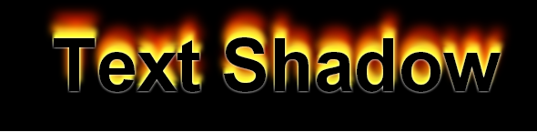
示例:模拟复杂的文本特效
p{
    text-align:center;
    margin:0;
    padding:24px;
    font-family:helvetica,arial,sans-serif;
    font-size:80px;
    font-weight:bold;
    color:#000;//设置文字颜色
    background:#000;//设置背景颜色
    text-shadow:0 0 4px white,
                0 -5px 4px #ff3,
                2px -10px 6px #fd3,
                -2px -15px 11px #f80,
                2px -25px 18px #f20;//使用阴影叠加出燃烧的文字特效
}
注:每个阴影效果必须指定阴影偏移值,而模糊半径和阴影颜色是可选参数,每个阴影之间用逗号隔开。
p{
text-align:center;
margin:0;
padding:24px;
font-family:helvetica,arial,sans-serif;
font-size:80px;
font-weight:bold;
color:#D1D1D1;
background:#CCC;
text-shadow:-1px -1px white,
-1px -1px #333;
1px 1px white,
-1px -1px #444;
-1px 0 black,
0 1px black,
1px 0 black,
0 -1px black;
0 0 0.2em #F87,
0 0 0.2em #F87;
}
- 1
- 2
- 3
- 4
- 5
- 6
- 7
- 8
- 9
- 10
- 11
- 12
- 13
- 14
- 15
- 16
- 17
- 18
- 19
- 20
- 21
- 22
- 23
-
使用阴影叠加出立体的文字特效:通过在文本的左上和右下各添加一个1像素的错位补色阴影,可实现一种淡淡的立体效果。

-
使用阴影叠加出凹体文字特效:与使用阴影叠加出立体的文字特效设置相反。

-
使用阴影叠加出文本描边特效:分别在文本的四个边上添加1像素的黑色阴影。

-
使用阴影叠加出文本外发光特效:设置阴影不发生位移,同时定义阴影模糊显示即可。当然,使用一个阴影或者一组阴影都可以。

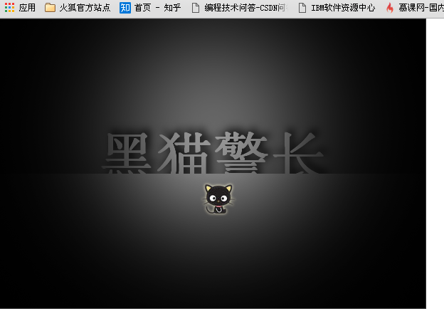
实例:超酷的黑猫警长首页
<!DOCTYPE html PUBLIC "-//W3C//DTD XHTML 1.0 Transitional//EN" "http://www.w3.org/TR/xhtml1/DTD/xhtml1-transitional.dtd">
<html xmlns="http://www.w3.org/1999/xhtml">
<head>
<meta http-equiv="Content-Type" content="text/html; charset=utf-8" />
<title>text-shadow</title>
<style type="text/css">
body {
padding: 0px;
margin: 0px;
color: #666;
}
#text-shadow-box {
position: relative;
width: 598px;
height: 406px;
background: #666;
overflow: hidden;
border: #333 1px solid;
}
#text-shadow-box div.wall {
position: absolute;
width: 100%;
top: 175px;
left: 0px
}
#text {
text-align: center;
line-height: 0.5em;
margin: 0px;
font-family: helvetica, arial, sans-serif;
height: 1px;
color: #999;
font-size: 80px;
font-weight: bold;
text-shadow: 5px -5px 16px #000;
}
div.wall div {
position: absolute;
width: 100%;
height: 300px;
top: 42px;
left: 0px;
background: #999;
}
#spotlight {
position: absolute;
width: 100%;
height: 100%;
top: 0px;
left: 0px;
background: url(images/spotlight.png) center -300px;
}
#spotlight a {
color:#ccc;
text-decoration:none;
position:absolute;
left:47%;
top:56%;
float:left;
}
a img { border:none; }
</style>
</head>
<body>
<div id="text-shadow-box">
<div class="wall">
<p id="text">黑猫警长</p>
<div></div>
</div>
<div id="spotlight"><a href="index.htm"><img src="images/cat1.png" /></a></div>
</div>
</body>
</html>
- 1
- 2
- 3
- 4
- 5
- 6
- 7
- 8
- 9
- 10
- 11
- 12
- 13
- 14
- 15
- 16
- 17
- 18
- 19
- 20
- 21
- 22
- 23
- 24
- 25
- 26
- 27
- 28
- 29
- 30
- 31
- 32
- 33
- 34
- 35
- 36
- 37
- 38
- 39
- 40
- 41
- 42
- 43
- 44
- 45
- 46
- 47
- 48
- 49
- 50
- 51
- 52
- 53
- 54
- 55
- 56
- 57
- 58
- 59
- 60
- 61
- 62
- 63
- 64
- 65
- 66
- 67
- 68
- 69
- 70
- 71
- 72
- 73
- 74
- 75
- 76
- 77
演示效果:


 1729
1729

 被折叠的 条评论
为什么被折叠?
被折叠的 条评论
为什么被折叠?
 到【灌水乐园】发言


