


div上设置 `display: flex` 或者 `display: inline-flex` 来变成一个flex容器。然后给其中的每一个孩子设置 `flex:[number]` 来让他们按比例分配容器的宽度。
设为Flex布局以后,子元素的float、clear和vertical-align属性将失效。
新版的flexbox规范分两部分:一部分是container,一部分是 items。
容器上有 主轴和纵轴的概念,默认主轴(main-axis)是横向,从左到右,纵轴是竖向,从上到下。
比如三个item分别设置了 `flex: 1` `flex: 2` `flex: 1` 则他们是按照 1-2-1 的比例来分配宽度的
父亲:
justify-content(如何分配剩余的空白区域)
不知道如何准确翻译 justify 这个词。它的作用是定义了如何分配剩余的空白区域。
flex-start:主轴方向
flex-end: 主轴反方向
center: 挤在中间
space-between: 中间有空白。
align-items: center;竖直居中
space-around: 中间和两边都有空白。其中两侧的空白是中间的一半宽度,可以理解为每个孩子两侧都有相同宽度的空白,并且空白不合并。
`flex-direction: column`,会发现他们的主轴已经变成从到上下了
flex-wrap(当内容超出之后是否折行)
nowrap:不换行,而是通过收缩每一个孩子的宽度来挤在一行。
wrap: 换行。
wrap-inverse: 换行,但是折行方向相反,(比如默认是折到下一行,但是这个属性会导致折到上一行)。
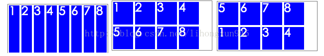
如下图所示,分别是上述的三个值的效果,其中每一个孩子宽度为 40px,8个孩子已经超出了容器的 200px宽度。
align-content(轴线的对齐方式)
属性定义了多根轴线的对齐方式。如果项目只有一根轴线,该属性不起作用
儿子:
给每个孩子都定义了
`flex-grow: 1
`,那么他们平分剩余的空白区域,就是这样:
定义第二个孩子
`flex-shrink: 2`
,其他两个为 1,那么他们会把 `112px` 的宽度按 `1:2:1` 来平分。于是第二个孩子宽度为 `100-(112/4*2)=44px` 宽度,另外两个为`100-(112/4*1)=72px`:
1.1 单项目
首先,只有左上角1个点的情况。Flex布局默认就是首行左对齐,所以一行代码就够了。

.box {
  display: flex;
}
设置项目的对齐方式,就能实现居中对齐和右对齐。

.box {
  display: flex;
  justify-content: center;
}

.box {
  display: flex;
  justify-content: flex-end;
}
设置交叉轴对齐方式,可以垂直移动主轴。

.box {
  display: flex;
  align-items: center;
}

.box {
  display: flex;
  justify-content: center;
  align-items: center;
}

.box {
  display: flex;
  justify-content: center;
  align-items: flex-end;
}

.box {
  display: flex;
  justify-content: flex-end;
  align-items: flex-end;
}
1.2 双项目

.box {
  display: flex;
  justify-content: space-between;
}

.box {
  display: flex;
  flex-direction: column;
  justify-content: space-between;
}

.box {
  display: flex;
  flex-direction: column;
  justify-content: space-between;
  align-items: center;
}

.box {
  display: flex;
  flex-direction: column;
  justify-content: space-between;
  align-items: flex-end;
}

.box {
  display: flex;
}

.item:nth-child(2) {
  align-self: center;
}

.box {
  display: flex;
  justify-content: space-between;
}

.item:nth-child(2) {
  align-self: flex-end;
}
1.3 三项目

.box {
  display: flex;
}

.item:nth-child(2) {
  align-self: center;
}

.item:nth-child(3) {
  align-self: flex-end;
}
1.4 四项目

.box {
  display: flex;
  flex-wrap: wrap;
  justify-content: flex-end;
  align-content: space-between;
}

HTML代码如下。
<div class="box">
  <div class="column">
    <span class="item"></span>
    <span class="item"></span>
  </div>
  <div class="column">
    <span class="item"></span>
    <span class="item"></span>
  </div>
</div>
CSS代码如下。
.box {
  display: flex;
  flex-wrap: wrap;
  align-content: space-between;
}

.column {
  flex-basis: 100%;
  display: flex;
  justify-content: space-between;
}
1.5 六项目

.box {
  display: flex;
  flex-wrap: wrap;
  align-content: space-between;
}

.box {
  display: flex;
  flex-direction: column;
  flex-wrap: wrap;
  align-content: space-between;
}

HTML代码如下。
<div class="box">
  <div class="row">
    <span class="item"></span>
    <span class="item"></span>
    <span class="item"></span>
  </div>
  <div class="row">
    <span class="item"></span>
  </div>
  <div class="row">
     <span class="item"></span>
     <span class="item"></span>
  </div>
</div>
CSS代码如下。
.box {
  display: flex;
  flex-wrap: wrap;
}

.row{
  flex-basis: 100%;
  display:flex;
}

.row:nth-child(2){
  justify-content: center;
}

.row:nth-child(3){
  justify-content: space-between;
}
1.6 九项目

.box {
  display: flex;
  flex-wrap: wrap;
}


 274
274

 被折叠的 条评论
为什么被折叠?
被折叠的 条评论
为什么被折叠?
 到【灌水乐园】发言


