


以前一直对div居中这个问题感到很麻烦,一般都是通过margin来实现居中的,然而还要算半天,今天get到了一种新方法,哈哈哈哈,特此记录:
<!DOCTYPE html>
<html lang="en">
<head>
    <meta charset="UTF-8">
    <meta name="viewport" content="width=device-width, initial-scale=1.0">
    <title>Document</title>
    <style>
        .main{
            width: 300px;
            height: 300px;
            background-color: lightblue;
            display: flex;
            justify-content: center;
            align-items: center;
        }
        .main>div{
            width: 200px;
            height: 200px;
            background-color: white;
        }
    </style>
</head>
<body>
    <div class="main">
        <div>haha</div>
    </div>
</body>
</html>
其中justify-content设置水平居中,align-items设置垂直居中。
继续上次的,今天特地研究了一下flex布局。flex布局的作用想必都知道是用来做响应式布局的,利用弹性布局可以让页面在缩放的时候里面的内容布局依旧清晰可观。
而对于初学者来说,我却很喜欢利用flex的特性来少写代码让div达到想要的效果,嘿。
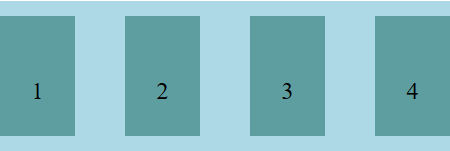
(1)div水平方向等距排列
<!DOCTYPE html>
<html lang="en">
<head>
    <meta charset="UTF-8">
    <meta name="viewport" content="width=device-width, initial-scale=1.0">
    <title>Document</title>
    <style>
        .main{
            width: 300px;
            height: 100px;
            background-color: lightblue;
            display: flex;
            margin: auto;
            align-items: center;
            justify-content: space-between;
        }
        .main>div{
            width: 50px;
            height: 80px;
            background-color: cadetblue;
            text-align: center;
            line-height: 100px;
        }
    </style>
</head>
<body>
    <div class="main">
        <div>1</div>
        <div>2</div>
        <div>3</div>
        <div>4</div>
    </div>
</body>
</html>
(2)div竖直方向等距排列

<!DOCTYPE html>
<html lang="en">
<head>
    <meta charset="UTF-8">
    <meta name="viewport" content="width=device-width, initial-scale=1.0">
    <title>Document</title>
    <style>
        .main{
            width: 400px;
            height: 500px;
            background-color: lightblue;
            display: flex;
            margin: auto;
            flex-direction: column;
            align-items: center;
            justify-content: space-between;
        }
        .main>div{
            width: 200px;
            height: 100px;
            background-color: cadetblue;
            text-align: center;
            line-height: 100px;
        }
    </style>
</head>
<body>
    <div class="main">
        <div>1</div>
        <div>2</div>
        <div>3</div>
        <div>4</div>
    </div>
</body>
</html>
其中flex-direction:规定主轴纵向,从上至下排列。
当主轴方向横向的话,如果子元素没有设置高度,则默认和父级等高;当主轴方向纵向的话,如果子元素没有设置宽,则默认和父级等宽。
弹性盒子内的子元素的大小属性:
flex-grow:弹性增长因子,为1定义弹性增加,有剩余空间按比例增长,为0则不增长
flex-shrink:弹性缩放因子,为1空间不足按比例缩小
flex-basis:指定子元素的基准值。
例子:
<!DOCTYPE html>
<html lang="en">
<head>
    <meta charset="UTF-8">
    <meta name="viewport" content="width=device-width, initial-scale=1.0">
    <title>Document</title>
    <style>
        ul,li{
            padding: 0;
            margin: 0;
        }
        ul{
            width: 350px;
            height: 100px;
            border: 1px solid black;
            list-style: none;
            display: flex;
            justify-content: space-between;
        }
        li{
            width: 100px;
            height: 50px;
            /* flex:1( flex-grow :1,flex-shrink :1,flex-basis :0%) */
            box-sizing: border-box;
            background-color: blue;
            border: red 1px solid;
        }
    </style>
</head>
<body>
    <ul>
        <li></li>
        <li></li>
        <li></li>
    </ul>
</body>
</html>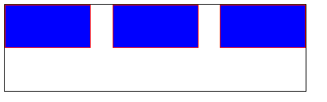
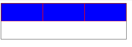
有剩余空间,定义flex-grow:1将子元素按比例增大:
父元素的宽度随着子元素的宽度变化而变化:
给父级设置display:inline-flex属性后使得父元素默认会根据子元素的宽高去自适应
<!DOCTYPE html>
<html lang="en">
<head>
    <meta charset="UTF-8">
    <title>Document</title>
    <style>
        *{margin: 0;padding: 0;}
        ul{
            display: inline-flex;
            height: 120px;
            background-color: cadetblue;
            margin-bottom: 50px;
        }
        ul>li{
            list-style: none;
            width: 120px;
            height: 100%;
            float: left;
            background-color: black;
        }
    </style>
</head>
<body>
    <ul class="list">
        <li></li>
        <li></li>
        <li></li>
    </ul>
    <ul class="list">
        <li></li>
        <li></li>
        <li></li>
        <li></li>
    </ul>
</body>
</html>
未给父元素设置宽度的显示效果:

最后附上相关属性值:
display:flex 设置弹性盒模型
flex-direction 设置主轴方向 row/row-reverse/column/column-reverse
flex-wrap 当轴线反向排不下的时候,规定如何换行,默认不换行重置子元素宽度/wrap换行排列
justify-content 规定子元素在主轴方向的排列情况 flex-end/flex-start/center/space-between/space-around
align-items 规定子元素在交叉轴上的排列方式 flex-end/flex-start/center/baseline/stretch


 9196
9196


 被折叠的 条评论
为什么被折叠?
被折叠的 条评论
为什么被折叠?
 到【灌水乐园】发言


