


目录
旋转动画
纯css即可实现丰富的动画,以旋转360度的动画为例,样式如下:
第1步——定义关键帧,取名为 rotate360,指定动画开始、动画中和动画结束时的样式,下方代码表示动画结束后,元素旋转360度
    @keyframes rotate360 {
        100% {
            transform: rotate(360deg);
        }
    }
第2步——在 animation 样式中,使用自定义的关键帧名称,并指定动画持续时长,动画播放速度曲线,动画开始播放时间(动画延时)
animation: rotate360 .5s ease-out 0s;为了方便后续动画控制,这里使用类名来包裹此动画样式
.rotate360 {
    animation: rotate360 .5s ease-out 0s;
}
致此,旋转动画定义完毕,更详细的关于css动画的定义,可以参考 https://blog.csdn.net/u013243347/article/details/79976352
悬浮触发动画
方式一 :hover 样式选择器触发
最简单的悬浮触发动画的方式
.logo:hover{
    animation: rotate360 .5s ease-out 0s;
}
方式二:@mouseenter 绑定鼠标移入事件触发
此时便需用到动态样式绑定,以图标为例:
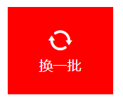
<i :class="{'rotate360':showAnimate}" @mouseenter="play" class="changeIcon iconfont icon-iconfontshuaxin"></i>通过改变变量 showAnimate 的值,来动态添加旋转动画的样式 rotate360
注意:部分动画不适用于行内元素,所以此处需添加样式,将图标转换为行内块级元素
.changeIcon {
    display: block;
    font-size: 30px
}
showAnimate 默认值为false
data() {
    return {
        showAnimate: false
    }
},
当鼠标悬浮于元素上时,触发mouseenter事件,执行play方法
play() {
    this.showAnimate = true
},
点击触发动画
也需用到动态样式绑定,通过 @click 绑定点击事件触发
注意:为了实现可多次点击,需在动画结束后,立马移除动画样式,所以还需绑定 @animationend 动画结束事件
<i :class="{'rotate360':showAnimate}" @click="play" @animationend="reset" class="changeIcon iconfont icon-iconfontshuaxin"></i> methods: {
play() {
this.showAnimate = true
},
reset() {
this.showAnimate = false
}
}三种动画综合使用的完整演示代码如下:
<template>
<div>
<div class="logoBox" @mouseenter="play">
<div class="changeLogo">
<i :class="{'rotate360':showAnimate}" @click="play" @animationend="reset"
class="changeIcon iconfont icon-iconfontshuaxin"></i>
<div>换一批</div>
</div>
</div>
</div>
</template>
<script>
export default {
data() {
return {
showAnimate: false
}
},
        methods: {
            play() {
                this.showAnimate = true
            },
            reset() {
                this.showAnimate = false
            }
        }
}
</script>
<style scoped>
.logoBox {
width: 120px;
height: 100px;
text-align: center;
color: grey;
display: flex;
margin: 10px;
cursor: pointer;
}
.changeLogo {
margin: auto;
}
.logoBox:hover {
background: red;
color: white;
}
.changeIcon {
display: block;
font-size: 30px
}
.rotate360 {
animation: rotate360 .5s ease-out 0s;
}
@keyframes rotate360 {
100% {
transform: rotate(360deg);
}
}
</style>
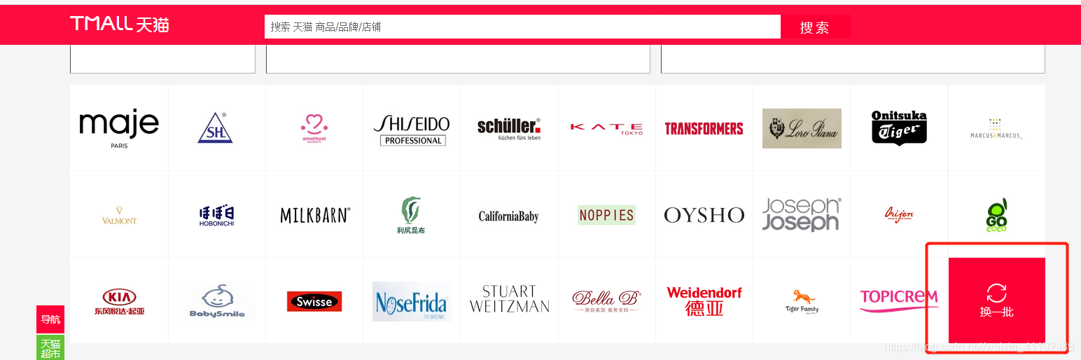
此范例,可实现天猫官网中,切换商家logo栏的动画特效 https://www.tmall.com


 扫一扫
扫一扫


 892
892

 被折叠的 条评论
为什么被折叠?
被折叠的 条评论
为什么被折叠?
 到【灌水乐园】发言


