


研究一上午,备份个代码:
let gap = "20%"
let BarWidth = "25"
option = {
legend: {
selectedMode: false,
data: ['数据1', '数据2'],
textStyle: {
fontSize: "20",
color: "#fff"
},
top: "3%"
},
grid: [{
left: '5%',
right: '5%',
bottom: '0%',
top: '12%',
containLabel: true
}],
tooltip: {
trigger: 'axis',
axisPointer: {
type: 'none'
},
formatter: function (params) {
return params[0].name + '<br/>' +
"<span style='display:inline-block;margin-right:5px;border-radius:10px;width:9px;height:9px;background-color:rgba(36,207,233,0.9)'></span>" +
params[0].seriesName + ': ' + params[0].value+ '<br/>' +
"<span style='display:inline-block;margin-right:5px;border-radius:10px;width:9px;height:9px;background-color:rgba(255,168,121,0.9)'></span>" +
params[1].seriesName + ': ' + params[1].value
}
},
backgroundColor: '#515a6e',
xAxis: {
show: false,
type: 'value'
},
yAxis: [{
type: 'category',
inverse: true,
axisLabel: {
show: true,
textStyle: {
color: '#fff'
},
fontSize: 20
},
splitLine: {
show: false
},
axisTick: {
show: false
},
axisLine: {
show: false
},
data: ["y轴1","y轴2","y轴3","y轴4","y轴5","y轴6",],
},
//新建一个y轴用于对齐背景
{
type: 'category',
show: false,
interval: 5,
axisTick: {
show: false
},
axisLine: {
show: false
},
splitNumber: 6,
data: ['', '', '', '', '', '']
}
],
series: [
//背景
{
yAxisIndex: 1,
barGap: gap,
type: "pictorialBar",
barWidth: BarWidth,
symbol: 'fixed',
symbolRepeat: 'repeat',
legendHoverLink: false,
itemStyle: {
normal: {
color: 'rgba(153, 153, 153, 0.23)'
}
},
data: [100,100,100,100,100,100],
symbolSize: [5, 20],
animation: false, //关闭动画
symbolMargin: 2,
},
//背景
{
type: "pictorialBar",
show: false,
yAxisIndex: 1,
barGap: gap,
barWidth: BarWidth,
symbol: 'fixed',
symbolRepeat: 'repeat',
legendHoverLink: false,
itemStyle: {
normal: {
color: 'rgba(153, 153, 153, 0.23)'
}
},
data: [100,100,100,100,100,100],
symbolSize: [5, 20],
animation: false, //关闭动画
symbolMargin: 2,
},
{
name: '数据1',
type: "pictorialBar",
barGap: gap,
barWidth: BarWidth,
legendHoverLink: false,
label: {
show: true,
color: "#fff",
fontSize: "18",
position: 'right',
formatter(p) {
return p['value'] + "%"
}
},
itemStyle: {
color: {
type: 'linear',
x: 0,
y: 0,
x2: 0,
y2: 1,
colorStops: [{
offset: 0,
color: '#ff9779',
},
{
offset: 1,
color: '#ffc079',
},
],
global: false // 缺省为 false
}
},
symbolRepeat: 'fixed',
symbolMargin: 2,
symbol: 'rect',
symbolClip: true,
symbolSize: [5, 20],
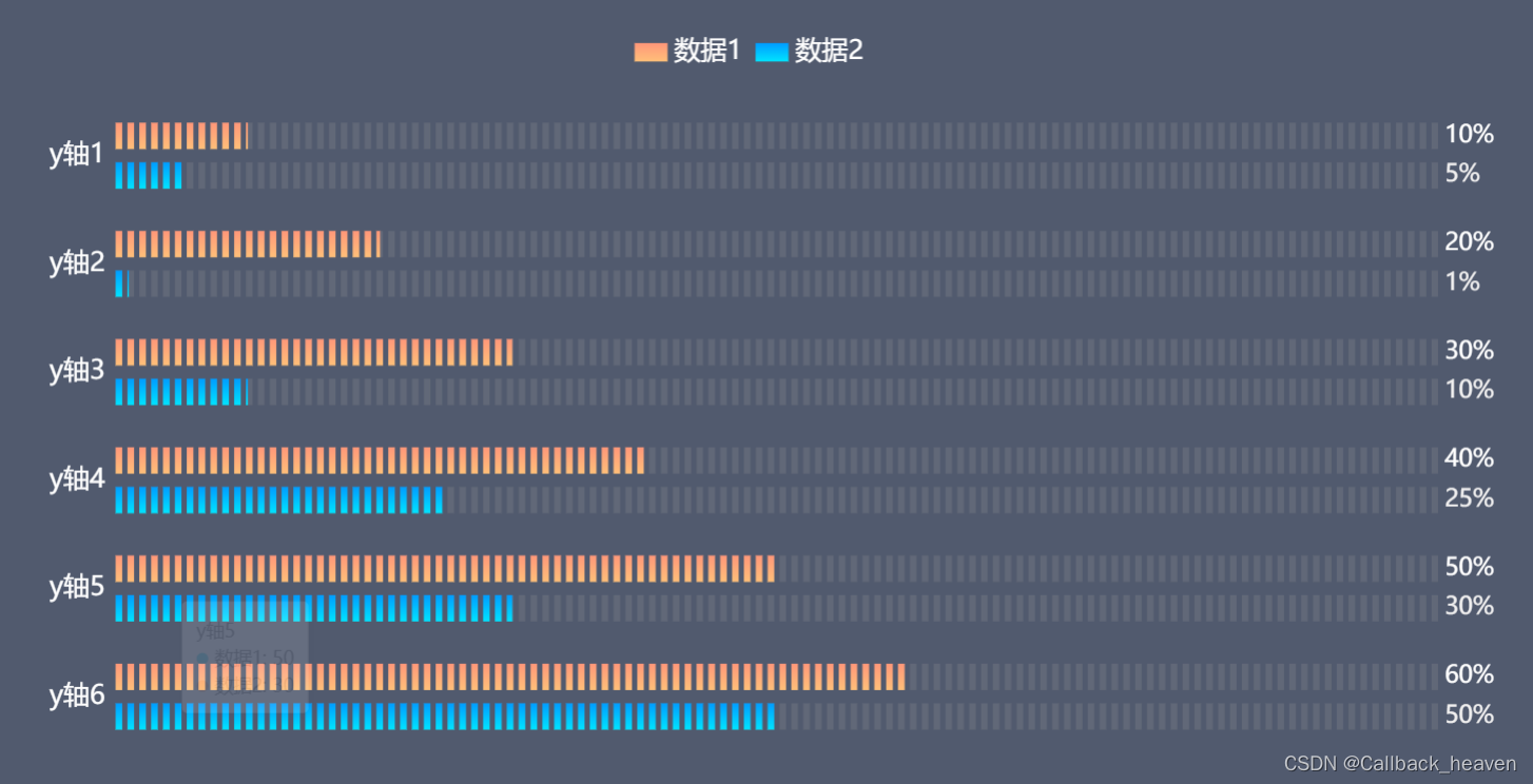
data: [10,20,30,40,50,60],
},
{
type: "pictorialBar",
name: "数据2",
barWidth: BarWidth,
barGap: gap,
label: {
normal: {
show: true,
position: 'right',
formatter: '{c}%',
textStyle: {
color: '#f2f1f1',
fontSize: 18
}
}
},
legendHoverLink: false,
itemStyle: {
color: {
type: 'linear',
x: 0,
y: 0,
x2: 0,
y2: 1,
colorStops: [{
offset: 0,
color: '#009cff',
},
{
offset: 1,
color: '#00e4ff',
},
],
global: false // 缺省为 false
}
},
symbolRepeat: 'fixed',
symbolMargin: 2,
symbol: 'rect',
symbolClip: true,
symbolSize: [5, 20],
data: [5,1,10,25,30,50],
},
]
};
直接放在Echarts官方编辑器中看效果:


 391
391


 被折叠的 条评论
为什么被折叠?
被折叠的 条评论
为什么被折叠?
 到【灌水乐园】发言


