


大家好!
制作旋转相册很简单,需要工具为:Windows的记事本即可:(如果有专业的HTML编辑工具会更方便);
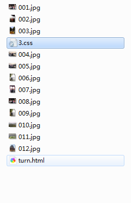
首先新建文件夹如:旋转相册实例;取题材,图片(分别命名号序列,之所以序列方便下面引入图片修改路径);
我新建的目录如下:命名12张图片名称,其中:3.css和turn.html为接下来要实现的内容。
首先,图片准备好了,新建css样式文件。
*{
    margin:0;
    padding: 0;
}

body{
    max-width: 100%;
    min-width: 100%;
    top:400px;
    height: 100%;
    background-size: cover;
    background-repeat: no-repeat;
    background-attachment: fixed;
    background-size: 100% 100%;
    position: absolute;
    margin-left: auto;
    margin-right: auto;
    background-color: #57faff;

}
li{
    list-style: none;
}

.box{
    width: 200px;
    height: 200px;
    background-size: cover;
    background-repeat: no-repeat;
    background-attachment: fixed;
    background-size: 100% 100%;
    position: absolute;
    margin-left: 42%;
    margin-right: 22%;
    -webkit-transform-style:preserve-3d;
    -webkit-transform:rotateX(13deg);
    -webkit-animation:move 5s linear infinite;
}
.minbox{
    width: 100px;
    height: 100px;
    position: absolute;
    left:50px;
    top:30px;
    -webkit-transform-style:preserve-3d;

}
.minbox li{
    width: 100px;
    height: 100px;
    position: absolute;
    left: 0;
    top:0;
}
.minbox li:nth-child(1){
    background: url(../img/01.png) no-repeat 0 0;
    -webkit-transform:translateZ(50px);
}
.minbox li:nth-child(2){
    background: url(../img/02.png) no-repeat 0 0;
    -webkit-transform:rotateX(180deg) translateZ(50px);
}
.minbox li:nth-child(3){
    background: url(../img/03.png) no-repeat 0 0;
    -webkit-transform:rotateX(-90deg) translateZ(50px);
}
.minbox li:nth-child(4){
    background: url(../img/04.png) no-repeat 0 0;
    -webkit-transform:rotateX(90deg) translateZ(50px);
}
.minbox li:nth-child(5){
    background: url(../img/05.png) no-repeat 0 0;
    -webkit-transform:rotateY(-90deg) translateZ(50px);
}
.minbox li:nth-child(6){
    background: url(../img/06.png) no-repeat 0 0;
    -webkit-transform:rotateY(90deg) translateZ(50px);
}
.maxbox li:nth-child(1){
    background: url(../img/1.png) no-repeat 0 0;
    -webkit-transform:translateZ(50px);
}
.maxbox li:nth-child(2){
    background: url(../img/2.png) no-repeat 0 0;
    -webkit-transform:rotateX(180deg) translateZ(50px);
}
.maxbox li:nth-child(3){
    background: url(../img/3.png) no-repeat 0 0;
    -webkit-transform:rotateX(-90deg) translateZ(50px);
}
.maxbox li:nth-child(4){
    background: url(../img/4.png) no-repeat 0 0;
    -webkit-transform:rotateX(90deg) translateZ(50px);
}
.maxbox li:nth-child(5){
    background: url(../img/5.png) no-repeat 0 0;
    -webkit-transform:rotateY(-90deg) translateZ(50px);
}
.maxbox li:nth-child(6){
    background: url(../img/6.png) no-repeat 0 0;
    -webkit-transform:rotateY(90deg) translateZ(50px);
}
.maxbox{
    width: 800px;
    height: 400px;
    position: absolute;
    left: 0;
    top:-20px;
    -webkit-transform-style:preserve-3d;
}
.maxbox li{
    width: 200px;
    height: 200px;
    background: #fff;
    border: 1px solid #ccc;
    position: absolute;
    left: 0;
    top: 0;
    opacity: 0.2;
    -webkit-transition:all 1s ease;
}
.maxbox li:nth-child(1){
    -webkit-transform:translateZ(100px);
}
.maxbox li:nth-child(2){
    -webkit-transform:rotateX(180deg) translateZ(100px);
}
.maxbox li:nth-child(3){
    -webkit-transform:rotateX(-90deg) translateZ(100px);
}
.maxbox li:nth-child(4){
    -webkit-transform:rotateX(90deg) translateZ(100px);
}
.maxbox li:nth-child(5){
    -webkit-transform:rotateY(-90deg) translateZ(100px);
}
.maxbox li:nth-child(6){
    -webkit-transform:rotateY(90deg) translateZ(100px);
}
.box:hover ol li:nth-child(1){
    -webkit-transform:translateZ(300px);
    width: 400px;
    height: 400px;
    opacity: 0.8;
    left: -100px;
    top:-100px;
}
.box:hover ol li:nth-child(2){
    -webkit-transform:rotateX(180deg) translateZ(300px);
    width: 400px;
    height: 400px;
    opacity: 0.8;
    left: -100px;
    top:-100px;
}
.box:hover ol li:nth-child(3){
    -webkit-transform:rotateX(-90deg) translateZ(300px);
    width: 400px;
    height: 400px;
    opacity: 0.8;
    left: -100px;
    top:-100px;
}
.box:hover ol li:nth-child(4){
    -webkit-transform:rotateX(90deg) translateZ(300px);
    width: 400px;
    height: 400px;
    opacity: 0.8;
    left: -100px;
    top:-100px;
}
.box:hover ol li:nth-child(5){
    -webkit-transform:rotateY(-90deg) translateZ(300px);
    width: 400px;
    height: 400px;
    opacity: 0.8;
    left: -100px;
    top:-100px;
}
.box:hover ol li:nth-child(6){
    -webkit-transform:rotateY(90deg) translateZ(300px);
    width: 400px;
    height: 400px;
    opacity: 0.8;
    left: -100px;
    top:-100px;
}
@keyframes move{
    0%{
        -webkit-transform:rotateX(13deg) rotateY(0deg);
    }
    100%{
        -webkit-transform:rotateX(13deg) rotateY(360deg);
    }
}
其次再新建一个html文件:
<!DOCTYPE html>
<html>
<head lang="en">
    <meta charset="UTF-8">
    <link type="text/css"  href="3.css" rel="stylesheet ">
    <title>turn_pictures_wys</title>
 <style>
 <pre name="code" class="css">*{
    padding:0;
    margin:0;
}
body{
    width:100%;
    height:100%;
    background:#333;
}
#react{
    width: 200px;
    height:200px;
    margin: 200px auto;
    transform-style:preserve-3d;
    animation:rotate 20s infinite;
    animation-timing-function: linear;
}
#react div{
    position:absolute;
    transition: all .4s;
}
div .out_pic{
    width:200px;
    height:200px;
    opacity:0.9;
}
div .in_pic{
    width:100px;
    height:100px;
}
#react span{
    display:block;
    position:absolute;
    width:100px;
    height:100px;
    top:50px;
    left:50px;
}
@keyframes rotate{
    from{transform: rotateX(0deg) rotateY(0deg);}
    to{transform: rotateX(360deg) rotateY(360deg);}
}


.out_front{
    transform:translateZ(100px);
}
.out_back{
    transform:translateZ(-100px);
}
.out_left{
    transform:rotateY(90deg) translateZ(100px);
}
.out_right{
    transform: rotateY(-90deg) translateZ(100px);
}
.out_top{
    transform:rotateX(90deg) translateZ(100px);
}
.out_bottom{
    transform: rotateX(-90deg) translateZ(100px);
}
.in_front{
    transform:translateZ(50px);
}
.in_back{
    transform:translateZ(-50px);
}
.in_left{
    transform:rotateY(90deg) translateZ(50px);
}
.in_right{
    transform: rotateY(-90deg) translateZ(50px);
}
.in_top{
    transform:rotateX(90deg) translateZ(50px);
}
.in_bottom{
    transform: rotateX(-90deg) translateZ(50px);
}

/*外面的图片散开*/
#react:hover .out_front{
    transform:translateZ(200px);
}
#react:hover .out_back{
    transform:translateZ(-200px);
}
#react:hover .out_left{
    transform:rotateY(90deg) translateZ(200px);
}
#react:hover .out_right{
    transform: rotateY(-90deg) translateZ(200px);
}
#react:hover .out_top{
    transform:rotateX(90deg) translateZ(200px);
}
#react:hover .out_bottom{
    transform: rotateX(-90deg) translateZ(200px);
}


/*里面的图片散开*/
#react:hover .in_front{
    transform:translateZ(100px);
}
#react:hover .in_back{
    transform:translateZ(-100px);
}
#react:hover .in_left{
    transform:rotateY(90deg) translateZ(100px);
}
#react:hover .in_right{
    transform: rotateY(-90deg) translateZ(100px);
}
#react:hover .in_top{
    transform:rotateX(90deg) translateZ(100px);
}
#react:hover .in_bottom{
    transform: rotateX(-90deg) translateZ(100px);
}

 </style>
</head>
<body>
<div id="react">
    <div class="out_front">
        <img src="001.jpg" class="out_pic">
    </div>
    <div class="out_back">
        <img src="002.jpg" class="out_pic">
    </div>
    <div class="out_left">
        <img src="003.jpg" class="out_pic">
    </div>
    <div class="out_right">
        <img src="004.jpg" class="out_pic">
    </div>
    <div class="out_top">
        <img src="005.jpg" class="out_pic">
    </div>
    <div class="out_bottom">
        <img src="006.jpg" class="out_pic">
    </div>
    <span class="in_front">
        <img src="007.jpg" class="in_pic">
    </span>
    <span class="in_back">
        <img src="008.jpg" class="in_pic">
    </span>
    <span class="in_left">
        <img src="009.jpg" class="in_pic">
    </span>
    <span class="in_right">
        <img src="010.jpg" class="in_pic">
    </span>
    <span class="in_top">
        <img src="011.jpg" class="in_pic">
    </span>
    <span class="in_bottom">
        <img src="012.jpg" class="in_pic">
    </span>
</div>
</body>
</html>
新建的HTML文件注意两个地方:
首先3.css文件的引入

1.如果你的css文件不是3.css那么修改成对应文件名即可;
2.重点地方:图片的插入:

其中out_left ,对应的是外层左边图片 --- in_rigth对应里层右边图片,根据需要你可以自己修改各图片的位置;
到这里制作过程完成;下面要做的事点击html后缀的文件打开方式为浏览器即可观看效果,希望大家可以一步成功,哈哈
:文章有部分内容借鉴别人的;参考文章:https://www.cnblogs.com/zyrblog/p/11142624.html


 925
925


 被折叠的 条评论
为什么被折叠?
被折叠的 条评论
为什么被折叠?
 到【灌水乐园】发言


