


使用css实现以下图案

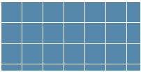
1、网格
<div class="box box2"></div>
<style>
   .box {
       width: 200px;
       height: 100px;
   }
   .box2 {
       background: white;
       background-image: linear-gradient(90deg, rgba(200, 0, 0, .5) 50%, transparent 0),
           				 linear-gradient(rgba(200, 0, 0, .5) 50%, transparent 0);
       background-size: 30px 30px;
   }
</style>
<div class="box box2"></div>
<style>
   .box {
       width: 200px;
       height: 100px;
   }
   .box2 {
       background: #58a;
       background-image: linear-gradient(white 1px, transparent 0),
           linear-gradient(90deg, white 1px, transparent 0);
       background-size: 30px 30px;
   }
</style>
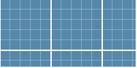
<div class="box box2"></div>
<style>
   .box {
       width: 200px;
       height: 100px;
   }
   .box2 {
       background: #58a;
       background-image:
           linear-gradient(white 2px, transparent 0),
           linear-gradient(90deg, white 2px, transparent 0),
           linear-gradient(hsla(0, 0%, 100%, .3) 1px, transparent 0),
           linear-gradient(90deg, hsla(0, 0%, 100%, .3) 1px, transparent 0);
       background-size: 75px 75px, 75px 75px,
           				15px 15px, 15px 15px;
   }
</style>
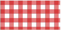
2、波点
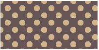
<div class="box box2"></div>
<style>
   .box {
       width: 200px;
       height: 100px;
   }
   .box2 {
       background: #655;
       background-image: radial-gradient(tan 30%, transparent 0),
           radial-gradient(tan 30%, transparent 0);
       background-size: 30px 30px;
       /* 第二背景的偏移定位值必须是贴片宽高的一半 30/2 */
       background-position: 0 0, 15px 15px;
   }
</style>
3、棋盘
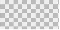
以下两种写法效果等同
常规写法:
<div class="box box2"></div>
<style>
   .box {
       width: 200px;
       height: 100px;
   }
   .box2 {
        background: #eee;
        background-image: linear-gradient(45deg, #bbb 25%, transparent 0),
            linear-gradient(45deg, transparent 75%, #bbb 0),
            linear-gradient(45deg, #bbb 25%, transparent 0),
            linear-gradient(45deg, transparent 75%, #bbb 0);
        background-position: 0 0, 15px 15px,
            15px 15px,30px 30px;
        background-size: 30px 30px;
   }
   /* 优化 */
   .box2 {
        background: #eee;
        background-image:
        	linear-gradient(45deg, #bbb 25%, transparent 0, transparent 75%, #bbb 0),
            linear-gradient(45deg, #bbb 25%, transparent 0, transparent 75%, #bbb 0);
        background-position: 0 0, 15px 15px;
        background-size: 30px 30px;
   }
</style>
使用角向渐变:
<div class="box box2"></div>
<style>
   .box {
       width: 200px;
       height: 100px;
   }
   .box2 {
       background: repeating-conic-gradient(#bbb 0, #bbb 25%, #eee 0, #eee 50%);
       background-size: 30px 30px;
   }
</style>


 6万+
6万+


 被折叠的 条评论
为什么被折叠?
被折叠的 条评论
为什么被折叠?
 到【灌水乐园】发言


