


https://www.cnblogs.com/pengfei25/p/6644953.html这是转载博源的
echarts各种字体颜色的修改
设置Legend颜色
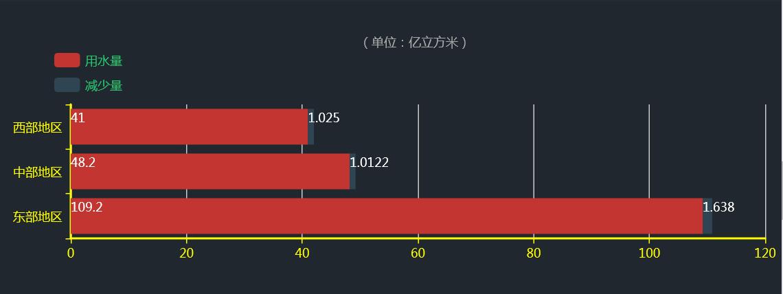
5.修改折线颜色
3.修改坐标字体颜色
完整代码:
<!DOCTYPE html>
<html>
<head>
<meta charset="utf-8">
<title>ECharts</title>
<!-- 引入 echarts.js -->
<script src="echarts.min.js"></script>
</head>
<body>
<!-- 为ECharts准备一个具备大小(宽高)的Dom -->
<div align="left" id="main" style="width: 900px;height:500px;"></div>
<script type="text/javascript">
// 基于准备好的dom,初始化echarts实例
var myChart = echarts.init(document.getElementById(‘main‘));
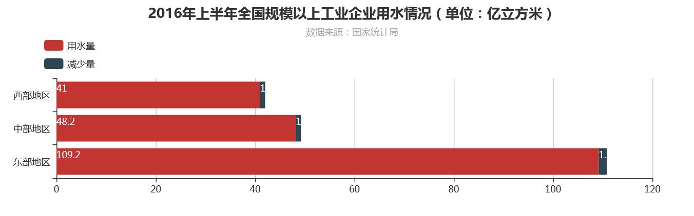
option = {
title: {
text: ‘2016年上半年全国规模以上工业企业用水情况(单位:亿立方米)‘,
subtext: ‘数据来源:国家统计局‘,
x: ‘center‘,
},
tooltip : {
trigger: ‘axis‘,
axisPointer : {
// 坐标轴指示器,坐标轴触发有效
type : ‘shadow‘
// 默认为直线,可选为:‘line‘ | ‘shadow‘
}
},
legend: {
orient: ‘vertical‘,
x: ‘left‘,
y:"top",
padding:50,
data: [‘用水量‘, ‘减少量‘,]
},
grid: {
left: ‘10‘,
right: ‘60‘,
bottom: ‘3%‘,
height: ‘30%‘,
top: ‘20%‘,
containLabel: true
},
xAxis: {
type: ‘value‘,
//设置坐标轴字体颜色和宽度
axisLine:{
lineStyle:{
color:‘yellow‘,
width:2
}
},
},
yAxis: {
type: ‘category‘,
//设置坐标轴字体颜色和宽度
axisLine:{
lineStyle:{
color:‘yellow‘,
width:2
}
},
data: [‘东部地区‘,‘中部地区‘,‘西部地区‘,]
},
series: [
{
name: ‘用水量‘,
type: ‘bar‘,
stack: ‘总量‘,
label: {
normal: {
show: true,
position: ‘insidelift‘
}
},
data: [109.2, 48.2, 41 ]
},
{
name: ‘减少量‘,
type: ‘bar‘,
stack: ‘总量‘,
label: {
normal: {
show: true,
position: ‘insidelift‘
}
},
data: [1.638, 1.0122, 1.025]
},
]
};
myChart.setOption(option);
</script>
</body>
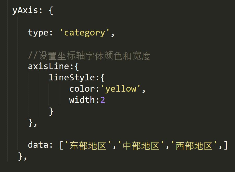
</html>核心代码如下所示:
yAxis: {

      type: ‘category‘,

      //设置坐标轴字体颜色和宽度
      axisLine:{
          lineStyle:{
              color:‘yellow‘,
              width:2
          }
      },

      data: [‘东部地区‘,‘中部地区‘,‘西部地区‘,]
    },
输出如下图所示:
我只是拿了例子 有需要的可点击链接


 1355
1355

 被折叠的 条评论
为什么被折叠?
被折叠的 条评论
为什么被折叠?
 到【灌水乐园】发言


