


Spape详解
1.自定义背景shape
1.1gradient
1.简介
- 定义渐变色,可以定义两色渐变和三色渐变,及渐变样式,它的属性有下面几个
2.属性
- angle,只对线性渐变是有效的
- 放射性渐变必须指定放射性的半径,gradientRadious
- centetX和centerY,设置渐变的中心位置,针对是放射性和扫描渐变的时候是有效的,默认0.5,识别小数,分数。范围0.0-1.0
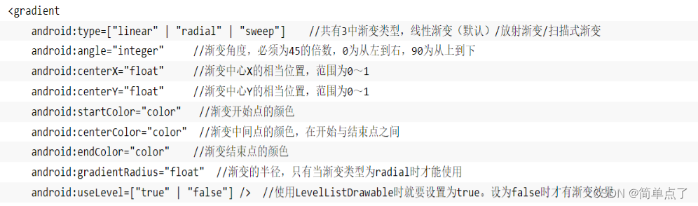
3.重点属性
- android:type=["linear" | "radial" | "sweep"]
- android:startColor="color" //渐变开始点的颜色
- android:centerColor="color" //渐变中间点的颜色,在开始与结束点之间
- android:endColor="color" //渐变结束点的颜色
- android:gradientRadius="float" //渐变的半径,只有当渐变类型为radial时才能使用
构造放射性渐变时,要加上android:gradientRadius属性(渐变半径),即必须指定渐变半径的大小才会起作用
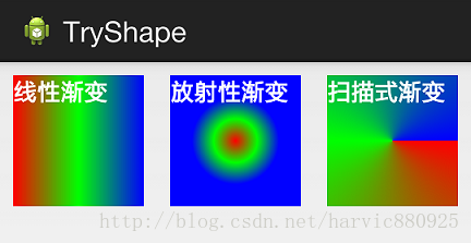
图1 渐变方式

图2 渐变角度
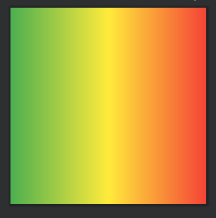
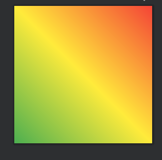
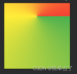
4.案例1:线性渐变
<gradient android:type="linear" android:startColor="@color/green" android:centerColor="@color/yellow" android:endColor="@color/red"/>
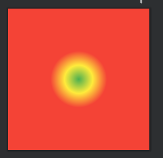
5.案例2:放射性渐变
- 指定type为radial同时需要指定放射性半径gradientRadious
<gradient android:type="radial" android:startColor="@color/green" android:centerColor="@color/yellow" android:endColor="@color/red" android:gradientRadius="100dp"/>
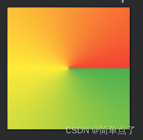
6.案例3:扫描式渐变
- 指定type为sweep
<gradient android:type="sweep" android:startColor="@color/green" android:centerColor="@color/yellow" android:endColor="@color/red"/>
7.案例4:angle属性
- 指定渐变的角度,必须为45的倍数,0为从左到右,90为从上到下
<!--    设置angle属性-->
    <gradient android:angle="45" android:type="linear" android:startColor="@color/green" android:centerColor="@color/yellow" android:endColor="@color/red"/>
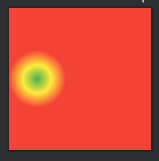
8.案例5:centerX和centerY属性
- 设置渐变的中心位置,针对是放射性和扫描渐变的时候是有效的
1)设置centerX=0.2
<gradient android:centerX="0.2" android:type="radial" android:startColor="@color/green" android:centerColor="@color/yellow" android:endColor="@color/red" android:gradientRadius="100dp"/>
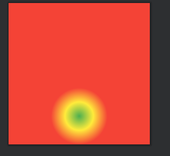
2)设置centerY=0.8
<gradient android:centerY="0.8" android:type="radial" android:startColor="@color/green" android:centerColor="@color/yellow" android:endColor="@color/red" android:gradientRadius="100dp"/>
3)给扫描式渐变设置也是可以的。
- 设置纵向偏移为0.2
<gradient android:centerY="0.2" android:type="sweep" android:startColor="@color/green" android:centerColor="@color/yellow" android:endColor="@color/red"/>
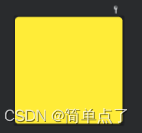
1.2solid
- 设置的填充的颜色,就是控件内部使用什么颜色进行填充
<solid android:color="@color/yellow"/>
- 表示填充的颜色就是黄色
1.3corners圆角
- 设置的是控件四个角的样式
- 属性
- radius,一下设置上左,上右,下左,下右
- radius等价于下面四个,可以单设
- topLeftRadius,上左
- topRightRadius,上右
- bottomLeftRadius,下左
- bottomRightRadius,下右
<corners android:radius="20dp"/>
- 下图明显的变成了圆角的了

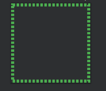
1.4stroke
1.简介
- 设置的描边的属性,定义边的宽度,颜色,是不是虚实线
2.属性
- 属性:
- width,宽度
- color,颜色
- dashWitth,虚线的宽度,0代表的就是实线
- dashGap,虚线的间隔

3.案例-设置绿色虚线描边,虚线高度是20dp,虚线宽度为10dp虚线间距为1dp:
<stroke android:color="@color/green" android:width="20dp" android:dashWidth="15dp" android:dashGap="10dp"/>
1.5size和padding
1.简介
实际的作用并不是很大,控件本身就可以实现,关键是stroke,solid,corners以及gradient
- size设置的是控件的宽度和高度
<size android:width="300dp" android:height="50dp"/>
- padding设置的是控件的内边距
<padding android:bottom="5dp" android:top="5dp" android:left="5dp" android:right="5dp"/>
1.6shape
1.简介
- 上面我们讲了Shape的子标签的的作用,但Shape本身还没讲,Shape自已是可以定义当前Shape的形状的,比如上面的矩形,还有椭圆形,线形和环形;这些都是通过Shape标签的 shape属性来定义的,Shape标签总共有下面几个属性,我们一个个讲:
2.shape属性
- android:shape=["rectangle" | "oval" | "line" | "ring"]
- shape的形状,默认为矩形,可以设置为矩形(rectangle)、椭圆形(oval)、线性形状(line)、环形(ring)
- 下面的属性只有在android:shape="ring时可用:
- android:innerRadius 尺寸,内环的半径。
- android:innerRadiusRatio 浮点型,以环的宽度比率来表示内环的半径,
- android:thickness 尺寸,环的厚度
- android:thicknessRatio 浮点型,以环的宽度比率来表示环的厚度,例如,如果android:thicknessRatio="2",
- android:useLevel boolean值,如果当做是LevelListDrawable使用时值为true,否则为false.
注意:注意,无论这里shape取什么形状,他的子标签都是可用的,但有时并不会有效果,比如在shape为椭圆时,那corners标签就不会有效果,很显然的道理。下面一个个看看各个形状都是怎么样的;
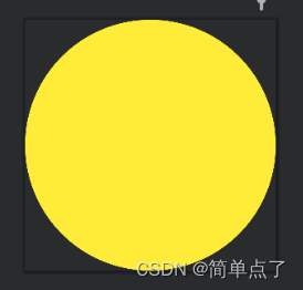
3.shape为oval椭圆
1)设置为椭圆
<shape xmlns:android="http://schemas.android.com/apk/res/android" android:shape="oval" > ...</shape>
4.line线性,没有什么用处
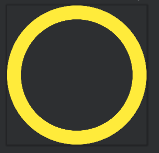
5.ring环形
- android:innerRadius 尺寸,内环的半径。
- android:thickness 尺寸,环的厚度
- android:innerRadiusRatio 浮点型,以环的宽度比率来表示内环的半径,
- android:thicknessRatio 浮点型,以环的宽度比率来表示环的厚度
- android:useLevel boolean值,如果当做是LevelListDrawable使用时值为true,否则为false.
以上这些属性无非都是定义环形的属性的,要么指定大小去设置,要么去设置指定的比率去设置大小。
注意:必须设置useLevel为false不然的话没有效果!!!
<shape xmlns:android="http://schemas.android.com/apk/res/android" android:shape="ring" android:innerRadius="200dp" android:thickness="50dp" android:useLevel="false">
...
</shape>


 2530
2530


 被折叠的 条评论
为什么被折叠?
被折叠的 条评论
为什么被折叠?
 到【灌水乐园】发言


